Having the new messages bar appear above the page title would make it much more difficult to spoof.
Version: unspecified
Severity: enhancement
| • MZMcBride | |
| Jan 18 2008, 10:10 PM |
| F4695: Screen_Shot_2012-04-09_at_10.40.11_AM.png | |
| Nov 21 2014, 10:04 PM |
| F4694: Screen_Shot_2012-04-09_at_10.39.55_AM.png | |
| Nov 21 2014, 10:04 PM |
| F4693: Alternative_positioning.png | |
| Nov 21 2014, 10:04 PM |
| F4692: Picture_2.png | |
| Nov 21 2014, 10:04 PM |
| F4691: 12681.diff | |
| Nov 21 2014, 10:04 PM |
Having the new messages bar appear above the page title would make it much more difficult to spoof.
Version: unspecified
Severity: enhancement
Added a permalink to an example of spoofing new message alert on English Wikipedia (see URL section above).
Created attachment 4574
Desired effect can happen by applying this patch.
I've added a patch which does what is requested here. Whether this should be applied can be controversial. I'm going to ask some more experienced developers to have a look and comment about it.
Attached:
thomas.dalton wrote:
I prefer the other suggestion I've seen for stopping spoofs: include the username in the message. You can't spoof a username without {{CURRENTUSER}} which isn't available on any Wikimedia wikis to my knowledge, and probably isn't used on many others either.
matthew.britton wrote:
Wow, people still care about this?
New messages bar spoofing is like rickrolling, only older and even more pointless.
ayg wrote:
This is pointless, IMO. The usertalk thing can still easily be spoofed with absolute positioning, unless bug 9526 is fixed. Adding the username is a much more sensible tactic.
ayg wrote:
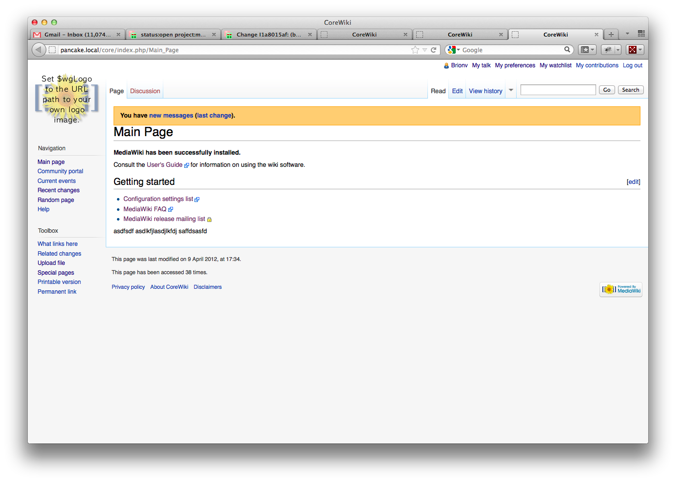
It was pointed out on IRC that every other message box (site notice, AJAX watch, . . .) goes above the header, and that in fact this is the logical place for message boxes (as opposed to being beneath the header and therefore in the same place as article text). The previous rationale was dubious, but the new point is certainly valid enough to make the change. Committed in r30136.
Please notice that this change only affects MonoBook skin. Other skins may also need to be updated accordingly.
Reverted in r30159.
The new location of message bar interferes with lock, geolocation, etc magic templates in use on Wikimedia sites. Hold off on this until there's a system for properly handling those "out of content area" magicks.
Created attachment 4580
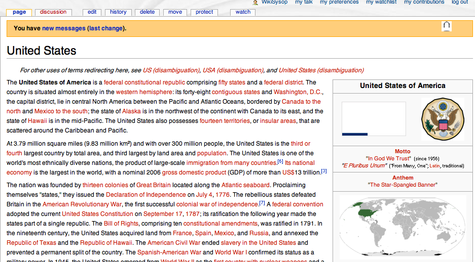
Screenshot of 'United States' from enwiki on a local test wiki
'Protected page' icon shown overlapping the messages bar.
(Ignore the bad SVG rendering. :)
Attached:
Presumably, the new messages bar will only be visible for a very short time (until the user checks their messages). Seeing that the sitenotice and CentralNotice both cause layout issues as well (and both of those are displayed for much longer periods of time, generally), perhaps it wouldn't be the worst idea to re-revert and help separate page content from the software stuff?
(In reply to comment #13)
Presumably, the new messages bar will only be visible for a very short time
(until the user checks their messages). Seeing that the sitenotice and
CentralNotice both cause layout issues as well (and both of those are displayed
for much longer periods of time, generally), perhaps it wouldn't be the worst
idea to re-revert and help separate page content from the software stuff?
I'd recommend that.
Created attachment 5539
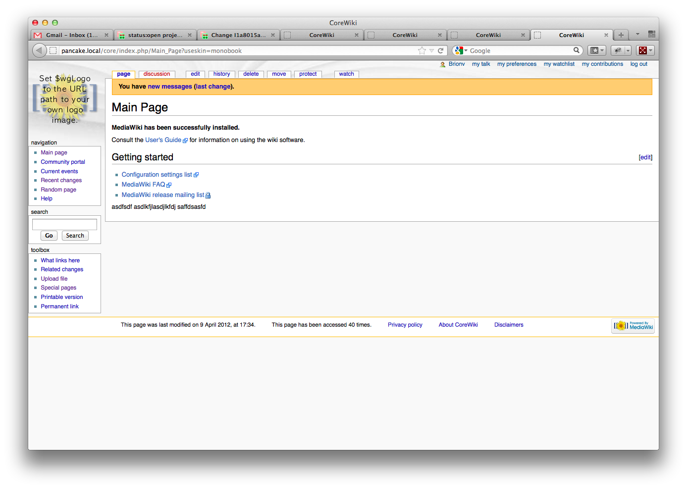
Alternative positioning suggestion.
Here is an alternative suggestion for message placement, which puts the user message at the top, along with the other user controls. As far as I know this won't conflict with any existing messages/templates.
For reference, the CSS I used for this was as follows (though it could be improved, I'm sure):
.usermessage {
position: absolute;
right: 1em;
top: -7.1em;
font-size: 0.9em;
padding: 0.2em 8.5em 0.3em;
line-height: 0.9em;
background-color: #FFFF00;
font-weight: bold;
}
(Note that this was from <div> tag in a page preview, not the actual edit message, so it may not work 'out of the box', as it were!)
Attached:

mike.lifeguard+bugs wrote:
(In reply to comment #13)
Presumably, the new messages bar will only be visible for a very short time
(until the user checks their messages). Seeing that the sitenotice and
CentralNotice both cause layout issues as well (and both of those are displayed
for much longer periods of time, generally), perhaps it wouldn't be the worst
idea to re-revert and help separate page content from the software stuff?
Indeed. Seems like a trivial issue.
(In reply to comment #13)
Presumably, the new messages bar will only be visible for a very short time
(until the user checks their messages). Seeing that the sitenotice and
CentralNotice both cause layout issues as well (and both of those are displayed
for much longer periods of time, generally), perhaps it wouldn't be the worst
idea to re-revert and help separate page content from the software stuff?
Yes, please split the content from other stuff.
I think, there is a solution for the problem of position from coordinate or other stuff.
Thanks.
*Bulk BZ Change: +Patch to open bugs with patches attached that are missing the keyword*
sumanah wrote:
I've added the "design" keyword since this is a visual design issue, and the "reviewed" keyword since it seems the patch did get reviewed (please feel free to change that to "need-review" if you'd like some more discussion of the code suggested by Huji).
Created attachment 10392
Current gerrit patch screenshot on Vector skin
Spacing under Vector is a bit off; not enough space above the title.
Attached:
Created attachment 10393
Current gerrit patch screenshot on Monobook skin
Very bad spacing, looks awful in monobook. :(
Attached:
I believe the orange message-bar is still shown to IP editors? I don't recall how it integrates with vector, central/site-notice banners, or other aspects.
It is still shown yes, in the area Echo should be. Not sure what the problem statement here is though as moving it below the title would make its position inconsistent in the UI.
Oh, I see. I thought it was still the full-page-width classic "OBOD", as documented at https://meta.wikimedia.org/wiki/New_messages_notification ? My quick test didn't work, so I can't confirm either way.