Page MenuHomePhabricator

Options form at the top of Special:Watchlist needs cleanup
Closed, ResolvedPublic

Assigned To
Authored By
matmarex
May 19 2013, 11:04 AM
Referenced Files
F2919056: pasted_file
Nov 5 2015, 5:03 PM
F2919065: pasted_file
Nov 5 2015, 5:03 PM
F27913: options.png
Jan 11 2015, 5:00 PM
F10349: 2014-04-13_19_26_09-Watchlist_-_Testwiki_-_Opera.png
Nov 22 2014, 1:17 AM
F10347: options.png
Nov 22 2014, 1:17 AM
Tokens
"The World Burns" token, awarded by MGChecker."Love" token, awarded by He7d3r."Like" token, awarded by matej_suchanek."Like" token, awarded by Florian."Like" token, awarded by Nemo_bis.

Description

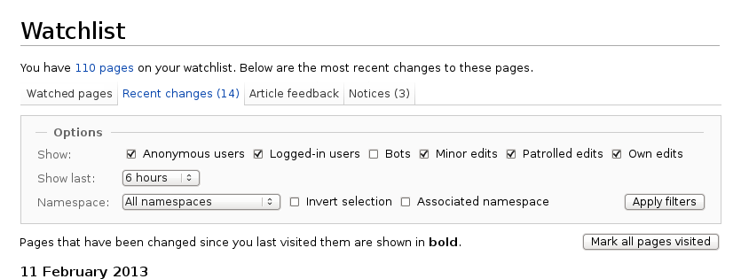
Options form at the top of Special:Watchlist needs cleanup.

Right now it features a "form" built with links to show different time ranges, then another to show different kinds of edits, and then another, this time real, form to show different namespaces.

All this should be consolidated.

(There's also a weird header with a one-item unordered list and a huge 'Mark all pages visited' button, but that's a different thing.)

Proposed layout:

options.png (315×835 px, 31 KB)

Related Objects

Event Timeline

There are a very large number of changes, so older changes are hidden. Show Older Changes

Great - subscribed to those. Thank you!

  • Bug 66373 has been marked as a duplicate of this bug. ***

Change 149268 had a related patch set uploaded by Rohan013:
A more cleaner Special:Watchlist options form

https://gerrit.wikimedia.org/r/149268

matmarex set Security to None.

Change 149268 had a related patch set uploaded (by Bartosz Dziewoński):
Cleaner Special:Watchlist options form

https://gerrit.wikimedia.org/r/149268

Current interface:

pasted_file (180×1 px, 35 KB)

After @rohan013's last patch:
pasted_file (180×1 px, 34 KB)

Note how the links were changed into form elements. Functionality should be unchanged, and user's preferences and bookmarks still work as before.

I'm going to merge it next Tuesday, after branch cut. It will be included in 1.27.0-wmf.7, which is due to be deployed to Wikimedia wikis on 17-19 November 2015 per https://www.mediawiki.org/wiki/MediaWiki_1.27/Roadmap.

Change 149268 merged by jenkins-bot:
Cleaner Special:Watchlist options form

https://gerrit.wikimedia.org/r/149268

matmarex removed a project: Patch-For-Review.

The fix has been merged and will be included in MediaWiki 1.27.0-wmf.7, which is due to be deployed to Wikimedia wikis on 17-19 November 2015 per https://www.mediawiki.org/wiki/MediaWiki_1.27/Roadmap.

I must say that "Show last:" is hard to translate for some languages.

Re: https://commons.wikimedia.org/wiki/Commons:Village_pump#Recent_changes_to_Watchlist_pages

This change removed handy links to hide minor/bot/self watchlist entries and instead turned them into a list of check boxes and a go button. Forcing users to make two fiddly actions where one click on a link used to do the same thing is not an improvement.

Can this be reversed please?

I'm going to merge it next Tuesday, after branch cut. It will be included in 1.27.0-wmf.7, which is due to be deployed to Wikimedia wikis on 17-19 November 2015 per https://www.mediawiki.org/wiki/MediaWiki_1.27/Roadmap.

Great. Is there a matching task for making the same change on Special:RecentChanges?

Edit: T53941 is, kinda, in the sense that it addresses merging the preferences for Recent Changes and Watchlist, but not specifically this. T29050 is also related.

In T50615#1816917, @Fae wrote:

Re: https://commons.wikimedia.org/wiki/Commons:Village_pump#Recent_changes_to_Watchlist_pages

This change removed handy links to hide minor/bot/self watchlist entries and instead turned them into a list of check boxes and a go button. Forcing users to make two fiddly actions where one click on a link used to do the same thing is not an improvement.

Can this be reversed please?

This requires as many user actions as having any combination of those links clicked while also reducing time and resources to load in the event you were filtering on more than one of those items (one page instead of two pages loaded).

Can this be reversed please?

This requires as many user actions as having any combination of those links clicked while also reducing time and resources to load in the event you were filtering on more than one of those items (one page instead of two pages loaded).

The use case I have in mind does not seem the same as yours. The way I used to use watchlists before this change was to click on one of the hide links, see the results and then decide if it is worth hiding any more. That is one user action, this change makes it two rather more fiddly interactions (very fiddly from a tablet).

Please rethink the change and the use cases you are using to justify this. It is not an improvement.

Thanks.

Would love to have this feature on Special:RecentChanges, Special:RecentChangesLinked etc. as well where it would be even more handy. Please no reverts.

For Special:RecentChanges see T119084: Options form at the top of old Special:RecentChanges needs cleanup.

@Fae: I don't really understand your use case. What is the intention of "see the results and then decide if it is worth hiding any more"? I think the use case of the Watchlist would be "What items I want to see, edits by bots? No. Edits by anonymous users? Yes. Click Submit". So I think a user already knows the groups of items he wants to see, no matter what amount of items are expected. If you want to reduce the number of items on the page, you probably want a limit option :)

In T50615#1817199, @Fae wrote:

This requires as many user actions as having any combination of those links clicked while also reducing time and resources to load in the event you were filtering on more than one of those items (one page instead of two pages loaded).

The use case I have in mind does not seem the same as yours. The way I used to use watchlists before this change was to click on one of the hide links, see the results and then decide if it is worth hiding any more. That is one user action, this change makes it two rather more fiddly interactions (very fiddly from a tablet).

I made no justification. I stated only facts. And I certainly did nothing to move this change to release.

It's good that you have can show that there is a use case (valid or not) that was harmed during this change, however, since that's important for the developers (as opposed to "change it back!") and can subsequently be discussed rationally.

I must say that "Show last:" is hard to translate for some languages.

I agree that it's a bit awkward, but the wording was already there before, and I couldn't come up with anything concise enough that would be better. If you have any suggestions, please share; or if there's a convenient expression in your language, I think you should feel free to translate this more creatively. :)

For Special:RecentChanges see T119084: Options form at the top of old Special:RecentChanges needs cleanup.

@Fae: I don't really understand your use case. What is the intention of "see the results and then decide if it is worth hiding any more"? I think the use case of the Watchlist would be "What items I want to see, edits by bots? No. Edits by anonymous users? Yes. Click Submit". So I think a user already knows the groups of items he wants to see, no matter what amount of items are expected. If you want to reduce the number of items on the page, you probably want a limit option :)

Your assumptions are valid from a design perspective but unfortunately they fail in practice. You assume that users, especially power users, who heavily rely on the watchlist constantly want to think about making decisions regarding their search parameters. They don't. They click on the link in the interface and when they see too much noise they click the filter deemed appropriate in that instance. This might be just bots or just registered users, it's rarely more thant one and it changes all the time, depending on what one is looking for. I guess Fae does not want to make conscious decisions at this point, just click and see what happens, same as me. With this change you have doubled the necessary clicks for this use case and tripled for the number of entries (pull down instead of links to options). Also, the default on dewiki is one hour, which makes it even more unusable. Please revert this change or at least provide links in addition to the checkboxes.

Please make the form respecting the settings (e.g. 30 days) when applying form changes.

Also, the default on dewiki is one hour, which makes it even more unusable.

Which default are you talking about here? "watchlistdays" defaults to 3.0 days in MediaWiki core. I don't believe any Wikimedia wiki overrides this setting.

Have you made adjustments to https://de.wikipedia.org/wiki/Spezial:Einstellungen#mw-prefsection-watchlist?

It was set to 5 days and I have now changed it to 30. When I call Special:Watchlist it shows me 30 days but the dropdown menu for "Show last" defaults to 1 hour, which I would have to change before hitting "go".

This is a bug I think, would you like to open a new task here in phabricator (would be nice, if you could add me as CC or mention it here, just a side note).

For Special:RecentChanges see T119084: Options form at the top of old Special:RecentChanges needs cleanup.

@Fae: I don't really understand your use case. What is the intention of "see the results and then decide if it is worth hiding any more"? I think the use case of the Watchlist would be "What items I want to see, edits by bots? No. Edits by anonymous users? Yes. Click Submit". So I think a user already knows the groups of items he wants to see, no matter what amount of items are expected. If you want to reduce the number of items on the page, you probably want a limit option :)

Your assumptions are valid from a design perspective but unfortunately they fail in practice. You assume that users, especially power users, who heavily rely on the watchlist constantly want to think about making decisions regarding their search parameters. They don't. They click on the link in the interface and when they see too much noise they click the filter deemed appropriate in that instance. This might be just bots or just registered users, it's rarely more thant one and it changes all the time, depending on what one is looking for. I guess Fae does not want to make conscious decisions at this point, just click and see what happens, same as me. With this change you have doubled the necessary clicks for this use case and tripled for the number of entries (pull down instead of links to options). Also, the default on dewiki is one hour, which makes it even more unusable. Please revert this change or at least provide links in addition to the checkboxes.

I understand the use case, but I hope you understand (and you mentioned it already :)), that from a design perspective (at least from my :P) this use case doesn't make really sense, and in fact we can support only one form :) Just an idea how we could support both: Someone could create a gadget (or a user script), which (with JavaScript) submits the form whenever a checkbox value changes. This would (if I understood you correctly) fulfill your use case, right?

Also, the default on dewiki is one hour, which makes it even more unusable.

Which default are you talking about here? "watchlistdays" defaults to 3.0 days in MediaWiki core. I don't believe any Wikimedia wiki overrides this setting.

Have you made adjustments to https://de.wikipedia.org/wiki/Spezial:Einstellungen#mw-prefsection-watchlist?

It was set to 5 days and I have now changed it to 30. When I call Special:Watchlist it shows me 30 days but the dropdown menu for "Show last" defaults to 1 hour, which I would have to change before hitting "go".

This is a bug I think, would you like to open a new task here in phabricator (would be nice, if you could add me as CC or mention it here, just a side note).

I was free and added it: T119172: Special:Watchlist should take the days of the preferences into the select field :]

For Special:RecentChanges see T119084: Options form at the top of old Special:RecentChanges needs cleanup.

@Fae: I don't really understand your use case. What is the intention of "see the results and then decide if it is worth hiding any more"? I think the use case of the Watchlist would be "What items I want to see, edits by bots? No. Edits by anonymous users? Yes. Click Submit". So I think a user already knows the groups of items he wants to see, no matter what amount of items are expected. If you want to reduce the number of items on the page, you probably want a limit option :)

Your assumptions are valid from a design perspective but unfortunately they fail in practice. You assume that users, especially power users, who heavily rely on the watchlist constantly want to think about making decisions regarding their search parameters. They don't. They click on the link in the interface and when they see too much noise they click the filter deemed appropriate in that instance. This might be just bots or just registered users, it's rarely more thant one and it changes all the time, depending on what one is looking for. I guess Fae does not want to make conscious decisions at this point, just click and see what happens, same as me. With this change you have doubled the necessary clicks for this use case and tripled for the number of entries (pull down instead of links to options). Also, the default on dewiki is one hour, which makes it even more unusable. Please revert this change or at least provide links in addition to the checkboxes.

I understand the use case, but I hope you understand (and you mentioned it already :)), that from a design perspective (at least from my :P) this use case doesn't make really sense, and in fact we can support only one form :) Just an idea how we could support both: Someone could create a gadget (or a user script), which (with JavaScript) submits the form whenever a checkbox value changes. This would (if I understood you correctly) fulfill your use case, right?

What I meant was, and I should have obviously been clearer, is that this form might be a good idea in theory but is useless in practice for the users who rely on it the most. Please explain "and in fact we can support only one form". Why? Your "solution" is a joke, right?

What I meant was, and I should have obviously been clearer, is that this form might be a good idea in theory but is useless in practice for the users who rely on it the most. Please explain "and in fact we can support only one form". Why? Your "solution" is a joke, right?

Sorry if I wrote, what I mean, in a confusing way :] I mean, that Special:Watchlist should hold only one form (it would look straneg with two forms, right?), and therefore, we normally support only this one :)

Your "solution" is a joke, right?

No, why? :( This isn't really constructive and doesn't help me to understand why you dislike the idea (an idea of a solution how to support as most use cases as possible).

What I meant was, and I should have obviously been clearer, is that this form might be a good idea in theory but is useless in practice for the users who rely on it the most. Please explain "and in fact we can support only one form". Why? Your "solution" is a joke, right?

Sorry if I wrote, what I mean, in a confusing way :] I mean, that Special:Watchlist should hold only one form (it would look straneg with two forms, right?), and therefore, we normally support only this one :)

Not really, no. If you don't want to expose two interfaces at once you could at least provide an option in the preferences.

Your "solution" is a joke, right?

No, why? :( This isn't really constructive and doesn't help me to understand why you dislike the idea (an idea of a solution how to support as most use cases as possible).

The core developers make a design decision and remove core functionality that what there since forever, as perceived by some power users who complain about this change and explain why this doesn't work in some use cases. Advising then to "go find someone who hacks around the problem" is something I don't find incredibly helpful. It may sound constructive to you, but isn't really. It would be if you had written that you will provide said gadget. If you were to do that, would you please take the planned changes to recent changes and the like into account.

For Special:RecentChanges see T119084: Options form at the top of old Special:RecentChanges needs cleanup.

@Fae: I don't really understand your use case. What is the intention of "see the results and then decide if it is worth hiding any more"? I think the use case of the Watchlist would be "What items I want to see, edits by bots? No. Edits by anonymous users? Yes. Click Submit". So I think a user already knows the groups of items he wants to see, no matter what amount of items are expected. If you want to reduce the number of items on the page, you probably want a limit option :)

I thought I explained this fairly clearly, let's try not to create lots of tangents which only muddy the waters. On the original form, I could click one link on the watchlist to hide bots or hide minor edits. The links were large enough to use on tablets and mobile platforms, which I frequently use right now when travelling, with no issue and without sacrificing much screen real estate. This change has made that usage almost impossible as the check boxes are tiny in comparison, take up the same amount of screen real estate as the old system, and the change means multiple clicks or, even worse, needing the user to zoom in first without accidentally clicking on anything when pinching on the screen.

As an example, I have been using my sister's Kindle 3g to check my watchlist. It is a hard device to use but data access is free when on the move, even internationally. On that platform zooming is impossible and the new check boxes are about 1/10 the size that Kindle gives the user for letters to press on the keyboard. That's just impossibly tiny, which now rules out that platform for users that want to try checking up on their watchlists. Now, that's pretty damn disappointing considering how many person-years of negotiation it took for Wikimedia to get Wikimedia projects accessible for free on Amazon devices.

I'd also like to have a possibility in my wikipedia user profile to set "use old watchlist style".

I'm contributing to/using wikipedia during the business days (Mo..Fr), having "last 3 days" as preference setting. I'm not contributing to WP during the weekend. At mondays, I almost always need "last 7 days" to see what has happened. At the old watchlist options, that was 1 click. Now I need 3. Not an improvement concerning the usability of this usecase.

In T50615#1820195, @Fae wrote:

The links were large enough to use on tablets and mobile platforms, which I frequently use right now when travelling, with no issue and without sacrificing much screen real estate. This change has made that usage almost impossible as the check boxes are tiny in comparison, take up the same amount of screen real estate as the old system

I think this use-problem may be resolved when the watchlist is upgraded to HTMLForm in T99256 (the proposed layout has its own issues, but small is not one of them...). You should probably keep an eye on that one.

change means multiple clicks

This should probably have its own task related to the use case you've brought up here, since this one is closed resolved and I'm skeptical that it will be reverted.

I must agree with the others, the "improvements" that where made are not good. Depending on activity I can switch between the 1,2,6 Hour options or even 12-24 on a regular basis. What was 1 click is now 3 each time..... Why are you making the UI more complex to use?

In T50615#1820195, @Fae wrote:

The links were large enough to use on tablets and mobile platforms, which I frequently use right now when travelling, with no issue and without sacrificing much screen real estate. This change has made that usage almost impossible as the check boxes are tiny in comparison, take up the same amount of screen real estate as the old system ...

You can click/tap the labels next to the checkbox too, as is standard for checkboxes. This means the interaction area is actually larger than previously, when it was only the "Show" or "Hide" link.

I must agree with the others, the "improvements" that where made are not good. Depending on activity I can switch between the 1,2,6 Hour options or even 12-24 on a regular basis. What was 1 click is now 3 each time..... Why are you making the UI more complex to use?

+1! this is so frustrating.

so the options form "needs cleanup" and now it has a nicer look but it's more cumbersome to use - hooray!

Please revert this, there are so many new unfixed bugs because of the new design. Additionally, it's true that the new form is worse than the old one: The case the users use the Watchlist is much more important than some Design issues.

Maybe a suggestion: I think this can work, only if the content of the page is refreshed dynamically. Could also make the page faster, maybe.

I must say that "Show last:" is hard to translate for some languages.

Would something like "Changes to show:" work better? Could then cram number of changes as well as duration on the same line.

Did we lose options?

Maybe a suggestion: I think this can work, only if the content of the page is refreshed dynamically. Could also make the page faster, maybe.

You could try w:en:User:Theopolisme/Scripts/ajaxWatchlist.js for updating the watchlist automatically.

Change 255806 had a related patch set uploaded (by Florianschmidtwelzow):
SpecialWatchlist: Add an option to automatically reload the page when a filter was changed

https://gerrit.wikimedia.org/r/255806

Not really, no. If you don't want to expose two interfaces at once you could at least provide an option in the preferences.

That will still add (from a technically point of view) two forms, which needs to be supported.

Your "solution" is a joke, right?

No, why? :( This isn't really constructive and doesn't help me to understand why you dislike the idea (an idea of a solution how to support as most use cases as possible).

The core developers make a design decision and remove core functionality that what there since forever, as perceived by some power users who complain about this change and explain why this doesn't work in some use cases.

I think, nobody said, that we still can't improve the form. But saying "this form doesn't fit our needs", only, doesn't help us to find out, _what_ your needs are :)

Advising then to "go find someone who hacks around the problem" is something I don't find incredibly helpful.
It may sound constructive to you, but isn't really. It would be if you had written that you will provide said gadget.

I never said, that. It was an idea how to support both, the new design and the needs of "Power users", and it would have been a simple to ask me to implement it (and I would be happy to do it!), but instead, saying me, that I'm not helpful (while I'm trying to understand your needs and find a way to support them as much as I can), isn't something what I've expected :( And yes, I find it constructive, if I make suggestions and want to gather feedback before implementing them.

Just my 2 cents

Change 255806 merged by jenkins-bot:
SpecialWatchlist: Add an option to automatically reload the page when a filter was changed

https://gerrit.wikimedia.org/r/255806

I must say that "Show last:" is hard to translate for some languages.

Would something like "Changes to show:" work better? Could then cram number of changes as well as duration on the same line.

T119245 was filed about this, there's a pending patch at https://gerrit.wikimedia.org/r/#/c/256958/. Please come over there to discuss the wording :)