Page MenuHomePhabricator

Red .diffchange text in the green 'added' area may be hard to read for color-blind users
Closed, ResolvedPublic

Assigned To
None
Authored By
bzimport
Sep 17 2007, 4:42 PM
Referenced Files
F4279: Diff-Colors.png
Nov 21 2014, 9:55 PM
F4280: mediawiki.action.history.diff.css.patch
Nov 21 2014, 9:55 PM
F4278: DiffView.pdf
Nov 21 2014, 9:55 PM
F4277: DiffView_sans_top_and_bottom_outlines.png
Nov 21 2014, 9:55 PM
F4274: Diff_Screenshot.png
Nov 21 2014, 9:55 PM
F4275: mediawiki.action.history.css
Nov 21 2014, 9:55 PM
F4276: Diff-Colors.png
Nov 21 2014, 9:55 PM
F4273: mediawiki_diff_scrollbars.png
Nov 21 2014, 9:55 PM

Description

Author: rene.kijewski

Description:
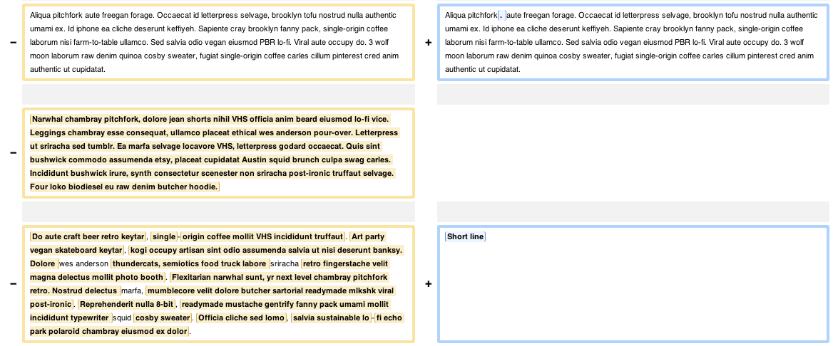
For red-green color blinds the changes on the diffs are difficult to find. For not red-green color blinds red highlights the changes, but for persons like me can not see them skimming. About 8 % of the males have this deficiency, so a big amount of users is discriminated.

In the German Wikipedia a user found the solution to give changes a blue highlight. It would be easy the see for "normal seeing" persons and for red-green color blinds as well.

Have a look at: http://de.wikipedia.org/wiki/Benutzer:Matze6587/monobook.css


Version: unspecified
Severity: enhancement

Details

Reference
bz11374

Event Timeline

bzimport raised the priority of this task from to Medium.Nov 21 2014, 9:55 PM
bzimport set Reference to bz11374.

rene.kijewski wrote:

red to blue

attachment diff.css.diff ignored as obsolete

rene.kijewski wrote:

correct patch file for skins/common/diff.css

The first attachment has a wrong header.

Attached:

rene.kijewski wrote:

You may have a look on

to see, what the patch would change (the colored lines).

You can also edit your own CSS files. Perhaps some userscripts for this should be posted in a nice easy to find place.

rene.kijewski wrote:

I have it in my monobook.css. My intention was to help more people than myself. I mean, it does nothing bad to no one. Anon users cannot change "their" user-CSS as well. I thought it would be nice to minimize this discrimitation in all-project and to help the overall accessibility.

I do not want to keep secret, that about 0.001 % of men and 0.03 % of women are blue-yellow color blind, and would be discriminated either. But it are far less than the 5 % now.

oysterguitarist wrote:

Another idea would be to make this configurable in your preferences, that way users could have it either way.

  • Bug 17763 has been marked as a duplicate of this bug. ***

michael.daly wrote:

Since fixing this universally would improve usability for all persons, recommending a personal CSS solution is not the best. Personally, I think the solution on fr.wikipedia is superior - a single colour background with different shades to identify the changes - light/dark blue for new. Coupled with bold text as on fr.wikipedia may be overkill but it is certainly functional. The advantage of black text with a varying background is that it avoids all colourblindness issues (since I'm not aware of any black-whatever colourblindness).

Example from fr.wikipedia: http://fr.wikipedia.org/w/index.php?title=Ac%C3%A9die&diff=37604705&oldid=31661742

  • Bug 3540 has been marked as a duplicate of this bug. ***

jp.posma wrote:

Fix

This patch uses the nice colour scheme from the French Wikipedia, but instead of green/blue it uses red/blue, to stay closer to the original colours (red/green). Red/blue still contrasts for colourblind people.

Apply patch to trunk/phase3/skins/common.

attachment 11374 ignored as obsolete

jp.posma wrote:

French fix

Hm, red/blue obviously doesn't work for red/green colourblindness, oops. Tried orange/blue, but that doesn't really look good. I think we can just use the French style, which is also a great improvement for non-colourblind users, see the link in comment #8.

Attached:

*Bulk BZ Change: +Patch to open bugs with patches attached that are missing the keyword*

The CSS hooks MediaWiki provides are flexible enough to change this entirely to your liking.

There are numerous mini Gadgets in the wiki land to change it to yellow-blue for example. Check [[Special:Preferences]] -> Gadgets and see if it's listed.

Otherwise, modify your User:Accountname/common.css wiki page and add css rules to your liking.

I think the latter isn't very attractive for non-tech users, but it's a way to experiment with the css. Once you're done ask an administrator on your wiki to create a gadget that anyone can enable with a single click.

ie.

  • MediaWiki:Gadget-diffGreenBlue

Change the difference view highlighting to green-blue colouring (instead of red/green)

  • MediaWiki:Gadget-diffGreenBlue.css

td.diff-addedline { background: #d8e4f6; }
td.diff-deletedline { background: #e4f6d8; }
.diffchange { color: inherit; }
td.diff-addedline .diffchange { background: #b0c0f0; }
td.diff-deletedline .diffchange { background: #b0e897; }

  • MediaWiki:Gadgets-definition

*diffGreenBlue|diffGreenBlue.css

And that's it. I've enabled it on Wikimedia Commons and Meta-Wiki for now. Feel free to export/import, enable or embed this as you like.

I'm marking this WONTFIX per BugTriage meeting. We probably don't want to change the default green/red which is too known and grown into the interwebs.

The problem isn't that yellow and green are hard to tell apart, but that the red text is hard to see against the yellow and green backgrounds.

A sane default should be *legible* for all readers.

(In reply to comment #13)

The CSS hooks MediaWiki provides are flexible enough to change this entirely to
your liking.

There are numerous mini Gadgets in the wiki land to change it to yellow-blue
for example. Check [[Special:Preferences]] -> Gadgets and see if it's listed.

Otherwise, modify your User:Accountname/common.css wiki page and add css rules
to your liking.

I think the latter isn't very attractive for non-tech users, but it's a way to
experiment with the css. Once you're done ask an administrator on your wiki to
create a gadget that anyone can enable with a single click.

ie.

  • MediaWiki:Gadget-diffGreenBlue

Change the difference view highlighting to green-blue colouring (instead of
red/green)

  • MediaWiki:Gadget-diffGreenBlue.css

td.diff-addedline { background: #d8e4f6; }
td.diff-deletedline { background: #e4f6d8; }
.diffchange { color: inherit; }
td.diff-addedline .diffchange { background: #b0c0f0; }
td.diff-deletedline .diffchange { background: #b0e897; }

  • MediaWiki:Gadgets-definition

*diffGreenBlue|diffGreenBlue.css

And that's it. I've enabled it on Wikimedia Commons and Meta-Wiki for now. Feel
free to export/import, enable or embed this as you like.

I'm marking this WONTFIX per BugTriage meeting. We probably don't want to
change the default green/red which is too known and grown into the interwebs.

http://commons.wikimedia.org/w/index.php?curid=9692858&diff=55008419&withCSS=MediaWiki:Gadget-diffGreenBlue.css

How about we make the .diffchange bold black (like the french fix[1] does) but keep the yellow/green backgrounds. Would that solve the issue ?

[1] http://commons.wikimedia.org/w/index.php?curid=9692858&diff=55008419&withCSS=MediaWiki:Gadget-diffGreenBlue.css

Alternatively:

  • Red diffchange -> black (for colorblinded and in general for all audiences to better visually tell apart the colors)
  • Background colors to red/green -ish (diff style)

http://commons.wikimedia.org/?debug=true&diff=55008419&withCSS=MediaWiki:Gadget-diffRedGreen.css

(In reply to comment #18)

Alternatively:

  • Red diffchange -> black (for colorblinded and in general for all audiences to

better visually tell apart the colors)

  • Background colors to red/green -ish (diff style)

This looks like the best proposal yet. I like the overall background color, since it's the most common diff style. Two tweaks:

I added a padding: 2px 1px; to .diffchange, this makes the "marked" area extend to the top/bottom of the line.
I'd say the marked portions could use a bit more saturation, I increased it from 30 to 45 (HSL model)

http://commons.wikimedia.org/?debug=true&diff=55008419&withCSS=MediaWiki:Gadget-diffRedGreen.css

Can I see a version where we add an underline to the changed words? Color alone should never be our only indicator, and the bold tends to get lost.

We can also try adding "over" lines as well.

(In reply to comment #19)

I added a padding: 2px 1px; to .diffchange, this makes the "marked" area extend
to the top/bottom of the line.
I'd say the marked portions could use a bit more saturation, I increased it
from 30 to 45 (HSL model)

http://commons.wikimedia.org/?debug=true&diff=55008419&withCSS=MediaWiki:Gadget-diffRedGreen.css

This link was meant to be http://commons.wikimedia.org/?debug=true&diff=55008419&withCSS=MediaWiki:Gadget-diffRedGreen2.css

Simulation how a red-green blind user would see the currently used scheme

Attached:

Simulation_showing_the_problem.png (199×253 px, 10 KB)

Simulation how a red-green blind user would see the proposed scheme

(In reply to comment #20)

Can I see a version where we add an underline to the changed words? Color
alone should never be our only indicator, and the bold tends to get lost.

We can also try adding "over" lines as well.

Sure, here you go: http://commons.wikimedia.org/?debug=true&diff=55008419&withCSS=MediaWiki:Gadget-diffRedGreen3.css

Also see the new screen, color is not the only indicator but darkness as well, so they actually stick out nicely for red-green blind users.

Attached:

Screen_Shot_2011-07-27_at_7.38.43_PM.png (189×800 px, 38 KB)

When I run the different types through my magic "this is what it looks like to color blind people" filters, I think we need to go with red/blue for the color sequences and not red/green (I'm talking the backgrounds).

The reason is that when viewed with Deuteranopia filters, both the red *and* the green highlights turn into a very similar "orange/brown" color problem (light orange/brown vs. dark orange/brown), while a red/blue version leaves us with "light orange/brown vs. blue".

The boxing done is great, I think. That's a strong indicator. I like it.

(In reply to comment #24)

When I run the different types through my magic "this is what it looks like to
color blind people" filters, I think we need to go with red/blue for the color
sequences and not red/green (I'm talking the backgrounds).

I thought about that as well, and came to this:

  1. Left / right, don't strictly need colors, you can easily distinguish them with, well, left and right.
  1. If we are to use colored backgrounds, make them something meaningful. Red / Green is a widely used diff scheme and easily recognizable as before / after.

So, 3. from the point of a new wikipedia user: If he sees red / green, he might get "it" immediately; if he sees red / blue, it's much less clear, and he might have to look at the header to understand what is what.
For a deuteranopia user, neither light-orange/dark-orange nor light-orange/blue is going to be immidiately understandable as old/new, so he'll most likely need to look at the table headers to understand what is what, anyway.

I see your points but I want to point out something that we are saying with the choice of "red/green":

People immediately assume "red = bad", "green = good". (red = blood, green = life). So by using red/green, we are *implying* a moral judgement about the diff, when that simply isn't the case. Revisions are revisions; no one is inherently better than another.

(In reply to comment #26)

People immediately assume "red = bad", "green = good". (red = blood, green =
life). So by using red/green, we are *implying* a moral judgement about the
diff, when that simply isn't the case. Revisions are revisions; no one is
inherently better than another.

Yes, that's true as well. Blue doesn't look to bad either imo, so personally I'm fine with either red/green or re/blue: http://commons.wikimedia.org/?debug=true&diff=55008419&withCSS=MediaWiki:Gadget-diffRedGreen4.css

I like that one (diffRedGreen4.css), but can we put the lines back around the text?

Actually, thinking about it more, I think we should go with green/blue and not red/blue.

(In reply to comment #29)

Actually, thinking about it more, I think we should go with green/blue and not
red/blue.

How come? Accessibility or aesthetics? If there aren't any accessibility reasons, I'd really prefer the red-blue. I think they make a rather nice contrast ( actually they are exactly opposites on a typical color wheel )

(In reply to comment #28)

I like that one (diffRedGreen4.css), but can we put the lines back around the
text?

Done under the same url.

Nx.devnull wrote:

Screenshot of problem in Google Chrome

On Chrome 16 the diff lines all have a scrollbar. It seems this is a result of the 1px border around the words that have been changed.

Attached:

mediawiki_diff_scrollbars.png (512×1 px, 39 KB)

  • This bug has been marked as a duplicate of bug 33335 ***
  • Bug 33139 has been marked as a duplicate of this bug. ***

Diff style reverted back to status que as of 1.18.0 in r112750.

Bug is still valid and needs a solution, see r112750 commit-msg for details

  • Bug 33335 has been marked as a duplicate of this bug. ***

A new patch that follows W3C Accessiblity guidelines will follow (authored by Timo and I)

The reasons these changes need to be reverted are because of violations of guidelines.

  1. Don't rely on color along
  2. Contrast ratio between background and foreground colors on the changed text portion of a diff is not high enough

See: http://www.w3.org/TR/WCAG10/

What was relying on color alone?

(In reply to comment #38)

What was relying on color alone?

For example, a bold period is not noticeable, so you are relying on color alone to show it's been changed. If you can't distinguish the difference between the background colors (insufficient contrast), it may as well be invisible. I've seen some approaches which solve this problem well, we will take them into account.

I will note that this was also true of using a bold red foreground as well. The new patch will solve this too.

Created attachment 10148
Screenshot of improved diff view. Satisfies accessibility guidelines and is highly resilient to nearly all forms of color blindness.

Attached:

Diff_Screenshot.png (693×1 px, 95 KB)

Created attachment 10149
Patch to apply new diff styles

Attached:

Created attachment 10150
New diff style color codes

Attached:

Diff-Colors.png (133×350 px, 4 KB)

Created attachment 10151
Updated diff view example

Changes to long parts of the text were rendering pretty badly. r112853 helps a lot by only using left and right borders.

Attached:

DiffView_sans_top_and_bottom_outlines.png (486×1 px, 74 KB)

Created attachment 10177
Variety of diff view screenshots as of r113071

Attached:

Created attachment 10178
Diff colors used in r113071

Attached:

Diff-Colors.png (133×350 px, 3 KB)

Created attachment 10355
Patch with final tweaks and small fixes

This patch has some fixes and final tweaks for the code currently in trunk.

  • Reorganized the CSS to specificallity.
  • Changed table width to 100%, and added zero margin for table, so no horizontal scrollbars.
  • Changed horizontal padding in table.diff td from 0.66em to 0.5em, making max use of expensive horizontal real estate.
  • Override default vertical 0.33em padding in td.diff-marker with 0.25em to compensate for increased fontsize of the marker (+ and -), which caused unwanted padding at the bottom in one-line diff rules.
  • Changed the background for td.diff-context to #f9f9f9, which is the same as the background for wikitables. (BTW, the default background for Vector is #f6f6f6, not the current #f3f3f3 as stated on wikitech-l).

The NewDiff gadget on enwiki has all these fixes implemented, so you can evaluate this code.

Attached:

This bug has been fixed as no red stuff is in the diffs anymore, an earlier patch got accepted and is now in master and live in wmf/1.20wmf1 on mediawiki.org and test2.wikipedia.org.

I'm not sure if the code was changed between now and the patch proposal on BugZilla but either way, if you could create a new bug for this with a patch or a merge request in Gerrit, that'd be nice.

My patch applies to r113561 in SVN, and as far as I can tell, that revision is live in 1.20. I haven't set up access to Gerrit yet.

Followed up in bug 35923.

While we're on it, now that colours etc. have been sorted out, it would be nice to improve the underlying diffs, which are often wrong or completely useless and make some of the style changes pointless. In particular bug 13462, also bug 13466.