Page MenuHomePhabricator

Add a label or icon to the page tools cactions dropdown menu in Vector
Closed, ResolvedPublic

Description

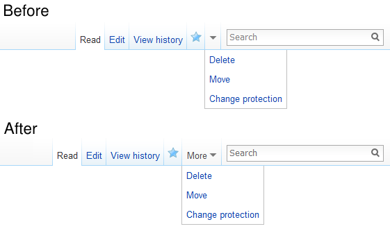
The cactions dropdown in the vector skin currently is only represented by the little arrow dropdown icon. While this means it doesn't indicate what is in this dropdown, more importantly it means it is also very easy for it to go unnoticed due to its visual similarity to the surrounding elements, thus often preventing new users from realising what tools they have at their disposal.

Adding a label saying what it is or even just a little gear or menu icon would make it stand out more, which should in turn help to alleviate the issue some.


Version: 1.21.x
Severity: enhancement

Details

Reference
bz44591

Event Timeline

bzimport raised the priority of this task from to Medium.Nov 22 2014, 1:29 AM
bzimport set Reference to bz44591.

cc @TrevorParscal who was part of the team that designed the toolbar.

Trevor's Apex skin has "Actions" next to the dropdown, we could try doing the same in Vector.

Change 112236 had a related patch set uploaded by Bartosz Dziewoński:
Show a label next to Vector's dropdown actions menu

https://gerrit.wikimedia.org/r/112236

Change 112236 merged by jenkins-bot:
Vector: Show a label next to the actions dropdown menu

https://gerrit.wikimedia.org/r/112236

Created attachment 15540
Screenshot showing the change in the interface (before-after)

attachment before-after.png ignored as obsolete

Created attachment 15541
screenshot

There's a problem with the text being partially hidden, if the feature is triggered due to window-width. (See screenshot). Reproduced in firefox, opera, and chrome, whilst logged in and out.
(I'm not sure if this bug should be re-opened, or a new one started. I'll leave that to better minds.)

attachment Screenshot from 2014-05-31 13:24:08.png ignored as obsolete

This only happens if the "Actions" dropdown disappears completely (it has no items inside), and then something gets moved inside it causing it to reappear.

Under the default (and WMF) configuration this only affects anonymous and
non-autoconfirmed users, which is probably why I failed to notice this in my tests :( I'll submit a followup shortly.

Change 136601 had a related patch set uploaded by Bartosz Dziewoński:
Vector: Fix conflicts of "Actions" dropdown with collapsibleTabs

https://gerrit.wikimedia.org/r/136601

This should do it. Sorry.

Another thing I noticed is that the width of the "Actions" dropdown is barely smaller than the width of the "View history" tab, which is the last one to collapse (and could conceivably be larger in other languages). The dropdown itself should probably "fold" to just the down-arrow (hiding the text) if it can't fit on the line. But that's something for another bug and another patch. :)

Ick. Labelling the menu "actions" makes it sound like the rest of the tabs aren't actions… maybe "more actions" (or just "more") or similar would make sense?

I'm not attached to it, I felt it was good enough, but do submit improvements :)
There were some comments about the wording on the changeset too, but no one proposed a solution to make it better.

I didn't come up with the text – that label was there before, it was just hidden visually and I unhid it.

On an unrelated note, if anyone feels personally offended by this change,
here's the CSS to revert it:

#p-cactions-label { width: 24px; }
#p-cactions-label span { display: none; }

Change 136610 had a related patch set uploaded by Jforrester:
Vector: Label the more actions menu "More", not "Actions".

https://gerrit.wikimedia.org/r/136610

Change 136601 merged by jenkins-bot:
Vector: Fix conflicts of "Actions" dropdown with collapsibleTabs

https://gerrit.wikimedia.org/r/136601

Just read this in tech news and I'm afraid to say that this was a bad decision, sorry.

First of all as James Forester claims in comment 12 all of the buttons (especially the uncollapsed ones) are "actions". Therefore the label is even more misleading than no label at all and and therefore adds unnecessary noise to the UI.

Even if we chose a more appropriate label (e.g. the suggested "more" it's kinda redundant: People are used to the feature that tools which do not fit into the toolbar are hidden behind a small icon at the end of the toolbar. Almost every software does this! Therefore for the majority of people the triangle is crystal clear!

Finally if you want to argue that there are still some people who do not find those additional actions "hidden" behind an arrow: Remember that those actions in the drop-down are *advanced* features. Most users never need them! And even then, do we really want users to use those advanced tools, if they are not even able to *find* them to start with?

All in all regarding the "monstrous" size that our toolbar already has I'd rather leave the label out as it always was. I assume that as soon as Winter is coming all those shiny labels will be obsolete anyway...

(In reply to Eduard Braun from comment #17)

Even if we chose a more appropriate label (e.g. the suggested "more" it's
kinda redundant: People are used to the feature that tools which do not fit
into the toolbar are hidden behind a small icon at the end of the toolbar.
Almost every software does this! Therefore for the majority of people the
triangle is crystal clear!

You have a point here, but the toolbar and the icon usually look completely different, and I think that toolbars not fitting on the screen happen very rarely in desktop programs (I can't remember the last time I saw this myself). While a majority of users might understand this easily, it seems that there is still a sizable minority that doesn't (judging by the number of people who do copy-paste moves, and judging by how many times I've had to explain myself where the option is hidden).

Finally if you want to argue that there are still some people who do not
find those additional actions "hidden" behind an arrow: Remember that those
actions in the drop-down are *advanced* features. Most users never need
them! And even then, do we really want users to use those advanced tools, if
they are not even able to *find* them to start with?

Moving pages is not a very advanced feature. And yes, we definitely want users to use it instead of copy-pasting page contents (even if they completely botch the page move, it's easier to fix than a copy-paste move).

If the text bothers you, I provided a CSS snippet to hide it in comment 14.

Change 136610 merged by jenkins-bot:
Vector: Label the more actions menu "More", not "Actions"

https://gerrit.wikimedia.org/r/136610

Created attachment 15566
Screenshot showing the change in the interface (before-after)

Updated screenshot for new tab text ("More" instead of "Actions").

Attached:

before-after.png (333×561 px, 17 KB)

Deeming this now fixed. Thanks all!

This has broken every gadget and user script (including Twinkle!) that depend on the Vector tabs HTML structure. This should have been done without changing the structure. Suggest revert.

(In reply to Erwin Dokter from comment #22)

This has broken every gadget and user script (including Twinkle!) that
depend on the Vector tabs HTML structure. This should have been done without
changing the structure. Suggest revert.

It's not always possible to change the appearance of the page without noticeably changing the structure. Thus, I don't know if it's possible to make things much easier on userscript writers while still accomplishing this particular UI change. I'll leave it to the people who worked on the bug to say.

The original issue has been fixed, so re-marking as such. If a clear enhancement in this regard (reducing HTML structure change in a particular way/ways) is identified, a separate bug can be opened.

(In reply to Erwin Dokter from comment #22)

This has broken every gadget and user script (including Twinkle!) that
depend on the Vector tabs HTML structure. This should have been done without
changing the structure. Suggest revert.

This *was* done without changing the structure. Can you explain the issue better?

I figured it out myself and submitted a patch for Twinkle: https://github.com/azatoth/twinkle/pull/225. It involves removing three separate weird workarounds that now break stuff.

(In reply to Bartosz Dziewoński from comment #24)

This *was* done without changing the structure. Can you explain the issue
better?

The CSS had a MAJOR restructure; I can't even fix my gadget because I always end up with a double- or NO border. This was the unnecessary part I was referring to.

Oh, the CSS, yes.

Sorry about that, I found it impossible to extend the old one in a way that would keep working with IE 6 and RTL languages, so I was forced to rewrite it a bit.

The trick used to ensure the dropdown is at least as wide as the tab itself https://gerrit.wikimedia.org/r/#/c/112236/13..14/skins/vector/components/tabs.less,cm is also a bit ugly, but I found no better way to do this.

If you had possibly shared with us which gadget are you unable to fix, someone might be able to help. I've drained out my omniscience powers for the week fixing the Twinkle bug.