Page MenuHomePhabricator

A way to hide the sidebar providing a "fullscreen" view
Closed, ResolvedPublic

Description

On small displays such as the very popular Eee PC there are quite a few Wikipedia articles that don't quite fit the width of the screen even with the browser in fullscreen mode.

Other sites such as Google Reader allow the user to fold or collapse the sidebar so as to provide maximum width for formatting the important content.

This ought to be easy via Javascript manipulating the CSS widths of the column-one and column-content for instance on the Monobook skin.

Support without Javascript would be possible but at the PHP level and might me too much trouble to bother implementing.


Version: unspecified
Severity: enhancement
See Also:
Details

Reference
bz14501

Related Objects

StatusSubtypeAssignedTask
ResolvedJdlrobson
Resolvedovasileva
DeclinedNone
Invalid alexhollender_WMF
Resolvedovasileva
Resolvedovasileva
Resolved alexhollender_WMF
OpenJScherer-WMF
ResolvedEdtadros
Duplicateovasileva
Duplicate Demian
Duplicate Demian
ResolvedSpikeovasileva
ResolvedEdtadros
DeclinedNone
ResolvedPeter.ovchyn
Resolved alexhollender_WMF
Resolvedovasileva
ResolvedMayakp.wiki
InvalidMayakp.wiki
ResolvedEdtadros
ResolvedJdlrobson
Resolvedovasileva
ResolvedEdtadros
ResolvedJdlrobson
Resolved Demian
ResolvedJdlrobson
ResolvedBUG REPORT Demian
ResolvedJdlrobson
OpenSpikeNone
Resolved alexhollender_WMF
OpenNone
ResolvedSpikeovasileva
ResolvedEdtadros
Resolvedjwang
Resolved ppelberg
Resolvedovasileva
ResolvedJdrewniak
ResolvedMNeisler
ResolvedMayakp.wiki
ResolvedNone
Resolvedovasileva
Resolvedovasileva

Event Timeline

bzimport raised the priority of this task from to Low.Nov 21 2014, 10:14 PM
bzimport set Reference to bz14501.
bzimport added a subscriber: Unknown Object (MLST).

You can select an alternate skin in your preferences, though this isn't necessarily ideal.

alexsm333 wrote:

I think this should be a userscript/gadget, like [[User:js/bottomSidebar]] (mine) or [[User talk:Gerbrant/hidePane.js]]

ayg wrote:

Turning off CSS will do this. Also see bug 7020, which is related. Maybe we should use media queries!

Jhs has created a JavaScript Gadget that will move the sidebar to the top of the page with drop down menus. He will probably be able to elaborate/refer. Adding Jhs to cc list.

This probably doesn't need to be in the core, a job for the gadgets. Reopen if you disagree.

ayg wrote:

I do disagree, which is why I didn't WONTFIX this bug when I commented before, and presumably neither Brion or Siebrand particularly agreed either, by the same logic. This is not a job for JS, it's a job for CSS, and if possible it should be automatically supported in the core software (using, e.g., media queries). Subnotebooks look to be becoming more popular, and it would be nice if we could support their lower resolutions cleanly and without extra configuration.

A gadget exists on Commons:

http://commons.wikimedia.org/?withJS=MediaWiki:IPadSidbarSlider.js

Orignally written to be automatically loaded for all users that match the iPad user agent. but can be used as a normal gadget as well.

Created attachment 9694
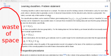
Waste of space

Currently if a reader starts to read a long article, he will soon get to the point where there is nothing in the sidebar (because the useful links are in the beggining of the page, and there is no other languages to show), so for the remaining 80% (or more) of the page, there will be a lot of wasted space on the left. It could be useful to provide by default some way to get the full width of the screen used for displaying the article content, or alternativelly, to bring the sidebar links down while scrolling the page.

See screenshot and some random long page from
http://en.wikipedia.org/wiki/Special:LongPages

Attached:

screenshot.png (819×1 px, 158 KB)

(In reply to comment #8)

Waste of space

Not at all. The wider the lines the more difficult is to read them. This is a basic usability principle. Just check any decent website with long pages out there.

(In reply to comment #10)

(In reply to comment #8)

Waste of space

Not at all. The wider the lines the more difficult is to read them. This is a
basic usability principle. Just check any decent website with long pages out
there.

I disagree with your assessment Quim, I have three screens on my desktop and one of them is portrait oriented in order to read long pages. I also have friends that complain about the sidebar when reading wikipedia on their tablet or cell phone.

I have other thoughts about the sidebar as well. Not only should the user be able to position it at any of the four poles or hide it all together. It should be offered to have it set to an absolute position so that scrolling the page up and down doesn't make it scroll off the page. Just my thoughts.

Quim Gil's comment is in fact correct. Very wide paragraphs of text are in fact hard to read. The reader is forced to move their head more and it becomes difficult to find the start of the next line. Likewise when a paragraph of text is too narrow the reader is forced to break to the next line too often breaking the flow of their reading. There is an optimum range for the width of a paragraph of text.

And white space is not a waste. White space between things de-clutters pages giving things room to breathe and separating unrelated stuff.

The white area below the sidebar is not the problem. The problem is that these small and portrait screens don't have the space to fit both the optimal paragraph width and the width of a sidebar.

At the same time our current navigation isn't very well suited to alternate forms of display.

https://gerrit.wikimedia.org/r/52781 (Gerrit Change Ie5dbcdc6efe15ea9ad6708c98ac5979deb7e29c5) | change ABANDONED [by Rjain]

(In reply to comment #13)

Quim Gil's comment is in fact correct. Very wide paragraphs of text are in
fact hard to read. The reader is forced to move their head more and it becomes
difficult to find the start of the next line. Likewise when a paragraph of
text is too narrow the reader is forced to break to the next line too often
breaking the flow of their reading. There is an optimum range for the width of a
paragraph of text.

That wasn't being debated (at least not by me).

And white space is not a waste. White space between things de-clutters pages
giving things room to breathe and separating unrelated stuff.

That is true, yet again only on wide-screens.

The white area below the sidebar is not the problem. The problem is that
these small and portrait screens don't have the space to fit both the optimal
paragraph width and the width of a sidebar.

Not sure what your point is with the first sentence of this comment. My comment regarding fixing the sidebar location (I incorrectly used the word absolute) was so that when you are at the bottom of a very long page, you still have easy access to all of the links that it offers without having to scroll ALL the way back to the top (and no, keyboard shortcuts don't exist on my mobile phone). For that matter, perhaps the top section shouldn't scroll either to have easy access to the edit link or other links, although...

At the same time our current navigation isn't very well suited to alternate
forms of display.

Would it be possible to add media selectors to the CSS or some kind of HxW (probably JavaScript) detection to the pages that can detect the orientation and size of the window pages are being displayed in and format them appropriately?

(In reply to comment #15)

My comment regarding fixing the sidebar location was so that when you are
at the bottom of a very long page, you still have easy access
to all of the links that it offers without having to scroll
ALL the way back to the top (and no, keyboard shortcuts don't exist on my
mobile phone). For that matter, perhaps the top section shouldn't scroll
either to have easy access to the edit link or other links

You might find this interesting to try: http://meta.wikimedia.org/wiki/User:Waldir/vector.css/fixednav.css

(In reply to comment #16)

You might find this interesting to try:
http://meta.wikimedia.org/wiki/User:Waldir/vector.css/fixednav.css

To give it a try, place this in your vector.css:

/* Fixed navigation (keep top tabs and sidebar always in place, only scroll the content */
@import url("https://meta.wikimedia.org/w/index.php?title=User:Waldir/vector.css/fixednav.css&action=raw&ctype=text/css");

In case you've not clicked the link above: this was done in Translate (for Special:Translate only), bug 45836. You can see it on [[m:Special:Translate]].

Fwiw... there's a gadget on Wikisource that converts the sidebar to an h-list like row of menu's across the top

https://en.wikisource.org/?withJS=MediaWiki:Gadget-FlatSidebar.js&withCSS=MediaWiki:Gadget-FlatSidebar.css

TheDJ set Security to None.

for collapsible side bar can't we use pure js and css ??

I would suggest we make a new button embedded at top of the sidebar and use a global script to toggle the sidebar to provide full screen mode.

I would suggest we make a new button embedded at top of the sidebar and use a global script to toggle the sidebar to provide full screen mode.

This can be moderately easily done with the current skin, see:
http://demian-demo.epizy.com/wiki/?uselimitedwidth=0
Sidebar hiding button is in the top left corner.

However, what will be available on wikipedia in a few months to one year will look like this:
https://en.wikipedia.beta.wmflabs.org/wiki/

Which won't necessarily meet all the requirements in the task description, most notably on small displays and mobiles (with technical term: it's not responsive). There is a solution for that, but it's not accepted by the developer team:
http://demian-demo.epizy.com/wiki/?uselimitedwidth=1

Compare these at a window width below 950 pixels: which one are you looking for?

I would suggest we make a new button embedded at top of the sidebar and use a global script to toggle the sidebar to provide full screen mode.

This can be moderately easily done with the current skin, see:
http://demian-demo.epizy.com/wiki/?uselimitedwidth=0
Sidebar hiding button is in the top left corner.

The second demo looks much better though

However, what will be available on wikipedia in a few months to one year will look like this:
https://en.wikipedia.beta.wmflabs.org/wiki/

Looks fine to me

Which won't necessarily meet all the requirements in the task description, most notably on small displays and mobiles (with technical term: it's not responsive). There is a solution for that, but it's not accepted by the developer team:
http://demian-demo.epizy.com/wiki/?uselimitedwidth=1

Can you please elaborate what are the requirements of the developers??

Compare these at a window width below 950 pixels: which one are you looking for?

I tested the links on my mobile and didn't find any issue in either of them. Then why is
this issue still open any idea??

Jdlrobson claimed this task.
Jdlrobson subscribed.

While this original task was written for Monobook, given the new Vector skin provides a collapsible sidebar, I will call this resolved. https://en.wikipedia.org/wiki/Main_Page?useskinversion=2