Page MenuHomePhabricator

Accept and reject buttons are too similar
Closed, ResolvedPublicFeature

Assigned To
Authored By
Tgr
Dec 5 2010, 10:24 PM
Referenced Files
F10626697: image.png
Nov 5 2017, 3:09 PM
F10626755: image.png
Nov 5 2017, 3:09 PM
F10626757: image.png
Nov 5 2017, 3:09 PM
F10626753: image.png
Nov 5 2017, 3:09 PM
F7944544: image.png
May 5 2017, 5:45 PM
F7944432: image.png
May 5 2017, 5:39 PM
F7944439: image.png
May 5 2017, 5:39 PM
F7944434: image.png
May 5 2017, 5:39 PM

Description

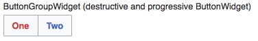
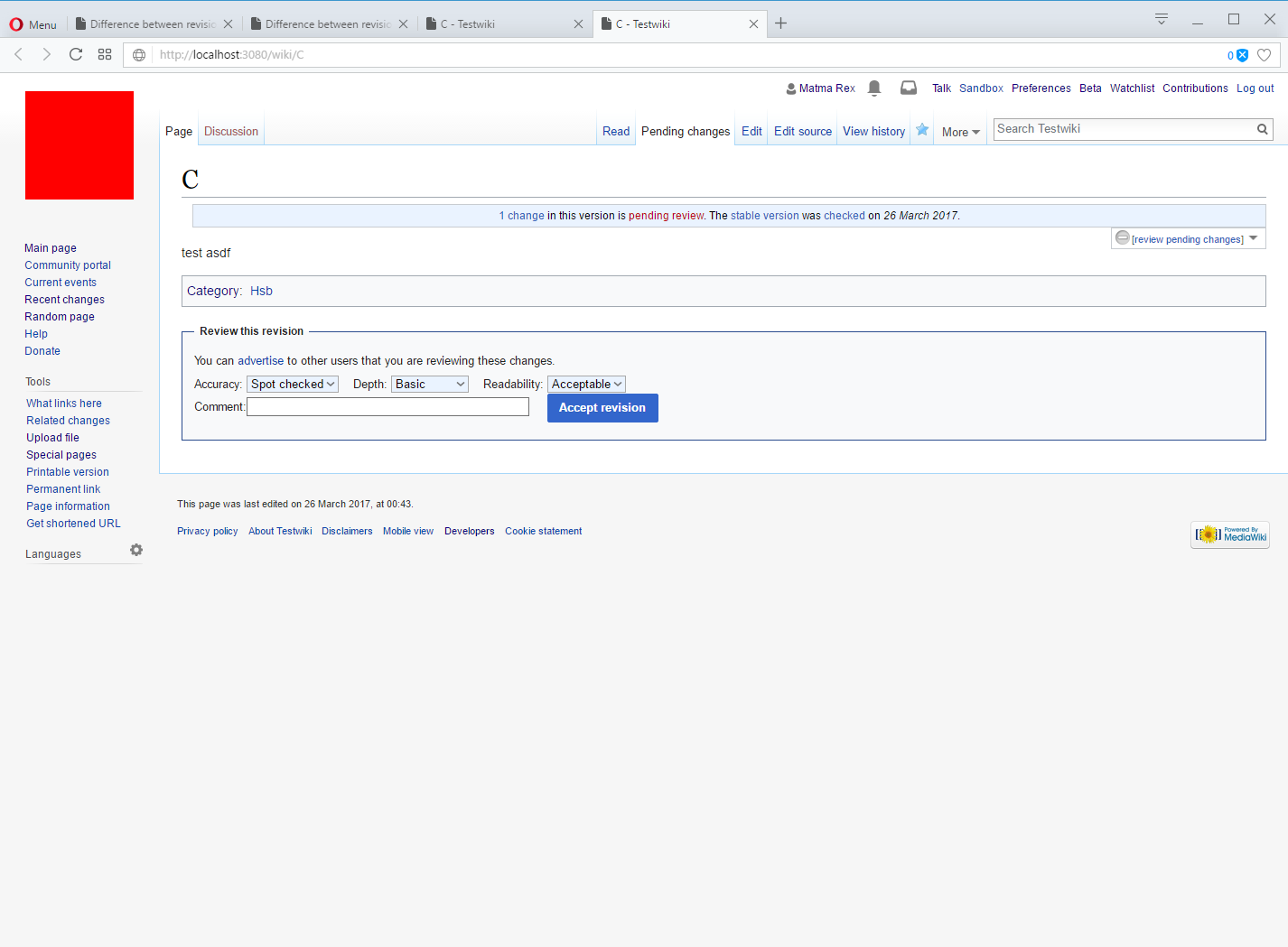
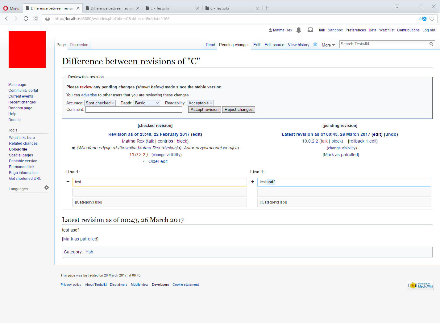
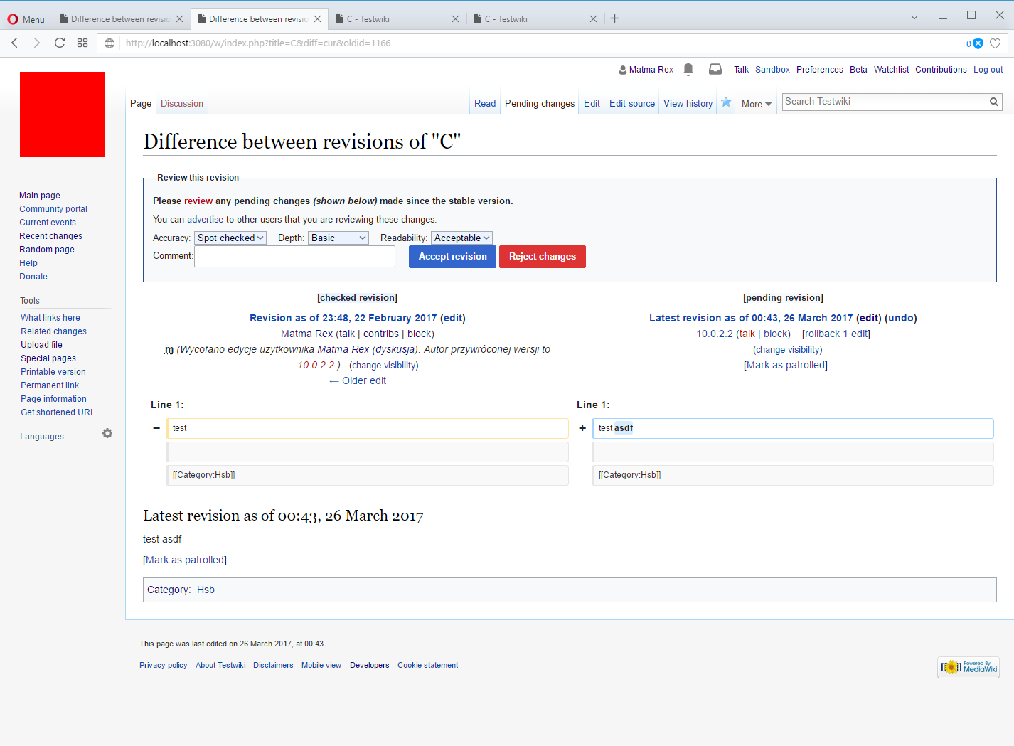
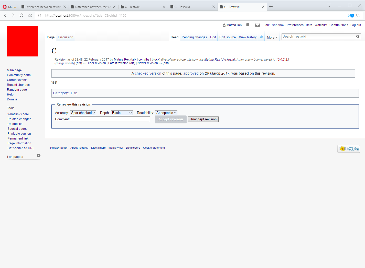
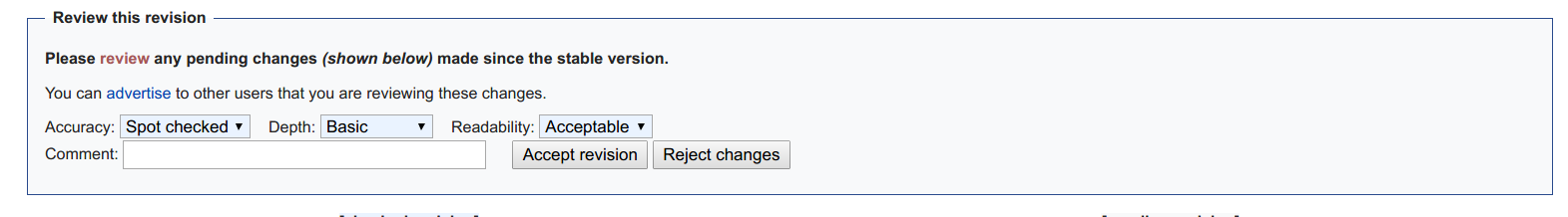
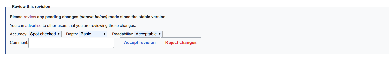
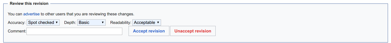
The new reject button that shows up for reviewers is too easy to confuse with the accept button (especially when one is patrolling a lot of revisions in a short time). There should be an obvious visual clue to tell them apart, like green/red color.


Version: unspecified
Severity: enhancement

Event Timeline

bzimport raised the priority of this task from to Medium.Nov 21 2014, 11:17 PM
bzimport set Reference to bz26256.
bzimport added a subscriber: Unknown Object (MLST).

I had a coloring scheme, but it was removed (but not replaced with anything).

We did intend to replace it with something (e.g. icons on the buttons), but didn't have time for the proper solution. I felt pretty strongly that the current all-black, all-the-time button text was better than the button scheme, which I think Brandon concurred with me on (though I'm not positive I checked wiht him). Anyway, it's good we have an issue logged to make sure we do this right. Assigning to Brandon for a quick mockup when he gets the chance.

The reject button shouldn't be a button if we can avoid it. It should just be a text link.

(In reply to comment #3)

The reject button shouldn't be a button if we can avoid it. It should just be
a text link.

Then accept shouldn't be a button too for consistency.

Not necessarily.

To be honest, the entire accept/reject/unaccept interface should have a totally different UI. But the resources to make it so aren't there right now (and won't be committed unless we have further sign off).

I suppose the question really is this: "is it possible to undo a 'reject'" and if the answer is no or 'yes but very difficult or tedious' then we should downplay reject. We know we can always revert an accept.

(In reply to comment #5)

I suppose the question really is this: "is it possible to undo a 'reject'" and
if the answer is no or 'yes but very difficult or tedious' then we should
downplay reject. We know we can always revert an accept.

It is difficult (and pollutes page history), but as long as you need two clicks for the reject, that isn't much of a problem. Mistaking the options (or even just having to think about which one to choose) wastes patrollers' time, though.

@Ladsgroup Maybe something you would want to look into…

FWIW this is the current interface:

flagrev-buttons.png (58×648 px, 10 KB)

I should probably just switch it to WikimediaUI. I don't think it existed when I filed this bug.

Although it's a form on top of a diff page, so people will be sensitive about form height,

I think we can simply change it to OOUI which automatically handles this task as well. I looked at the codebase and it doesn't look hard. I will get to this in the weekend.

Made https://gerrit.wikimedia.org/r/344820 (gerrit-bot doesn't add comment when I make a patch)

Before:

pasted_file (185×1 px, 35 KB)

After:
pasted_file (207×1 px, 37 KB)

The highet is not that different.

The buttons probably don't need to be primary?

Hmm, I'm not sure. It looks like primary to me because it does a major job (accepting or rejecting a set of revisions). But it's not definitely my call. @Volker_E, thoughts?

Making both of them quiet would defeat the purpose of this bug. Making accept normal and reject quiet would be an option, but IMO the primary makes sense - when you are a reviewer and looking at an unreviewed diff, you are expected to do something about it.

Would a primary accept and a quiet reject work?

The reject button is as the important as the accept button, even more.

@Ladsgroup If there's not one clearly indicated primary(!) action, but two, equally important, OOjs UI developers invented the concept of the quiet progressive and destructive buttons side-by-side.
The strict rule around the primary button is that it should be applied on only one button per view.
At https://en.wikipedia.org/w/index.php?title=Special:UserLogin we've specifically styled mediawiki.UI to allow for a non-primary, progressive button. I'd suggest going that way here as well.

Side-note, in your latest screenshot, the label for the textbox seems to have lost the margin in-between.

This is how it looks like after adding quiet flags:

pasted_file (225×1 px, 55 KB)

I don't like it.

https://en.wikipedia.org/w/index.php?title=Special:UserLogin we've specifically styled mediawiki.UI to allow for a non-primary, progressive button. I'd suggest going that way here as well.

mw-ui-primary doesn't seem to do anything. The login page has a non-primary non-progressive (but also not quiet) button for the signup link.

My comment was obviously misleading, we styled the signup button there, not mediawiki.UI in general. I'm thinking of something like

image.png (61×376 px, 9 KB)

Well, that doesn't exist in mediawiki.ui (as you mentioned) and I don't think we can migrate the review form to OOUI without refactoring half of the extension. I don't have any better option now.

@Ladsgroup Why not specifically style those buttons accordingly in extension's CSS?

Some screenshots of the current version of the patch. (These are with the default configuration, things look different on each of our production wikis.)

BeforeAfter
Page view
image.png (1×1 px, 112 KB)
image.png (1×1 px, 113 KB)
Diff view
image.png (1×1 px, 160 KB)
image.png (1×1 px, 161 KB)

Issues:

  • The space between the comment field and its label disappeared.
  • On page view, the comment field is not styled.

Also, the "Unaccept revision" button (shown when viewing an accepted revision) is inconsistent now:

image.png (1×1 px, 122 KB)

In order to provide users a better experience, resulting in higher acceptance in that change it would need some extra per-extension CSS:

  • don't provide two primary action buttons, rather a solution as proposed in T28256#3234020
  • adding margin-bottom: .5em` to .mw-fr-ratingselects || .fr-ratingoptions
  • vertical align the “Comment:” label

This is after manual CSS injection:

BeforeAfter
image.png (218×1 px, 48 KB)
image.png (233×1 px, 47 KB)
image.png (168×1 px, 32 KB)
image.png (171×1 px, 35 KB)

Now I added a little bit of margin-top so It doesn't stick to upper elements.

I couldn't get to do anything about this one. Hopefully I will tackle it in Wikimania hackathon.

Aklapper changed the subtype of this task from "Task" to "Feature Request".Feb 4 2022, 12:24 PM

Change 930927 had a related patch set uploaded (by Ladsgroup; author: Amir Sarabadani):

[mediawiki/extensions/FlaggedRevs@master] Replace review CSS with Codex components

https://gerrit.wikimedia.org/r/930927

Change 344820 abandoned by Ladsgroup:

[mediawiki/extensions/FlaggedRevs@master] Use mediawiki.ui for comment and OOUI styles for buttons of review form

Reason:

Superseded by I2eec7f3c03204

https://gerrit.wikimedia.org/r/344820

Change 930927 merged by jenkins-bot:

[mediawiki/extensions/FlaggedRevs@master] Replace review CSS with Codex components

https://gerrit.wikimedia.org/r/930927

See T191156#8945100.
I put user-notice on the other ticket.