Page MenuHomePhabricator

UI issues at 'Create account' page
Closed, ResolvedPublic

Description

Author: nadeejw

Description:
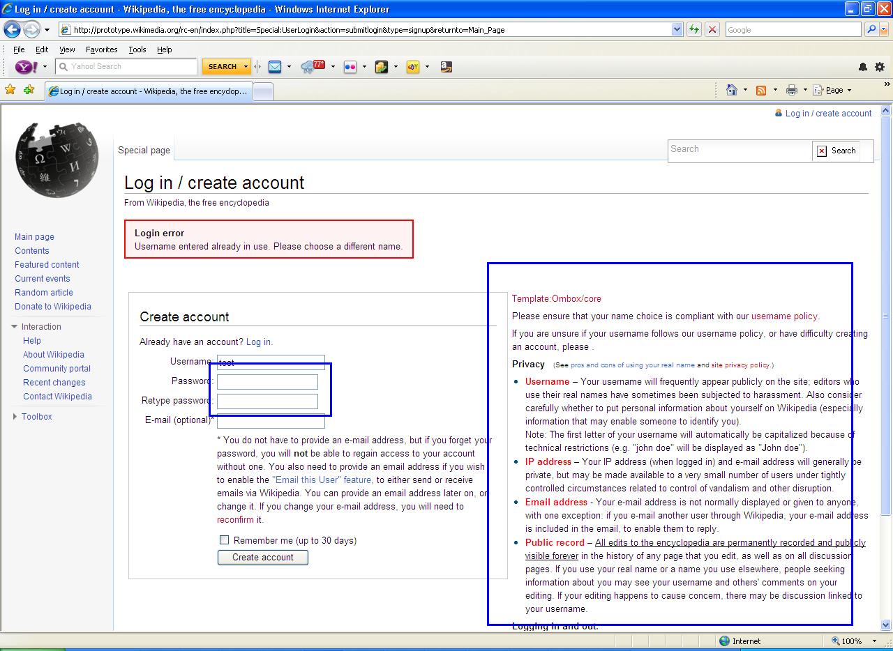
Screen shot - Create account UI - IE7

Steps to reproduce:

  1. Navigate to Wikimedia main page using IE7.
  2. Click on the 'Log in / create account' link.
  3. Click on the 'Create one' link.
  4. Observe the 'Password' and 'Retype password'fields and the text area.

Actual results:

  1. 'Password' and 'Retype password'fields are in different sizes.
  2. 'Create account' frame and the text area are in the same level.

(only in IE7)

Expected results:

  1. All four fields should be in same size.
  2. Text area should be below thwe 'Create account' frame.

URL : http://prototype.wikimedia.org/rc-en/index.php/Main_Page
Version : 1.17alpha (r80667)


Version: 1.17.x
Severity: minor
OS: Windows XP
Platform: PC

Attached:

UI_Create_account_IE7.JPG (934×1 px, 211 KB)

Details

Reference
bz26952

Event Timeline

bzimport raised the priority of this task from to Lowest.Nov 21 2014, 11:12 PM
bzimport set Reference to bz26952.
bzimport added a subscriber: Unknown Object (MLST).

The password fields being different sizes is a longstanding IE-specific problem, where it has different mappings of the 'size' attribute (max count in characters) to the default width of the actual input box for regular text inputs and password inputs.

This is likely due to either forcing a font, or differences in how it calculates the width based on average character sizes. (Since every "character" shown in the password box is a little dot thingy, they're all the same size, which is much narrower than many regular letters.)

Apparently this can be worked around by specifying explicit widths in the stylesheets.

(This is a totally trivial problem in that it has no actual negative effects, it's just a little annoying looking.)

The side-by-side issue is likely related to longstanding issues with the MediaWiki login/create account box itself *being floated*, which is confusing and weird, and it's not always obvious how to make sure the text either does, or doesn't float.

Not super high priority, but also not a new issue. The float on that should probably be removed all around for good measure, but may need minor fixups in various skins.

Going ahead and duping this to bug 18262 which covers the password field issue.

  • This bug has been marked as a duplicate of bug 18262 ***