Page MenuHomePhabricator

Vector dialog styling causes problems with links
Closed, ResolvedPublic

Description

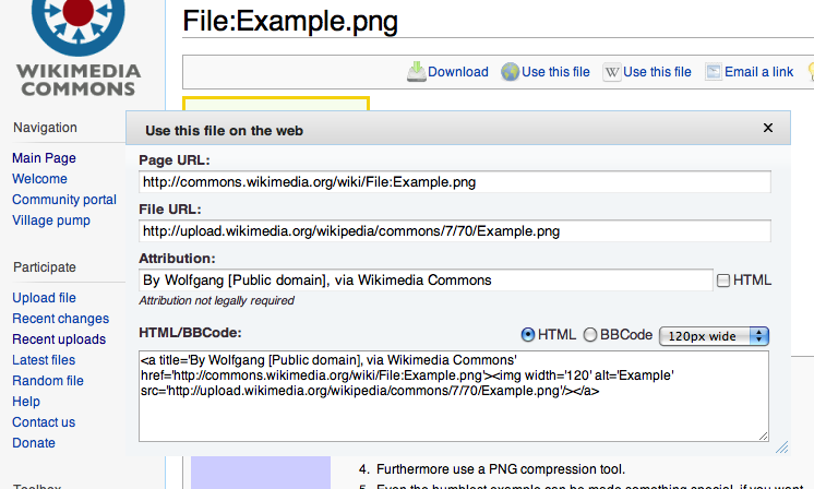
I have to issues here, see the image.

  • Dialog borders blend into the background color and makes it difficult to see where the dialog ends
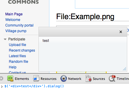
  • Link color is forced to color that is indistinguishable from black. This prevents users from discovering links in my dialog. For some reason my more specific rule does not override it: http://laxstrom.name/wtf-css.png Does it have to do with loading order?

Version: 1.18.x
Severity: normal
URL: http://laxstrom.name/vector-dialog.png

Details

Reference
bz28690

Event Timeline

bzimport raised the priority of this task from to Medium.Nov 21 2014, 11:25 PM
bzimport set Reference to bz28690.

Just need to tweak the CSS in:
resources/jquery.ui/themes/vector/jquery.ui.dialog.css

I noticed the link color got changed from blue to black recently. We should probably change that back.

It looks like the border issue might be a bit deeper than I thought. We're actually removing the border around all jQuery UI elements, not just dialogs. This seems to be an actual design choice (rather than an oversight), but probably needs to be rethought. Simply adding the border back isn't good since we're also removing the padding, so this could cause stacked borders. A temporary workaround you could use would be to set the dialog to be modal.

Bumping this up to highest so I remember to ping Krinkle on this bug this week.

Created attachment 8487
Reproduced the bug: Non-modal dialog. Bug: No border, no visisble edge, bad accessibility/usability/

Reproduced the bug: Non-modal dialog. Bug: No border, no visisble edge, bad accessibility/usability/

Attached:

nonmodal_bug.png (448×746 px, 83 KB)

Created attachment 8488
Proposed fix: Adding back the 0.2em padding and the border for dialog

attachment fix.png ignored as obsolete

Created attachment 8489
Example of what a modal dialog looks like in this context (proposed work-around)

Example of what a modal dialog looks like in this context (proposed work-around)

attachment modal.png ignored as obsolete

Meh. Doesn't look as clean, in my opinion. What if we added the outside border (without padding) and changed the title border to be border-bottom only?

Are you planning on adding the styling to ui-widget or ui-dialog? We need the same fix for datepicker, so might make sense to apply to ui-widget. I haven't investigated this thoroughly, however.

Link color fixed in r87345. No idea what the original motivation behind this was.

Created attachment 8490
new suggestion for dialog styling

Just added a new attachment based on my ideas above. What do you guys think of this implementation?

attachment dialogscreenshot.png ignored as obsolete

Created attachment 8491
Patch for above implementation

Here's the patch for the implementation above, if that seems good.

attachment fix-dialog-borders.diff ignored as obsolete

(In reply to comment #9)

Link color fixed in r87345. No idea what the original motivation behind this
was.

I now do ;) Links are used many places (menus) where they shouldn't look like links. Reverted

What do the regular jQuery UI skins do for link coloring? Maybe we should just match one of them (I think our skin is very loosely based on the Cupertino skin, BTW).

(In reply to comment #12)

I now do ;) Links are used many places (menus) where they shouldn't look like
links. Reverted

Can the menus be fixed then instead of breaking everything else?

I don't think regular jQuery skins do anything to link colours, as it should be.

(In reply to comment #14)

I don't think regular jQuery skins do anything to link colours, as it should
be.

They do. But obviously only for links inside jui stuff

Link color issue remains (sorry for having to issues in the same bug). Dialog border problem is fixed.

I would suggest that we do whatever the jQuery UI skins do regarding link styling. Unfortunately, I'm full time on fundraising now, so I don't have any time to work on this.

  • Bug 29615 has been marked as a duplicate of this bug. ***

Reminder for after this bug is fixed:

(Citing bug 29615 comment #4)

We overrode the black to blue in the WikiLove CSS. I'm going to go ahead and
mark this as a duplicate, but we need to remember to remove the override after
28690 is fixed.

(Citing to bug 29615 comment #5)

Yes, I added a CSS line to at least make links blue, otherwise things looked
really weird. But that's a crappy fix, obviously, the real solution is to fix
bug 28690 by removing the link colour inside dialogs, and then fix stuff that
gets broken by that. After that the CSS line making stuff blue can be removed
from WikiLove.

sumanah wrote:

I'm aesthetically impaired so I can't make the judgment of whether this problem is still reproducible. :-) Is it?

According to the screenshots posted by krinkle, this dialog now looks like attachment 8489 in comment 7 -- so, fixed? Kind of looks like wikilove is fixed, too, but I'm not sure.

Created attachment 10995
It now has a proper border.

Fixed indeed.

Attached:

Screen_Shot_-_jQUIDialog_Vector_fixed.png (302×439 px, 35 KB)