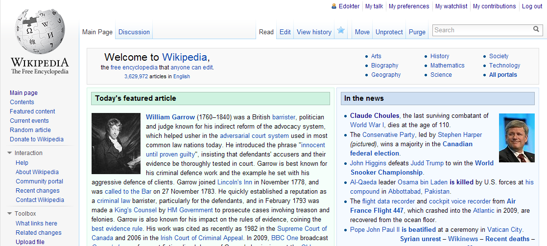
I like Vector, but the personal links look too much like the old Monobook links (no seperator whatsoever) and there is no styling to speak of that really integrates them into the Vector skin, as is the case in other skins.
So I tried 'vectorizing' them. First I tried up-side-down tabs, but that required rewriting the HTML. As the best solution is ususally the simplest, I came up with simple CSS that inserts a thin fading line between the links ([[File:Portal-break-v-vector.png]], inspired by Portal-break.png used in the left sidebar).
This really makes the links part of the skin, without becoming obtrusive in any way.
Changes required in skins-1.17/vector/main-ltr.css:
BEGIN PATCH
/* Personal */
#p-personal {
CHANGE:
right: 0.75em;
TO:
right: 0.25em;
}
/* This one flips! */
#p-personal li {
REMOVE:
margin-left: 0.75em;
margin-top: 0.5em;
ADD:
margin: 0;
padding: 0.5em;
}
/* Icon for Usernames */
#pt-userpage,
#pt-anonuserpage,
#pt-login {
CHANGE:
background: url(images/user-icon.png?1) left top no-repeat;
TO:
background: url(images/user-icon.png?1) no-repeat left;
ADD:
#pt-mytalk,
#pt-preferences,
#pt-watchlist,
#pt-mycontris,
#pt-logout {
background: url("http://upload.wikimedia.org/wikipedia/commons/8/8a/Portal-break-v-vector.png") no-repeat left; /* Upload to bits.wikimedia.org! */
}
END PATCH
To preview this styling, put the following in your personal vector.css:
/* Personal menu styling preview */
#p-personal {
right: 0.25em;
}
#p-personal li {
margin: 0; padding: 0.5em;
}
#pt-login,
#pt-userpage,
#pt-anonuserpage {
background-position: left;
}
#pt-mytalk,
#pt-preferences,
#pt-watchlist,
#pt-mycontris,
#pt-logout {
background: url("http://upload.wikimedia.org/wikipedia/commons/8/8a/Portal-break-v-vector.png") no-repeat left;}
Version: unspecified
Severity: enhancement