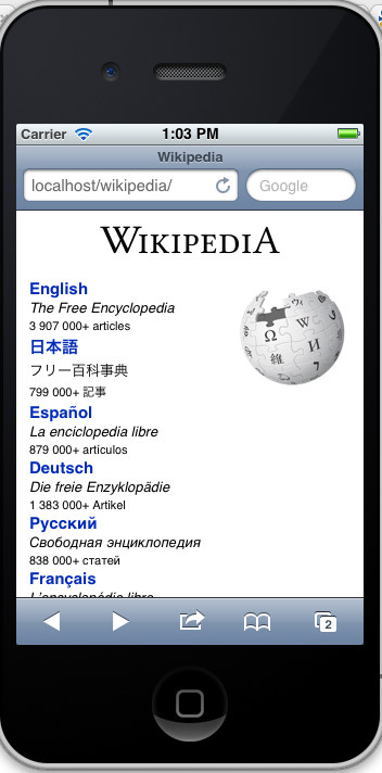
Currently our portal site at http://www.wikipedia.org/ does not detect a mobile device. This forces a large screen layout which may not be appropriate.
Version: unspecified
Severity: normal
| • Tfinc | |
| Aug 16 2011, 3:42 AM |
| F8166: Screen_shot_2012-05-29_at_20.09.49.png | |
| Nov 21 2014, 11:53 PM |
| F8165: Screen_shot_2012-05-21_at_14.33.41.png | |
| Nov 21 2014, 11:53 PM |
| F8164: Screen_shot_2012-05-21_at_10.16.51.png | |
| Nov 21 2014, 11:53 PM |
| F8163: Screen_shot_2012-05-19_at_18.10.23.png | |
| Nov 21 2014, 11:53 PM |
| F8162: Screen_shot_2012-05-18_at_13.03.32.png | |
| Nov 21 2014, 11:53 PM |
Currently our portal site at http://www.wikipedia.org/ does not detect a mobile device. This forces a large screen layout which may not be appropriate.
Version: unspecified
Severity: normal
| Title | Reference | Author | Source Branch | Dest Branch | |
|---|---|---|---|---|---|
| Add text under the logo in the footer | sebastian-berlin-wmse/wikipedia-homepage!10 | sebastian-berlin-wmse | footer-logo | main |
| Status | Subtype | Assigned | Task | ||
|---|---|---|---|---|---|
| Resolved | None | T36000 [DO NOT USE] Wikipedia Zero (tracking) [superseded by #Zero] | |||
| Declined | None | T30815 wikipedia.org should detect mobile browsers and local language, and forward to xx.m.wp | |||
| Resolved | None | T32389 making http://www.wikipedia.org/ mobile friendly |
(In reply to comment #1)
Would we need a mobile-friendly version of that entry page?
Yes.
Yup, I've had numerous reports about non google search results users being frustrated at the large screen layout of that page.
philinje wrote:
Making 28815 dependent on this, because detecting a mobile browser is the first step toward country-specific landing pages.
Why don't we just apply a responsive design to the homepage that way there is no need for redirects...
If someone was kind enough to replace inline styles from the homepage with classes and rules in a stylesheet I would happily create a mobile specific stylesheet using media queries that we could put at the bottom of the new stylesheet.
Who should I talk to about this?
(In reply to comment #6)
Why don't we just apply a responsive design to the homepage that way there is
no need for redirects...If someone was kind enough to replace inline styles from the homepage with
classes and rules in a stylesheet I would happily create a mobile specific
stylesheet using media queries that we could put at the bottom of the new
stylesheet.Who should I talk to about this?
It's all set from here http://meta.wikimedia.org/wiki/Www.wikipedia.org_template
And the gory explanation of it is here http://meta.wikimedia.org/wiki/Talk:Www.wikipedia.org_template
(In reply to comment #6)
Why don't we just apply a responsive design to the homepage that way there is
no need for redirects...
I don't think the people accessing Wikipedia from WebTV really want or need the additional CSS or JavaScript.
Or put more politely, responsive Web design comes with costs and I'm not sure they outweigh the benefits.
If someone was kind enough to replace inline styles from the homepage with
classes and rules in a stylesheet I would happily create a mobile specific
stylesheet using media queries that we could put at the bottom of the new
stylesheet.
As Tomasz already said, you're free to edit https://meta.wikimedia.org/wiki/Www.wikipedia.org_template/temp.
There's quite a bit of ancient magic layered in www.wikipedia.org and people are fairly protective of its look and behavior, though. Fair warning.
So I've done this on the temp template and would appreciate some review.
First I rewrote the inline styles as css rules in a style tag in the head of the document
(https://meta.wikimedia.org/w/index.php?title=Www.wikipedia.org_template%2Ftemp&diff=3764806&oldid=3754632)
Then I added a viewport meta tag as well as a media query
https://meta.wikimedia.org/w/index.php?title=Www.wikipedia.org_template%2Ftemp&diff=3764927&oldid=3764806
The style rules do not touch any device which doesn't support media queries and doesn't support
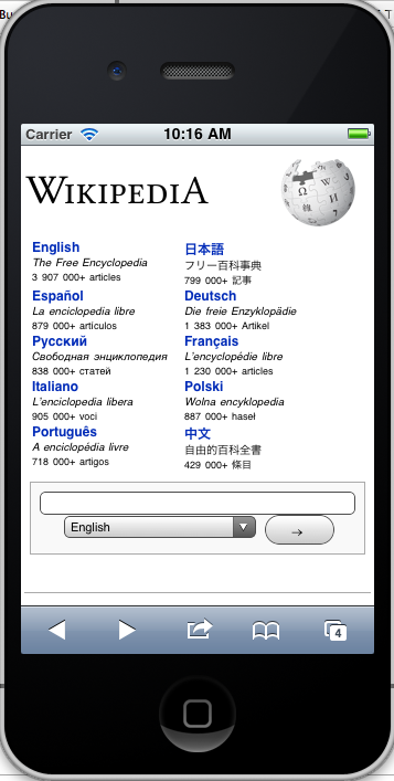
The result is much more mobile friendly (imo) - attachment to follow
Thoughts?
(In reply to comment #10)
The result is much more mobile friendly (imo) - attachment to follow
Thoughts?
Neat!
On a narrow screen, I think it probably makes sense to consider why users are visiting wikipedia.org. With the new responsive layout, the first one or two screens become the list of big Wikipedias with the logo on the right. If most users are (presumably) visiting wikipedia.org to look something up, I'd be inclined to kill all of big project links (or at least move them down) and put the search input at the top. And put the logo on the same line as the "Wikipedia" text to save space (and avoid weird overlap between the logo and the list of big projects).
Removing the "patch-need-review" keyword as there isn't any patch to speak of. Any Meta-Wiki administrator can sync the /temp page to the live page when it's ready.
You make a great point MZMcBridge that w should think more about the users goals.
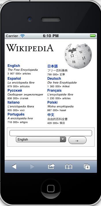
I think one of those goals might be to select a language but agree another likely purpose is to do search.. so that does need moving up. As suggested i"ve moved the logo up to the same line as the Wikipedia text to save space. (see https://meta.wikimedia.org/w/index.php?title=Www.wikipedia.org_template%2Ftemp&diff=3768908&oldid=3764927)
I've tried to minimise the space for language links - now there are 2 per line. I've also reduced the font-size so that the search appears without scrolling.
I've left the project links and various language links at the bottom (although have reduced their font-sizes) as it would be wasteful to hide them in the page in a responsive layout considering the html for them in a responsive layout will be served regardless (and thus contribute to page weight).
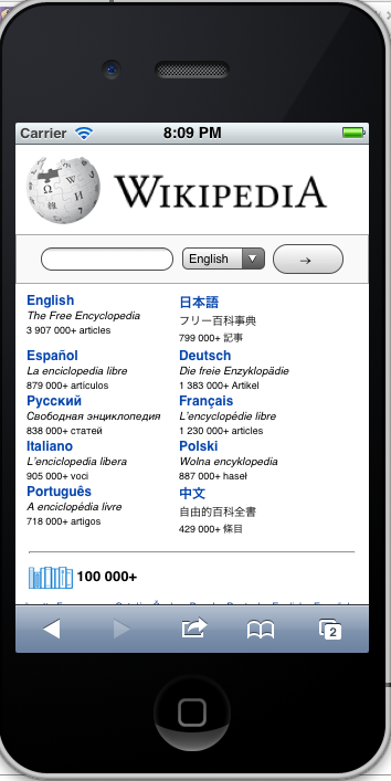
Adding new attachment to show new layout on an iphone...
(In reply to comment #14)
Created attachment 10625 [details]
Responsive Homepage on the iphone v2
Better. :-)
The globe icon still seems large to me. I think it'd ideally always be the height of the "Wikipedia" text.
There are some other (minor) tweaks I'd like to see:
Some of these are separate bugs. Some of these I can just do at some point by editing the HTML.
I think this can be synced pretty soon. wikimedia-l should also get a note about it, in case issues crop up. Do old browsers simply ignore the @media code?
Attached:
Globe icon is even smaller now. Let me know what you think.
Although not obvious the entire text (English and article count for example) are all clickable. However only the heading is styled like a link.
Agreed the go button should be styled more like a search icon (but this is also a problem on desktop site in my opinion).
I'm not sure about making the globe do something but again if it was to do something it should also do so on the global site.
Most mainstream browsers (IE6 included) should be fine with these media queries simply not recognising and thus ignoring them. Certain minority older browsers with broken parsers might apply the rules regardless - but in this situation content *should* still be readable only the user would get a 'mobile view' (
http://dev.opera.com/articles/view/safe-media-queries/ has lots of useful information on this topic).
As said though any mobile browsers that do not support media queries in future should be served the same styles without the media query wrapper to ensure they also get a good experience.
philinje wrote:
This is a big improvement for a long-standing problem. Nice work!
I also think search can be above the project languages.
This page is a fairly popular destination in countries like India and Brazil. How could we make this work on feature phones? I am guessing that would require mobile detection because media queries are not an option.
We do have country-specific landing pages working in Zero (based on IP address and a specific landing page used by mobile operators. That is probably a better solution in any part of the world that is not covered by the main project languages.
Anyway, let's polish the design a bit and see if we can make this fly.
Do you have any stats on the number of mobile browsers that support media queries?
The problem with putting search above the languages it that in the html (and the desktop site) it appears below the languages. To achieve this goal is likely to result in some messy css (absolute positioning and use of fixed heights) which I'm keen to avoid. I'd also worry that this would be an inconsistent experience for users that use both the mobile and desktop version as we'd be changing the order round. I think this requires a bit more thought.
As said previously feature phones that don't support media queries will just get the desktop site.
A better more long term approach would be to make the design mobile first (e.g. apply media queries for the desktop site rather than for the mobile site). There are tricks for IE 8< using conditional if statements for serving the desktop site to those users.
I agree the search bar should be above the language list. We can then include the complete language list (instead of just the first few) just like on the desktop.
The desktop site can then indeed use absolute positioning to get it where it needs it (or already does, actually)
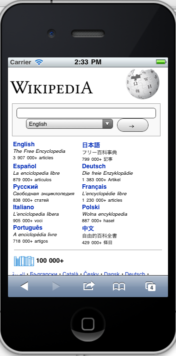
Created attachment 10632
Design revision 4
This change moves search to top. Thoughts?
Attached:
Showing the full search language list by default is a poor experience and we shouldn't do it. Through usability tests & user feedback of both the mobile and desktop site we've seen that the more language options you give ... the worse it gets. Our users are consistently confused by the desktop portal page and if we mimic that behavior then we'll just be extending the same confusing experience to mobile.
Instead we should base the language options on our Squid country breakdown report so that we serve relevant languages with an option to add additional languages per detected country.
This way we serve whats relevant to mobile users.
bugs wrote:
(In reply to comment #22)
Showing the full search language list by default is a poor experience and we
shouldn't do it. Through usability tests & user feedback of both the mobile and
desktop site we've seen that the more language options you give ... the worse
it gets. Our users are consistently confused by the desktop portal page and if
we mimic that behavior then we'll just be extending the same confusing
experience to mobile.
Is it as much of a problem if it's below the fold?
If it is, we might want to make that a separate bug. There's already been a lot of improvement of the portal page and it'd be better to get those changes synced first and *then* consider changing the content of the page as well.
Potentially but I'd have to see a mockup of what your thinking before I could answer that.
(In reply to comment #24)
Potentially but I'd have to see a mockup of what your thinking before I could
answer that.
What? You've lost me (and everyone else, I think).
Timeline:
What are you talking about? A mockup of what?
Anyway, back to this bug, I'm in agreement with Casey. I think Jon's code is enough of an improvement for now that it can be synced in short order.
philinje wrote:
If the search field is above the main projects, the list of languages would be above the fold.
We do have country-specific landing pages working in Zero. This does not require device detection but it does require identification of country by IP address, which, again, is already working.
However, this media query approach is still an improvement over what happens currently on the portal page.
It could be worth trying. The only question is if the users affected would be confused if we switched to the country-specific approach later.
bugs wrote:
(In reply to comment #24)
Potentially but I'd have to see a mockup of what your thinking before I could
answer that.
See Jon's design revision 4 at attachment 10632. The list of languages begins just above the fold. All of the other things that people care about ("Wikipedia", logo, search, top 10) are located completely above the fold. They can scroll down if they want the rest of the languages.
Discussion here seems to have stalled somewhat. I have been a bit busy with other things so apologies for my absence.
I believe the problem of a large list of language is one that also effects the desktop site and shouldn't prevent us from making small steps of progress which I have the (possibly biased) belief that this design provides. We should be striving to make progress quickly rather than boil the ocean by covering every aspect of the homepage at once. No one can argue that the current page is pretty unusable in its current state (one must zoom and scroll to get to any language)
Considering that this problem already exists on the current version of this page which is not mobile optimised at all I believe this responsive design is a huge improvement as it projects popular languages to the top of the page making it easier for users of these encyclopedias to access their version.
There is only one real blocker in my opinion:
It has come to my attention that there are brand guidelines we must follow with respect to the logo :
https://wikimediafoundation.org/w/index.php?title=File:VIG-v3_SHIP_23pp_25oct11_150.pdf&page=6
As a result a few tweaks would need to be made and verified as being acceptable before syncing this. If we can get agreement to do this sync I'll make those tweaks and we can then move on to thinking about providing a better language experience (I'd assume this would be via a javascript widget that can be used across mediawiki)
Created attachment 10667
Design revision 5
Improve to match brand guidelines
Attached:
Recently I've been working on updating all the www portals to match the latest from each other (they all looked similar at some point in time, but over time stuff broke and diverged quite a bit.
Among other things I created a ResourceLoader module for the www portals on Meta to keep the common styles and scripts central while also making the pages lighter (by separating the css/style in a separate request, and by having that request be minified/combined with ResourceLoader from bits.wikimedia.org).
During that I also went through the queue of staged changes on all the /temp pages of the portals and either backed them out or tested it and included it in the sync.
For Wikipedia I ended up keeping it (I did wonder why there was no note of it on the talk page[1]) and, after testing it, synced it.
I left the mobile <style> as is (not in the ResourceLoader module yet still raw on the template [2]).
It ahm.. yes, so. This is live now :)
[1] https://meta.wikimedia.org/wiki/Talk:Www.wikipedia.org_template
[2] https://meta.wikimedia.org/wiki/Www.wikipedia.org_template
Krinkle.. you may want to resync as the page should actually show the wikipedia logo on the left. I uploaded some changes earlier today [1] that you may have missed.
Jon
(In reply to comment #32)
Krinkle.. you may want to resync as the page should actually show the wikipedia
logo on the left. I uploaded some changes earlier today [1] that you may have
missed.
Done.
A recent addition to the homepage has added a language search. This makes the homepage appear broken (apparently there is an rt ticket 2012071410001848 about this) . I've applied a patch to hide this for the time being I just need someone to sync (or revert it back to how it was before).
(In reply to comment #34)
A recent addition to the homepage has added a language search. This makes the
homepage appear broken (apparently there is an rt ticket 2012071410001848 about
this) . I've applied a patch to hide this for the time being I just need
someone to sync (or revert it back to how it was before).
Thanks for the fix, it was synced yesterday. I'll try to make it work for the mobile version later on.