Page MenuHomePhabricator

ipad apps - mobile article doesn't fit if webview width < 768
Closed, ResolvedPublic

Description

Author: blanc.greg

Description:
no problem a few weeks ago

The problem occures on iPad when

The article doesn't fit within the width of the webview : the user has to scroll to see the "right" part of the article. It seems the min width of the webPage is set to 768px. This was not the case a few weeks ago.
(The problem doesn't occure on iPhone although its width is 320 px)

This makes the article a little painfull to read because the user has to scroll to read the end of each line.
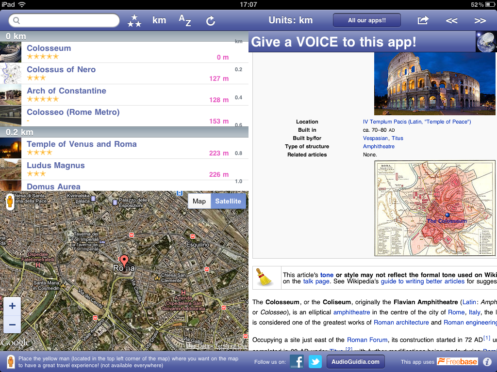
This happens on iPad for example with this free app (but not on iPhone)
http://itunes.apple.com/fr/app/world-explorer/id381581095?mt=8

Please find attached 2 screenshots showing the behaviour a few weeks ago and now.

Thanks for your help !

regards

Greg


Version: unspecified
Severity: major
OS: other
Platform: Other

Attached:

colosseum_08_2011.jpg (360×480 px, 36 KB)

Details

Reference
bz31214

Event Timeline

bzimport raised the priority of this task from to Medium.Nov 21 2014, 11:56 PM
bzimport set Reference to bz31214.
bzimport added a subscriber: Unknown Object (MLST).

blanc.greg wrote:

the text of the article is hidden on the right of the webview.

the user has to scroll to read the content

Attached:

photo_(30).PNG (768×1 px, 886 KB)

The HTML template contains a <meta> viewport specifying width=device-width, forcing initial scaling to 1.0, and disabling user rescaling. On iPad device-width would report 768px, which sounds like what you're seeing.

It looks like this last changed in r89940 in June, switching from semicolons to commas for the separation of the bits in there. If the old Ruby code was using the semicolons, maybe it wasn't kicking in quite the same before the switchover to the new code?

I'm not sure what's a feasible workaround for this; uncertain whether just dropping the 'width' would do the right thing or if that'll default back to 1000px or something. (Basically we want the viewport size to match the webview's native size -- which may not actually be the width of the entire device if we're being embedded.)

blanc.greg wrote:

Brion,

thanks again for your quick investigation!

I'm not sure if this will help, but I can ensure this problem is quite new and didn't happen in June, July or August (I took many screenshots the 24th august for a few apps so I'm quite sure)

Besides it seems to me that the mobile wikipedia looks very well on my computer screen (whatever the size of my firefox window until < 300px) so as a user I think would be happy with exactly the same page on my ipad... There should be a reason for this <meta> viewport I'm missing?

thanks a lot for your help!

regards

preilly wrote:

I think for now just reverting to way the Ruby gateway had that viewport line is going to be the easiest potential fix. The change should go out next Tuesday.

— Patrick

preilly wrote:

This fix is in r98566.

Greg's indicated there are still problems (possibly a regression?). Reopening, need to double-check status.

blanc.greg wrote:

Yes I confirm the problem came back a few weeks ago (around oct 27).
It seems the viewport meta tag was added back.

If there's anything we can do to help we'd be happy to work on that issue.
By the way I was wondering if this viewport is really useful on tablets (=quite large screens) and if there's a way to put the viewport only on phones (=with smaller screens)

thanks for your help!

  • Greg

I think what we theoretically want is a viewport that defines a 1.0 zoom ratio and just sticks with that; otherwise I'd expect it to default to the 980px or so virtual viewport width, which won't look good if your browser is actually half the width of an iPad screen or something.

richard1 wrote:

I'd also like to ad my vote to this issue. I also see the problem and that it used to work.

Is there any way to or have a change made to specify the content width along the lines of http://en.m.wikipedia.org/w/index.php?title=Jupiter&device-width=320.0?

Ideally I'd like to see things work the way they used to.

blanc.greg wrote:

Hello!
Brion suggested a few months ago that it could be worth trying to delete the "width=device-width" and just let "initial-scale=1.0"

did someone had the time to check this?

richard1 wrote:

Yes removing "width=device-width" works.

This has been fixed in r113463. It was fixed by switching the meta tag from
<meta name="viewport" content="width=device-width, initial-scale=1.0">
to
<meta name="viewport" content="max-width=device-width, initial-scale=1.0">

We don't want to remove the tag fully or to remove the width value as
pages will not be optimised for reading on iphones, androids etc...
more information here [1]

With help from Greg (thanks Greg!) this has been tested and works nicely so closing!

Reopening this issue. Unfortunately r113463 causes the following error in Chrome: "Viewport argument key "max-width" not recognized and ignored."

This is still actually fixed. See r113693