Author: bhartshorne
Description:
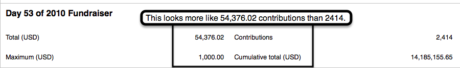
screenshot of the detail text
The layout for the text showing the detailed statistics for a specific day in the fundraiser needs some spacing improvements. I've attached a screenshot showing that the adjacency of numbers to the text of the next column over is sufficient to make it unclear what number goes with what label. Additionally, even on a large monitor, the length of the graph pushes the detailed description off the right side of the screen since the width of the detail table is the same as the width of the graph.
I would suggest listing all the stats one per line instead of splitting them into three columns.
Environment: firefox 8.0 running on mac osx lion.
Version: unspecified
Severity: normal
Attached: