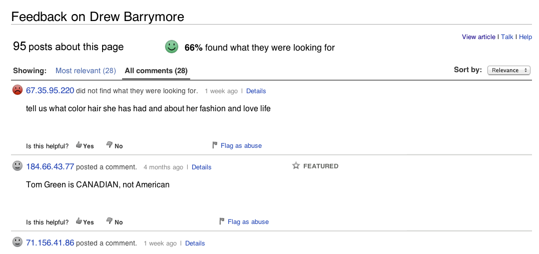
Streamlined reader view of the feedback page
Here are a number of formatting tweaks we propose to streamline the feedback page design, make it look simpler, fit better on small screens and avoid overlap between UI elements.
See preliminary mockups attached below (new prototype and CSS code to be provided shortly by Pau Giner).
- Overall
- Add 'on' in the page title: 'Feedback on Drew Barrymore' (instead of 'Feedback: Drew Barrymore').
- Keep new warning messages implemented separately by Matthias (which removed the red 'Beta' label for now)
- Say '<x> posts about this page' below the title (instead of '96 feedback posts on this article'--we cannot use the 'article' word, because of internationalization policies)
- Slide 'Showing' to left-align it with above text
- Use these font styles and colors for indicating selected filters:
- selected filter should be black and bold, same font style as 'Showing' (e.g.: 'All comments' in mockup)
- the other filter link should be blue, for consistency with other links (e.g.: 'Most relevant' in mockup)
- When selecting a filter, show the yellow 'Loading' label above the toolbar, to the right of the filter selection menu (instead of below the toolbar).
- Change toolbar and tab color to match upcoming prototype from Pau Giner (hold off on that item until then)
- Simplify 'Sort by' options as follows:
- Relevant [most relevant posts shown first]
- Newest [most recent posts shown first]
- Oldest [earliest posts shown first]
- If recommended by Pau Giner, switch the 'Sort by' selector to be a drop-down menu (hold off on that item until we get Pau's updated prototype).
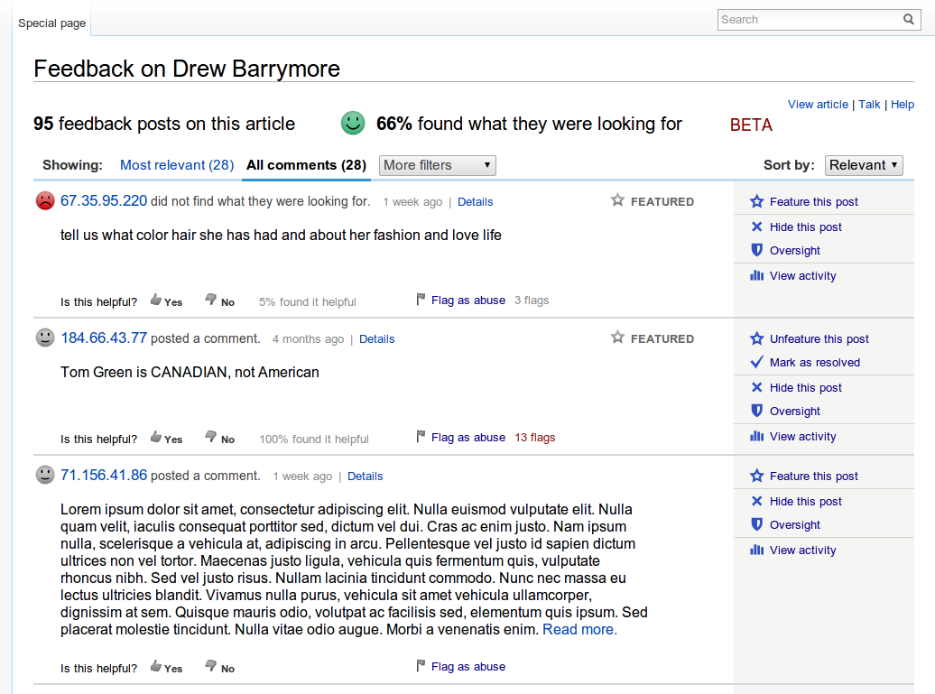
- Don't show '0% helpful' next to any helpful labels - only show this label if more than one person marked it as helpful (this also excludes showing '100% helpful' if only one person marked it as such).
- Don't show '(0)' next to any flag labels - only show the number if it's higher than zero.
- Show '(x)' counter next to flag labels in same light gray font style and size as for 'y% helpful' and don't include a link under that counter (continue to include a link behind 'Flag as abuse' and 'Flagged for abuse', though).
- Remove the red color under 'Flag this post' when a post has been flagged 3 times (it seems more confusing than helpful, based on what Chris reported last week).
- Only show 'Featured' or 'Resolved', whichever was selected last (don't show both one on top of another, to save space).
- Implement the CSS code recommended by Pau Giner to make the UI more compact and prevent objects from overlapping each other (hold off on that item until we get Pau's updated prototype).
- Reader View Only
- Don't show readers any other filter options besides 'Most relevant' and 'All comments' (simply remove the 'More filters' menu for readers, but not for editors)
- Don't show readers any '(66% helpful)' numbers next to helpful labels (only show them to editors)
- Don't show readers any '(x)' numbers next to flag labels (only show them to editors - I think we're doing this already, just putting this here for confirmation)
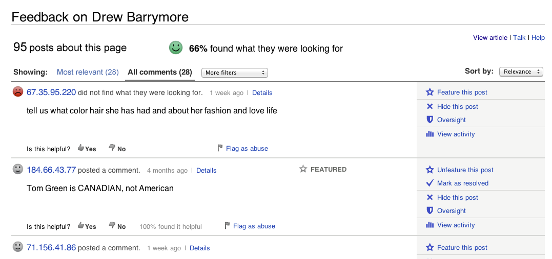
- Editor View Only
- Show editors the tools available for their user rights (with a greater height for each post for oversighters than for editors, based on the number of tools available to them).
- Show editors any '(66% helpful)' numbers next to helpful labels (except 0%)
- Show editors any '(x)' numbers next to flag labels (except 0)
- Show gray labels for 'Hidden' and 'Oversighted' (just like 'Featured' or 'Resolved' labels, for editors only)
- Show link called 'See Central Feedback Page >' at the bottom of this *article* feedback page (below the 'See More Posts' bar, same font size and style as 'See feedback page' on the permalink page).
To see a *preliminary* version of Pau Giner's prototype, download this Zip file: http://dl.dropbox.com/u/30377416/prototypes/feedback-tool/article-feedback/tabbed/article-feedback-changes.zip (but please hold off until Pau's next prototype to implement the changes indicated above as dependent on that new prototype).
Version: unspecified
Severity: major
Attached: