Page MenuHomePhabricator

Special:ArticleFeedbackv5 layout
Closed, DeclinedPublic

Description

Hi,

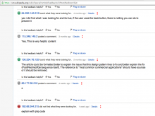
Just randomly passing through and noted something that maybe could be improved. There are likely plans for this already, since it is marked as a prototype, but just a few notes:

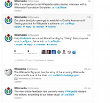
I noticed that everything is left-align and stacking from there - causing the right edge to be shifting from entry to entry. Makes it look a bit messy.

Perhaps the fixed width items (not in pixels fixed, but within a page view e.g. the word "Details" can be longer or shorter in different languages but all links for that on the page will have the same width) could be put on their own line. Or perhaps group them and align in the top right or bottom left corner of each section. That would make room for the "time ago" (which is variable in length) in the opposite corner maybe (a bit like a tweet)


Version: unspecified
Severity: minor
Details

Reference
bz38018

Event Timeline

bzimport raised the priority of this task from to Lowest.Nov 22 2014, 12:45 AM
bzimport set Reference to bz38018.
bzimport added a subscriber: Unknown Object (MLST).

Created attachment 10798
Screenshot of Special:ArticleFeedbackv5 on en.wikipedia.org - right edge highlighted in red

Attached:

Screen_Shot_2012-06-28_at_6.51.25_AM.png (760×1 px, 112 KB)

Created attachment 10799
Tweet view

Attached:

Screen_Shot_2012-06-28_at_7.01.28_AM.png (595×630 px, 119 KB)

[Lowering priority to reflect reality, as AFTv5 is not very actively being worked on anymore.]

Jdforrester-WMF subscribed.

All development work on AbuseFilter v.5 (and indeed, previous versions) is halted. The project is archived, so having open tasks is inappropriate. Consequently, I'm closing all tasks.