Page MenuHomePhabricator

PostEdit: Invisible .postedit-container makes 50%-of-width area next to the notification unclickable
Closed, ResolvedPublic

Description

Author: mr.heat

Description:
Please change the CSS as follows:

#postedit-container {

z-index: 1000; /* Remove this and move it down. */

}
.postedit {

z-index: 1000; /* Move it here. */
margin-top: 0; /* Remove this because it does nothing. */
margin-bottom: 18px; /* Is there a reason for this? If not please remove it. */

}

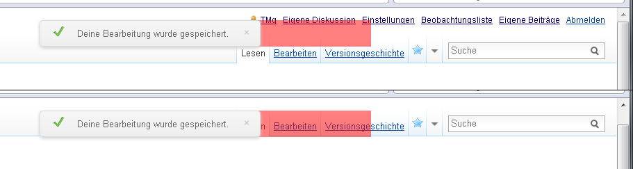
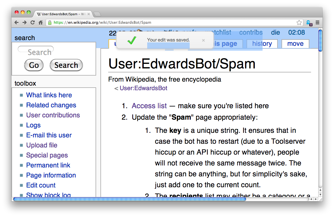
The first element is invisible. The only reason why it is there is to "calculate" the position of the second element. The second element is the popup you see on the screen.

The first element does not need to be at z-index 1000. This blocks links like the "Version history" tab in the vector skin.

The strange margin (I'm not sure why it is there, could be to fix an issue with the box-shadow) makes the invisible pane even bigger.

Description and example (commented out currently):
http://de.wikipedia.org/wiki/Benutzer_Diskussion:Steven_(WMF)


Version: master
Severity: normal

Details

Reference
bz41231

Event Timeline

bzimport raised the priority of this task from to High.Nov 22 2014, 1:03 AM
bzimport set Reference to bz41231.

Munaf, can you please try these changes and confirm that they do not break the layout in IE?

mr.heat wrote:

I'm sorry but in this case I don't care about IE. The wrong z-index is the reason why the UI next to the popup is blocked. This needs to be fixed first. If this change breaks something in IE this must be fixed later.

An other way to fix this issue is to get rid of the #postedit-container and use some CSS as follows. This works in all browsers including IE for sure.

.postedit {

left: 50%;
width: 20em;
margin-left: -10em;

}

swalling wrote:

(In reply to comment #2)

I'm sorry but in this case I don't care about IE. The wrong z-index is the
reason why the UI next to the popup is blocked. This needs to be fixed first.
If this change breaks something in IE this must be fixed later.

We do care about IE. I believe the reason Ori mentioned it is because the z-index is set the way it is to fix the message's appearance in IE, so fiddling with it may introduce brokenness there.

Munaf, if you can tackle this soon that would be great. S/Ori: the duplicate or incorrect appearance of the message is priority over this issue.

massaf wrote:

I'm testing this on IE and it does break the layout. We have to support it, as it is a significant portion of our userbase.

The provided alternate class would indeed work on all browsers, but only on a fixed-width popup (which isn't friendly to other languages, or flexible enough to provide other messages).

The margin-bottom was cruft that we didn't catch in our gerrit review; it can be safely removed.

As for blocking version history, I'm unable to reproduce the issue. I can click on the tab while the PostEdit message is up.

Gerrit change #29526 removes the margin-bottom attribute. Haven't been able to reproduce the other issues either. TMg, what browser, OS and screen resolution are you using?

mr.heat wrote:

Come on, guys. This issue applies to all web browser including IE. Don't tell me you don't know what your own code does. Let me help you:

http://de.wikipedia.org/wiki/Special:PermanentLink/109522498

Removing the margin-bottom helps but does not fix the issue. The popup still blocks mouse events. What is blocked depends on the #anchor. For example when you edit a section the page scrolls down to that section and the popup blocks everything on the right side of the popup.

This is very annoying. It happened to me multiple times today. I tried to click "Version history" or an other link but nothing happened.

Removing the color in my example does not make the container transparent for the mouse. The problem is the bad z-index. It is applied to the wrong container. Simple. If the only solution is to use a fixed width then use a fixed width please.

A bad browser (IE7 and below) is no excuse to block UI elements.

massaf wrote:

I can't reproduce the issue with any browser or screen resolution. In every condition, I can click the tab and mouse events aren't blocked. Would you mind recording a video of you experiencing the error and sharing it with us? It would make this easier to address.

Also, can you provide your use case? Meaning, under what specific scenario did you need to click this mouse target within 2s after completing a page edit?

If this is indeed a usability problem, whatever solution we propose must support variable length messages (meaning variable container sizing) for internationalization, or it's simply not viable. And regardless of any developer's opinion on the quality of IE, millions of people use it to browse Wikipedia and we're not going to be prejudiced against them, full stop.

mr.heat wrote:

Do you see the violet rectangle?

http://de.wikipedia.org/w/?oldid=109522498&uselang=en

Everything behind that rectangle can not be clicked. You can select text behind the rectangle but you can not click links. If you make your browser window small enough the rectangle even makes it impossible to focus the search bar.

There are dozens of use cases depending on what is blocked. It's not only the "View history" link. Depending on the width of the browser window (and depending on the length of the text in the popup) this also applies to the "Read" and "Edit" tabs, to the watchlist star, to the search bar, even to the "My user page", "My talk page" and so on in the line above.

A very common use case is to click "My watchlist" within 2 seconds after completing a page edit.

An other common use case is to click the watchlist star within 2 seconds after completing a page edit (if you missed the checkbox under the textarea).

As said this applies to all browsers. I tested it with Firefox, Opera and IE8 (all Windows 7). I don't think this is an OS issue.

Note: I'm a web developer. I know we need to serve IE users. But it is unacceptable to block UI elements because of a browser with a market share below 5% (according to http://en.wikipedia.org/wiki/Internet_Explorer_7). If there is no other solution the PostEdit extension must be disabled for IE7 and below.

swalling wrote:

(In reply to comment #8)

Do you see the violet rectangle?

I think he means he can't replicate it while actually using the feature.

mr.heat wrote:

If you can reproduce this depends on the scroll position

There is no difference. It's the same CSS. The only difference is the color.

My previous comment was incomplete. It only applies if the whole page was edited. When you edit a section the pages scrolls back down to that section. In this case some "random" links in the page are blocked depending on the scroll target and depending on the length of the site (the target #anchor is not always on top of the screen if the page is not long enough). It's very common to click an other "Edit section" link or simply a link in the text. If that link is next to the popup it is blocked.

See the attached screenshot (not photoshopped, this is created by applying a color to the actual DIV element with Opera Dragonfly). When you edit the whole page you end up with the first example. Only very small parts of the tabs and the lower half of some of the "My" links are blocked. But when you edit a section you may end with the second example. In this case a lot more if not the whole tabs are blocked.

As said I consider it unacceptable to block UI elements, no matter what the reason is.

Attached:

depends-on-the-scroll-position.png (243×911 px, 13 KB)

massaf wrote:

(In reply to comment #8)

Do you see the violet rectangle?

Yes; the problem is it's a static representation of our code and none of us could replicate it in Vector (there is a legitimate vertical spacing issue in Monobook, however). I'm aware that the overlay obstructs the links, but in practice, I couldn't replicate the problem.

There are dozens of use cases depending on what is blocked.

Stating that they are common use cases doesn't mean they're common. The fact that there is only one person bringing this up is likely an indicator of how common it is.

Note: I'm a web developer.

That's pretty clear; you want clean code that covers edge cases, and that's understandable. Practical user needs, however, override code perfection. Unless some indication/data emerges that:

(a) This issue can be replicated by other people and
(b) This is obstructing an actual use case

...then it's not worth anyone's time. We should reopen this if it becomes a problem for others (or even if someone on the development team can actually replicate it), but in the mean time, I don't think it's worth addressing this.

Munaf

PS: Saw your screenshot and the fact that you're using Opera - this helps. Like I said, we'll keep investigating and worry about it if it seems like a common user problem.

mr.heat wrote:

(In reply to comment #11)

the problem is it's a static representation of our code

Why is this a problem? It's the same code. For the two seconds when the popup is on the screen it's exactly the same. If you can reproduce it on the example page you can reproduce it everywhere.

Again: Today this happened to me multiple times. I tried to click one of the links mentioned and nothing happened.

The fact that there is only one person bringing this up is likely
an indicator of how common it is.

Wrong. Look at
http://de.wikipedia.org/wiki/Wikipedia:FZW#Kleine_Neuerung:_Hinweis_.E2.80.9EDeine_Bearbeitung_wurde_gespeichert..E2.80.9C

From a regular users point of view this is a very obscure issue. A mouse click does not work but one or two seconds later it works. I assume this happens to many user. But nobody knows why this happens. Nobody knows where to report this issue. I'm a web developer and I understand the reason is bad CSS. Most people at Wikipedia are not web developers.

you want clean code that covers edge cases

What the ...? Hell, no! It's not an "edge" case if everything is blocked under an invisible rectangle. It's not about "clean" code if a z-index is misused.

This issue can be replicated by other people and

Are you kidding? You said you can replicate it.

This is obstructing an actual use case

Again, are you kidding? It is!

Saw your screenshot and the fact that you're using Opera

I'm going crazy! This is not an Opera issue! It's the same bug in every single web browser because this is how z-index is defined in the CSS specification! Do I need to quote the W3C spec? Do I need to explain how z-index works? You are using it wrong! It is applied to the wrong element! Fix this stupid bug and find an other solution to position the popup in IE7 and below!

The redundant margin is removed in Iaf36c8f97a80abb548784ac80c344c776ead0250.

(In reply to comment #12)

(In reply to comment #11)

the problem is it's a static representation of our code

Why is this a problem? It's the same code. For the two seconds when the popup
is on the screen it's exactly the same. If you can reproduce it on the example
page you can reproduce it everywhere.

Yeah, I'm with you on this one. The response here has been more than a bit "what the fuck is wrong with you?"

I'm able to easily reproduce this issue. The fact that can you make the edit notification re-appear by using the browser's back button (the subject of another bug) actually makes this bug really easy to test.

I'm attaching a screenshot momentarily showing the highlighted area that the current code is blocking. I've not edited this image at all, it's just a screenshot after hitting the back button in my browser and double-clicking the (obscured) history tab, which adds a selection highlight to the area. This is using OS X/Google Chrome version something. I can provide details if you need them, but this isn't really browser-specific, as TMg notes.

Created attachment 11228
Screenshot of PostEdit's edit notification blocking other UI elements on the English Wikipedia presumably due to weird CSS

Attached:

postedit-edit-notiification-enwiki-blocking-tabs-2012-10-23.png (758×1 px, 172 KB)

This is due to the way the notification is centered (by aligning the invisible wrapper in the center and then going -50% to the left to where the notification should be). This can be probably be improved as the margin: 0 auto; rule seems ineffective / redundant.

Rephrased summery to not mention the high z-index, though that does identify the element we're talking about, it isn't relevant to the bug or cause.

(In reply to comment #16)

This is due to the way the notification is centered (by aligning the invisible
wrapper in the center and then going -50% to the left to where the notification
should be). This can be probably be improved as the margin: 0 auto; rule seems
ineffective / redundant.

Rephrased summery to not mention the high z-index, though that does identify
the element we're talking about, it isn't relevant to the bug or cause.

Y'know, in many ways, this bug is seems like a duplicate of bug 41240 ("[Postedit] Popup covers up monobook tabs"). If you just moved the whole fucking notice out of the way of the tabs, it wouldn't matter how wide it is (in theory).

This bug is just extra annoying because you not only get inhibited by the notice itself (albeit for like two seconds), there's also an invisible layer to battle!

mr.heat wrote:

Still blocks random UI elements in Vector and MonoBook

From what I know there was an update recently that fixed a few bugs. But the popup still blocks "random" UI elements. For example I would like to go to my talk page without waiting 2 seconds, please.

The problem is worse in Skins like MonoBook.

Additionally the text is not readable at all in MonoBook but that's an other bug.

Attached:

still-blocking-random-ui-elements.png (226×800 px, 14 KB)

mr.heat wrote:

Here is an other possible solution that uses the same method to center the popup but moves the invisible container out of the screen. This way the bad z-index does not matter. Try it here:

http://de.wikipedia.org/wiki/Special:PermanentLink/109747763

The relevant parts of the code are:

.postedit-container {
position: fixed;
left: 50%;
top: -100%;
height: 100%;
}
.postedit {
position: relative;
left: -50%;
top: 102%;
}

mr.heat wrote:

I wanted to avoid the big container and found a very nice solution (sorry for the rapid posts).

.postedit-container {

position: fixed;
left: 50%;
top: -2%;
height: 2%;

}
.postedit {

position: relative;
left: -50%;
top: 200%;

}

The main difference is the height of the container. Now it's 2% instead of 100%. I tried 1% but it seems there is a rounding error in Opera so I avoid it. 2% is pixel perfect. Try it here: http://de.wikipedia.org/wiki/Special:PermanentLink/109747833

I'm not sure why the container is positioned 2% from the top of the screen. Isn't it better to use a constant position so it looks the same no matter how you scale your browser window? In this case it's possible to set the container height to zero.

.postedit-container {

position: fixed;
left: 50%;
top: 0;
height: 0;

}
.postedit {

position: relative;
left: -50%;
top: 10px;

}

Gerrit change #31733

TMg, sorry for the delay, and thanks for the careful bug-squashing -- your proposed fix works well, and will go out by Thursday night UTC.

mr.heat wrote:

The "10px" was just a quick example. It's no problem to keep it. But after looking at the CSS code of some of the skins I think it is better to use ".6em". See bug 41240 for more details.

massaf wrote:

(In reply to comment #20)

I'm not sure why the container is positioned 2% from the top of the screen.
Isn't it better to use a constant position so it looks the same no matter how
you scale your browser window? In this case it's possible to set the container
height to zero.

This was just mentioned in https://bugzilla.wikimedia.org/show_bug.cgi?id=41404 so I thought it best to respond here.

I tested this out and it works nicely.

The only issue is section edits; absolutely positioning .postedit-container from the top of body positions it at the top of the page, regardless of where the user is being redirected to after making an edit. When positioning with percentages, the popup appears relative to the viewport and not body, and therefore appears for section edits.

mr.heat wrote:

(In reply to comment #23)

The only issue is section edits; absolutely positioning .postedit-container
from the top of body positions it at the top of the page, regardless of where
the user is being redirected to after making an edit. When positioning with
percentages, the popup appears relative to the viewport and not body, and
therefore appears for section edits.

I'm very sorry but again your comment is very confusing. This behavior was the same all the time and does not change in any way with the suggested changes. What you wrote is not true. The container always appears relative to the viewport because it uses "position: fixed;". It does not matter if it uses percent, px or em. The popup is always visible regardless of the scroll position. Are you using an other browser that does not respect the W3C spec? Are you using any extension or script that interferes with the PostEdit code?

Reference: http://www.w3.org/TR/css3-positioning/#fixed-positioning

mr.heat wrote:

This is still an issue in all Wikipedia projects. Would you please, please deliver the fix? The comment about "section edits" above is confusing. What is this supposed to mean? There is no difference between editing a full page and editing a section. The popup is always positioned from the top of the viewport. The CSS does not care about the scroll position.

[This does not classify as something that needs immediate fixing. Resetting.]

I restored Gerrit changed 31733 and verified that it does indeed work correctly; I'm not sure why our tests indicated otherwise. TMg, sorry for maligning a good commit. This is now merged and queued for deployment.