The PE popup covers up some tabs in monobook which is annoying.
Screenshot: http://i.imgur.com/saBT6.png
Version: unspecified
Severity: normal
| Legoktm | |
| Oct 20 2012, 11:45 AM |
| F10042: Modern_German_April_2013.png | |
| Nov 22 2014, 1:04 AM |
| F10041: MonoBook_German_April_2013.png | |
| Nov 22 2014, 1:04 AM |
| F10040: Screen_Shot_2012-10-23_at_10.33.31_AM.png | |
| Nov 22 2014, 1:04 AM |
| F10039: Screen_Shot_2012-10-20_at_8.23.18_AM.PNG | |
| Nov 22 2014, 1:04 AM |
| F10038: Screen_Shot_2012-10-20_at_6.40.11_AM.PNG | |
| Nov 22 2014, 1:04 AM |
| F10036: postedit-notice-enwiki-vector-logged-out-2012-10-20.png | |
| Nov 22 2014, 1:04 AM |
| F10037: postedit-notice-enwiki-monobook-brand-new-account-2012-10-20.png | |
| Nov 22 2014, 1:04 AM |
The PE popup covers up some tabs in monobook which is annoying.
Screenshot: http://i.imgur.com/saBT6.png
Version: unspecified
Severity: normal
| Status | Subtype | Assigned | Task | ||
|---|---|---|---|---|---|
| Resolved | ori | T43512 Increase time on screen from two seconds to three | |||
| Resolved | ori | T43240 Popup covers up monobook tabs | |||
| Resolved | None | T43404 PostEdit: Text unreadable in the Monobook skin |
Generally, please upload screenshots to Bugzilla as attachments. Bugs are forever; imgur is probably not.
It looks like you've got quite a few extra tabs there. The general overlap issue is relevant, though.
What do you propose as a solution here? Adding space for the notification? Moving it elsewhere? I mean, it's probably going to obstruct something no matter where it is unless you add space for it, right? The question becomes how to make it as least painful as possible.
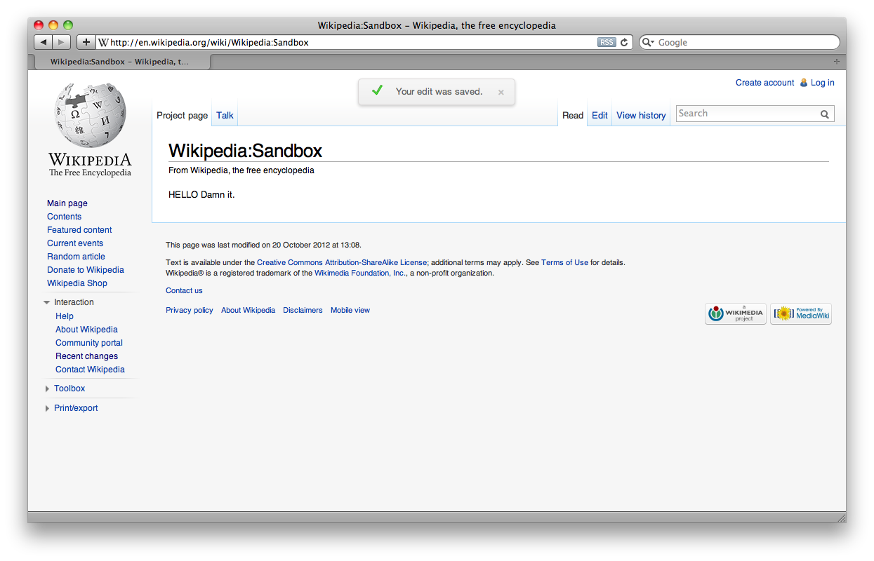
Created attachment 11210
Screenshot of PostEdit's saved edit notification on the English Wikipedia using the Vector skin while logged out
Attached:
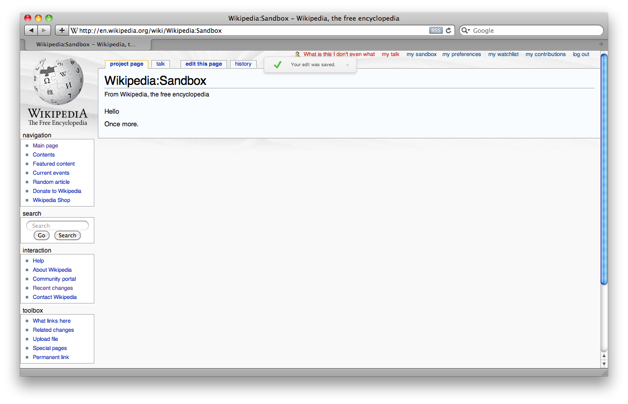
Created attachment 11212
Screenshot of PostEdit's saved edit notification on the English Wikipedia using the Monobook skin with a brand new account
Attached:
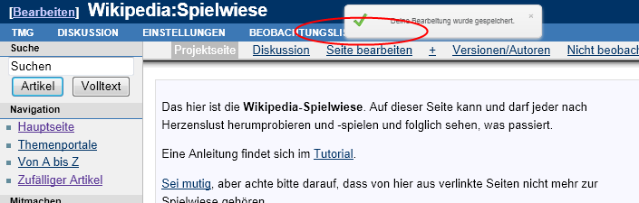
Created attachment 11213
Original screenshot showing PE popup on Monobook with many custom tabs enabled
Attached:

(In reply to comment #1)
Generally, please upload screenshots to Bugzilla as attachments. Bugs are
forever; imgur is probably not.
Done.
It looks like you've got quite a few extra tabs there. The general overlap
issue is relevant, though.
Looking at your screenshot it seems like it covers up the watch tab. I took a different screenshot (with a brand new account) and the watch tab isn't covered up. Will attach in a minute.
What do you propose as a solution here? Adding space for the notification?
Moving it elsewhere? I mean, it's probably going to obstruct something no
matter where it is unless you add space for it, right? The question becomes how
to make it as least painful as possible.
I was thinking you could put it in title section. This isn't ideal either, however you would expect the user to know the title of the page that they are editing so it's not as high priority to be able to see something they already know compared to a tab they might want to click.
Created attachment 11214
Screenshot showing new monobook account where watch tab is not covered by PE popup.
Attached:

swalling wrote:
MZ's perspective is correct: we definitely want to make a notification that is a minimum of distraction, but considering that...
I am calling this a special case that doesn't require a change to the extension. If in the case of power users like yourself, who have many extra tabs, you find this annoying, then you can use user CSS to hide the notification:
.postedit {
display; none;
}
why not just add body.skin-monobook .postedit { margin-top: something; } to move it over the title instead of the tabs ?
Please enable users and don't dismiss them. Yes it's 'easy' to do for powerusers, but if something is this easy to fix in the extension itself, we should fix it in the extension. It will lead to much happier customers.
I'm getting a bit tired about things like this being dismissed, and if even I get tired about it, then I can't imagine how the community feels.
Yes it's difficult to make the 'perfect' extension, but that's just what community development is about. I feel what is meant here is: "WMF doesn't want to invest in this because we think the impact is not big enough to commit our resources to". But then just say so and move the ticket into a "Postedit (for volunteers)" section of bugzilla or something.
However, remember that the devil is in the details. WMF will never be able to successfully develop software until they start spending a bit more attention to detail, even though the immediate cost-benefit might seem off, it will pay off directly in community acceptance of that software.
I'm the developer of this extension and explicitly asked Legoktm to file a bug after receiving an informal report. I'd like to fix it. Steven, please consult me before closing.
(In reply to comment #7)
- In the default views of Vector and Monobook, tabs are not obscured
This isn't strictly true. Depending on the browser window width, the tabs can be obscured (cf. attachment 11212).
Earlier today I was working on the English Wikipedia and I saved an edit and quickly tried to click to the "talk" tab, but it was obscured for a second or two by this notification.
(In reply to comment #9)
I'm getting a bit tired about things like this being dismissed, and if even I
get tired about it, then I can't imagine how the community feels.
Generally, the MediaWiki skins system is so terrible and broken that we haven't really hit many issues because we kind of assume that any skin available in Special:Preferences is supported, when that's not really the case. I think right now we (somewhat frequently) get hit by the issue of what level of support to provide users who have non-standard (non-default) setups. In the case of Monobook, the non-default is still a major problem because so many users continue to use Monobook.
There are a few approaches to take here. One might be to say "we only support Monobook, Vector, and [whatever the next skin is]" and resolve bugs against Chick or Modern or whatever as "wontfix." Another (better) approach might be to make a sane skinning system and build in a dedicated place for messages like this into any skin.
Created attachment 11222
Proposed location for notification on Monobook
On Monobook, we could move the notification down so that it is vertically centered on the horizontal rule below the article title (see attachment). Would this work, or is that even more invasive?
Attached:

mr.heat wrote:
Part of the problem is that the position of the popup is literally "2% from the top of the screen". Because of this the vertical position of the popup changes depending on the height of your browser window. This is why the position is different for every user and in every screenshot.
From what I see in the MonoBook code all vertical positions are calculated using the unit "em". The popup should use the same unit.
I suggested an alternative method to position the popup in bug 41231#c20. Simply replace the "10px" from my example with ".6em" in Vector (I tested it and this is perfectly centered between the top of the screen and the tabs) and something like "3em" or "4em" in MonoBook (this moves the popup below the tabs).
mr.heat wrote:
PostEdit still covering default tabs in MonoBook
I'm not sure why this was closed without fixing the dependency first. It's not fixed. The notification still blocks "random" (depending on the window width) tabs in the MonoBook interface. Even if there are no custom tabs added. See the attached screenshot.
Attached:

mr.heat wrote:
PostEdit still covering default tabs in Modern
Same problem in other skins, e.g. the Modern skin (see the attached screenshot). Should I create a new bug report for this? I don't think this is necessary. It's the same bug.
Attached:
Senior contributors find it distracting at Wiktionary. How can individual users turn it off. Custom JS? CSS?
swalling wrote:
(In reply to comment #20)
Senior contributors find it distracting at Wiktionary. How can individual
users
turn it off. Custom JS? CSS?
Just add:
.postedit {
display: none
}
to your personal common.css file.
swalling wrote:
(In reply to comment #21)
(In reply to comment #20)
Senior contributors find it distracting at Wiktionary. How can individual
users
turn it off. Custom JS? CSS?Just add:
.postedit {
display: none}
to your personal common.css file.
Sorry, typo. That should have a semicolon in it, ala:
.postedit {
display: none;
}
Ori: this bug is assigned to you. The issue as reported in comment 0, comment 1, comment 2, and comment 3 is still readily reproducible and annoying. Is there a status update regarding this bug?
(In reply to comment #23)
Ori: this bug is assigned to you. The issue as reported in comment 0, comment
1, comment 2, and comment 3 is still readily reproducible and annoying. Is
there a status update regarding this bug?
I thought I fixed it. I'll look again.
mr.heat wrote:
The patch
https://gerrit.wikimedia.org/r/#/c/45234/
was for Monobook only, as far as I can tell. The same problem applies to all skins as described above.
Change 76222 had a related patch set uploaded by Ori.livneh:
Increase vertical offset of post-edit confirmation in MonoBook
Change 76222 merged by jenkins-bot:
Increase vertical offset of post-edit confirmation in MonoBook
Ori's patch is merged, I'm marking this as resolved again.
(In reply to comment #18)
Created attachment 12049 [details]
PostEdit still covering default tabs in ModernSame problem in other skins, e.g. the Modern skin (see the attached
screenshot). Should I create a new bug report for this? I don't think this is
necessary. It's the same bug.
It's only covering the personal toolbar, which probably isn't used that often right after editing, and which is also covered by the postedit notification on Vector.
Attached: