Page MenuHomePhabricator

Vector: Default icon for "profile" in personal tools should be gender neutral and fit with other site icons look & feel
Closed, ResolvedPublic

Description

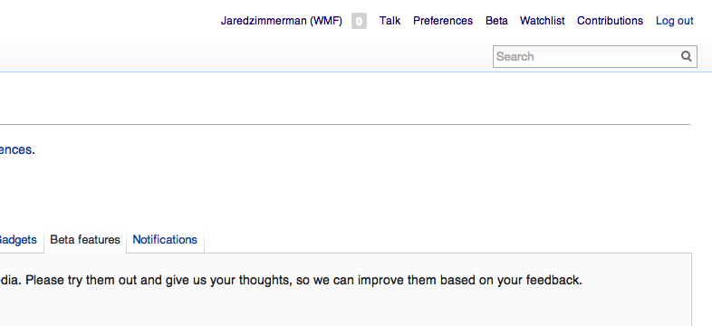
We have this dude in the Vector skin next to the user name:

image.png (13×10 px, 526 B) http://bits.wikimedia.org/static-1.21wmf2/skins/vector/images/user-icon.png

If one specifies their gender in preferences as female, it would be cool to see a female user icon instead of the dude. :) If we're interested in gender gap, this could be one tiny thing to help make the software more welcoming.


Version: unspecified
Severity: minor
See Also:
https://bugzilla.wikimedia.org/show_bug.cgi?id=45056
https://bugzilla.wikimedia.org/show_bug.cgi?id=51927
https://bugzilla.wikimedia.org/show_bug.cgi?id=53732

Details

Reference
bz41484

Event Timeline

bzimport raised the priority of this task from to High.Nov 22 2014, 12:51 AM
bzimport set Reference to bz41484.
bzimport added a subscriber: Unknown Object (MLST).

p.selitskas wrote:

If the icon from Vector is this[1], then we can pick a red one for girls[2]. If red is not OK, then anyone can just change the color in SVG and it's done.

[1] https://commons.wikimedia.org/wiki/File:Emblem-person-blue.svg
[2] https://commons.wikimedia.org/wiki/File:Emblem-person-red.svg

The MediaWiki Vector skin is primarily white/grey oriented with focus on blue and activity on orange (mouse down).

Blue is not male in this context, it is theme colours. Using red would grab wrong attention to the icon.

Removing 'easy' keyword until it is clear whether we want this in the first place. Adding 'design' and CC-ing Trevor for his opinion.

sumanah wrote:

Thanks for pointing this out, Aude. For ideas on how to rework the default icon to make it more gender-neutral, here's the "gallery of default anonymity": http://www.murketing.com/journal/?p=3098

I prefer a single, neutral icon to gender specific icons.

How do you make a "female" icon anyway, short of giving it breasts? Long hair? Tell that to Brandon and Sumana!

(In reply to comment #3)

Thanks for pointing this out, Aude. For ideas on how to rework the default
icon to make it more gender-neutral, here's the "gallery of default
anonymity":
http://www.murketing.com/journal/?p=3098

Flickr is IMHO the best. Should also be {{PD-ineligible}} and in compliance with the colour scheme per Krinkle above.

sumanah wrote:

The current icon is https://bits.wikimedia.org/static-1.21wmf9/skins/vector/images/user-icon.png .

(In reply to comment #4)

I prefer a single, neutral icon to gender specific icons.

How do you make a "female" icon anyway, short of giving it breasts? Long
hair?
Tell that to Brandon and Sumana!

For people who haven't met us: Brandon is a man with long hair, and I am a woman with short hair.

These kinds of avatars are usually heads, head-and-shoulders, or stick figures of the whole body, so some designers use long hair, earrings, or a skirt as a shorthand for "female."

I ask our designers to figure out how to make a more gender-neutral icon (perhaps dispensing with the requirement that it look like a person).

Sorry for double comment.

(In reply to comment #5)

Flickr is IMHO the best. Should also be {{PD-ineligible}} and in compliance
with the colour scheme per Krinkle above.

(Same for Yahoo and identi.ca, very similar.)

(In reply to comment #6)

The current icon is
https://bits.wikimedia.org/static-1.21wmf9/skins/vector/images/user-icon.png
.

Ah, right, I forgot that monobook is different! You can see the old good one e.g. in the screenshot at https://creativecommons.org/weblog/entry/13967
I've never considered it particularly manly: the hair always looked to me like a bun (if this is the correct term for the hairstyle), which is indeed particularly rare for men. :-)
Hence the ? in the bug summary.

(In reply to comment #6)

I ask our designers to figure out how to make a more gender-neutral icon
(perhaps dispensing with the requirement that it look like a person).

Species-neutral too, I like it :)

Killing this icon was briefly proposed at bug 35341.

I agree with Krinkle. I don't see what makes this icon (https://bits.wikimedia.org/static-1.21wmf9/skins/vector/images/user-icon.png) male. I don't think a blue shirt makes it male.

As he said, Vector uses a lot of blue. In particular, light blue. We could change the shirt color to light blue to make it further match the theme, but I don't know that this is really necessary.

Well, as Sumana notes, the current icon can be perceived as conforming to some gender stereotypes, so it's not "neutral" in its common perception. I've clarified the summary further.

massaf wrote:

an attempt at a gender-neutral icon

Here's a first attempt. I agree with Krinkle that it shouldn't draw attention. Link blue (#3366bb) might be appropriate, but for now it's gray. Thoughts?

attachment GenderNeutralPerson.png ignored as obsolete

So, I don't want to be a buzzkill and mean, but Munaf, have you actually tried putting that icon into the interface?

Because it looks awful. It doesn't fit the rest of the skin and hardly resembles a human, especially scaled-down. Maybe it would be a little better if made blue-ish, but I'm still skeptical about the new look.

massaf wrote:

testing out a gender-neutral icon

Not sure I see what you're seeing. It fits fine when you scale and color it based on context.

A shade of gray would work if each user portlet item had an icon alongside it, which we're talking about in other bugs.

attachment gender-icon-test.png ignored as obsolete

(In reply to comment #9)

Killing this icon was briefly proposed at bug 35341.

Filed separately as bug 45056.

(In reply to comment #14)

Created attachment 11794 [details]
testing out a gender-neutral icon

Not sure I see what you're seeing. It fits fine when you scale and color it
based on context.

Okay, it's considerably better when appropriately colored (but still looks like a pawn). But why did you change the color of userpage link in that mockup? This just distracts from the purpose of the change :/

Actually I'm starting to lean towards just killing the icon per bug 45056.

attachment gender-icon-test.png ignored as obsolete

Personally, I say kill the icon. It's the only one we have, and it stands out because of it. Maybe we revisit them in the future, but for now I don't see a purpose.

(In reply to comment #17)

Personally, I say kill the icon. It's the only one we have, and it stands
out because of it. Maybe we revisit them in the future, but for now I don't
see a purpose.

We may one day have an avatar up there (similar to Facebook). Definitely something to think about for [[mw:GlobalProfile]]. For now, I think you're probably right that no icon is better than the current icon.

Two things: One, that is not a male icon. Blue does not make it male. Blue matches the skin, and I really don't understand why there is a fuss about that in particular. Two, killing the icon entirely would make sense with current skins especially since it has no functional significance anyway.

GRAW. Arg. Chickidee?

I kind of find the icon to be a sort of visual cue. Without it the personal bar is just a collection of unidentified links. While with the icon it's instantly identified as a series of links related to the user.

Stuff like proper padding and lining up of whitespace are invisible when they are present and done right. But when they are not there they give uncomfortable feelings, usability issues, etc... I think the personal icon fits into that category.

Why don't we try Agora-fying the icon?
https://www.mediawiki.org/wiki/Wikimedia_Foundation_Design/Agora_Icon_Set

Agora doesn't really work with Vector.

I agree with the three comments above (as said on bug 45056). Finding a better icon doesn't seem that hard, and we're not in a hurry: the current one is not doing any severe harm, it's just imperfect (and in monobook probably even good enough).

massaf wrote:

But why did you change the color of userpage link in that mockup?
This just distracts from the purpose of the change :/

Unintentional. I habitually plugged in Agora red (#cc0000) instead of our current link red (#ba0000) so there's a weird differential.

Actually I'm starting to lean towards just killing the icon per bug 45056.

Not sure I'm convinced of that yet. Just one icon does make the user tool list more scannable (ideally they'd be re-arranged or redesigned altogether).

(In reply to comment #4)

How do you make a "female" icon anyway, short of giving it breasts? Long
hair?
Tell that to Brandon and Sumana!

Are you suggesting that I could be mistaken for a woman? ;)

Speaking on this issue, I think we should avoid any kind of gender cues in the icon. The concept of "gender" is intensely personal, mercurial, and ephemeral. This bug actually points to a larger issue that we have within the software itself (which is that gender is a binary switch, rather than something that accommodates individuals who identify as "genderqueer").

(And yes, I know that namespace translations for user pages based on gender is a whole other ball of wax, and I can't hope to think we'll ever solve for gender-identification problems that are fundamental to a language itself).

As far as the icon itself goes, I would prefer that we also would move towards an image that is also racially neutral (thus, Munaf's grey icon is probably the best choice).

That said, I still want to get rid of the icon entirely.

Brandon, thanks for adding your points about older comments, but I hope you can also address comment 20, comment 23 and bug 45056 comment 6: instead of explaining your position you just restated it in a post-scriptum. Thanks.

I don't necessarily think I need to address them; my position is that the icon isn't needed at all and I think it distracts as clutter rather than providing a visual cue.

However, I'm not married to killing it off, and if people decide that we want to keep it, I'm fine with that, but I also want to make sure that we're working inside some rational guidelines.

sumanah wrote:

(In reply to comment #24)

Speaking on this issue, I think we should avoid any kind of gender cues in
the
icon. The concept of "gender" is intensely personal, mercurial, and
ephemeral.

I completely get what you're saying here (and nudge you to potentially undo the WONTFIX on Bug 25834 to expand the currently binary gender options MediaWiki preferences offer users). But is it really possible to avoid *any* gender cues in an icon given that "male" is, to the perception of most users, the default state of any head-and-shoulders icon unless it includes specific "not male" markers? Defeating the unmarked state is tough.

This bug actually points to a larger issue that we have within the software
itself (which is that gender is a binary switch, rather than something that
accommodates individuals who identify as "genderqueer").

(And yes, I know that namespace translations for user pages based on gender
is
a whole other ball of wax, and I can't hope to think we'll ever solve for
gender-identification problems that are fundamental to a language itself).

Solve entirely? No. *Improve* how we deal with genderqueer people in all languages? Sure.

People opining on this bug ought to also look at Bug 30442 - give the user a chance to specify the gender when opening the account - and Bug 31816 - Improve the wording of gender selection option.

As far as the icon itself goes, I would prefer that we also would move
towards
an image that is also racially neutral (thus, Munaf's grey icon is probably
the
best choice).

Seconding the request for the icon's "skin color" to be neutral. :-)

sumanah wrote:

symbolic variant from gnome-icon-theme courtesy Mizmo (Máirín Duffy of Red Hat)

I asked a few other designers who work in open source to comment. Georgia Bullen wrote:

"Hmmm...

Well there are the options of just stick figure gender-less icons e.g.
http://wikieducator.org/images/1/16/Dummy_user.png and if you avoided
colors, and went with gray or something like that then it wouldn't even
have gender color implications.

Another design practice that I'm a fan of is to go with more abstract user
icons or animal icons e.g. github's
https://dribbble.s3.amazonaws.com/users/8063/screenshots/873671/github_icon_vector_shape_teaser.png

Or this awesome site: https://diy.org/ which uses animal avatars to avoid
issues with COPA for children.

Hope that's helpful!

-georgia"

Máirín Duffy of Red Hat wrote:

"The best gender- and race-neutral icons of people are basically abstract
head + shoulders or an abstract face in b&w. One of the links you posted
in the bug had a few good examples:

http://www.murketing.com/journal/wp-content/uploads/2009/04/garageband.gif

http://www.murketing.com/journal/wp-content/uploads/2009/04/myspacenophoto.jpg

http://www.murketing.com/journal/wp-content/uploads/2009/04/nopic_192.gif

http://www.murketing.com/journal/wp-content/uploads/2009/04/vimeo.jpg

http://www.murketing.com/journal/wp-content/uploads/2009/04/identica.png

http://www.murketing.com/journal/wp-content/uploads/2009/04/npr.gif

FWIW the icon you guys are using now is one of the old gnome-icon-theme
icons. I am attaching a copy of the same icon from the newer
gnome-icon-theme, symbolic variant - it's licensed GPL, I've pasted the
link with license details below:

http://git.gnome.org/browse/gnome-icon-theme/tree/COPYING

You may of course feel free to use it!

~m"

attachment avatar-default-symbolic.svg ignored as obsolete

Just adding my 2 cents in here.

The icon was chosen, by me, in 2009. It was the standard generic user icon in the Tango icon library, which we were embracing at the time.

I agree with some of comments here that using stereotypes to make the icon more gender specific is going to be offensive. Should we also assume their nationality based on their location or language and adjust the icon accordingly? Obviously this is going to be a nightmare. Besides, none of this would any value.

The use of the icon was inherited from Monobook. As many people are aware, Vector was more of a riff on Monobook than a new skin. At the time especially, Monobook had become this iconic skin that everyone was so attached to after years of staring at it, that every tiny adjustment we proposed was highly controversial.

Do we still need the icon? I think so. It's actually one of the more reasonable uses of iconography - which we use very selectively in Vector - because it is...

  1. Identifiable (must be obvious what it means)
  2. Necessary (icons for the sake of icons are bad)
  3. Important (icons for obscure tasks bring attention to the wrong things)

I say we keep it, and when we make all the other icons monochrome (going along with work like Agora and VisualEditor) it should become a silhouette.

Looks like it wasn't linked yet: monobook icon on Commons, "Racially, gender neutral icon". https://commons.wikimedia.org/wiki/File:User-variant.png

(In reply to comment #29)

I say we keep it, and when we make all the other icons monochrome (going
along
with work like Agora and VisualEditor) it should become a silhouette.

I don't understand, are you saying it can't be changed before that for some reason of consistency? Also, does "silhouette" mean that in

(In reply to comment #28)

abstract
head + shoulders or an abstract face in b&w.

you recommend the former?

(In reply to comment #5)

(In reply to comment #3)

Thanks for pointing this out, Aude. For ideas on how to rework the default
icon to make it more gender-neutral, here's the "gallery of default
anonymity":
http://www.murketing.com/journal/?p=3098

Flickr is IMHO the best.

BTW, apparently Flickr disagreed :) , they replaced the default buddy icon with a purple square containing a rainbow camera.

We'll address this icon as part of a a visual alignment exercise we're doing with the echo notifications

Thanks Jared; please leave correct terminology too in the bug summaries for the purposes of discoverability (the area is called "personal tools").

Profile icon

attachment User_web.svg ignored as obsolete

Removed May (visual designer) as the assignee, not that she's uploaded the new asset from the Echo icon set. Please assign a developer to submit a patch as needed.

Can we get someone to integrate this, we've recently updated the general user icon used in mobile for user talk, article history, and watchlist, so it would be great to get this one in sync sooner rather than later.

(In reply to comment #28)

Another design practice that I'm a fan of is to go with more abstract user
icons or animal icons e.g. github's
https://dribbble.s3.amazonaws.com/users/8063/screenshots/873671/
github_icon_vector_shape_teaser.png

I'd just like to point out that animal icons would not be wise since languages may associate certain animals with certain genders by default. For example, a user with native language hindi might consider a cat icon to be female and a lion to be male. Cat: male: बिल्ला, female: बिल्ली, latter is what is generally default usage. Lion invokes a male idea since hindi, like English, defaults to lion (शेर), not lioness (शेरनी)

Removing easy keyword; the implementation may be easy, but as we still haven't agreed on what to do with this, it's probably not something we'd necessarily want to bring a new person into.

There are arguments here that an icon is not needed at all, but based on what Trevor said, even if it isn't needed, it's definitely useful. To remain useful, however, it needs to also remain a recognisable 'user' icon - that rules out anything with too much abstraction that wouldn't necessarily have the same meaning to the user, like a smiley face or animal (even without added issues those might present such as those Siddhartha Ghai points out), and brings us back to the more standard head and shoulders, which arguably tend to look male. Blue, which fits the skin, is apparently also problematic because in some cultures blue is associated with masculinity.

It seems rather like we're stuck on a choice - whether to be intuitive and clear or to not offend people. Strange choice, since no matter what you do you'll pretty much always wind up offending or disturbing someone if you've a broad enough audience.

wmf.amgine3691 wrote:

(In reply to comment #39)
...

It seems rather like we're stuck on a choice - whether to be intuitive and
clear or to not offend people. Strange choice, since no matter what you do
you'll pretty much always wind up offending or disturbing someone if you've a
broad enough audience.

Nonsense.

As you point out, it should likely be anthropomorphic. Blue is used for accent in the skin, but every icon and graphic is monochromatic grey (http://ur1.ca/fx8u3, search) - as should be this one.

Aesthetically not the best choice for some people, but it's likely the least offending (even to the designers) compromise and we're all just waiting for someone to point this out and force the stakeholders to grow up and accept the compromise.

Realized the asset uploaded was slightly out of date, May is uploading the correct asset and mockup now.

I feel that the asset she's uploading (a variation on the original she posted) head and shoulders (ha!) better than what we have now. its a small change, I'd prefer to integrate it, since its in-line with the user icon on mobile as well as upcoming multi-media features. Stay tuned for the updated asset in just a bit.

Example use of icon

attachment Screenshot 2013-10-22 16.06.53.png ignored as obsolete

Profile icon

attachment profile.svg ignored as obsolete

(In reply to comment #43)

Created attachment 13547 [details]
Example use of icon

I want to say that I appreciate all of the work that the design team does. Good design on our projects and in our products is important. A rich, meaningful, and aesthetically pleasing user experience is something that every user who visits our sites or uses our services should have.

That said, sweet Jesus no, we will not be putting that icon anywhere near MediaWiki core or Wikimedia wikis. It conjures up [[blackface]] in the mind and will be viewed by many users to be offensive and completely inappropriate. This icon flatly will not work.

In seeing another squared-headed smiley face in the wrong color, I'm reminded of bug 51927. (Oh, it's already marked as a "see also." Hrm.)

attachment Screenshot 2013-10-22 16.06.53.png ignored as obsolete

(In reply to comment #40)

As you point out, it should likely be anthropomorphic. Blue is used for
accent in the skin, but every icon and graphic is monochromatic grey
(http://ur1.ca/fx8u3, search) - as should be this one.

Good point - I must have been thinking of some extension icons I'd seen that were link-coloured.

(In reply to comment #44)

Created attachment 13548 [details]
Profile icon

As I said, an icon like that defeats the purpose of having a user icon in the first place, as it is not immediately recognisable as 'user account' related and thus does not adequately function as a graphical label for the personal tools. Indeed, that it is so similar to the echo thanks thing should help explain why it isn't appropriate here.

The one Munaf made or one of the ones thehelpfulone linked would be much more appropriate and effective. May need to fix the colours/weight for the skin, but that is the direction this should be taking. Or rather that it should never have left.

attachment profile.svg ignored as obsolete

ritusparks wrote:

Hey!
I'm a newbie to mediawiki and I would like to work on this bug! Could somebody navigate me through the required procedure?

Hi RituS, thanks for your interest! Please see https://www.mediawiki.org/wiki/Developer_access and https://www.mediawiki.org/wiki/Gerrit/Tutorial for information and also for where to receive help with the general development setup.

Hi RituS! Actually I don't think this bug at this point is the best first task for a new contributor. We have many other bugs to choose from at

https://www.mediawiki.org/wiki/Annoying_little_bugs

The reason is...

(In reply to comment #39)

Removing easy keyword; the implementation may be easy, but as we still
haven't
agreed on what to do with this, it's probably not something we'd necessarily
want to bring a new person into.

I agree. Have we agreed on a plan? If so, a new comment summarizing the work that needs to be done is welcome. With 48 comments and 5 attachments, the chances to work on something that won't be directly merged are high.

  • Bug 67837 has been marked as a duplicate of this bug. ***

Created attachment 15906
no icon -> mediawiki.ui controls

How about for now we just remove the icon altogether, pre-login we should use medaiwiki.ui controls, and post login, just remove the existing icon.

Attached:

Screenshot_2014-07-10_22.20.03.png (538×748 px, 131 KB)

swalling wrote:

(In reply to Jared Zimmerman (WMF) from comment #51)

Created attachment 15906 [details]
no icon -> mediawiki.ui controls

How about for now we just remove the icon altogether, pre-login we should
use medaiwiki.ui controls, and post login, just remove the existing icon.

I think this is the right way to go for login.

Not sure about removing the icon for once you're logged in. It does provide value, in that it denotes that the menu items are related to you personally. I think if we try something simpler (the version May did pushed things a bit in terms of personality and verve) then we can easily replace it. Munaf is working on something in conjunction with our designs for a task suggestions alpha.

Attached:

Screenshot_2014-07-10_22.20.03.png (538×748 px, 131 KB)

I propose we remove the post-login icon for now, and when wikifont is in core we can add the updated icon then. We have personal bar instrumented right now, so we'll be able to see if there is any dropoff from users based on the removed icon.

Created attachment 15907
post login

see post login sketch

  • icon removed
  • additional per item padding added
  • right margin adjusted to align with search.

Attached:

Screenshot_2014-07-10_22.39.39.png (360×786 px, 28 KB)

What is the pre-login or post-login icon? Jared, please file a separate bug report for separate issues. This bug is not about removing the icon.

Nemo, bugs shouldn't neccesarily express a solution, the problem here is "icon represents gender" it's easy to assume the fix is "make a better icon" when the problem could just as easily be "don't have an icon" when we presuppose a solution we close ourselves off to many possible correct conclusions for the same issue.

Pre- and post- login icons are currently the same asset by the way, to answer your question.

The problem in this bug is very well defined and it has nothing to do with your proposed solution. Your proposal is a solution for the supposed problem "personal toolbar personalises", which is a) different, b) not agreed upon as a problem. It's possible that the two problems will be resolved by a single solution in the end, but collapsing them in a single report doesn't help anything.

I don't know what "personal toolbar personalises" means, can you explain/clarify?

swalling wrote:

(In reply to Nemo from comment #57)

The problem in this bug is very well defined and it has nothing to do with
your proposed solution. Your proposal is a solution for the supposed problem
"personal toolbar personalises", which is a) different, b) not agreed upon
as a problem. It's possible that the two problems will be resolved by a
single solution in the end, but collapsing them in a single report doesn't
help anything.

When a problem comes up with a current design (whether it's an icon, a button, or a whole feature), it is extremely useful to go back to basic principles and talk about why something is needed in the first place. Questioning whether a design element is necessary hones in on why it's important. If we understand why it's important, then if we want to keep it, we can be clearer about what it's supposed to be doing.

TL;DR: all options are on the table. If you don't like it, we can always go discuss this on the more open-ended bug I filed. But berating a designer for having ideas is not progress.

wmf.amgine3691 wrote:

This idea has already been discussed in this bug (starting around comment 9, 17) and was discussed in other bugs (35341) and has its own bug (45056).

Change 146979 had a related patch set uploaded by Robmoen:
Make profile icon gender neutral. Remove from Login link

https://gerrit.wikimedia.org/r/146979

While we wait for screenshots here, I've loaded the icon at its default size of 13px and out of context I would have called it a sunset over a hill. I guess that *is* gender neutral, no idea how clear it is.

See also bug 45056 comment 15.

Change 157990 had a related patch set uploaded by Robmoen:
Make profile icon gender neutral and remove from login link in Vector

https://gerrit.wikimedia.org/r/157990

Change 146979 abandoned by Robmoen:
Make profile icon gender neutral and remove from login link in Vector

Reason:
Abandoned in favor of new patch in skins directory.
https://gerrit.wikimedia.org/r/#/c/157990/

https://gerrit.wikimedia.org/r/146979

Change 157990 merged by jenkins-bot:
Make profile icon gender neutral and remove from login link in Vector

https://gerrit.wikimedia.org/r/157990

Jason_quinn wrote:

Postscript:

Blue is for boys. Pink is for girls. Yellow or green are neutral.

This is a cultural convention for gender through the Western world and much of the rest of the World, especially for example in nurseries, and has been for the better part of a century. This is *why* many here associate blue with male. If you are from the Western world and don't have at least some mental association about that, you're an oddity. The suggestion of "red" rather than "pink" to denote female is puzzling. (In fact, the red icon suggested above for female and the old icon's blue color are clearly similar to the red and blue used for instance by Olympic boxers.) It is also puzzling why "yellow" or "green" weren't mentioned as possible general neutral colors.

I'm not saying that this color convention (or any color convention) should be used for the icon. There would be many issues to discuss about it. Some people might object saying it re-enforces gender stereotypes and so on. There may be countries where the conventions are totally different (I'm unaware of any but this same issue came up when color-coding Asian family tree charts in the encyclopedia and nobody has yet complained). All I am saying is that it wasn't clear to me from the above discussion that anybody even was even consciously aware of the convention so it needed to be mentioned explicitly. Getting rid of the icon altogether may be the best course of action anyhow so this might be moot except to better understand the issue.

Regardless, it was a fantastic suggestion that the icon should not have an indefinable skin color. Bravo on that.