Page MenuHomePhabricator

VisualEditor: Toolbar "Save page" button is confusing as it merely opens the dialog to save the page
Closed, ResolvedPublic

Assigned To
Authored By
MZMcBride
Nov 15 2012, 5:32 AM
Referenced Files
F8119442: wikitext-2017-mockup-splitted-view.png
May 18 2017, 7:54 PM
F8119439: wikitext-2017-mockup-frame-dropdown.png
May 18 2017, 7:54 PM
F8119451: wikitext-2017-mockup-splitted-frame-dropdown.png
May 18 2017, 7:54 PM
F8119433: wikitext-2017-mockup-editor-dropdown.png
May 18 2017, 7:54 PM
F8094595: wikitext-2017-mockup-extended-preview-dropdown.png
May 16 2017, 4:06 AM
F8094055: wikitext-2017-mockup-initial.png
May 16 2017, 4:06 AM
F8094059: wikitext-2017-mockup-load-preview.png
May 16 2017, 4:06 AM
F8094031: wikitext-2017-mockup-preview.png
May 16 2017, 4:06 AM
Tokens
"Orange Medal" token, awarded by Liuxinyu970226."Like" token, awarded by Elitre."Orange Medal" token, awarded by Krinkle.

Description

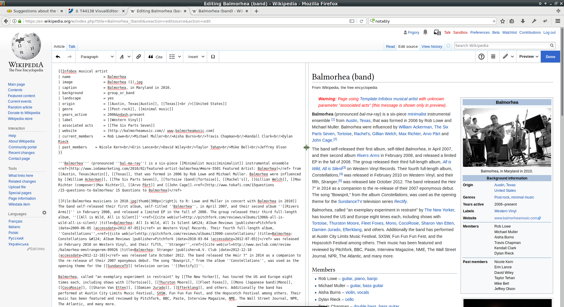
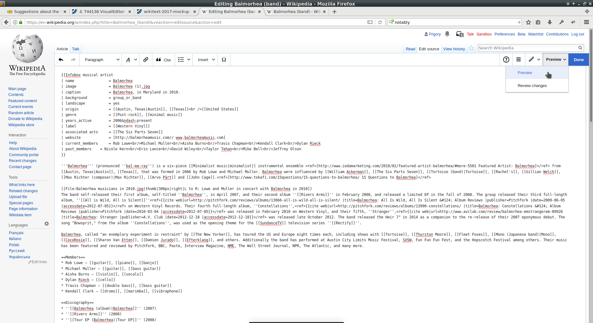
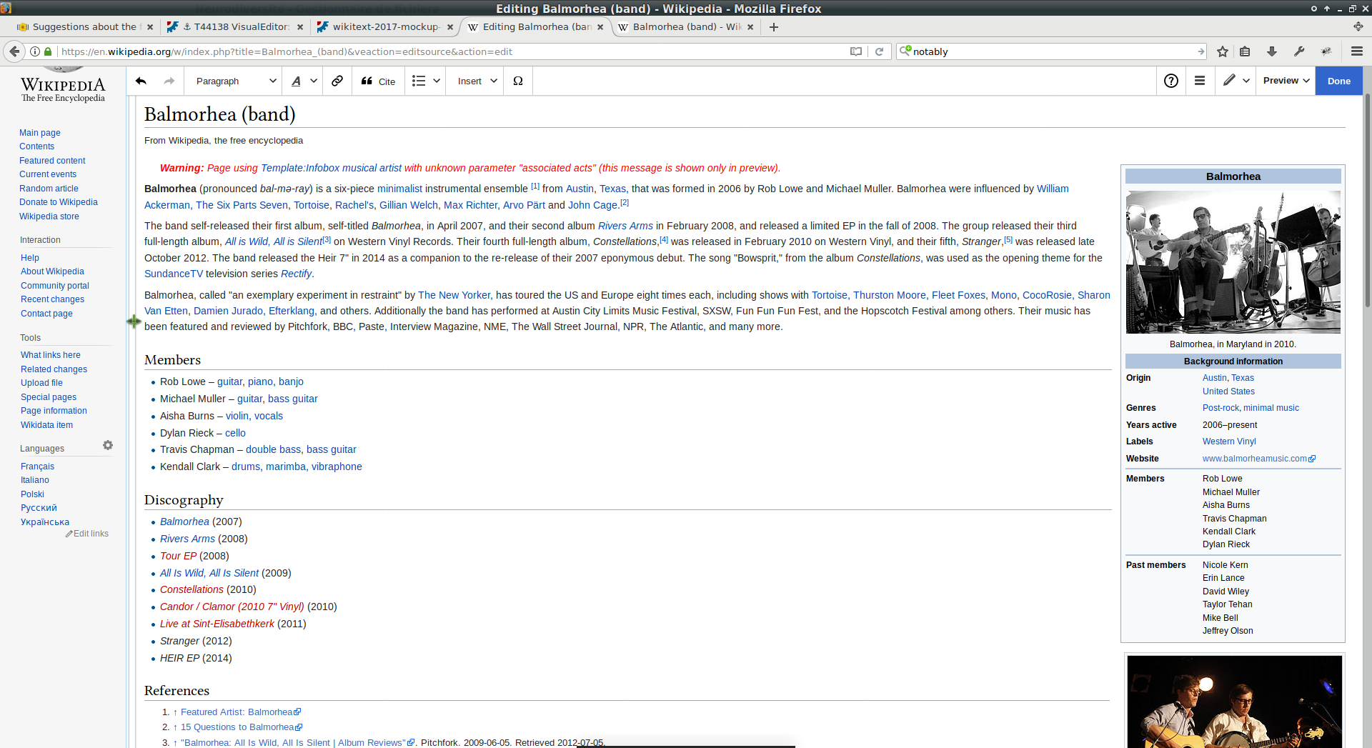
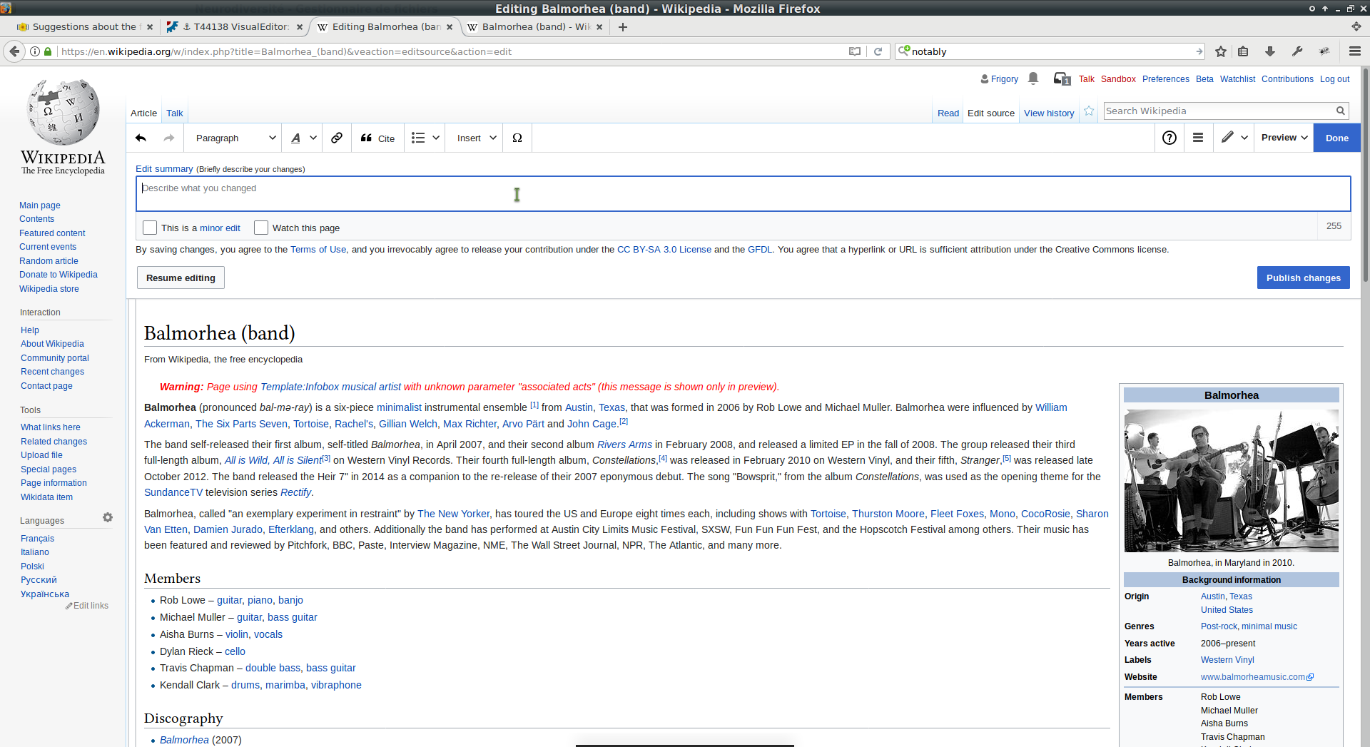
Currently when using the VisualEditor extension, there's a big green button that reads "Save page" in the top-right corner of the browsing window.

When a user clicks this button labeled "Save page", the page is not saved. Instead, a dialog box appears in which the user is prompted to enter an edit summary. If the user then clicks the "Save page" button again (a second time), the page will be saved (maybe).

I believe this is behavior is a little wrong. Historically the behavior of the "Save page" button has been to actually attempt to save the page to the database. This new workflow changes that behavior.

Roan suggested perhaps changing "Save page" to read "Save page...", which would give the user a clue that it's going to be a process, not an immediate action.

There's also no warning within the "Save page" dialog box that says that the page has not yet been saved to the database. There's no "this is only a preview!" text. Perhaps that's a separate bug, though.


Version: unspecified
Severity: enhancement

Details

Reference
bz42138

Related Objects

Event Timeline

bzimport raised the priority of this task from to Low.Nov 22 2014, 1:07 AM
bzimport set Reference to bz42138.

Filing without prejudice as to whether we should implement.

Setting milestone to 2013-06-27 since it is marked as blocker for "Beta" (2013-07). It may be moved to an earlier milestone as we see fit. But no later than 06-27. Setting it since I use milestone to sort "My bugs".

I agree the toolbar button needs improvement, but imho changing the label from "Save page" to "Save page..." is not an improvement.

It doesn't clarify or improve the user experience, it only makes it more mysterious.

I'd prefer we look for another solution, but I think the current situation is better than having "..." tacked on to the label.

There have been a lot of complaints about this on the enwiki feedback page. One especially interesting point was raised by the ever-wise John Broughton:

["Save page"] is the same label as on the button, in the old editing interface, that completed the edit session. Lots of effort has been made, over the years, to encourage editors to write an edit summary before they click "Save page", and now VE is designed exactly the opposite. The button ought to be labeled "Finish edit" or "Continue" or "Final steps" or just about anything other than "Save page".
The current problem is even worse than just one poorly labeled button. In VE, after clicking "Save page", a dialog box appears that also has a "Save page" button. So now an editor has to understand that the two "Save page" buttons do not do the same thing. And documentation (when it's written) is going to have to clarify which "Save page" button is being referred to - unless the label on the first occurrence of "Save page" is changed, as it should be.

The button label on enwiki was modified to "Finish edit" per [[MediaWiki:Visualeditor-toolbar-savedialog]].

The whole save/preview/edit summary interface feels clunky and getting the way. I don't have a constructive suggestion, it's a rather straightforward way of handling saving in a WYSIWYG editor - but it does not feel right, and I hear others complaining about it as well.

I like the save process for the most part. I agree this (initial label that opens the dialog) could potentially be changed, but in practice it's not really a problem as is.

Maybe there should be something like "Proceed to save" instead...

A very typical wording would be "Review and save" (or "Review and publish"). It shouldn't be merely "Save" or "Publish", since the page is not immediately saved when pressing it.

Roan suggested perhaps changing "Save page" to read "Save page...", which would give the user a clue that it's going to be a process, not an immediate action.

I think this would make sense – it is an established UI standard and can be found in many desktop applications.
I would love to see an improved wording on the button itself, but util then, I’d go with …

Would look like:

Screenshot from 2017-04-07 10-21-14.png (109×264 px, 2 KB)

Do we know if there's an equivalent for the ellipsis for every language we support?

@Elitre: To better understand the concern – is this about the problem that users may see a rectangle because their fonts don't support "…" or about the users not understanding what "…" means in that context?

Do we know if there's an equivalent for the ellipsis for every language we support?

Looking at the translations for the ellipsis and some messages containing it (1, 2) it would seem so.

Roan suggested perhaps changing "Save page" to read "Save page...", which would give the user a clue that it's going to be a process, not an immediate action.

I think this would make sense – it is an established UI standard and can be found in many desktop applications.
I would love to see an improved wording on the button itself, but util then, I’d go with …

I'm not sure the standard is used in this way. It is used in dropdown menus, but I don't think it is common in push buttons. I certainly don't recall seeing it in web "call to action-style" buttons, ever.

In T44138#2087472, @Tgr wrote:

The whole save/preview/edit summary interface feels clunky and getting the way. I don't have a constructive suggestion, it's a rather straightforward way of handling saving in a WYSIWYG editor - but it does not feel right, and I hear others complaining about it as well.

I think a large part of the weird feeling is having the button at the top of the screen. "Submit" buttons are typically at the bottom of the page, below the form they complete, to go with the reading flow (see this very interface as an example).

I'm not sure the standard is used in this way. It is used in dropdown menus, but I don't think it is common in push buttons. I certainly don't recall seeing it in web "call to action-style" buttons, ever.

Yes, it is not very widely used on buttons. Checking some applications (Libreoffice and Ubuntu System Settings), I found that:

  • Few of the buttons I checked open new windows/popups anyway (makes sense, I assume, a button usually triggers an action)
  • For the buttons which open a new window, several had "…" (In Setting: "Network"/"use as hotspot…" ; "Language Support"/"install / remove Languages…"; "Security and Privacy"/ "Files & Applications"/ "Clear Usage Data…")

So, not widely used, but used, if it opens new windows.

I think it would be an improvement.

On desktop it's very widely used. See e.g. Microsoft and Apple button design guidelines.

In T44138#3171667, @Tgr wrote:

Do we know if there's an equivalent for the ellipsis for every language we support?

Looking at the translations for the ellipsis and some messages containing it (1, 2) it would seem so.

Would it be possible to migrate all ellipsis of MediaWiki core and extensions in all languages to use "…" (by default, i.e. if we don't provide translations), which can help extract a lot?

@Liuxinyu970226 That should be possible with CSS or HTML/CSS without big issues if requested and agreed upon.

Hello,

I’m 21, and I have a bit of experience and interest in web ergonomics. I’ve contributed to the design of a few websites (notably this one, which was really worse before). I’d like to share my opinion on this task as a Wikimedia contributor. I hope I’m not too late.

I’m not sure all my ideas are appropriate here but let’s spread. I’ve realized screenshots on a random article with the DOM manually modified.

For the preview, I’m dreaming about something like this:

wikitext-2017-mockup-preview.png (1×1 px, 531 KB)

I.e. two (possibly resizable) frames, one containing the code and the other one for preview or reviewing changes.
On my desktop computer, I have two monitors with a resolution of 1920×1080. With this configuration, I could extend my browser window on the two monitors, and have the code on the first one, the preview on the second one.

The initial setup would be:

wikitext-2017-mockup-initial.png (1×1 px, 263 KB)

Then you would click on ‘Preview’ in the dropdown:

wikitext-2017-mockup-load-preview.png (1×1 px, 267 KB)

It would make the preview appear on the right, half width, just like in the first screenshot but a bit larger, till the bottom:

wikitext-2017-mockup-preview-bottom.png (1×1 px, 298 KB)

You could have full preview by sliding:

wikitext-2017-mockup-preview-full.png (1×1 px, 434 KB)

You could reload the preview by clicking on the button ‘Preview’. To get the dropdown, you should click on the arrow. If you select ‘Review changes’, then the button’s label would change to ‘Review changes’.

Then for writing the summary, the popup annoys me because it takes more than 1 second to appear. I contribute mainly for minor edits (orthotypo, article structure, etc.) and I sometimes do a bunch of them so I’d like efficient tools.
I would imagine something similar to the Find & Replace panel when you click on ‘Done’:

wikitext-2017-mockup-publish.png (1×1 px, 384 KB)

(I would also prefer it for template editing because the current dialog lags…)

Other ideas:

  • Two different scrollbars:
    wikitext-2017-mockup-scrollbars.png (1×1 px, 515 KB)
  • With these separate scrollbars, a button to show the section containing the cursor in the preview, and another for the opposite (would be very useful when I’m reviewing long articles). This button could be on the vertical splitting bar.
  • For monitors having different sizes: vertically resizable frames (or two different windows?):
    wikitext-2017-mockup-resizable-frames.png (1×1 px, 471 KB)
  • In the ‘Preview’/‘Review changes’ dropdown, a second subsection with 3 choices: Hidden/Splitted/Full to set the frames’ width automatically (or another button which would toggle between these 3 choices when clicked):
    wikitext-2017-mockup-extended-preview-dropdown.png (1×1 px, 509 KB)
    I’m also suggesting new labels there. ‘Reviewing the changes’ is actually like viewing a preview of the changes.
  • Maybe having separate toolbars/dialogs in the two frames (e.g. Find & Replace with the wikitext, Publish with the preview)…

Note that, currently, I’m often using two different windows for editing: the first with the wikitext editor and the second with the published article (to explore it and make the fixes at the same time; but it is quite a pity not to view the changes I’m realizing).

I’m not sure I’m the ‘common’ editor but to me it would really be simpler to improve the quality of articles with such an interface, and newbies might appreciate it too.

What do you think about all this? I can give more details if you feel there’s a gap somewhere.

@Frigory I'm not a dev, but I like your proposals (I've already suggested some of them in a different task). Just be aware of those people with more narrow screens (like me - 1280x768), where those features like separate scrollbars, separate toolbars/dialogs and text "Preview" as a dropdown label are not very convenient.

  • Separate scrollbars could be a preference.
  • Indeed separate toolbars and dialogs are probably a bad idea.
  • I don’t understand why the Preview dropdown wouldn’t be convenient? You don’t have enough space for it?

No, if I add just a button with "Preview" and dropdown arrow, the symbol button is moved to the second line. The problem of a space in a toolbar or why text labels should be avoided was discussed in detail in T116417 or T153306 or above I guess.

So I could imagine something like this.

  • Possibility to have frames in the same dropdown, and an additional option for separate scrollbars:
    wikitext-2017-mockup-editor-dropdown.png (1×1 px, 231 KB)
  • A dropdown in the top right-hand corner of each frame to choose its content:
    wikitext-2017-mockup-frame-dropdown.png (1×1 px, 225 KB)
  • The splitted view:
    wikitext-2017-mockup-splitted-view.png (1×1 px, 511 KB)
    (the bar at the middle can be moved)
  • In the content selection, a ‘Switch panels’ option (I don’t know if the correct word should be ‘frame’ or ‘panel’), and the content of the other panel is grayed; also, a ‘Refresh’ button for the preview:
    wikitext-2017-mockup-splitted-frame-dropdown.png (1×1 px, 524 KB)

Of course there should be other icons (‘Refresh’ should be an icon).

This way the toolbar is even shorter than before, because ‘Done’ is shorter than ‘Publish changes’ — :).

Hi @Frigory, Hi @Dvorapa,

I like these ideas! I suppose they should have their own ticket. The current ticket was just meant to make the button actions clearer. Your suggestion extends the scope a lot.
Can you copy it in a separate tasks and mention this one (T44138)? Thus they would be kept connected and allows each one to focus on the button, two column view or both.
If you need help doing it, please write me or tell here.

@Frigory, @Jan_Dittrich: There is a task for this, where all this stuff should probably go, please see T155732

Related to this, there is an article on the German signpost equivalent "Kurier", in which as user talk about having trouble finding the save button and difficulties on clicking on "save", assuming it might save directly.

»Zunächst einmal sucht man vergeblich einen Knopf für die Vorschau. Wie heißt es doch: „Sei mutig!“ Wir drücken also einfach ohne Vorschau auf „Änderungen speichern“ «

Roughly translated: »We search unsuccessfully of the "preview" Button … They say "Be brave" and we press without preview on "Save Changes"«

What about "Complete...", "Final review" or similar term to indicate the button will lead to the publication, but not being a "Publish" button?

Yep, I’ve put the word ‘Done’ in my mockups.

It seems that

  • An ellipsis is standard in many UI guidelines, including Mac and Windows (as @Tgr wrote). It is an UI standard at least since the 90s and basically the icon for "a window will open".
  • The only feedback I remember that was contra ellipsis itself came from @Krinkle ("It doesn't clarify or improve the user experience, it only makes it more mysterious.").
  • The character could be either included via CSS or in the translation messages.
  • The "does the save button save immediately?!" is an actual problem (at least according to German Kurier and feedback on enwiki according to @TTO )

With ellipsis, it would look like

Screenshot from 2017-04-07 10-21-14.png (109×264 px, 2 KB)

@Pginer-WMF – what do you think? And: Who is the one to decide about this?

You may consider my feedback withdrawn. I didn't make the connection with the operating system conventions. I have indeed used many applications that use ellipsis in context menus or top menus for items to indicate they won't be performed immediately but will require an additional interaction first (e.g. new dialog, or next panel if already in a dialog).

Before I realised this connection, my main concern was that adding ellipsis would not solve the original problem, which is that users may be uncomfortable clicking this button because they may want to do a comparison first or enter an edit summary, and the current appearance of the button suggests it will be immediate. Adding ellipsis does make sense for this and might a good first step toward solving this problem.

@Pginer-WMF – what do you think? And: Who is the one to decide about this?

I'm not convinced this would improve much. I'm ok with experimenting, but given the importance of the publishing workflow I'd like to have a clear hypothesis of what we expect and how to observe the impact of the change. More details below:

On the need to communicate additional steps

Ellipses may help to emphasise that the publishing process have multiple steps. The key question is whether we need to anticipate such information. There are many processes that require some kind of confirmation/follow-up step that users see as a logical progress to completion, and do not cause any kind of confusion or surprise despite those extra steps not being anticipated. For example, I don't think that adding ellipses to all actions that open any kind of panel such as "add link" or "insert image" would improve things much.

I'd like to understand better the specific issues that the uncertainty about "whether the save button saves immediately" generates. What do we expect users to do differently if they know there are more step behind the button?

The ellipses make also the call to action less strong. In addition, ellipses in buttons have been also used to communicate an action being performed (e.g., a "Save" button turning into "Saving..." after being pressed), so there is a risk of confusion for users thinking some publishing action may be going on that we may want to check.

Connection with "preview" issue
If the proposal is intended to improve the issue with preview (T155732), which some comments in this ticket still refer to, I don't think it will help much.

My understanding of the preview issue is that some users don't see "preview" necessarily as an intermediary step in their way to publishing. That is, some users understand preview as away to check that their recent editing actions produce the expected result before continue their editing session. Since they are not completing their editing session, it is not obvious that preview will be behind the "publish" path. We are supporting well the scenario of "preview in your way to publish" but we may not be doing so well with the "preview as you edit".

Ellipsis help to emphasise that the publishing process has multiple steps. However, is surfacing that the publishing process has multiple steps going to solve the above issue? I don't think so. Since users in that context are not interested yet to go into the publishing path, they are unlikely to explore that way to check if they find functionality that they don't consider connected to it, being it "preview" or "print".

Who is the one to decide about this?

Me. I'm watching this task. :-)

This is far from the most pressing item on the agenda, but I do agree with the statement of the problem. I like the ellipsis idea; it's not perfect, but it's easy to implement, is at least step in the right direction, and can easily be iterated on. I think more discussion about other solutions would be good.

I'd like to understand better the specific issues that the uncertainty about "whether
the save button saves immediately" generates.

From observing the users and further corroborated by the comments on Kurier

  1. Users, particular experienced ones, seem to rely a lot on previewing before they save, so they want to preview before they save and create an entry in the history.
  2. In the current UI, the only way to preview is clicking a button that indicates it does something they want to avoid: Saving directly.

Thus there is a problem. Adding … does not solve all the problems. But it alleviates point 2: It indicates that clicking "publish changes" does not do immediately what they want to avoid.

@dialmove's suggestion above to rename the button to "Review and publish" would also be a simple way to improve things.

The downside is that the space for the button is limited, and the text can already be fairly long in some languages. E.g. in Hungarian "Publish changes" is "Változtatások közzététele"; "Review and publish" would be something like "Változtatások áttekintése és közzététele".

Maybe just change to "Review" and rely on the constructive colors to tell the user that's the next step?

I feel like unfortunately we already have enough tasks open about how long translations look ugly and make the interface potentially difficult to use. "..." is a good compromise that I really endorse.

From observing the users and further corroborated by the comments on Kurier

Some notes on the different observations:

  1. Users, particular experienced ones, seem to rely a lot on previewing before they save, so they want to preview before they save and create an entry in the history.

This probably means that some users don't see preview as part of the publishing process, but as part of their edit process: edit-> preview -> continue editing...

  1. In the current UI, the only way to preview is clicking a button that indicates it does something they want to avoid: Saving directly.

Having the option to preview as you publish is fine, but it does not have to be the only entry point we provide for it. Especially if we want to support users that don't see "preview" as part of the publishing process. for example, we can provide an access to preview as an additional mode in the menu we provide access to "Visual editing" and "Source editing". That seems to align better with the idea of supporting preview as another perspective to switch while editing.

Thus there is a problem. Adding … does not solve all the problems. But it alleviates point 2: It indicates that clicking "publish changes" does not do immediately what they want to avoid.

I don't think that adding ellipsis is going to alleviate the issue of point 2 since the publishing button (with ellipses or other indications) has the main job of announcing the path to publishing, and being it in one or two steps, these users are not interested to go into it yet. Making the "publish" action (even slightly) to be less about publishing does not seem the most promising option.

Let's assume that ellipses make more users access the summary panel. Is that solving the issue? I don't think the problem is that those users are not reaching the summary panel, these users probably have already done so (since they are experienced editors), the problem is they don't seem to find it natural to go through the publishing path while their editing process is not over.

I'm ok with experimenting with this if people think it may have potential, but let's make sure it does not impact the regular use of publishing when people actually want to publish.

for example, we can provide an access to preview as an additional mode in the menu we provide access to "Visual editing" and "Source editing".

I provided mockups demonstrating something like this in a previous message.

I came here just for this after too often accidentally publishing an incomplete or undescribed edit. It's really frustrating to me as a user that it's not easily possible to see if pressing the "Publish changes" button will take me to an intermediate step allowing review and description or if it will publish the changes immediately.

This issue has been open for 5+ years now. Please take action to differentiate the text on the two buttons so it's possible to distinguish whether pressing them will publish something immediately or not.

Deskana claimed this task.

With the completion of T189803, there is now more clarity about what clicking the first "Publish changes" button does, so this task is now resolved.

This issue has been open for 5+ years now. Please take action to differentiate the text on the two buttons so it's possible to distinguish whether pressing them will publish something immediately or not.

If had a pound for every time someone said that, I'd be a rich man.

Tasks come in faster than they can be worked on. The Editing team has only three full time engineers, and we have the responsibility of an entire ecosystem of editing tools across over 800 Wikimedia wikis, and thousands more third-party websites. The consequence is that many, many tasks sit around for years with no action, even though every task is very important to the person that filed it; this is an unfortunate reality of software development.