Page MenuHomePhabricator

Account creation interface should not be using helvetica/arial when the rest of the skin does not
Closed, ResolvedPublic

Description

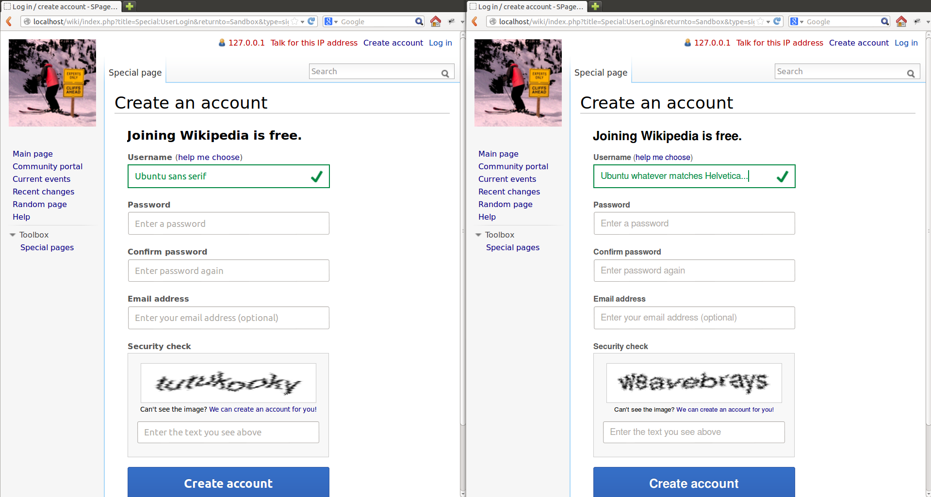
For some reason the account creation interface is using specified fonts, overriding the normal skin appearance instead of inheriting the normal fonts like everything else. It should not be doing this, as it results in an inconsistent interface on the site and gives users a less unified experience.

Now of course this probably seems like a complete non-issue to most folks, but arguing would be like trying to explain why intentionally opening security holes in a production server is still bad when chances are nobody will see it, or why blue and orange are pretty much the worst possible colours to use together with most anything, or why ankle-deep water all over the floor is bad.

You just don't do it.


Version: unspecified
Severity: normal

Details

Reference
bz44394

Event Timeline

bzimport raised the priority of this task from to Medium.Nov 22 2014, 1:14 AM
bzimport set Reference to bz44394.
bzimport added a subscriber: Unknown Object (MLST).

Sorry, that was unfair - the developer in me finds this entire thing ridiculous (seriously, fonts?) and expected everyone else to as well and I got all defensive especially after what happened with some other bugs.

Basically bugzilla makes me really bitter sometimes, and fonts generally shouldn't be specified in things like this, but at least the latter is a fairly easy fix.

swalling wrote:

I get the same feeling from Bugzilla sometimes. ;)

In any case, regardless of your tone or whatever, I'm sure Munaf would be happy to explain his design choice.

massaf wrote:

This seems to keep coming up. I may revert it simply to avoid further headaches. But regardless...

To your point about inconsistency: yes, this typeface is inconsistent with the rest of the site, and inconsistency is bad. We're testing out new styling. The new styling seemed to work, or at least it wasn't a hindrance (more people sign up to Wikipedia now). So, we're very slowly building a MW extension to apply this styling site wide which will hopefully eliminate the inconsistency. Ideally this would happen faster, but it's a 20% project for everyone and is harder than it sounds. But that was the end-goal, and it still is.

So we agree that the typeface is inconsistent and inconsistency is bad. Big blue buttons are also inconsistent. So is CSS3 font smoothing, big input fields, vertical input field labeling, pink tipsy errors, giant gray icons, properly aligned checkboxes, and big bolded headers in special pages. Should we change all of those back too?

What about the random sprinkling of Lucida Grande in our Search field? The fact that we use at least a dozen different font sizes throughout the site? That we seem to use monochromatic icons in some places and 3D icons in similar contexts? If I tried to list every easy-to-spot design inconsistency on Wikipedia I'd go over my character limit.

Sorry if this is sounding like a rant, but my points are:

  1. We're working, albeit slowly, on making things more consistent
  2. Wikipedia is designed inconsistently anyways, and in far worse ways
  3. This inconsistency is easier to spot for developers rather than users

By (3), I mean that Helvetica Neue is mostly present on Macs (now a meaningful part of our user base; no derision please). Depending on the browser, Helvetica is likely the default sans-serif on those machines and is quite similar to HN. HN just has a better range of font-weights, which leaves more options for type treatment in the future. On machines that don't have it, nothing changes at all. You'll mostly spot this if you're reading the code, not viewing the page. The premise of this bug masquerades as empathetic to users, but as it's stated it's mostly a bother for developers.

As to Steven's mention of my design rationale, here it is:

Simply put, it's widely accepted that Helvetica Neue reads better than the default sans-serif *on systems that have it*. This is an optimization for systems that have a resource; others are not affected. We're testing out design ideas on a small scale and spreading them across the site if they've been successful; this will lead to temporary inconsistencies, but we're trying to make those short. This account creation page was a success, so I suggest we continue using its patterns, including typography.

If it keeps coming up, perhaps that should be a sign that it is indeed a problem.

Existing inconsistency is not a reason to add further inconsistency; it should not be there at all. Until a new style is determined, the main styles should be maintained across everything - not just to give the users a better overall experience due to being less often confused, but also so it is feasible, once said new style is determined, to actually apply it.

I appreciated that the third e in e3 is experiments, but the account creation interface is no longer an experiment - it is currently deployed in full and should not be using experimental formatting without a demonstrated need.

That said, these experiments themselves are indeed precisely the place to be determining the most effective new styles for overall, but those styles should remain in the experiments. That they do not, and that many other products are also being deployed with mismatched styles is unfortunate, but it does not make any of this right. All it really does it make the sites more difficult for users to get used to using and more difficult for developers as well, not just those who will eventually be tasked with cleaning up the entire mess, but especially anyone currently creating new components, as there is simply no way to know what styles and existing infrastructure to use and thus they have that much more to deal with on top of everything they actually meant to be doing.

As for this specifically, if Helvetica and Arial are truly superior to the defaults (which in most cases should probably be Helvetica and Arial anyway if this is so), make the change in core. If you can make your case it should certainly be a trivial enough change.

massaf wrote:

(In reply to comment #4)

If it keeps coming up, perhaps that should be a sign that it is indeed a
problem.

...for developers who don't like seeing something different in their codebase. There is no merit to the claim that users are negatively affected by this for the reasons already given.

Existing inconsistency is not a reason to add further inconsistency; it
should not be there at all.

It's not a reason to add further inconsistency. This is a very selective target that doesn't visually impact users, and that there are far bigger fish to fry from a consistency standpoint.

maintained across everything - not just to give the users a better overall
experience due to being less often confused, but also so it is feasible, once
said new style is determined, to actually apply it.

The "main styles" aren't increasing signups to Wikipedia. If we're calling out the lack of consistency of this page with others, you have to look at all of the elements that are visually distinct, not just the typography (which, again, won't be visually distinct). Reverting all of the inconsistent elements on the page would invalidate the impact of the design.

I appreciated that the third e in e3 is experiments, but the account creation
interface is no longer an experiment - it is currently deployed in full and
should not be using experimental formatting without a demonstrated need.

The "demonstrated need" is that it works in its current state and deviating from that, even in a small way, might affect its impact.

All it really does it make the sites more difficult for users to get used to using

Again, it's not any different for users that have it.

those who will eventually be tasked with cleaning up the entire mess

Which is mostly me, and I'm fine with it.

As for this specifically, if Helvetica and Arial are truly superior to the
defaults (which in most cases should probably be Helvetica and Arial anyway
if this is so), make the change in core.

If we could, we would. Data is what makes the case. Gradually moving tested changes (with positive results) into an extension was the advised strategy by everyone involved in these design updates, so that's how we're doing it.

Okay, I'll put on my developer hat.

It's not a matter of seeing something different, it's a matter of dealing with it and working around it and having to fix it separately when everything else updates, and generally just having to worry about it at all. And we shouldn't have to worry about it or fix it separately. MediaWiki is modular and has various layers of abstraction precisely so we don't have to do that. This is, for instance, both what makes it skinnable and also what makes it work on multiple different database platforms. This is why we can make changes at all without everything breaking every time - because we need only make them in one place to affect everything, because folks wrote the layers to handle specific things and the other developers used those layers. This is why I can write an extension that supports postgres without ever having touched postgres in my life, and why WikiSource works in CologneBlue, and the Vector skin's search suggest was so easily moved into core.

But you go and ignore the platform, you're just breaking your code for everyone. This thing here, this isn't skinnable. It don't match the main skin now, but it may not even work in others, and when we get an update, what then? You'll fix it yourself? What if you've already left the project or been hit by a bus? What if you're still here but you don't recall what all needs changing or how it went together? Would you even have time anyway?

Use the damn platform, man, so it doesn't need that. If there's something wrong with the platform, fix it in the platform. Us designers, we go on about visual styles and design patterns and data and tests and usability, but this is still a bloody piece of software. Still need to code properly so it's bloody maintainable.

And yes, that's blowing things out of proportion. This is a bug about fonts. Fonts.

Seriously, though, I don't mean to be fighting you about this. You know your stuff and I know my stuff; they're just different stuffs. We should be putting these stuffs together to make some greater stuff, not using them to try to plough over each other's, but I'm not entirely sure how we'd start doing that.

But you can change core, really. Process is pretty simple - find bug, loudly say OY A BUG, see if anyone objects, and then fix it. Everybody benefits except for the people who don't, but that's about as good as it ever gets.

massaf wrote:

It's not a matter of seeing something different

Yes, it is. That's what matters here, especially since you initially cited user experience as the primary motivator for this bug and have suddenly changed that position to focus entirely on developer experience. Not to mention that you're ignoring the fact that there are dozens of new style choices in this page that are far more difficult to skin or revert, if that's really the concern we're discussing now.

But you go and ignore the platform, you're just breaking your code for
everyone.

Platform developers weren't ignored. There are four people working on Agora who are/have been aware of this, and even more who did a code review on the account creation page. I didn't unilaterally merge the change with a middle finger raised.

It don't match the main skin

Almost nothing on that page matches the main skin. That was the point.

You'll fix it yourself? What if you've already left the project or been hit
by a bus?

Fix *what* exactly? This is trivial to remove if needed and skins are trivial to update in terms of using a new font stack. Nobody who is actually working on this codebase seems to be worried about this particular line.

I don't mean to be fighting you about this.

Let's recap:

  1. A change that everyone thinks is trivial to revert if really needed
  2. A change that doesn't negatively impact user experience
  3. Consensus with affected developers indicating that this isn't an issue
  4. Many other changes in the same interface that fly against the skin completely and are far more difficult to revert, yet conveniently ignored in this bug

Conclusions?

But you can change core, really.

Again, the strategy of grouping Agora styles in an extension after they are proven by experiment was made alongside core skin developers.

Closing as WONTFIX.

I must say I share Isarra's resentment.

While this particular issue is not really an important one, the general point stands.

Basically *all* new interface-related things developed in last few months, not only by the E3 team, but in general - with the sole exception of Visual Editor - are awfully incompatible with current styles, current scripts, and in general other code. And what's worse, they're often awfully incompatible with any languages other than English, and any wikis other than English Wikipedia.

Some examples would be the edit area cleanup (which hardly works when you manually load the RL module on any other wiki), the page curation tools (which are in my opinion a result of some terrible misunderstanding, and which last time I looked had enwiki pieces hardcoded), the ULS and related fluff (which is incredibly badly behaved on any platforms save for the ones the devs use), all incarnations of AFT (let's not even comment on this one), and I could go on about this.

These things have to either go away if they are useless, or be merged into something more stable if they are useful - and by merged, I mean both the code being merged, and the styling and behavior being merged.

/rant
/offtopic

(In reply to comment #7)

It's not a matter of seeing something different

Yes, it is. That's what matters here, especially since you initially cited
user
experience as the primary motivator for this bug and have suddenly changed
that
position to focus entirely on developer experience.

Does it *have* to be users vs. developers?

It don't match the main skin

Almost nothing on that page matches the main skin. That was the point.

Breaking consistency for the sake of it? I mean...that does sound rather [[WP:POINT]]y and all.

You'll fix it yourself? What if you've already left the project or been hit
by a bus?

Fix *what* exactly? This is trivial to remove if needed and skins are trivial
to update in terms of using a new font stack. Nobody who is actually working
on
this codebase seems to be worried about this particular line.

Let me get this straight...

skins
trivial to update

Pick one, you can't have cake and eat it, too.

In the long run, considering the bus factor is a rather good idea. "Nobody who is actually working on this codebase" is awfully vague and teams, people and priorities are subject to change, sometimes on a very short notice, yes?

  1. Many other changes in the same interface that fly against the skin

completely and are far more difficult to revert, yet conveniently ignored in
this bug

Someone did something that wasn't so smart, and you should do the same just because they got to do so, too...reeeeeally?

Again, the strategy of grouping Agora styles in an extension after they are
proven by experiment was made alongside core skin developers.

Core skin developers? Who are those, out of curiosity? I know that Trevor (and Roan) worked on the Vector skin and MatmaRex has been doing some work towards porting Cologne Blue to this century, but besides them, skin system has been a rather esoteric area of the software, much like the Parser. Given that I have plenty of expertise in the field myself, I'm interested in knowing who I can poke should I ever encounter one of those hard-to-track-down-and-even-harder-to-fix skin bugs.

Closing as WONTFIX.

I don't think this is an appropriate resolution, as indicated by Isarra's and MatmaRex's comments, which are nevertheless partially unaddressed.

swalling wrote:

Closing as WONTFIX.

I don't think this is an appropriate resolution, as indicated by Isarra's and
MatmaRex's comments, which are nevertheless partially unaddressed.

MatmaRex's comments were not really about the specific font issue, even if they were insightful and correct. Playing tug of war with the state of the bug doesn't change the fact that Munaf, as the designer on the project, unequivocally articulated a comprehensive rationale for the choice, and why we're not going to change it in the short term. Patches for review are of course welcome.

This has obviously become really heated. I know for a fact that Munaf is working really hard (and successfully) to improve the UX. And neither E3 nor Munaf is responsible for e.g. ULS, so let's stay on topic.

However, I have a some of the same concerns.

Almost nothing on that page matches the main skin. That was the point.

I don't see a reason that it has to be outside the skin framework. Clearly, we want to provide a nice account creation UX for logged out users (i.e. the majority of Wikipedia readers and all self-service account creators). Given that:

a. Logged out users use the default skin.
b. The default skin is Vector on Wikipedia (and I believe all WMF wikis).
c. Self-service account creation is a core feature applicable to almost all MediaWiki wikis
d. We know these account creation styles work

I think it makes sense to put them core Vector (with perhaps pieces in core common where appropriate). This could happen at the same time we productize the HTML/PHP component.

(This if off-topic now, but I just want to answer.)

(In reply to comment #9)

(In reply to comment #7)

Again, the strategy of grouping Agora styles in an extension after they are
proven by experiment was made alongside core skin developers.

Core skin developers? Who are those, out of curiosity? I know that Trevor
(and
Roan) worked on the Vector skin and MatmaRex has been doing some work towards
porting Cologne Blue to this century, but besides them, skin system has been
a
rather esoteric area of the software, much like the Parser. Given that I have
plenty of expertise in the field myself, I'm interested in knowing who I can
poke should I ever encounter one of those
hard-to-track-down-and-even-harder-to-fix skin bugs.

I think the basically only person with intrinsic knowledge of the skin system right now is Dantman (Daniel Friesen), who I think rewrote a large part of it some time ago. I never talked with Trevor about it, though, but he's certainly busy with other projects right now and rarely available, say, on IRC.

I think I have a reasonably good understanding of how skinny things work after my Cologne Blue endeavor, but I wouldn't call it "knowledge". But basically, with docs at hand, I can solve problems well enough - feel free to poke me if you think I could help :)

I'm not sure why so much discussion is needed on this bug. It's an ancient design principle that Wikimedia wikis do not specify a default font. Wikimedia wikis specify sans-serif and leave it at that. Extensions that are deployed on Wikimedia wikis should follow this principle.

Not every ancient tradition needs to be upheld forever. It may be just sans-serif worked better with earlier adopters, who knew how to customize their browsers' fonts.

That said, I don't see any reason to go outside the skin system permanently for this one.

swalling wrote:

(In reply to comment #14)

Not every ancient tradition needs to be upheld forever.

Ssssssh. You may wake The Old Ones.

(In reply to comment #14)

Not every ancient tradition needs to be upheld forever. It may be just
sans-serif worked better with earlier adopters, who knew how to customize
their browsers' fonts.

Sure, and it may make sense to switch the default font in the future. But doing so should be part of a larger (single) test of changing the default font across the site. Changing the font as part of a number of other changes (multivariable testing) makes the site needlessly inconsistent and provides useless testing results.

Comment 3 of this bug is frustrating, as the suggestion that the font was related to an improved account creation experience is unproven and disputed and the deflection about how other inconsistencies exist in the user interface is mostly meaningless and irrelevant (to this bug and generally).

I'm gonna go ahead and mark this bug as "easy" and assign it to Isarra.

Adding some CCs.

The change itself is simple enough, but as there is still some tension regarding the matter, I'm not sure moving forward at this point would be the best idea.

So for now just bringing in some other perspectives: like Jack Phoneix, Dantman and Trevor have more than a little experience with skinning, which is certainly relevant, and as a designer, Brandon may be able to help settle matters as well, though being my boss and stuff he should probably be in the loop regardless.

As there also appear there may be general i18n issues, Siebrand should probably take a look too (mind, if this is the case that would be another bug, but it came up here).

Isarra, though it's a separate issue, we're well aware that it needs i18n. Steven decided we would do that at the same time as the main productization.

Matthew: I think the major i18n issue here is that it applies specific font styles that override local wiki choices - which is a problem for wikis that don't use Latin scripts.

Brandon, that's a good point. I was thinking of the messages.

I can see both sides.

Isarra: A single, very prominent, page looks dramatically different from the rest, and now our software is even more inconsistent.

Munaf: The status quo is not working, and the only way to get things done seems to be working on one page at a time.

I'm really glad we are experimenting. But there's almost a risk to being successful here, because the way you hack something together to research it's impact on user behavior is understandably different than the way it should be properly integrated into the software. But how do you convince you manager that although feature you hacked together is making a measurable positive impact on user behavior, you need more time and a few engineers to do it "properly".

Isarra is right, this change isn't really the kind of thing we want to see. This change, in time, will be proper cruft. It's the fate of all irregular one-off solutions, and we should be thankful that Isarra is here to fight the cruft.

However, if Munaf had written a patch that changed the default font of Vector to "Helvetica Nueu", he would be attacked - probably with at least a few speculative arguments that ring of "this is how it's always been done, stop changing stuff". What Munaf did is went out and proved that this design made a positive impact on user behavior.

The next step is hard, and he's probably not capable of pursuing this finding in a way that will make the developers happy all by himself. It's not fair that Munaf is taking the fall for this product being rushed into full production use. It's really the fault of an unknown (to me) manager, eager to make a difference - commendable, but misguided.

Bottom line:

This change was very vertical, it changed one page dramatically. Such changes are fast and easy to get in front of users because they are small and isolated. If the experiment is successful, it /should/ be applied horizontally (to all pages, possibly in less dramatic ways). This is really hard to do and requires a lot more effort - but it is what we have to do if we want to keep MediaWiki cruft-free while also improving it.

The next step:

Let's talk about how we can take elements of this design and apply them elsewhere. If the font is the problem, let's back that part out now that we are in production until we are sure this is the right font, and then let's use on all pages.

I've also started working on applying some extra classes to buttons[1][2]. If we have these classes on all buttons, a skin (or an extension while we are experimenting) can customize their appearance in safe way (CSS rules like "button, input[type=button] { ... }" are pretty evil). I don't have enough time for this work unfortunately, so maybe some other people could pick it up and run with it.

Overall, I hope to see vertical approaches be used for research, and horizontal approches being used in production.

[1] https://gerrit.wikimedia.org/r/#/c/29641/
[2] https://gerrit.wikimedia.org/r/#/c/29640/

Aiight, looks like there is mostly a consensus for this, so unless new objections arise in the next however long it takes me to find my harddrive, I'ma go ahead and submit a patch for this soon as I find my harddrive.

Gerrit Change I47e954e3, if that's how you link it.

Created attachment 11734
font comparison on stock Ubuntu

I have none of 'Helvetica Neue, Helvetica, Arial, sans-serif' available yet it still looks better IMO.

Attached:

2013-02-05_ACUX_font_comparison.png (1×1 px, 231 KB)

From Comment #3
"Simply put, it's widely accepted that Helvetica Neue reads better than the
default sans-serif *on systems that have it*."

And on some that don't. I don't have Helvetica Neue, Helvetica, or Arial on my Ubuntu system, and yet doggone if the page don't read better just trying to match Helvetica, see prior attachment. (According to fc-match, asking for "sans serif" results in "DejaVu Sans" "Book", while "Helvetica Neue, Helvetica, Arial, sans-serif" results in "Nimbus Sans L" "Regular").

(I'm only commenting on Munaf's statement, not on the disposition of this bug.)

(In reply to comment #25)

Created attachment 11734 [details]
font comparison on stock Ubuntu

I have none of 'Helvetica Neue, Helvetica, Arial, sans-serif' available yet
it
still looks better IMO.

Looks like the Ubuntu font might be the default sans-serif if I remember the look of the font right.
http://font.ubuntu.com/

In fact maybe something like this might be nice:
'"Helvetica Neue", Helvetica, Ubuntu, Arial, "Liberation Sans", FreeSans, sans-serif'

;) For fun why don't we throw Roboto somewhere in there?

Actually... yeah! In theory that should be available on Android devices and fit better than another sans-serif.

Attached:

2013-02-05_ACUX_font_comparison.png (1×1 px, 231 KB)

(In reply to comment #27)

My point was not that there are many other sans-serif fonts on devices, but that if you specify Helvetica many devices are smart enough to use something closer to it than whatever they use for sans-serif and/or their "branding" font.

Looks like the Ubuntu font might be the default sans-serif

No, as I wrote fontconfig uses "DejaVu Sans".

(In reply to comment #28)

(In reply to comment #27)

My point was not that there are many other sans-serif fonts on devices, but
that if you specify Helvetica many devices are smart enough to use something
closer to it than whatever they use for sans-serif and/or their "branding"
font.

You sure that it's actually because "Helvetica" is being specified? Doing something like that sounds like a violation of the css spec. Sounds more like you actually do have something calling itself Arial available, but it looks worse than the default sans-serif, as Arial itself may even.

I'm not sure how relevant Android is to this bug (maybe for tablets). I believe for phones it would generally use MobileFrontend.

(In reply to comment #24)

Gerrit Change I47e954e3, if that's how you link it.

Merged. Here's to hoping this depressing thread never shows up in my inbox again.

Munaf has put in a change ( https://gerrit.wikimedia.org/r/#/c/54682/ ) to reinstate the fonts. I think this is a better place to discuss the overall idea.

I am inclined to agree with Trevor's conclusion above, namely:

"Let's talk about how we can take elements of this design and apply them elsewhere. If the font is the problem, let's back that part out now that we are in production until we are sure this is the right font, and then let's use on all pages."

Now that Agora (which includes font changes) is almost in core, this is in sight (if not all pages, at least all Agora/mediawiki.ui).

swalling wrote:

(In reply to comment #32)

Munaf has put in a change ( https://gerrit.wikimedia.org/r/#/c/54682/ ) to
reinstate the fonts. I think this is a better place to discuss the overall
idea.

I am inclined to agree with Trevor's conclusion above, namely:

"Let's talk about how we can take elements of this design and apply them
elsewhere. If the font is the problem, let's back that part out now that we
are
in production until we are sure this is the right font, and then let's use on
all pages."

Now that Agora (which includes font changes) is almost in core, this is in
sight (if not all pages, at least all Agora/mediawiki.ui).

Yes, if we want to have a long term discussion about fonts, then Agora and how it's implemented in general should be the focus of the discussion.

In the short term, sticking with the design that was tested successfully is a change I support.

(In reply to comment #32)

Now that Agora (which includes font changes) is almost in core, this is in
sight (if not all pages, at least all Agora/mediawiki.ui).

Actually, it just happened. The change S Page and Munaf Assaf have been working on to move new account creation and user login to core (bug 44628) was merged (https://gerrit.wikimedia.org/r/#/c/30637/) today.

Among other things, this adds reusable fonts to resources/mediawiki.ui/mediawiki.ui.vector.css, which is in the mediawiki.ui module (it uses skinStyles to specify that file applies to Vector).

There are still font-family overrides in resources/mediawiki.special/mediawiki.special.createaccount.agora.css, resources/mediawiki.special/mediawiki.special.forms.agora.css:, and resources/mediawiki.special/mediawiki.special.userlogin.agora.css.

Munaf, S, do you know if these are necessary in addition to mediawiki.ui?

swalling wrote:

(In reply to comment #34)

(In reply to comment #32)

Now that Agora (which includes font changes) is almost in core, this is in
sight (if not all pages, at least all Agora/mediawiki.ui).

Actually, it just happened. The change S Page and Munaf Assaf have been
working on to move new account creation and user login to core (bug 44628)
was
merged (https://gerrit.wikimedia.org/r/#/c/30637/) today.

Just "sort of" happened. It doesn't do anything for now unless you opt in to it, even for signup and login.

(In reply to comment #32)

Munaf has put in a change ( https://gerrit.wikimedia.org/r/#/c/54682/ ) to
reinstate the fonts. I think this is a better place to discuss the overall
idea.

As I commented on Gerrit change 54682, I don't understand where Lucida Grande is coming from. I'm re-opening this bug for now, as according to Munaf's commit message, this bug is not properly fixed.

For right now, we should be specifying sans-serif and nothing else in all Wikimedia-deployed extensions and in MediaWiki core. If we want to change the interface font in the future, we can do so in a consistent and much less haphazard way.

I just submitted a revert for review. The code is absolutely unacceptable. Details: I00d72fe1.

Changes Icf3d3fbab and Ie9480912d make the activation of ACUX contingent on $wgGrownUpBehavior being true, because it is only possible to to make progress on Wikipedia's interface when people treat each other with respect and kindness. It is currently set to false, based on a survey of the way most participants in this bug (and related changes) have conducted themselves.

I am happy to report that Munaf, Isarra and MatmaRex are now in agreement: ACUX fonts are the most monumental issue affecting MediaWiki at the moment, and we should fight to the death to ensure its resolution conforms to our views.

Perhaps scientists of the future will be able to explain why this bug is a bermuda triangle of good faith; perhaps it is a consequence of some occult numerological significance of the number, 44394.

Also reclosing this because as far as I can tell this bug, at least, was resolved in the extension - the related continuing issues/arguments/reviews should now regard core, other extensiony things, etc.

This was never actually completely fixed. As I said above, I understand why Munaf et al wanted to use better fonts. But I do still think we should roll out the font more broadly in Vector.

Right now it's used in a few places in mediawiki.ui (mw-ui-vform, mw-ui-input, mw-ui-container, etc.)

There are a couple options:

  1. Make it the default Vector font.
  2. Add some kind of class that controls it.

As Trevor said, if it's a good font stack (which we think it is), the goal should be roll it out on all pages.

Wow, this is a long thread about fonts.

my recommendation

change default font to "Helvetica Neue, Helvetica, Arial, San-serif"

that said there will be a few instances where specific fonts will likely need to be displayed.

e.g. Main CTA buttons will use Helvetica Neue Bold, which is a separate typeface than Helvetica Neue with a bold weight applied by the browser (please never do this). However I would hope that switching between a multiple fonts within a family would happen in a programatic way site-wide and not on a page by page basis.

Hope I didn't miss anything important.

(In reply to comment #42)

change default font to "Helvetica Neue, Helvetica, Arial, San-serif"

Meaning Vector's default font, right?

that said there will be a few instances where specific fonts will likely need
to be displayed.

Agreed, another example: The Georgia numbers on the signup page are eye-catching and distinctive (I think intentionally).

However I would hope that switching between a multiple fonts
within a family would happen in a programatic way site-wide and not on a page
by page basis.

Agreed.

FYI: as I suspected, the Lucida Grande showing up is NOT coming from Mediawiki core. You can see this by looking at enwiki and mw.org (and meta, and and). You'll note that the "Search" text in the searchbox is Lucida Grande on enwiki *only*.

This leads me to believe that there is a rule happening someplace (common.css?) that is overriding and bleeding through in places. The screenshots of Lucida Grande showing up in forms when it shouldn't is likely the result of a *different*, enwiki-only bug.

I tried finding the rule that applied the font change on enwiki but couldn't.

Created attachment 12473
Font comparisons, three browsers, two sites

Attach font comparisons - screenshots of the searchbox in meta and enwiki, in Opera, Chrome, and Firefox.

Attached:

fontcomparisons.png (261×381 px, 17 KB)

I replied re Lucida at bug 46437, since it's more appropriate there. It's not related to Helvetica/Arial, account creation or Agora.

Simply put, it's widely accepted that Helvetica Neue reads better than the
default sans-serif *on systems that have it*.

Citation needed. I've always heard that Verdana is the most legible sans-serif font as it was specifically designed for optimum online legibility, especially at small sizes. Personally I find Helvetica Neue to have overly tight kerning at smaller sizes, which is a common problem with sans-serif fonts. Regardless, I agree that changing the font on one page looks bad and will ultimately end up as cruft. Personally, I would support removing the font-declaration on the log in page and having a bigger discussion about site typography instead.

swalling wrote:

(In reply to comment #47)

Simply put, it's widely accepted that Helvetica Neue reads better than the
default sans-serif *on systems that have it*.

Citation needed. I've always heard that Verdana is the most legible
sans-serif
font as it was specifically designed for optimum online legibility,
especially
at small sizes. Personally I find Helvetica Neue to have overly tight kerning
at smaller sizes, which is a common problem with sans-serif fonts.
Regardless,
I agree that changing the font on one page looks bad and will ultimately end
up
as cruft. Personally, I would support removing the font-declaration on the
log
in page and having a bigger discussion about site typography instead.

Note that while login and account creation are the most visible places this font stack is applied right now, it's actually coming from resources being used by several extensions and interfaces so far, including guided tours, Getting Started, and so on. So this isn't really a matter of font usage in one interface, but rather how we want the mediawiki.ui standard to look and feel. In the short term, we won't be removing form styles that we tested successfully with thousands of new users successfully, certainly not based on a Bugzilla thread based on personal opinions and hunches, like your comments about Verdana.

So you guys A/B tested the font specifically?

swalling wrote:

(In reply to comment #49)

So you guys A/B tested the font specifically?

No. But if your theory is that Helvetica Neue is a terrible typeface that isn't readable, the testing results overall don't really support that assertion. If users couldn't read the forms or found it annoyingly different, how did we manage to get statistically significant increases in new registrations?

The testing also does not support your assertion that the font had anything to do with it. At it shows is that there was an overall improvement; without specific testing of the font, for all we know said font does make it worse and the rest simply more than makes up for it.

Personally I don't expect it'd really change much one way or another in practice here; it just looks bad and the inconsistency makes it seem unprofessional.

Also I'd like to second everything Kaldari said.

(In reply to comment #50)

(In reply to comment #49)

So you guys A/B tested the font specifically?

No. But if your theory is that Helvetica Neue is a terrible typeface that
isn't readable, the testing results overall don't really support that
assertion. If users couldn't read the forms or found it annoyingly different,
how did we manage to get statistically significant increases in new
registrations?

This is a fallacy, but you already knew that when you posted this comment. Both this comment and comment 48 come off as hyper-combative, which isn't really an acceptable tone with volunteers, but somehow seems even more unacceptable when directed at a professional colleague. There are legitimate points being raised about, for example, kerning at small sizes. Let's try to focus on those.

(In reply to comment #48)

Note that while login and account creation are the most visible places this
font stack is applied right now, it's actually coming from resources being
used by several extensions and interfaces so far, including guided tours,
Getting Started, and so on. So this isn't really a matter of font usage in
one interface, but rather how we want the mediawiki.ui standard to look and
feel.

It'd be hyperbolic for me to call this line of reasoning dishonest, but it certainly enters a grey area. GuidedTours, GettingStarted, the redesigned login form, and resources/mediawiki.ui were all introduced by you and your team. If other extensions and interfaces (outside of E3) are using this font stack, that would be an interesting data point to discuss. As it is, saying that you and your team have consistently introduced this font stack (making the overall user interface more inconsistent) doesn't feel like a very strong argument.

I think everyone here (Ryan K., me, Matt F., et al.) is agreed that the path forward is to holistically look at updating the font stack for the Vector skin. For now, this font stack should be removed in core and in any extensions as there isn't any consensus about what beyond sans-serif should be included.

swalling wrote:

(In reply to comment #53)

(In reply to comment #50)

(In reply to comment #49)

So you guys A/B tested the font specifically?

No. But if your theory is that Helvetica Neue is a terrible typeface that
isn't readable, the testing results overall don't really support that
assertion. If users couldn't read the forms or found it annoyingly different,
how did we manage to get statistically significant increases in new
registrations?

This is a fallacy, but you already knew that when you posted this comment.
Both
this comment and comment 48 come off as hyper-combative, which isn't really
an
acceptable tone with volunteers, but somehow seems even more unacceptable
when
directed at a professional colleague. There are legitimate points being
raised
about, for example, kerning at small sizes. Let's try to focus on those.

(In reply to comment #48)

Note that while login and account creation are the most visible places this
font stack is applied right now, it's actually coming from resources being
used by several extensions and interfaces so far, including guided tours,
Getting Started, and so on. So this isn't really a matter of font usage in
one interface, but rather how we want the mediawiki.ui standard to look and
feel.

It'd be hyperbolic for me to call this line of reasoning dishonest, but it
certainly enters a grey area. GuidedTours, GettingStarted, the redesigned
login
form, and resources/mediawiki.ui were all introduced by you and your team. If
other extensions and interfaces (outside of E3) are using this font stack,
that
would be an interesting data point to discuss. As it is, saying that you and
your team have consistently introduced this font stack (making the overall
user
interface more inconsistent) doesn't feel like a very strong argument.

I think everyone here (Ryan K., me, Matt F., et al.) is agreed that the path
forward is to holistically look at updating the font stack for the Vector
skin.
For now, this font stack should be removed in core and in any extensions as
there isn't any consensus about what beyond sans-serif should be included.

Change 78408 had a related patch set uploaded by Matmarex:
Remove inconsistent font-family declarations

https://gerrit.wikimedia.org/r/78408

There has been discussion (including by me) of rolling out this new font stack to all Vector (or all Vector forms). But I'm not convinced it makes sense to remove it from account creation and login in the mean time.

(In reply to comment #56)

But I'm not convinced it makes sense to remove it from account creation and
login in the mean time.

Same goes for the other places the patch affects.

swalling wrote:

(In reply to comment #56)

There has been discussion (including by me) of rolling out this new font
stack
to all Vector (or all Vector forms). But I'm not convinced it makes sense to
remove it from account creation and login in the mean time.

Agreed. There is a draft by Jon Robson tackling this very issue. There is no reason to remove the declarations before that discussion concludes.

I think MatmaRex's patch should be merged.

It seems that everyone involved in this thread agrees that using one set
of typefaces in two isolated cases and another set of typefaces in all
other interfaces is inconsistent, and that inconsistent interfaces are
bad. So what we're debating is whether there are other factors that
recommend the font change that are significant enough to trump the cost of
the inconsistency. There were several arguments to that effect in this
thread. I'll treat each in turn.

(I took the liberty to mix and match quotes from different
individuals without attribution below.)

  1. It's just temporary.

We're working, albeit slowly, on making things more consistent

We're testing out design ideas on a small scale and spreading them
across the site if they've been successful; this will lead to temporary
inconsistencies, but we're trying to make those short.

This was posted in 2013-01-27. Although the changes have moved from an
extension to core, the use of Helvetica Neue in core is still confined to
post-edit feedback and the account creation / login forms. There are plans
to expand it further, but I think we have to acknowledge that we haven't
made substantial progress here over the past seven months. We can't
credibly argue that the inconsistencies are temporary / transitional.

  1. There are bigger fish to fry.

Wikipedia is designed inconsistently anyways, and in far worse ways
there are far bigger fish to fry from a consistency standpoint.

Even if the assertion is true, it fails to explain why additional
inconsistencies should be tolerated. This is an appeal to hypocrisy
(http://en.wikipedia.org/wiki/Tu_quoque), a kind of logical fallacy.

  1. It's not as bad as you make it sound.

This inconsistency is easier to spot for developers rather than users
Depending on the browser, Helvetica is likely the default sans-serif on

those machines and is quite similar to HN.

I researched typespace consistency a little because I wanted to have an
informed position on this bug. The sources I found argued that, if anything,
using font-faces that are very similar to one another is *especially* bad:

"There's nothing wrong with having two pieces of text look the same,
only something wrong with two pieces of text that *almost* look alike but
are different enough to be distracting."
(https://tinyurl.com/typography-dos-and-donts)

Ultimately, I think that this isn't a valid argument, either. What it's
really saying is "it's not nearly as bad as you're making it sound".
Even if true, so what? It doesn't make a case for the font change.

  1. It's just better.

Simply put, it's widely accepted that Helvetica Neue reads better than
the default sans-serif *on systems that have it*.

This could have been a valid argument if we supplied some evidence to
subtantiate the claim, but we haven't.

Ryan Kaldari denied that Helvetica Neue reads better and went on to
identify specific issues. His preferences may ultimately be subjective,
but they are clearly well-considered, and they raise the standard of
evidence that would be needed to decide the argument in favor of Helvetica
Neue.

  1. It's what we tested.

It works in its current state and deviating from that, even in a small
way, might affect its impact.

In the short term, sticking with the design that was tested successfully
is a change I support.

We've already deviated from the designs we tested in other minor ways. If
it is indeed the case that even small changes mean that all bets are off,
than all bets are already off. In other words, if the results we got from
ACUX support only the redesign *exactly* as we tested it, then the current
design is not supported by the experiment.

I reject the premise of this argument, by the way. I think it's dishonest.
Our working mental model of usability is that the login and account
creation interfaces would be improved by being made more welcoming and
less cluttered, and I attribute the positive result to our adherence to
these broad principles rather than to minute particulars. I think the
flexible approach that we took as a team when moving this redesign into
core suggests that this belief is shared by the rest of the team.

So, how do we go forward from here?

I think we should start by merging MatmaRex's patch. We've let this drag
on long enough and we've run out of excuses. By allowing this to fester
we've both undermined trust in our work and soured relationships that
could be pleasant and productive. Let's move on, really.

Second, like all of you, I propose that we continue to think about how we
could effect horizontal improvement of typefaces. The bits and pieces of
design advice that I read tonight were unanimous in recommending explicit
& specific typography over browser defaults. We shouldn't scorn MediaWiki
design conventions, but it's 2013, the web has changed, and what was
reasonable a decade ago is not necessarily reasonable today.

(In reply to comment #59)

There are plans to expand it further, but I think we have to acknowledge that
we haven't made substantial progress here over the past seven months. We can't
credibly argue that the inconsistencies are temporary / transitional.

[...]

I think we should start by merging MatmaRex's patch. We've let this drag
on long enough and we've run out of excuses. By allowing this to fester
we've both undermined trust in our work and soured relationships that
could be pleasant and productive. Let's move on, really.

That is choosing one direction, which is "Don't specify a stack". It's a good-faith one. It would also make sense if we're (particularly the design and UX teams) not willing to put in the work to finalize a global stack.

The bits and pieces of design advice that I read tonight were unanimous in
recommending explicit & specific typography over browser defaults. We
shouldn't scorn MediaWiki design conventions, but it's 2013, the web has
changed, and what was reasonable a decade ago is not necessarily reasonable today.

However, as you note here, specifying a stack is the clear trend. Taking that general trend (as well as the opinions of the design team here) into account, specifying a global Vector stack currently seems like the better direction.

There is a proposal for such a stack at https://www.mediawiki.org/wiki/Wikimedia_Foundation_Design/Typography . I think the body one (essentially the stack in question at this bug) is close to being ready for the prime time. Ori presents a fair point (on IRC), that we should do a final review of the trade-offs, check our work, and make adjustments to the stack if needed.

I will email the design list to point to this bug.

swalling wrote:

(In reply to comment #60)

(In reply to comment #59)

There are plans to expand it further, but I think we have to acknowledge that
we haven't made substantial progress here over the past seven months. We can't
credibly argue that the inconsistencies are temporary / transitional.

[...]

I think we should start by merging MatmaRex's patch. We've let this drag
on long enough and we've run out of excuses. By allowing this to fester
we've both undermined trust in our work and soured relationships that
could be pleasant and productive. Let's move on, really.

That is choosing one direction, which is "Don't specify a stack". It's a
good-faith one. It would also make sense if we're (particularly the design
and
UX teams) not willing to put in the work to finalize a global stack.

The bits and pieces of design advice that I read tonight were unanimous in
recommending explicit & specific typography over browser defaults. We
shouldn't scorn MediaWiki design conventions, but it's 2013, the web has
changed, and what was reasonable a decade ago is not necessarily reasonable today.

However, as you note here, specifying a stack is the clear trend. Taking
that
general trend (as well as the opinions of the design team here) into account,
specifying a global Vector stack currently seems like the better direction.

There is a proposal for such a stack at
https://www.mediawiki.org/wiki/Wikimedia_Foundation_Design/Typography . I
think the body one (essentially the stack in question at this bug) is close
to
being ready for the prime time. Ori presents a fair point (on IRC), that we
should do a final review of the trade-offs, check our work, and make
adjustments to the stack if needed.

I will email the design list to point to this bug.

Matt's comments echo my feelings precisely.

Rolling back to the prior default is the easy thing to do. Making consistent change in the font stack is hard and takes time. The current limbo is inconsistent and messy, but personally I don't think the universe has exploded because of it.

The design team and others are working on an implementation of a new Vector font stack (described in the page Matt linked to, patch forthcoming). What I want is to support that as an answer to the current inconsistency, but it's not going to happen overnight. In the meantime, if Ori or someone with +2 in core thinks it's not reasonable to request that we wait on that as a way forward, they can feel free to merge Matma's patch over my objections. No hard feelings.

(In reply to comment #61)

Rolling back to the prior default is the easy thing to do. Making consistent
change in the font stack is hard and takes time. The current limbo is
inconsistent and messy, but personally I don't think the universe has
exploded because of it.

(In reply to comment #60)

That is choosing one direction, which is "Don't specify a stack". It's a
good-faith one. It would also make sense if we're (particularly the design
and UX teams) not willing to put in the work to finalize a global stack.

The link between this issue and any current effort to specify a font stack for Vector is really quite thin, and it's only politics that makes us pretend otherwise. You've hitched this issue to Jon's patch as a way of framing the current inconsistency as being part of a gradual roll-out, but it isn't: it's just some incomplete work that we left laying around.

It is important to note that there is no future in which it is desirable to specify a font stack for the edit confirmation or login / sign-up interfaces. If by chance we choose this exact stack as the Vector default (which would be surprising, since we've done so little legwork to establish that the fallbacks are optimal), we'd remove the current definitions, since they'd simply be duplicating what is declared at a broader scope. This makes the resistance to change I01eec7285 confounding to me: is it motivated purely by a dislike of having been wrong? Would this be easier to accept if we changed the commit message headline to "Remove interface-specific font declarations to clear path for a site-wide font stack"?

I don't understand how we can ask users to let go of old interface cruft that they've gotten used to if we're not prepared to do it ourselves.

In an effort to move this along, I've created a page that lets you flip between the current login interface (with Helvetica Neue) and the login interface as it would appear after removing the font declarations. The screenshots were captured on a Mac with Helvetica Neue installed.

http://noc.wikimedia.org/~olivneh/bugs/44394.html

I'd rather not merge patches over anybody's objections, so please let's just come to an agreement here.

(In reply to comment #62)

You've hitched this issue to Jon's patch as a way of framing the
current inconsistency as being part of a gradual roll-out, but it isn't: it's
just some incomplete work that we left laying around.

I didn't even know Jon's patch was in Gerrit (or if I did, I forgot), when I wrote that comment. That's why I didn't mention it.

I agree it's inconsistent/incomplete/whatever you want to call it. The question is where we go from here.

This makes the resistance to change I01eec7285 confounding to me: is it
motivated purely by a dislike of having been wrong?

Since we're talking about fallacies, can you try to avoid ad hominem?

You still haven't explained why this is such an *urgent* problem with the site that we can't change it as part of a switch to a global Vector font stack, even though that's in progress.

If it becomes clear the global font stack push has stalled, I will be glad to reconsider in a while.

Would this be easier to

accept if we changed the commit message headline to "Remove interface-
specific font declarations to clear path
for a site-wide font stack"?

No, the point is that if we're doing a global font stack, and it seems we are, that should be one unit of work.

I don't understand how we can ask users to let go of old interface cruft that
they've gotten used to if we're not prepared to do it ourselves.

You are essentially asking to flip the font twice for users, even if we do choose to use the same (or close enough) stack, and even if the global stack comes out quite soon.

Jon's patch for a broad Vector font change is https://gerrit.wikimedia.org/r/#/c/79948 . It is still experimental.

Since fonts are being discussed from the very ground I think we should bring back the discussion about using only free fonts, just like we use only free content and free graphics for Wikimedia projects. See http://www.mediawiki.org/wiki/Talk:Wikimedia_Foundation_Design/Typography#Arial.3F_18136

Should I open a bug report about "Don't specify proprietary fonts in MediaWiki core and Wikimedia projects" to discuss this further?

We have free fonts in the font stack, as well as OS specific/proprietary fonts.

(In reply to comment #65)

Since fonts are being discussed from the very ground I think we should bring
back the discussion about using only free fonts, just like we use only free
content and free graphics for Wikimedia projects. See
http://www.mediawiki.org/wiki/Talk:Wikimedia_Foundation_Design/
Typography#Arial.3F_18136

We should only use free *web fonts*, since those are actually downloaded to the user's machine, and we don't distribute proprietary software.

But a CSS font specification does not download anything, it just specifies some names. The font matcher (e.g. http://linux.die.net/man/1/fc-match or some similar tool or wrapper thereof) then decides which installed font to use. This is more analogous to how we support the proprietary IE browser, but do not actually distribute it.

So I think using a mixture is okay in this case.

Change 78408 merged by jenkins-bot:
Remove inconsistent font-family declarations

https://gerrit.wikimedia.org/r/78408

Good friend for Jimbo sake forbear
To dig the dust enclosed here!
Blest be the man that spares these fonts,
And curst be he that eats croissants.

Change 79948 had a related patch set uploaded by Krinkle:
Beta: Apply mobile typography lessons to Vector on desktop

https://gerrit.wikimedia.org/r/79948

Change 79948 had a related patch set uploaded by Jdlrobson:
Vector: New beta module with new typography styles

https://gerrit.wikimedia.org/r/79948

Closing back after bot's reopening of this per Jdlrobson's patch (which seems only vaguely related).