Page MenuHomePhabricator

Consolidate personal portlet links into collapsed control or dropdown (tracking)
Closed, DeclinedPublic

Description

Author: massaf
Description:
Dropdown containing user tools links in page header

We're currently overloading our page headers with user tools links and that's making it difficult to use that space for important links and notices (such as a link back to the Getting Started special page).

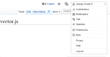
I've built a simple mockup* (see attachment) to illustrate the idea. I'm sure this has been thought of before, but I think it's time to finally execute on it, or at least re-open this for discussion. It's currently styled under the assumption that we're reusing the Guiders extension to display popovers, but I'm open to changing it to look like a more traditional dropdown menu.

Pros:

  • Frees up some much needed screen real-estate for important links
  • Makes user tools more scannable
  • Makes things look nicer on small resolutions.

Cons:

  • Potential loss of feature discoverability
  • Information architecture not optimal; perhaps things like watchlist shouldn't be grouped with the user's talk page
  • _________________ (fill in the blanks)

URL: https://www.mediawiki.org/wiki/Compact_Personal_Bar


Stalled see T46448#1021480 for details
Details

Reference
bz44448

Related Objects

StatusSubtypeAssignedTask
DeclinedFeatureNone
DeclinedNone
DeclinedNone
DuplicateNone
DeclinedCatrope
DeclinedNone
ResolvedNone
DeclinedNone
DeclinedNone
ResolvedPhoenix303
ResolvedAnomie
Resolved Springle
ResolvedNone
DeclinedNone
OpenNone
DeclinedNone
ResolvedNone
DeclinedNone
ResolvedNone
DeclinedNone
DeclinedNone
DeclinedNone
DeclinedNone
OpenNone
DeclinedNone
DeclinedNone

Event Timeline

There are a very large number of changes, so older changes are hidden. Show Older Changes

I'm going to take this bug and assign it to myself for now.

We need to have a product discussion about this in a larger sense and until that happens we shouldn't implement this.

I'll set up a meeting.

A consideration of who the interface is meant to serve would also be a good idea at this stage, I think. As it is, it feels like Monobook has become the skin of choice for editors (who need easier access to the watchlist and contributions links), while Vector has become the skin of choice for readers (mostly as it's the default).

MZMcBride, I'm not sure that's the case (Monobook vs. Vector). However, it should be relatively easy to study from the database (correlate skin use and active editing).

Though we don't currently have data either way, I don't think this proposed change would make Vector worse for editors. There's a potential case that it makes it better by making things like Watchlist and Contributions that are too far right more accessible.

If and when something is added to the upper right (e.g. Echo), we might want to consider placing this menu the left, which would move it (and thus the key features like Watchlist within) closer to the center of the screen.

The original vector design included grouping the user tools into a hover-to-open menu, but it got cut due to some negative feedback early on. I'm glad to see this is getting some attention now, because I've always felt it was a great way to reduce clutter - but at the same time I'm aware that it can be done wrong, and we need get it right because it's a very visible and frequently used feature.

I believe we should do the following:

  1. Run click-tracking (in monobook and vector) on the personal tools links and get a feel for how they are used and by who. If people who edit a lot use some of them frequently (as MZ has suggested) it will easy to confirm in the data.
  2. Use the data we get, combined with some hallway user testing and our own brains to split the items into two levels of frequency of use.
  3. Tuck the less-used items into a menu, leave the more frequently used items where they are.
  4. Experiment with using icons for the most important items that aren't in the menu (a gear for preferences, a speech bubble or circle with number in it for notifications, etc.)
  5. Consider bringing the search to the top line, rather than the 2nd line (making more room for tabs)

Created attachment 11711
Apex Skin (concept)

Here's an example of a skin design which uses a combination of a menu and top-level items in place of the personal tools.

attachment Apex.png ignored as obsolete

Created attachment 11712
Helix Skin (concept)

Here's another example of a skin design which uses a combination of a menu and top-level items in place of the personal tools.

attachment Helix.jpg ignored as obsolete

I don't think we need to bother goofing with monobook, tbh.

My primary concern about this change is the discoverability of "Watchlist" and "Talk" for new users and making sure that we're aligned with the plans regarding Echo and Flow.

Given that we would have to go out of our way to exclude monobook from the stats, I think it's probably worth just getting those too, if only to put to rest any debate over whether the "real" editors have incompatible usage patterns (because if we only look at vector, it's easy to say we excluded people from the survey).

Oh! I didn't mean "not do the lookup on the stats" for monobook (and I quite agree with you re: "real" editors). I was saying that when/if we develop this, we probably don't need to do it for monobook.

I agree this bug should be limited to Vector. Someone can definitely propose doing it for Monobook separately, but that's a different matter.

I've emailed the analytics list regarding the statistical correlation (skin v. active editor).

I'm not that worried about exposing Talk, since recipients will get a user talk notification (or later Echo). And they can still get to it at other times through User/Profile -> Talk

I've made this investigation official: https://gist.github.com/milimetric/5262726
I know some people might want to see this in gerrit, you're welcome to move it in there. It's just early in the morning and nobody's here to answer where it would go.

Ok, I've got a candidate solution. The fix to the query was the one I mentioned months ago but forgot about :) Step by step analysis:

https://gist.github.com/milimetric/5262726

And results:

/*
+-------------+------------+

skinskin_users

+-------------+------------+

2525
032
chick21
cologneblue104
default26582
modern329
monobook2810
myskin8
nostalgia15
simple21
standard98
vector74

+-------------+------------+
*/

What are the empty 2525 at the top, more default/vector? It would be useful to coalesce all the vectors (default/vector/empty?) together for easier readability.

It sounds like everyone's happy with the validity of the results, closing the bug. (Feel free to re-open if you find a problem, but maybe ping me first if you can find me)

Oh, and it sounds like the 2525 will be the same as 'default' - assigned 'vector'

err - 'default' is assigned 'monobook' and I'm really sorry, I was posting in the wrong bug. I have learned that bugzilla does not reward hurried responses - no way to delete. Very sorry everyone!

This work is planning and in progress as a desktop web beta feature you can read more about the beta features planning here http://www.mediawiki.org/wiki/Lab_experiments

Almost one year of silence, resetting assignments.

(In reply to Jared Zimmerman (WMF) from comment #28)

This work is planning and in progress as a desktop web beta feature you can
read more about the beta features planning here
http://www.mediawiki.org/wiki/Lab_experiments

Moving to extension requests accordingly.

The code for this is being written by Juliusz inside MobileFrontend but they don't like desktop-related bugs from making that messy; the idea however is that this would be merged into Vector core, so moving back.

I can't imagine this happening in core. Surely not in Vector.

swalling wrote:

(In reply to Nemo from comment #31)

I can't imagine this happening in core. Surely not in Vector.

The code by Juliusz is in VectorBeta extension, where it will likely remain as long as it's a Beta Feature. You can try it out now on Beta Labs (http://en.wikipedia.beta.wmflabs.org/).

swalling wrote:

(In reply to Steven Walling from comment #32)

(In reply to Nemo from comment #31)

I can't imagine this happening in core. Surely not in Vector.

The code by Juliusz is in VectorBeta extension, where it will likely remain
as long as it's a Beta Feature. You can try it out now on Beta Labs
(http://en.wikipedia.beta.wmflabs.org/).

Sorry, *should be in*

(In reply to Nemo from comment #31)

I can't imagine this happening in core. Surely not in Vector.

The limits of your imagination notwithstanding, the intent is to make changes for all users of all MediaWiki installs, so… yes.

(In reply to Jared Zimmerman (WMF) from comment #35)

Should we close this as a dupe of
https://bugzilla.wikimedia.org/show_bug.cgi?id=44448 since that is the
tracking bug for Compact Personal Bar (CPB)
https://www.mediawiki.org/wiki/Compact_Personal_Bar

I assume you mean bug 64321, not bug 44448.

(In reply to Jared Zimmerman (WMF) from comment #35)

Should we close this as a dupe of
https://bugzilla.wikimedia.org/show_bug.cgi?id=44448 since that is the
tracking bug for Compact Personal Bar (CPB)
https://www.mediawiki.org/wiki/Compact_Personal_Bar

I assume you mean bug 64321, not bug 44448.

Bug 64321 is not the tracking bug for that feature.

(In reply to comment #38)

(Sorry about the duplicate comment. This quirk is being discussed tangentially at bug 64864.)

Is there a list of tasks considered hard blockers of the graduation of the Compact Personal Bar? Or is there a plan to start trying wider adoption in some wikis willing to become early adopters? I'm just forwarding a question of a user in ca.wiki, being curious myself as a happy user of this beta.

I would say most of this list of blockers is required to close before we'd graduate compact personal bar, however, we may end of taking much of the learning and apply it elsewhere rather than making any changes to Vector.

Jaredzimmerman-WMF renamed this task from Consolidate personal portlet links into collapsed control or dropdown to Consolidate personal portlet links into collapsed control or dropdown (tracking task).Dec 23 2014, 12:15 AM
Jaredzimmerman-WMF updated the task description. (Show Details)
Krinkle renamed this task from Consolidate personal portlet links into collapsed control or dropdown (tracking task) to Consolidate personal portlet links into collapsed control or dropdown (tracking).Jan 9 2015, 2:30 AM
Jaredzimmerman-WMF lowered the priority of this task from Medium to Low.Jan 16 2015, 6:45 PM
Jaredzimmerman-WMF lowered the priority of this task from Low to Lowest.

Note: The CPB betafeature has been disabled on all wikis, per T86831. If I understand correctly, it was disabled because it was breaking the language selector at various wikis (see T85541 for details), and there were no developer resources available to fix that, or the numerous other blocker tasks listed in this tracking task, that are needed before it can/could move forward to graduate from a betafeature.

Users who wish to re-enable it for themselves, via their user.js, can do so by following the instructions in this comment.

Onwiki discussion is at https://www.mediawiki.org/wiki/Topic:Sa0b3ys2vr6ihen8

Quiddity changed the task status from Open to Stalled.Feb 6 2015, 9:20 PM
Quiddity updated the task description. (Show Details)

From my reply on our internal mailing list:

I am wondering who maintains the extension nowadays and whether we should:

A) shoot the extension / undeploy it
B) fix the bug, enable the code

I am not a huge fan of code bitrotting and only being used as a corner case. That is a maintenance burden.

Please do not undeploy CPB. It was one of the few recent usability improvements, and it's still being loaded by many users.

I understand, please be patient with me. I know it must be very annoying to all you pro editors. This is my first time editing and it must be frustrating to clean up after me. I will try to learn as fast as I can I am trying to be creative I would be very created if I knew what I was doing please be patient with me and if you can help me, I will try to be as officiant as I possible you can I. I would like to make this site very unique. I would like to request to use my real name it's already out there now. If not I get it but I did go through this for four years and just doesn't make sense to use a coding when I'm already uncensored. And I did accomplish a big thing by hacking the hackers and it would be nice to get the credit for it. But it's up to you. I had my oncology appointment today and physical therapy yesterday I should be back in the game tomorrow. Thank you you have any questions let me know and I will try to do what you've asked do you have a book or is there a size that by Stepway to do what you're asking if you could give me some guidance that would be very helpful. Thank you

Please do not undeploy CPB.

In my understanding, the "Compact Personal Bar" code is part of the VectorBeta extension codebase and the extension itself won't get undeployed (though the CPB code might get removed?), as the CPB feature has been unavailable since January 2015 already: https://gerrit.wikimedia.org/r/#/c/185116/

the CPB feature has been unavailable since January 2015 already

Yes and no, see https://meta.wikimedia.org/w/index.php?title=Special%3ASearch&profile=advanced&search=skins.vector.compactPersonalBar&fulltext=1&ns2=1.
If it gets undeployed, I will host a copy on Tool Labs.

When will the personal bar come back?

When will the personal bar come back?

Compact Personal Bar is back!

https://tools.wmflabs.org/cpb/

@Ricordisamoa, that tool has a few bugs, look:

9qHAs2j.png (298×309 px, 6 KB)

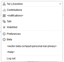
It's a screenshot taken on Meta-Wiki, but the same issue applies to any other wiki. 'Vector...', and 'help' link to pages with names beginning with <, and 'notifs' links to nothing.

When will the personal bar come back?

Compact Personal Bar is back!

https://tools.wmflabs.org/cpb/

Cheers! But I meant officially.

@Ricordisamoa, that tool has a few bugs

I just pushed a new version, be sure to refresh your cache to use it.

2016-2-27_cpb.png (396×760 px, 22 KB)

fwiw... seems to still have trouble with assimilating the active language/ULS bit(s) and that was one of the previous incarnation's deal breakers.

And why are the watchlist and talkpage links [repeated] outside the fly-out? If anything that is where the notification counters for alerts and messages should go (imho).

fwiw... seems to still have trouble with assimilating the active language/ULS bit(s) and that was one of the previous incarnation's deal breakers.

Do you think that after a piece of code has been abandoned, bugs just fix themselves? :-P

And why are the watchlist and talkpage links [repeated] outside the fly-out?

That's how the original version worked (more or less...)

Do you think that after a piece of code has been abandoned, bugs just fix themselves? :-P

Oh sorry. I got the impression it was refined at least a little since the last 'official' revisions removal.

That's how the original version worked (more or less...)

Blech. I though the whole point was to keep the total width as small as possible while still being functional. To me; that means the only things outside of the fly out should be the alert and message notifications (which have been updated to use OOUI since that snapshot was taken as well).

The whole background-image/icon thing cracks me up too - so much easier to call upon FontAwesome for the same results [if not better].

I got the impression it was refined at least a little since the last 'official' revisions removal.

I spent a few hours to make it work, that's all. To seriously fix it, we should get in touch with someone at WMF who is willing to revive VectorBeta :-)