Page MenuHomePhabricator

Add a subtle box shadow to the content in Vector
Closed, DeclinedPublic

Description

Because many other elements also use shadows - some centralnotice banners, dropdown menus, and the postedit popup come to mind - adding a shadow to the main content would help unify the skin and make those look less out of place. And they really should not look out of place when shadows are so effective at non-disruptively highlighting objects.

Adding a box shadow would also serve to bring the content forward in general, emphasising it to the reader/user, as well as help, on poorer monitors, make clearer where the content ends and the navigation begins (on one of mine all the greys are so washed out the entire skin is basically just white with some lines on it, and from what I understand this isn't all that uncommon).

This would be a purely cosmetic change and would probably not apply to old versions of IE, but nor would the other box shadows on various other pieces of the interface.

Basically something like on this: http://en.uncyclopedia.co/w/index.php?title=User:Lyrithya/css&oldid=5653300


Version: 1.22.0
Severity: enhancement
Details

Reference
bz44854

Event Timeline

bzimport raised the priority of this task from to Low.Nov 22 2014, 1:17 AM
bzimport set Reference to bz44854.

Patch added and updated. And it's not just the content; the shadows extend to the tabs as well. It's all there:

https://gerrit.wikimedia.org/r/#/c/50594/

(In reply to comment #2)

Patch still needs review...

I love how folks can prevent a proposed change from ever going anywhere purely by ignoring it. Never even arguing anything against it, just not paying it any attention at all.

Jared: do you know who might be able to review https://gerrit.wikimedia.org/r/50594? It's been sitting around for several months.

Isarra: are there mocks or (comparison) screenshots of the proposed changes here? It would help move the bug forward to have these, I think. I looked at attachments on this bug and didn't find any. :-(

Thanks for working on this, since it's in the same code would you be willing to also include the change for making the minimum height and width of the notification equal?

If you can post a picture of the end state with the patch applied I'll see if I can find a Dev to get it reviewed.

Thanks!

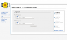
Created attachment 13455
Installer with shadows

Attached:

installer.png (615×1 px, 57 KB)

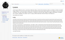
Created attachment 13456
Testpage without shadows

Attached:

lurg_without_shadows.png (630×1 px, 56 KB)

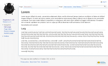
Created attachment 13457
Testpage with shadows

Attached:

lurg_with_shadows.png (630×1 px, 58 KB)

(In reply to comment #5)

Thanks for working on this, since it's in the same code would you be willing
to also include the change for making the minimum height and width of the
notification equal?

Where/what is this? I could probably take a look at that as well, indeed, but I'm not entirely sure what you're referring to.

If you can post a picture of the end state with the patch applied I'll see
if I can find a Dev to get it reviewed.

Screenshots attached - with and without shadows for comparison, as well as a screenshot of the installer which looks a little strange but then again it always has. (I doubt that's worth worrying about, at least, though it is kind of funny in that it shows part of how this is actually implemented.)

As it is there isn't much to review in terms of the code itself as the existing patch has been obsoleted, but word on the viability of the change from a design perspective would be nice in the meantime while I update it.

...or if I even should update it; it was because it just sat there ignored so long in the first place that it did get out of date.

Sorry everyone perhaps I was confusing this bug with another one, Now that I see the images I'm going to have to say no, this is absolutely not in-line with the visual design direction.

While in principle the goal of differentiating "content" from "chrome" (User interface) is absolutely something we want to do, I do not believe this is the way to achieve it. Much of what you're hoping to achieve with this will be handled with the Beta Feature "Typography Update"

you can read more about it here:
https://gerrit.wikimedia.org/r/#/c/79948/

(In reply to comment #11)

Sorry everyone perhaps I was confusing this bug with another one, Now that I
see the images I'm going to have to say no, this is absolutely not in-line
with
the visual design direction.

While in principle the goal of differentiating "content" from "chrome" (User
interface) is absolutely something we want to do, I do not believe this is
the
way to achieve it. Much of what you're hoping to achieve with this will be
handled with the Beta Feature "Typography Update"

you can read more about it here:
https://gerrit.wikimedia.org/r/#/c/79948/

That looks like a potentially useful direction for Wikipedia (and applicable sister sites) to go if given more thought, but it doesn't appear to be all that related to the Vector skin itself, or at all to this change.

While this change is intended to visually bring the content forward, its primary goal is to make clearer the distinction between different layering elements while unifying their overall visual presentation, because currently it is quite varied:

  • Popups like the gadget commonly used on wikipedia and other projects
  • The extended cactions
  • Echo
  • Postedit
  • Notifications using the mw-notification-area
  • and others.

And to start, distinguishing the content from the base layer not only makes it clearer what layer an object actually belongs to (is it part of the content, is it over the content, etc), it also provides a template that others can follow and helps unify existing formats - if the content casts a shadow, it's less weird that postedit should too.

Shadows are a powerful tool when used properly, and now that browser support is finally fairly consistent, there is little reason not to put them to use, especially when dealing with a platform as inherently complicated as MediaWiki.

Change 50594 abandoned by Isarra:
(Bug 44854) Add shadows to the content in Vector

Reason:
Duuuur.

https://gerrit.wikimedia.org/r/50594