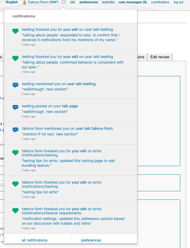
Due to Monobook's use of text-transform, Echo's notifications look rather silly (they're all lowercase). Attachment 12177 shows this.
Version: unspecified
Severity: normal
| • MZMcBride | |
| Apr 25 2013, 3:23 PM |
| F10890: Screen_Shot_2013-04-25_at_12.26.32_PM.png | |
| Nov 22 2014, 1:37 AM |
Due to Monobook's use of text-transform, Echo's notifications look rather silly (they're all lowercase). Attachment 12177 shows this.
Version: unspecified
Severity: normal
| Status | Subtype | Assigned | Task | ||
|---|---|---|---|---|---|
| Resolved | None | T45833 Bugs that should be fixed before deploying Echo to en.wiki (tracking) | |||
| Resolved | None | T49652 Echo notifications menu looks rather silly in Monobook |
The notification text is also blue, making it _really_ difficult to distinguish links.
Copying Fabrice on this bug report. Monobook isn't a fringe skin: it's what most power users use. :-) The color of the text and the text-transform need to be addressed before Echo is deployed to the English Wikipedia.
Thanks, MZ, you make a good point that we need to update the UI for Monobook.
I have attached a screenshot showing some of the issues on my browser as well:
I defer to our designer Vibha on the coloring of the text. To that end, I have Cc:d her on this thread.
We will aim to make these changes as quickly as possible, so they can be included by the time we deploy on En-wiki, if feasible.
Thanks for bringing this up!
Initial Cap, Icons can and should be fixed by front end.
Im assuming this would be Ryan Kaldari.
I would need more details around the text readability issues.
I'm having a hard time understanding the issues with the screenshot attached.
Upon discussion with some other members of the team:
-Not sure why the non hyperlinked part of the notification body is showing up in blue, that should be grey/black. There is some kind of over-write happening there, assuming its inherited from the skin.
If a front end person on the team has the bandwidth, we could look into this.
Caveat: Its not a real functional issue right now because the entire notification is a single target and so it still works, although a user may not know what to expect in terms of target URL.
-Monobook in general has extremely poor contrast for visited/ unvisited links (blue/ purple) so thats a classic skin problem and it would be appropriate to try and fix that as part of echo because its a systemic skin issue and occurs in areas such as the left nav, top right nav and so on. It also has sever margin issues with links etc hitting the edges of their containers.
(In reply to comment #5)
If a front end person on the team has the bandwidth, we could look into this.
I don't really like the conditional here. This needs to be fixed.
Caveat: Its not a real functional issue right now because the entire
notification is a single target [...]
No it isn't (bug 47665).
-Monobook in general has extremely poor contrast for visited/ unvisited links
(blue/ purple) [...]
Right, the issue here is the blue (non-link) text, though. (Or at least that's one of the issues. Monobook's link colors aren't really relevant here at all.)
Related URL: https://gerrit.wikimedia.org/r/61065 (Gerrit Change Id8dd1454a5a303b809f07b6667396303b0514f5c)
Related URL: https://gerrit.wikimedia.org/r/61066 (Gerrit Change I29562fa75ec4af1128f69865d0500fc13a92eec8)
Related URL: https://gerrit.wikimedia.org/r/61076 (Gerrit Change I2600b5836ea7bca59d9089d8bb7e69a6aaeca6a4)
Related URL: https://gerrit.wikimedia.org/r/61159 (Gerrit Change I3199af6aef0ceab2380fb1de7b74cc21541e2886)
There are still quite a few rendering bugs in Monobook (due to its overly aggressive selectors and generally weird styling), but at least it doesn't look silly anymore :) Unfortunately I have bigger bugs to fry right now, so I haven't had a chance to comprehensively fix everything. Feel free to file new bugs on any remaining rendering issues.
(In reply to comment #11)
There are still quite a few rendering bugs in Monobook (due to its overly
aggressive selectors and generally weird styling), but at least it doesn't
look silly anymore :)
Can I see it deployed anywhere?