Compare:
The blue button is no longer blue. And there's a grey background with strange padding. Maybe some other quirks.
Version: 1.22.0
Severity: normal
See Also:
https://bugzilla.wikimedia.org/show_bug.cgi?id=47777
| • MZMcBride | |
| Apr 26 2013, 12:21 AM |
| F10979: merrrrr.png | |
| Nov 22 2014, 1:41 AM |
Compare:
The blue button is no longer blue. And there's a grey background with strange padding. Maybe some other quirks.
Version: 1.22.0
Severity: normal
See Also:
https://bugzilla.wikimedia.org/show_bug.cgi?id=47777
| Status | Subtype | Assigned | Task | ||
|---|---|---|---|---|---|
| Resolved | None | T49698 User login and signup forms don't look great in Monobook | |||
| Resolved | • Mattflaschen-WMF | T57554 Style mediawiki.ui buttons in other skins (e.g. Monobook) the same as Vector buttons (except typography) |
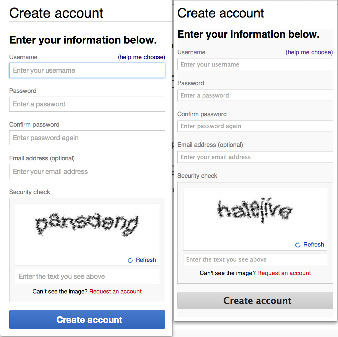
Created attachment 12185
Crude comparison of the "new" signup form in Vector vs. Monobook
Attached:
The style is applied by Monobook, in skins/monobook/main.css:646. It is specific to #userloginForm and #userlogin, so it should be safe to drop when we make the new form the default.
(To be clarify: my comment above is in reference to the grey background. I haven't investigated the button color yet.)
swalling wrote:
We should improve with the styles regardless (we're tracking in https://trello.com/c/lmY261Rx), especially the button style, but this is not a blocker since the only way to view this version is to force it, or have your wiki set to Monobook as default.
The grey button was implemented under the theory that non-Vector users are likely to prefer a more low-key interface.
The mediawiki.ui module (which implements these buttons) uses a ResourceLoader feature that allows different styles for each skin (which can even be more different than the two options currently are).
However, we could consider using the same colors on Monobook if there is consensus to do so.
(In reply to comment #5)
The grey button was implemented under the theory that non-Vector users are
likely to prefer a more low-key interface.
It was intentional? Why is it acceptable to use the blue and green in Vector but not in Monobook?
(In reply to comment #6)
It was intentional? Why is it acceptable to use the blue and green in Vector
but not in Monobook?
It's normal for different skins to look different.
That doesn't mean the way they look is final. We can add the colors to additional skins if they're consensus to do so. Alternatively, there are other possible ways non-Vector skins could choose to render these classes.
swalling wrote:
(In reply to comment #6)
(In reply to comment #5)
The grey button was implemented under the theory that non-Vector users are
likely to prefer a more low-key interface.It was intentional? Why is it acceptable to use the blue and green in Vector
but not in Monobook?
Let's get back to what you think might actually be done differently in Monobook.
Do you have suggestions for what to do? Like I said before, we're willing to consider improvements to the forms in the skin, but I'd like to hear what specific changes you'd like, as a Monobook user.
(In reply to comment #8)
Do you have suggestions for what to do? Like I said before, we're willing to
consider improvements to the forms in the skin, but I'd like to hear what
specific changes you'd like, as a Monobook user.
When this bug was filed, it wasn't clear that parts of the interface had been intentionally changed for Monobook.
Vector and Monobook are very similar in design. I don't understand why it's acceptable to use bright green and blue in Vector, but not in Monobook.
swalling wrote:
(In reply to comment #9)
(In reply to comment #8)
Do you have suggestions for what to do? Like I said before, we're willing to
consider improvements to the forms in the skin, but I'd like to hear what
specific changes you'd like, as a Monobook user.When this bug was filed, it wasn't clear that parts of the interface had been
intentionally changed for Monobook.Vector and Monobook are very similar in design. I don't understand why it's
acceptable to use bright green and blue in Vector, but not in Monobook.
Okay, so you're saying you want the button colors to be the same in Monobook. That's reasonable I think. We assumed Monobook users would want the opposite, since it's a plainer interface not typically used other than by power users.
Anything else?
First, a quick note. Currently there are only two versions of the mediawiki.ui styles, Vector and non-Vector. It does not have to stay that way. Other core skins can propose and implement their own stylings for the module.
As for Monobook, we are going to hold off on adding the button colors until we hear from more Monobook users regarding what they want.
(In reply to comment #11)
As for Monobook, we are going to hold off on adding the button colors until
we hear from more Monobook users regarding what they want.
Can we hold off on the button colors for Vector until we hear from more Vector users?
We have gotten feedback from Vector users, in addition to quantitative data.
We've been trialling the button colors (on account creation) in Vector since October, we've done A/B tests, we've gotten informal feedback much of that time, we just published a blog post asking people on all WMF projects to try it, and we just did an IRC session about it where multiple people expressed positive feedback of the Vector version.
People have raised various interface issues (including color in other parts of the UI, e.g. bug 47777, which we're looking into)
But both user feedback and the data is in favor of the button colors for Vector.
The biggest issue is the background colour that is forced for the login form, but which is different to the page background, making it look very strange.
Personally, I don't have a strong feeling about what colours the buttons should be, but I do have two general observations:
This applies to all skins (including Vector).
I acknowledge that there may be a period of time between this new page going live and the rest of the interface being updated, but so long as the plan is to update all other buttons to match then there isn't necessarily a problem with them being out-of-sync for a while. If there is no plan to update the other buttons on the site, then this change is more worrying.
Finally, the input box labels is pretty faint, but perhaps this is because the placeholder text serves the same purpose (though this is only visible if the user's browser supports it, of course).
(In reply to comment #14)
The biggest issue is the background colour that is forced for the login form,
but which is different to the page background, making it look very strange.
It's like that for the old form too, but the old form has a border. We can probably either put back a border or remove the color override from the new form.
Personally, I don't have a strong feeling about what colours the buttons
should
be, but I do have two general observations:
- Grey buttons with grey borders (in particular with grey text, too) look
like
they are disabled, so should be avoided. More contrast between the
border/background (and darker text in the case of the 'Join Wikipedia'
button)
would resolve this, if the grey colour is to be retained.
Yeah, I agree. The login button already looks darker (though that was unintentional). However, I think it's worth making all non-Vector mediawiki.ui button text black, at least for now:
https://gerrit.wikimedia.org/r/66044
I acknowledge that there may be a period of time between this new page going
live and the rest of the interface being updated, but so long as the plan is
to
update all other buttons to match then there isn't necessarily a problem with
them being out-of-sync for a while. If there is no plan to update the other
buttons on the site, then this change is more worrying.
As you said, it will take some time. However, it's already in progress for some forms, and we'd definitely like to roll it out everywhere in time (e.g. https://gerrit.wikimedia.org/r/#/c/65346/)
Finally, the input box labels is pretty faint, but perhaps this is because
the placeholder text serves the same purpose (though this is only visible if
the user's browser supports it, of course).
Yes, this is a known issue (bug 47777), but it looks worse in Monobook because of the slight background.
Re bug 50304 comment 1:
Like I say on 47698, we're open to suggestions or patches for Monobook, but
considering the only way to see it is to either A) use a URL parameter or B)
set the site skin to Monobook by default, which we no longer do on Wikimedia
sites, it's not a big priority for us.
**In particular, the defaults don't change on upgrade. If you installed mediawiki not all that long ago, you probably are still using monobook.
*Features in core should be skin agnostic.
(In reply to comment #17)
- A significant portion of third party sites still use monobook.
I doubt they're using a modern version of MediaWiki, and certainly not 1.22alpha. Do you have any statistics that suggest otherwise?
(In reply to comment #18)
(In reply to comment #17)
- A significant portion of third party sites still use monobook.
I doubt they're using a modern version of MediaWiki, and certainly not
1.22alpha. Do you have any statistics that suggest otherwise?
1.22alpha eventually becomes 1.22.0
According to http://wikiapiary.com/wiki/Skin:Main_Page monobook is most common (then again, if you sum the statistics, the result is significantly more than the total number of sites they surveyed, so I don't know if I trust that).
Anecdotally I still see quite a few using monobook, but ancedotal doesn't mean much. However its not just that the login form should look good in monobook - it should look good in any skin. Core features should not require a specific skin to look ok in.
Change 103558 had a related patch set uploaded by Bartosz Dziewoński:
Remove grey background from login/createaccount form on Monobook
With https://gerrit.wikimedia.org/r/#/c/103498/ (fix for bug 55554, button colors) and https://gerrit.wikimedia.org/r/#/c/103558/ (fixing grey background) I think we could consider this fixed.
Change 103558 merged by jenkins-bot:
Remove grey background from login/createaccount form on Monobook