Page MenuHomePhabricator

Add font size adjustment feature
Closed, DuplicatePublic

Description

Author: thexlab

Description:
I use an iPhone 5 with iOS 6.1.4 (latest version at the time of this writing). I use the built-in Safari browser to read Wikipedia articles via the mobile version of the site (http://en.m.wikipedia.org in my case).

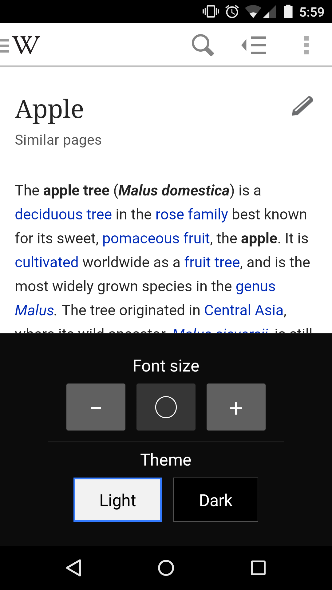
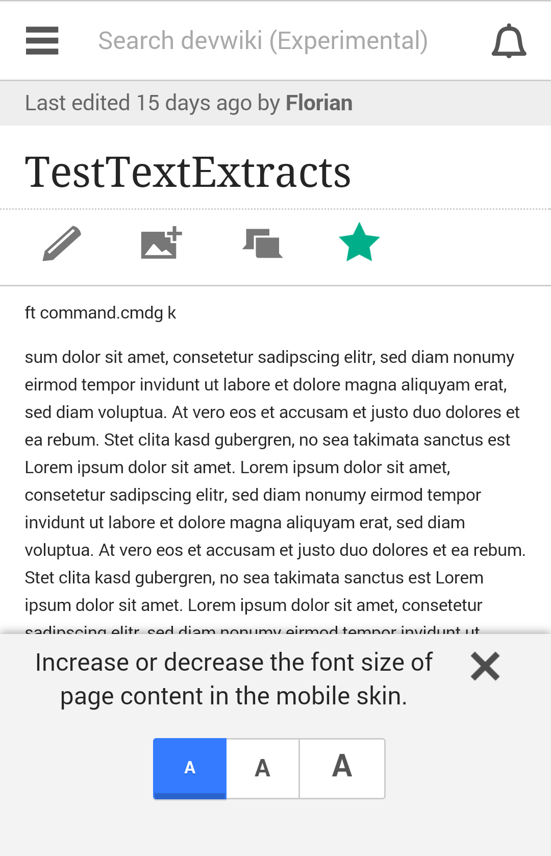
The mobile version of Wikipedia offers no option for changing the font size. I find the fonts much too small to read comfortably for more than a short period of time.

I recommend adding a font size adjustment feature to the mobile front end, perhaps via the menu that appears in the upper-left of each page (Home, Random, Nearby, etc.) The mobile site needs something like the A+ / A- feature to adjust the font size up or down, respectively, as seen on many Web sites.

While pages on the mobile site can be zoomed to some extent, an option to simply enlarge the font size throughout would provide a better experience.

One option might be to provide a larger default font size when rotating from portrait to landscape mode. For example, the mobile version of The Verge site supports this. Nevertheless, it's still not a substitute for a true font size adjustment feature.

An alternative would be to redesign the pages to support the Reader function in Safari: Safari Reader mode offers font size adjustment. Unfortunately, no Wikipedia Mobile pages work in Reader.

A somewhat related bug report is # 24739 (https://bugzilla.wikimedia.org/show_bug.cgi?id=24739)


Version: unspecified
Severity: enhancement
OS: other
Platform: Smartphone
See Also:
https://bugzilla.wikimedia.org/show_bug.cgi?id=24739
https://bugzilla.wikimedia.org/show_bug.cgi?id=70879

Related Objects

StatusSubtypeAssignedTask
DuplicateFlorian
DuplicateJdlrobson
DuplicateNone
DuplicateNone
OpenFeatureNone
OpenNone
DuplicateNone
ResolvedKrinkle
ResolvedJdlrobson
OpenJdlrobson
ResolvedJScherer-WMF
OpenJScherer-WMF
OpenJScherer-WMF
Resolvedovasileva
ResolvedNBaca-WMF
ResolvedEdtadros
ResolvedDesignJScherer-WMF
ResolvedJScherer-WMF
ResolvedNone
Resolvedovasileva
Resolvedovasileva
ResolvedNone
ResolvedSpikeJdrewniak
Resolvedbwang
Resolvedovasileva
ResolvedBUG REPORTJdlrobson
Resolvedovasileva
ResolvedDTorsani-WMF
Resolvedovasileva
Resolvedovasileva
Resolvedovasileva
ResolvedJdlrobson
Resolvedovasileva
Declinedovasileva
Resolvedovasileva
Resolvedovasileva
Resolvedovasileva
StalledNone
StalledBUG REPORTJdlrobson
Resolvedovasileva

Event Timeline

bzimport raised the priority of this task from to Medium.Nov 22 2014, 1:40 AM
bzimport set Reference to bz48946.
bzimport added a subscriber: Unknown Object (MLST).

The font size is relative to your default browser font size. To increase font size you should increase this.

Potentially we may want to review the default font size and as you suggest increase it on landscape mode but I am very anti making this configurable in the mobile site itself as this feature already exists as part of the browser as it should...

thexlab wrote:

Jon wrote:

<quote>"The font size is relative to your default browser font size. To increase font size you should increase this."</quote>

Not in Safari under iOS: there is no preference (under Settings > Safari) for changing the default browser font size.

The Accessibility setting for font size (Settings > General > Accessibilty > Large Text) does not apply to Safari: it only applies to the Mail, Contacts, Calendar, Messages, and Notes apps.

thexlab wrote:

I think before one considers this to be a "low priority enhancement" one should look at some of the impacts of small fonts on vision:

• According to the latest data I can find from the National Eye Institute (NEI), a division of the US National Institute of Health (NIH), over 100 million people in the US — about a third of the population — need corrective lenses (NEI, "Vision Research National Plan 1999-2003", page 7, PDF: http://www.nei.nih.gov/resources/strategicplans/nei_vision_report.pdf)

• About 11 million people who need corrective lenses do not have them.
(http://www.nei.nih.gov/news/pressreleases/050906.asp)

• Increasing cases of Computer Vision Syndrome (CVS - see http://en.wikipedia.org/wiki/Computer_vision_syndrome) are being related to smartphone use and possibly font size. If the font is too small, you hold the device in a manner that increases the likelihood of developing CVS. While I've not found a study directly correlating font size and CVS, the following articles discuss issues of CVS and smartphones, with the first citing font size:

  • The NEI's Dr. Rachel Bishop discusses CVS on this Voice of America interview:

http://www.youtube.com/watch?v=8LYCmvSHyjo

The CVS problem, in particular, is one that could be helped by enabling font size adjustment in the Wikipedia Mobile site.

Yes but as you point out you can still pinch zoom on iOS and this problem only effects the iOS browser which although has a large percentage of mobile traffic doesn't account for the majority of our users (Android for example allows you to increase the browser font size).

Note here is also the zoom function on iOS:
"A simple double-tap with three fingers instantly zooms in and out 200% and you can double-tap and drag three fingers to dynamically adjust the magnification between 100% and 500%. Even when zoomed, you can continue using all of the familiar flick, pinch, tap, and other iPhone gestures to run your favorite applications."

thexlab wrote:

Hi Jon:

I'm fully aware of all the zoom functions in iOS 6. The experience of zooming a page and dragging it back-and-forth to read sentences is a far cry from being able to specify a larger font size and having the page reflow accordingly.

I've submitted feedback to Apple requesting a minimum font size setting for mobile Safari, but I suspect that's not going to happen.

I think I'm beating a dead horse here. It appears that both you and Apple seem to think that zoom solves all problems, but — from a user experience standpoint – it doesn't. In my experience, this is a common problem with sites designed for smartphones. Some "get it" by using a larger default font size (ReadWrite, The Next Web), but most others don't.

Perhaps the answer is to simply increase the default font size used by mobile Wikipedia to that used by ReadWrite or The Next Web in their articles.

Hi Gregory
Terribly sry if I gave the impression otherwise but I am not saying that zoom does solve all the problems - all I am saying is I want us to be cautious in adding any functionality around this and I think we need to discuss it further. I tend to try and look at bug reports from the other extreme with the goal to find some compromise that suits every user. Please don't take anything I've said personally! I see there is an issue here I'm just not quite sure what is the right way this should be solved.

We could add a user preference for font size but if we do that it would probably be better as a site wide preference rather than mobile. This however has the downside in that it means only logged in user's can benefit from the font size setting. We /can/ also limit this code to phones that need it (e.g. iPhone)

Increasing default font size is also another option.

I'm no expert in accessibility so it would be really good to understand:

  • what the exact problemis that this would be solving that zooming doesn't help with
  • what the ways we might solve it (maybe they are not simply limited to tweaking the font size)
  • What is the extent of the problem? (Which browsers do not have a font size setting? is it just iphone users? What percentage of our iphone users are hit by this problem?)

I've added accessibility and design tags in hope we might attract more discussion.

thexlab wrote:

Hi Jon:

I'm no expert on accessibility either, but I did spend a lot of my career in software design and usability.

This is something of a Catch 22 situation. Mobile Safari doesn't permit one to specify a default minimum font size (Safari on OS X does in the Advanced tab of Safari Preferences). The problem of small fonts on mobile-optimized Web sites would be solved if Apple added this feature to mobile Safari. Barring that, it's up to the designers of Web sites targeted at smartphones to either use larger default fonts or to offer a feature to change the font size of the content. This puts the Web designer in a bind between larger fonts (which people with perfect vision might not like) and the chore of coding a font-adjustment feature.

If one were to use the old IBM "CUPRIMDS" defect classification system (CUPRIMDS = Capability, Usability, Performance, Reliability, Installability, Maintainability, Documentation, Service), this font issue is a Capability bug in Mobile Safari or the mobile Web site. Capability bugs are bugs in "Functionality delivered versus requirements."

Identifying this issue as a Capability bug is why I decided to report this issue via Bugzilla. I initially sent an e-mail about the font size issue to the Wikipedia Information Team and was directed to The Village Pump, but after a fruitless attempt to figure out how to raise this issue there, my developer background kicked in and I decided this was a Capability bug that needed reporting via Bugzilla.

To address your particulars, I can only speak from my personal experience and my perspective as an iPhone 5 user:

  • what the exact problem is that this would be solving that zooming doesn't help with

I find the default font on mobile Wikipedia too small. I suspect I'm not the only person who feels this way (you'd need to survey to find out). For me, reading Wikipedia articles (and other "mobile-optimized" Web sites with small fonts) for a period of time frequently leads to symptoms of CVS.

Zooming doesn't help because it complicates the experience of reading long-form articles. Try reading the Wikipedia article on World War I zoomed via three-finger tap on an iPhone: it's a nightmare of constant horizontal scrolling (in either portrait or landscape mode) to read sentences. Reading long-form articles when zoomed is an awful user experience. The navigation when zoomed via the three-finger tap isn't great. IMO, zoom is more useful for viewing images than reading long-form text.

What I'm looking for is the kind of user experience one has in e-readers or when using the Reader mode of mobile Safari: one that allows for font size adjustment. Unfortunately, mobile Wikipedia articles are coded in a way that the Reader feature is unavailable. As an aside, I've been unable to find any Apple guidelines for Web designers to make their content work in Reader. If you search Google for "safari reader design guidelines" (sans quotes) you'll find some posts relating experiments Web developers have performed to glean Reader-friendly design guidelines, but there are no official guidelines from Apple on how to design Web pages so they work with the Reader function.

  • what the ways we might solve it (maybe they are not simply limited to

tweaking the font size)

The problem for me is the default font size! If the default font size of the mobile Wikipedia site was larger — like that on ReadWrite or The Next Web — I wouldn't have a problem reading them.

I've spent a long time thinking about this problem, so perhaps I'm now too close to it, but as I see it, there are three ways the mobile Wikipedia site could address the problem:

  1. Increase the default font size (perhaps only for iPhone users) along the lines of the sites I've cited earlier. This would be the easiest to implement.
  1. Code a feature to adjust the font size to the user's liking (I'd recommend saving the preference in a cookie instead of requiring a log-in: as a user of Wikipedia, rather than a contributor / editor, I don't log in).
  1. Design mobile Wikipedia pages so their full content can be read using the Reader function of Mobile Safari. Reader has a built-in font size adjustment feature. (I suspect the divisions in the mobile-optimized pages are prohibiting Reader).

I've searched to see if anyone has published guidelines on optimal font size for mobile Web site design. I haven't found any, but perhaps Jakob Nielsen may have some in the Nielsen Norman Group report on mobile Website design guidelines (I'm not going to purchase the report to find out). More of the debate in this area seems to be focused on "Responsive Design" vs. "Dedicated Mobile Site" and doesn't get into basics like font size. Those in the debate may be blindsided by their proximity to the problem: Google may not see the issue because Android mobile browsers have the font size adjustment that mobile Safari lacks; Apple may see Zoom and Reader as the answers to all such problems, hence why mobile Safari lacks the minimum font size feature of the OS X version.

  • What is the extent of the problem? (Which browsers do not have a font size

setting? is it just iphone users? What percentage of our iphone users are hit
by this problem?)

Tough to put a number on this. I'd say this is clearly a problem for all iPhone users who find the default font size too small. I'm sure the Wikimedia Foundation has stats on how many folks read mobile Wikipedia on an iPhone. You'd have to survey to find out how many folks have issues with the current default font size.

I've given you stats above indicating roughly a third of the US population wears vision correction (glasses, contacts, etc.). Maybe a third of all iPhone users of Mobile Wikipedia have issues with the default font size?

CVS is a problem for people regardless of whether or not they wear vision correction. Tiny fonts probably exacerbate CVS, as noted in one of the earlier articles I cited.

It's difficult for people who are Wikipedia readers – vs contributors "in the community" — to bring issues like this forward. If people can't find an easy way to complain about a site, they either put up with the problem or stop using the site.

In terms of reader function see bug 49163 - I ran some investigations and worked out what was going on.

I think as you suggest a survey might help work out which user's are effected by this problem. Although a a third of the US population have this problem we can't directly equate this to iPhone users - maybe no browser font size is a reason people don't buy an iPhone. Interesting stuff.

thexlab wrote:

(In reply to comment #8)

In terms of reader function see bug 49163 - I ran some investigations and
worked out what was going on.

One of the better articles I've found on designing for Reader is here:

http://mathiasbynens.be/notes/safari-reader

I think as you suggest a survey might help work out which user's are effected
by this problem. Although a a third of the US population have this problem we
can't directly equate this to iPhone users -

I posited "one third of iPhone users" as a hypothetical upper bound in response to your question "What is the extent of the problem?" It could be more, it could be less.

There could be millions of Android users who don't know how to set a minimum font size in their browser and have the same problem reading Mobile Wikipedia. Just because a browser — or any other technology — has a feature, one can't assume people know about it or know how to use it.

It would be difficult to conduct a proper, i.e. statistically valid, survey of the problem, but an informal survey might glean some useful data.

maybe no browser font size is a reason people don't buy an iPhone.

I suspect the vast majority of people don't consider features like this when buying smartphones.

The real problem here is designing Web pages for smartphones. As I've noted, other mobile-optimized sites have chosen larger fonts to improve readability for their articles and I recommend Mobile Wikipedia do the same.

I think this is a great idea. Washinton post uses a modified version of http://brow.si you can see it here http://www.washingtonpost.com/world/mikhail-kalashnikov-inventor-of-ak-47-dies-at-94/2013/12/23/624e40be-6bf5-11e3-b405-7e360f7e9fd2_story.html (only shows on mobile) May is working on a similar control for native app, lets wait for that design and try to implement consistantly on mobile web, native app, and possibly desktop at the same time. Adding May to this bug.

Should it surface to all browsers? I personally find the icon in the bottom left on Washington Post rather annoying and would be interested in a less obtrusive UI element. Also the less JavaScript for the best - it might be better placed in Special:MobileOptions / Special:Preferences as a setting if we do want to support this.

I still think this is what pinch zoom what built for.

I don't like burying things like this in settings, i might need a different font size from being on the couch at home, to being on the bus, to reading in bed, to walking down the sidewalk not paying attention to my surroundings. point is I don't want to go to another screen, i don't want to reload the page, and i don't want to fiddle with my browsers back buttons. A lot of people probably don't even know settings exist or why they'd want to go there in the first place. I don't find the brow.si extension to be particularly distracting, and I think its a great access point for visual settings like background color, font size, and sharing options, always there, and not really in your way. Burying in settings is a sure-fire way to have it not used. out of sight, out of mind.

Could be a good task for a volunteer to put a first version of this in alpha... Anyone interested in designing something akin to #c10?

May has started a design for this on mobile app, perhaps we could leverage a lighter weight version for mobile web.

May has started a design for this on mobile app, perhaps we could leverage a lighter weight version for mobile web.

Hi! As a volunteer, this looks rather intriguing :) I'd be interested in working on it. (Can you provide a link to May's design, perhaps?)

This is a video about the action button but what you're looking for is also captured. 49sec.
https://www.dropbox.com/s/5pf7josg0s3ht95/ActionButton.mov

I've received feedback that the reading experience settings should stay under settings (accessible through side drawer) and I can agree because it isn't something users change frequently. Users will most likely adjust their reading experience settings (text size, contrast, background color) once every now and then to their comfortable spot. Also, night/day mode should be an option to change automatically by the device. I think having to watch the changes on the article while you adjust is very helpful to a user and I don't know if we can achieve this if we put it under "settings" screen.

Hope it's what you guys are looking for.

Theo does this still look rather intriguing and fun to work on it? If so let us know and I'll mark the bug to show you are working on it! :)

Yeah, please do so.

This requires a fair bit of work to make functional so it won't be done immediately, but I plan to work on it this weekend.

Change 108300 had a related patch set uploaded by Theopolisme:
[WIP] Allow users to adjust the font size

https://gerrit.wikimedia.org/r/108300

Change 108300 abandoned by Jdlrobson:
[WIP] Allow users to adjust the font size

Reason:
Abandoning due to lack of activity. Please resubmit with changes if you are not done :-)

https://gerrit.wikimedia.org/r/108300

Change 176961 had a related patch set uploaded (by Florianschmidtwelzow):
Beta: Add a setting to change font size of the content

https://gerrit.wikimedia.org/r/176961

Patch-For-Review

@Florian thanks for that, I think it might be more helpful for the size adjustment to be in the main chrome so that users could see the change in real time, rather than having to enter and exit settings every time. Additionally, it might be more simple to have ~4 fixed sizes that represent actual letterforms rather than abstracting it to a percentage that users have to think about converting.

@Jaredzimmerman-WMF You mean something like:

Unbenannt.PNG (66×320 px, 1 KB)

(maybe the first size is not needed, it's just too small i think).

And where to add it? In the menu bar or above the footer? E.g.:

Unbenannt_2.PNG (264×990 px, 11 KB)

(100% maybe should be renamed to default or so)

Might also be worth comparing to how the mobile app does it. Appears as an overlay after "Font and theme" is selected from the menu in the upper righthand corner.

Screenshot_2014-12-03-05-59-06.png (1×1 px, 183 KB)

@Theopolisme that is closer to what I was implying, @Florian I think you could get away with not having 100% in the center but just another letterform, just make sure to be clear on the current state take a look at the mediawiki.ui control that is closest to what you're proposing https://trello.com/c/RVkdiGI2/19-button-group for the way to represent the curret state of the control.

The footer is already getting a bit crowded, but at least you could have the text in the reference section visible, something completely contextual accessible from anywhere in the article, that you don't have to scroll or navigate to would still be the most ideal access point I think.

I think you could get away with not having 100% in the center but just another letterform

Ok :)

just make sure to be clear on the current state take a look at the mediawiki.ui control that is closest to what you're proposing

Yes :) The image above was just an image made without coding, that's why i haven't added the selected state, but thanks for the card :)

The footer is already getting a bit crowded

Right :/

but at least you could have the text in the reference section visible, something completely contextual accessible from anywhere in the article

Hmm, that i haven't understand correctly i think, sorry :( Where you suggest to add the element? :/

Florian renamed this task from Add font size adjustment feature to the mobile front end to Add font size adjustment feature.Dec 4 2014, 2:11 PM
Florian claimed this task.

@Florian, thats the problem, there isn't currently any fixed element in the web interface that could hold or be the anchor for a component like this, the way there is in the app interface.

@Jaredzimmerman-WMF: then i haven't misunderstood you, unhappily :( That's why i have added it to Special:MobileOptions. Maybe, as a first step, we could add this feature to Special:MobileMenu (when you click the menu button at the top left corner), a new menu item to open a drawer like mobile app do it? Maybe under the "About" and "Impress" page?

@Florian yes, I think the left sidebar on mobile web would be a reasonable place in the interim, lets target putting this into experimental mode for testing? Since the page is still visible on most mobile devices, live updating the text when the font size changes could be critical for the user to know that its working correctly.

Also due to the narrowness of the control, perhaps we could initially try 3 fixed sizes, small, normal, large, rather than a 5 step gradation.

@Jaredzimmerman-WMF: Yes, i will put it into alpha (first thought was beta, but i think Jon is right, alpha is much better for this experimental feature). Ok, 3 initially and then we look what we can improve :)

Also we should Absolutely do some minimal instrumentation on this, to see how users are interacting with it, and what size they are using.

If you're not familiar with EventLogging this might be helpful https://www.mediawiki.org/wiki/EventLogging/Workshop

Also we should Absolutely do some minimal instrumentation on this, to see how users are interacting with it, and what size they are using.

@Jdlrobson: Can we reuse MobileWebClickTracking for it, or should this be an own Schema? The plans are to add 3 font sizes, so it would be 3 new "links", size1, size2 and size3.

@Jaredzimmerman-WMF: Just to confirm: We want to use different sized "A" to visualize the font size in the drawer, right? Or full names
small | medium | large
??

yeah, I think 3 different size A letter forms would be best, if they could match the size, and font of the body text that would be even more ideal.

I've not really been following this, but please also consider that similar requests exist for 'desktop' site.
I also remember that someone made some mockups of an 'accessibility' section for the website at large. @Quiddity probably remembers more on that.

If anything gets made, try to make it in a way that the parts might be reusable :)

@TheDJ: I was thinking about to make it useable on desktop, too, but doesn't know, that there was already the idea to do this. I think mobile web is a good way to start and see, how the user use such a feature and what we can improve before we implement it on desktop, too :)

Thats how the actual change looks like:

Screenshot_2014-12-05-18-23-50.png (1×1 px, 255 KB)

The link is in Special:MobileMenu:

Unbenannt.PNG (198×273 px, 5 KB)

@Florian how about "Increase or decrease the size of the text for readability" and maybe move the X more to the right?

@TheDJ lets log that as a separate task I agree it could be of value, but I don't want the scope of this to become unmanageable, code wise, or community engagement wise. Additionally the desktop skin handles browser zoom much more gracefully, not something that can really be said of the mobile interface.

@Jaredzimmerman-WMF: Added your suggestions to the change and will add it in a new patchset, after i know, which logging schema we should use :)

I've copied the wireframe idea for more useful/powerful control panel (for the desktop), that everyone (logged in/out) can use, from onwiki to

  • Change 176961 merged by jenkins-bot:
    Alpha: Add possibility to change font size of the content

    https://gerrit.wikimedia.org/r/176961

    Removed patch-for-review. The change was merged and the function will be available in alpha mode :)