Page MenuHomePhabricator

MobileFrontend images shown double-sized in Retina desktop, iOS 7 beta
Closed, ResolvedPublic

Description

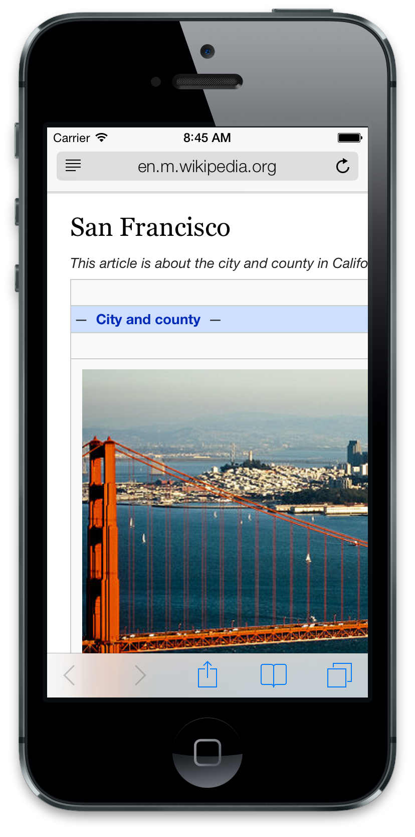
screenshot of simulator with huge image

iOS 7 beta problems with images on mobile...

Looks like some kind of issue with the jquery.hidpi plugin -- when high-res images get loaded in, the images are getting doubled in size instead of staying at their existing sizes.

Tested in iOS simulator and beta build on iPod Touch 5th-gen.


Version: unspecified
Severity: enhancement
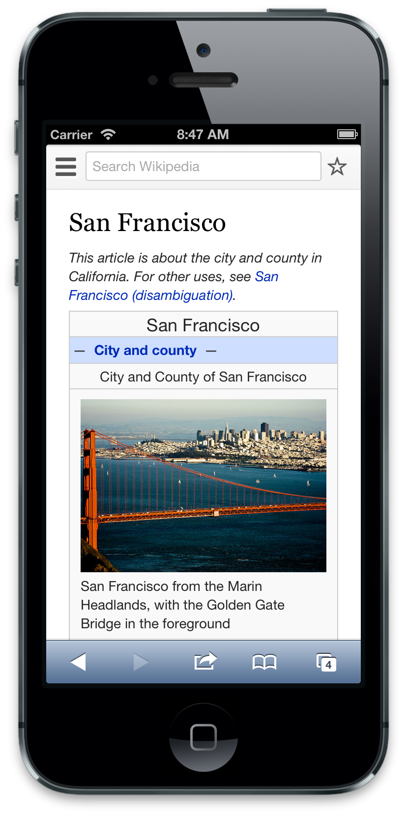
URL: http://en.m.wikipedia.org/wiki/San_Francisco

Attached:

Screen_Shot_2013-06-11_at_8.45.18_AM.png (1×828 px, 851 KB)

Details

Reference
bz49440

Related Objects

StatusSubtypeAssignedTask
ResolvedNone
OpenNone
ResolvedNone
ResolvedNone
ResolvedNone
ResolvedNone
ResolvedNone
ResolvedTgr
ResolvedAnomie
Resolvedtstarling
Resolvedcoren
ResolvedAnomie
DeclinedBUG REPORTNone
ResolvedAnomie
ResolvedEsanders
ResolvedEsanders
Resolvedssastry
ResolvedAnomie
ResolvedCKoerner_WMF
Resolvedjhsoby
ResolvedTgr
DeclinedTgr
Resolvedcoren
ResolvedAnomie
ResolvedTgr
DeclinedNone
Resolvedssastry
ResolvedTgr
ResolvedTgr
ResolvedTgr
Resolved Deskana
ResolvedCKoerner_WMF
Resolved Whatamidoing-WMF
ResolvedTgr
ResolvedTgr
ResolvedTgr
ResolvedUrbanecm
ResolvedTgr
ResolvedTacsipacsi
ResolvedTgr
ResolvedCKoerner_WMF
ResolvedNone

Event Timeline

bzimport raised the priority of this task from to Low.Nov 22 2014, 2:08 AM
bzimport set Reference to bz49440.
bzimport added a subscriber: Unknown Object (MLST).

Created attachment 12519
Screenshot of iOS 6 simulator with normal image

this is how it should look

Attached:

Screen_Shot_2013-06-11_at_8.47.12_AM.png (1×828 px, 775 KB)

Hmm... I'm also seeing this bug in regular browsers on a retina display.

Firefox
Safari
Chrome

Seems to be caused by this style:

img.tex, .image img, .thumb img {

max-width: 100% !important;
width: auto !important;
height: auto !important;

}

Reverting this change fixes it locally:

commit dc80c98adce6d8c98475413d87e038e9b2cb0b85
Author: jrobson <jrobson@wikimedia.org>
Date: Tue May 28 19:08:19 2013 -0700

Bug 48728: Scale thumbnails on Commons

Change-Id: I330e277ae1034fe9cd018abfc84f72f6966cf91d

The same trick is used on wikipedia and without the change they spill out of the page. Without the change images spill out of the window for pages without JavaScript due to default image widths due to inline styles..

Will take a look later today...

Well, the fundamental failure of the trick appears to be that it's using CSS to completely override the 'width' and 'height' attributes on the <img> elements, so they show up to twice their expected size once the high-resolution image is loaded in.

I'm a little confused and finding it hard to understand what's going on. I tried the ios7 developers version iPod but it seems way too buggy (viewport seems to be completely ignored on all articles)

The height and width are set to auto and max-width of the image is 100% - this is correct. It should mean make this image as big as possible but only as big as the container allows. I suspect since the a.image is not display block this might be the issue. If you add the rule display: block to .image does the problem go away?

Ideally image tags should be completely controlled by css (ie. there should be no width parameter).

Any chance you'll be in the office soon? Would be good to debug this together..

"The height and width are set to auto and max-width of the image is 100% - this
is correct. It should mean make this image as big as possible but only as big
as the container allows."

This is *incorrect* the instant the images are replaced with their high-resolution versions: now they will show at up to *twice* their intended size. Whether they sometimes get constrained by a container is less relevant; images that are intended to be small such as icons should remain at their original size instead of inflating.

I think I'm misunderstanding here. The jquery plugin simply changes the src attribute no? Thus why would changing the src attribute have any effect on the styling (specifically the width)?
http://unstoppablerobotninja.com/entry/fluid-images/

Changing the underlying image to one with double the dimensions changes the "natural size" of the image element to match the new image, eg from 320x240 to 640x480.

Normally, the 'width' and 'height' attributes on the img element override this natural size with the dimensions of the original image (320x240). (Because these dimensions are the same as the original image's natural size, it's easy not to notice this.)

However, when CSS 'width' and 'height' are both set to 'auto' with !important, the layout engine appears to essentially override the on-element attributes, and it goes right back to the natural size of the content... 640x480 pixels.

Looking more carefully, this isn't specific to iOS 7 -- I see the basic bug on iOS 6 simulator as well. However, the 'max-width' appears to kicking in in iOS 6, where it doesn't in iOS 7. This causes the doubling bug to only really be noticeable on smaller inline images (for instance the flag and seal in [[San Francsico]]'s infobox), while on larger images (like [[San Francisco]]'s thumbnail image) the max-width is keeping it screen-sized.

(Jon, I'm coming in to the office today so we can poke this on my beta devices in person. :)

I chatted with Brion today it seems that the bug is not as high priority as first thought. Basically what happens if an image smaller than the screen resolution is in a page (e.g. say 200px) when the responsive images javascript kicks in it switches to an image say double the size e.g. 400px. The image then grows to consume the space available to it.

This is actually probably the desired behaviour in that the image should take up all available space however there should be no screen flash.

Currently the mediawiki.hidpi module JavaScript file seems to be loading at the bottom of the page. Maybe it should be loaded earlier to avoid this screen flash and prevent the unnecessary download of 2 images?

Related URL: https://gerrit.wikimedia.org/r/68458 (Gerrit Change I4efeaafac5db5b16df19ec08e5a52bc84d29ca8b)

Related URL: https://gerrit.wikimedia.org/r/68458 (Gerrit Change I4efeaafac5db5b16df19ec08e5a52bc84d29ca8b)

https://gerrit.wikimedia.org/r/68458 (Gerrit Change I4efeaafac5db5b16df19ec08e5a52bc84d29ca8b) | change ABANDONED [by Jdlrobson]

This is somewhat the equivalent of a flash of unstyled content. If we can switch out the src attribute before the image loads or temporarily hide the image until it is loaded this would prevent that flash..

I don't think there is anything we can do here until
https://www.mediawiki.org/wiki/Requests_for_comment/Allow_styling_in_templates
or similar happens

This would allow us to turn off our hacks to get round inline styles.

The only other thing I can suggest doing is alter mediawiki.hidpi so that it somehow ensures that the original image never gets loaded. Essentially this phenomenon will happen when the original image is loaded then the new retina image is loaded. I'm not sure however if there is a way to do this other than clearing src attributes for non-javascript users.

yunabe.public wrote:

Sorry for jumping in.

Why do we have "width (height): auto !important;" rule in CSS?
As far as I can tell, it only affects to sizes of images in ".infobox" on retina devices.
(Because div.thumbinner has width in inlined-style, the rule does not affect to
sizes of images in articles)

In retina devices, the high resolution images are rendered as "larger images" because of this rule. For example, the picture of iPod Nano is very large in retina device.
http://en.m.wikipedia.org/wiki/IPod_Nano

Because we replace images with large ones in delay-loaded JavaScript and
it takes long time to fetch large images in retina devices,
image sizes in .infobox are changing while users read articles and it makes screen flash.
I think it's not good for user experience and "width/height: auto" should be deleted from CSS.

  • Bug 51557 has been marked as a duplicate of this bug. ***

peterwhy wrote:

Bug 53026 should be a duplicate.

I propose removing the rule for "width:auto !important;", leaving the max-width and height rules there.

  • Bug 53026 has been marked as a duplicate of this bug. ***

The problem is there is no standardisation on info boxes. Currently widths of images are fixed. This leads to several problems. On small screens if the image is bigger it either gets cut off by the page or it makes the UI grow so the entire article doesn't fit inside the viewport.

If the image is too small since info boxes take up the entire viewport on mobile this can result in some ugly whitespace around the image which looks broken as well.

Changing the default image width to 320px in the info box template might be worth considering as this would avoid this problem altogether on the majority of browsers.

Created attachment 13127
without this responsive image technique some info boxes look odd.

Attached:

Screenshot_2013-08-19-08-06-16.png (1×768 px, 506 KB)

like i said, disable the hidpi script in that case. it doesn't work on mobile, so let's not enable it in that case.

peterwhy wrote:

The problem is what a 1x devpixel user sees does not match with a 2x devpixel user sees. I am not talking about image details, I am talking about image sizes. And relying on this bug to enlarge images (only for some users!) does not seem appropriate to me. This is not a desired behaviour and this does not serve all.

Disabling hidpi is going backward, and still would not achieve that "desired behaviour". What you actually want is to make an extension that detects what 100% means in px, and fetches images of that width (or more).

Alternatively, figure out better CSS selectors that goes for infoboxes and thumbnails. The current CSS selectors get even inline images, but otherwise do not get something like [[File:a.png|50px|link=File:a.png]]. (Yes, one can use this when one needs to be pixel-perfect in mobile view)

Still alternatively, remove CSS "width:auto !important;".

hsteen wrote:

Brion, thanks for cross-linking those bugs - it is indeed the same issue. May I suggest perhaps modifying the hidpi script to not do this on images if CSS sets their width and height to auto? You can check for this condition with getComputedStyle().

Hmm, if we skip the srcset handling we won't get the higher-resolution image; even if it's only on a subset of images I don't think that's a good thing.

My recommendation is to either remove the 'width: auto' forcing, or replace it with something more explicit and consistent. Perhaps setting a width relative to the container? This would then also do the 'zoom' effect on 1x devices as well as the high-dpi ones.

Jon, any preferences on the way to go here?

Change 84544 had a related patch set uploaded by Jdlrobson:
Leave width of image rendering of infoboxes up to the template

https://gerrit.wikimedia.org/r/84544

I suppose we can live with whitespace around an image for the time being.

I suspect the real solution here is to alter the infobox templates to render images at the maximum available width.

The max-width and height properties are still important for smaller resolution screens so I've left them in.

Change 84544 merged by jenkins-bot:
Leave width of image rendering of infoboxes up to the template

https://gerrit.wikimedia.org/r/84544