Page MenuHomePhabricator

[Regression] VisualEditor: The "Add parameter" confirmation button should be close to the input field (at least visible)
Closed, InvalidPublic

Description

Especially when a template has many parameters;
scrolling until you find the actual button to add them,
having to add them one by one and having to do so by clicking each time on the name of the template itself to get to the list again, it's confusing users.
There's already a bug about mandatory parameters not being enforced; I am not sure of the behaviour related to the order of the parameters, but it would be great if the editor could keep them in the same order they're being chosen with. Thanks :)


Version: unspecified
Severity: critical
Details

Reference
bz50773

Event Timeline

bzimport raised the priority of this task from to High.Nov 22 2014, 1:45 AM
bzimport set Reference to bz50773.

Agreed. This is what I was going to add into a new feature request:


In the current version of the template editor, the user needs to select a parameter, click "Add parameter", enter the value, go back, and rinse and repeat for all the other parameters.

There are at least two issues with this workflow:

  • For templates with a long list of parameters, the "Add parameter" button is hidden at the end of the list, so it's not obvious what to do after selecting a parameter

*: Possible solution: Give each parameter a button that adds it to the left column (like a green "+" sign, or something)

  • If the user needs/wants to add many parameters, the process can be quite long.

*: Possible solution: Add an "Add all parameters" button, and possibly an "Add all required parameters" button as well.

We really need a fix on this. I just tried to add a template (cite web) and was so confused I had to reach out to Timo and Guillaume to work out how in the hells you add a parameter. It's...tremendously counterintuitive on any template with more than 5 params.

We're getting various reports of this kind, let's try and keep them somewhat focussed on a single tangible thing. If you don't mind I'll turn this into:

The "Add parameter" confirmation button should be next to the input field

.. not at the bottom of the page after a potential long list of paramaters one has to scroll through to even discover the button.

Works for me. Can we twiddle with the prioritisation and criticality? This is a big workflow to have practically broken.

Though I don't know for sure, I think this is a recent regression. the button used to be where it should be (next to the input field). However at that time the input field width was also dynamic (widening as you type). I suspect Trevor "fixed" that odd overflow bug by moving the bottom out of the visible form area but probably tested it only with a small template where it was still in sight.

Adding screenshots for clarity.

Created attachment 12829
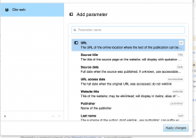
Screenshot of the problem (current version)

No add button anywhere in sight, users are likely to be blocked indefinitely with no ability to add any parameters.

Attached:

Screen_Shot_2013-07-11_at_12.36.17_PM.png (1×1 px, 150 KB)

Created attachment 12830
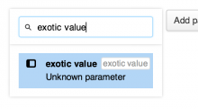
Screenshot of how it used to be

Note that though this is how it was. It was also true that when the text in the input field was very long (like, very very long, as long as the dialog is wide) the button would jump to *below* the parameter list (as opposed to directly below the input field or just stay where it was).

I propose that we either keep the current behaviour of the input field having a fixed width, but making sure that width is without the width of the "Add" button so that that one always stays where it should be (similar to having the "Go" button of a search field next to the input and not at the bottom of a variable-length and scrollable list of results).

Alternatively we could bring back the dynamic-width behaviour but when we'd still need to make sure it doesn't go wider than the width allotted to keep the button on the same line as well.

Attached:

Screen_Shot_2013-07-04_at_5.45.08_AM.png (316×572 px, 24 KB)

There is no longer such a button (as of a week ago).