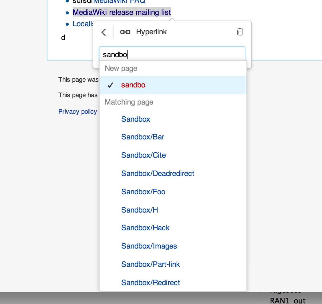
Screenshot of problem
When the link inspector is fairly tall and the space somewhat narrow (e.g. a red link, 10 suggestions in the inspector, and the link itself is towards the bottom of the screen), the box will expand further than the page goes (triggering a scrollbar if needed).
That's fine, except that it is hard to see for the user whether there is more or not. Especially with OSX hiding scroll bars by default.
There should be some bottom margin so that it can be clearly seen that the bottom of the list is the bottom, ans eparated from the bottom of the (now expanded) page.
See attached screenshot.
Version: unspecified
Severity: minor
Attached: