Author: kagatlin
Description:
Version: unspecified
Severity: normal
OS: other
Platform: Smartphone
URL: http://en.m.wikipedia.org/wiki/Bill_Gates
| • bzimport | |
| Aug 6 2013, 4:15 AM |
| F11412: MediaQueriesLumia920.jpg | |
| Nov 22 2014, 1:55 AM |
| F11410: wikipicture.jpg | |
| Nov 22 2014, 1:55 AM |
Author: kagatlin
Description:
Version: unspecified
Severity: normal
OS: other
Platform: Smartphone
URL: http://en.m.wikipedia.org/wiki/Bill_Gates
kagatlin wrote:
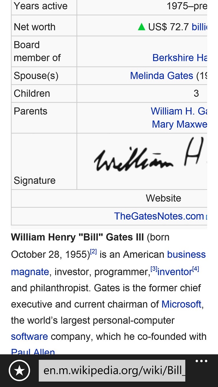
A screenshot showing the infobox being clipped on the right. The rest of the page seems fine.
Attached:
kagatlin wrote:
You can see this on several pages like Bill Gates, Jay Z, tiger, rose, and Steve Jobs pages (pretty much any page with an infobox on the top).
As the page is loading the infobox is rendered correctly, but as the page completes its loading it re-renders much larger and is clipped on the right side.
It doesn't happen on all phones, but can repro consistently on phones where it is an issue.
It appears to be related to the computed devicepixelratio:
devicePixelRatio=function(){if(window.devicePixelRatio!==undefined){return window.devicePixelRatio;}else if(window.msMatchMedia!==undefined){if(window.msMatchMedia('(min-resolution: 192dpi)').matches){return 2;}else if(window.msMatchMedia('(min-resolution: 144dpi)').matches){return 1.5;}else{return 1;}}else{return 1;}};$.fn.hidpi=function(){
This value returns '2' on phones where this is a problem. If the value is changed to 1.5, it renders fine.
Thanks for taking the time to report this and the initial analysis!
Could you tell us on which phones you can reproduce this?
kagatlin wrote:
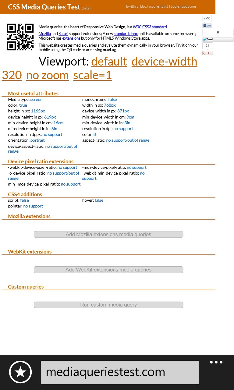
Lumia 920 hitting www.mediaqueriestest.com.
Screenshot of Lumia 920 hitting the www.mediaqueriestest.com site. This is the 920 with the updated version of the browser.
Attached:
kagatlin wrote:
Hi Jon and Andre, sorry for the late response.
I can reproduce this on most Windows Phones, e.g., the Nokia Lumia 920, although it is in a build of the OS that hasn't been released (so you won't see this issue on a phone that you have available to you). This is work we've previously discussed to improve the @viewport device-width issue reported in the past (see http://mattstow.com/responsive-design-in-ie10-on-windows-phone-8.html for a description of the issue). With this change device-width returns 371px rather than 768px on the Lumia 920.
The browser we're using is IE10 in Windows Phone 8.
I've also attached a screenshot from mediaqueriestest.com that might be helpful.
I hope this is useful. I can certainly work to dig up more information if it will help.
http://mattstow.com/responsive-design-in-ie10-on-windows-phone-8.html also implies that this is a Windows 8 problem only: "Windows Phone 8, which for some reason behaves differently to every other mobile OS".
It doesn't happen on all phones, but can repro consistently on phones
where it is an issue.
Could you categorize this a bit more?
Has this only happened on Windows 8 phones?
Or also on other Windows Phone versions (7) or systems (Android, iOS, etc)?
(In reply to comment #1)
Created attachment 13064 [details]
A screenshot showing the infobox being clipped on the right.
As already written in the linked blogpost, this seems to be no issue with Windows Phone 7: Trying on http://en.m.wikipedia.org/wiki/Bill_Gates with a Nokia Lumia 800, which according to mediaqueriestest.com has
device-width in px: 480px
width in px: 1024px
I cannot reproduce the problem. (I don't have a Windows Phone 8 phone here.)
Attached:
Yes.. could also be a duplicate of bug 49440 - either way i think this is a mixture of these 2 bugs.
Prioritization and scheduling of this bug is tracked on Mingle card https://mingle.corp.wikimedia.org/projects/mobile//1180
kagatlin wrote:
(In reply to comment #8)
http://mattstow.com/responsive-design-in-ie10-on-windows-phone-8.html also
implies that this is a Windows 8 problem only: "Windows Phone 8, which for
some
reason behaves differently to every other mobile OS".It doesn't happen on all phones, but can repro consistently on phones
where it is an issue.Could you categorize this a bit more?
Has this only happened on Windows 8 phones?
Or also on other Windows Phone versions (7) or systems (Android, iOS, etc)?
This only happens on Windows 8 phones with a new update of the OS (which hasn't rolled out yet). I have tried to see if I can find a repro on other non-WP devices, but I haven't found a repro thus far on another device.
(In reply to comment #1)
Created attachment 13064 [details]
A screenshot showing the infobox being clipped on the right.As already written in the linked blogpost, this seems to be no issue with
Windows Phone 7: Trying on http://en.m.wikipedia.org/wiki/Bill_Gates with a
Nokia Lumia 800, which according to mediaqueriestest.com hasdevice-width in px: 480px width in px: 1024pxI cannot reproduce the problem. (I don't have a Windows Phone 8 phone here.)
WP7 doesn't have this issue. Nor does the current shipping version of WP8. We fixed the WP8 behavior for @viewport width in this upcoming version, and that seems to be causing the problem (as related to the computed devicepixelratio I noted earlier).
Attached:
Would it be possible for us to get access to this WP8 build to test? Emulator would be fine...
kagatlin wrote:
I'm working on it... Would you, Brion, be the contact person to discuss this more?
kagatlin wrote:
So it's weird... yesterday morning I could repro this bug, but then last night the bug stopped repro'ing. I literally have two tabs open on my phone -- one with the repro and one that renders as desired.
Was there a fix that went in for this yesterday?
(In reply to comment #17)
Was there a fix that went in for this yesterday?
Wild guess: Bug 49440 comment 30 was resolved and deployed yesterday.