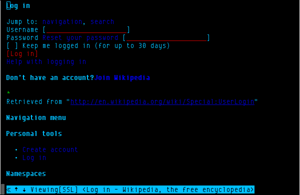
When using a text browser, the login page looks like here:
Jump to: navigation, search
Username [ ]
Password Reset your password [ ]
- Keep me logged in (for up to 30 days)
[Log in]
Help with logging in
w3m (and some other text browsers) tabs over all links, images and fields, not obeying tabindex (for a reason - those need to be reachable somehow).
What happens now one has to tab over the "Reset your password" link once more to get to the password field. I suppose also screen reader user might be confused - "Reset your password" follows just the string "Password" in the HTML of the page:
<label for='wpPassword1'>
Password <a href="/wiki/Special:PasswordReset" title="Special:PasswordReset" class="mw-ui-flush-right">Reset your password</a>                        </label>
<input class="loginPassword" id="wpPassword1" tabindex="2" size="20" placeholder="Enter your password"
type="password" name="wpPassword" /> </div>
Arguably, "Reset your password" does not belong to this <label> at all.
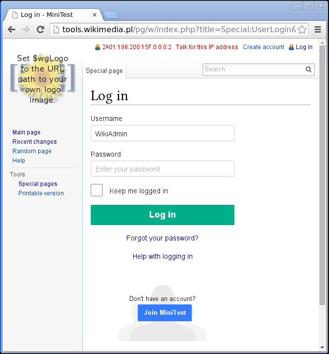
Even in the graphical browser, when reading LTR, one glances over "Password " and "Reset your password" labels, probably focusing more on "Enter your password" prompt in the field itself. Eyeballs shouldn't be bothered with
some not very often used link if the user is going to provide the password
right away.
I think those fields should be re-ordered, at least in HTML (and may be even
in the layout for the graphical browser).
I would suggest to move "Reset your password" before or after "Help logging in" - actually this could be on a single line with "Reset your password" probably right justified. Not sure what relative position of those should be vis-a-vis "Log in" button, but logically "reset your password" is some specific tool address on particular login problem; while the rest of the problems should be addressed in "Help logging in".
Please note that some sites (Google I think) call their forgot password "Problems logging in?" and therefore one link might cover all cases -
forgotten psssword, some more complex account recovery tool and some
general help. Additional "Help logging in" button is then unnecessary.
Most popular workflow should be "User name" -> "Password" -> "Log in" with all other buttons (remember 30 days, recover and help) moved out of the way, if possible.
Version: 1.22.0
Severity: normal
URL: https://en.wikipedia.org/wiki/Special:Userlogin?uselang=en