Page MenuHomePhabricator

Button on MWOAuthManageMyGrants/manage should be text instead
Closed, ResolvedPublic

Description

Feedback from the designers on OAuth interface.

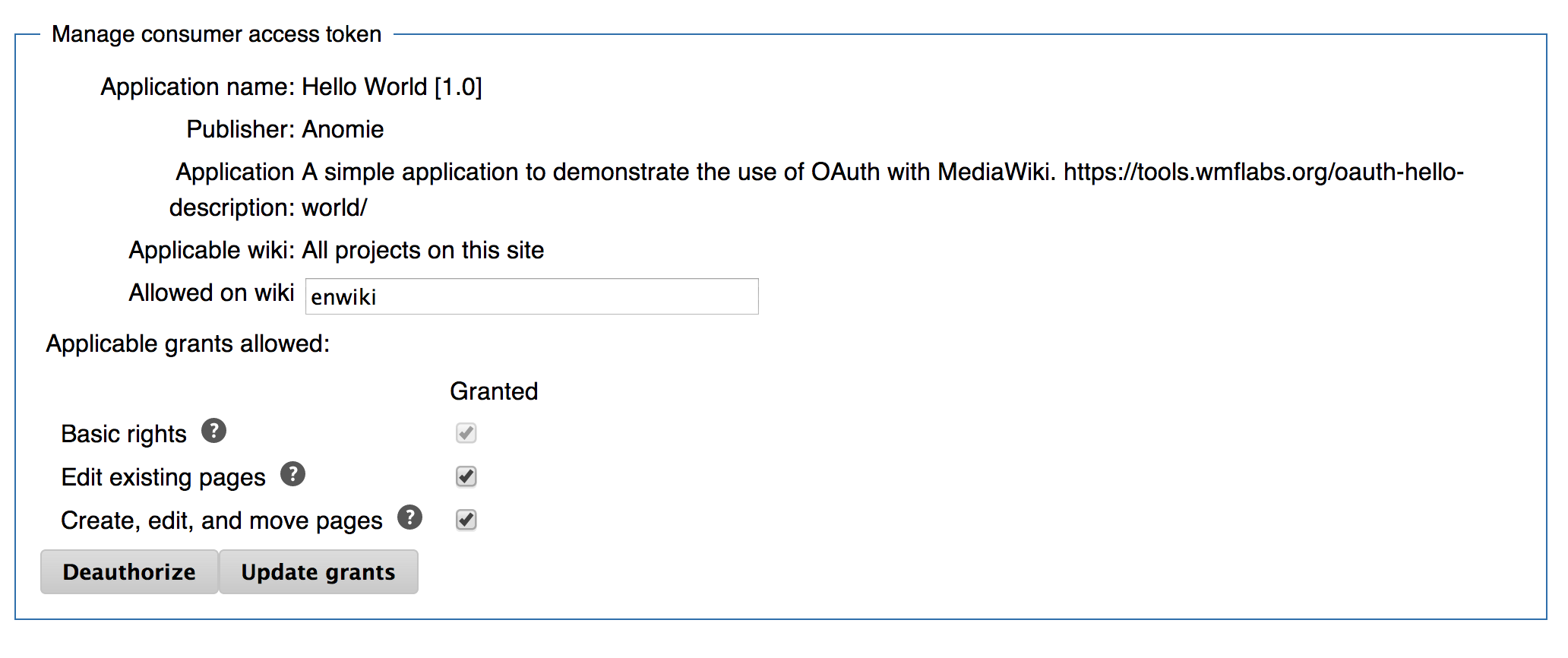
When managing grants for one particular consumer ([[Special:MWOAuthManageMyGrants/manage/N]] for some N) "deauthorise" should be text above the "Update grants" button, rather than a separate button, as it's not intended to be the main functionality of the screen.


Version: unspecified
Severity: normal

Details

Reference
bz54716

Event Timeline

bzimport raised the priority of this task from to Needs Triage.Nov 22 2014, 2:22 AM
bzimport set Reference to bz54716.

The one concern I have about this is whether users will miss the text and be asking "How do I remove permission for something to use my account?"

I hear you. Let's look at alternative ways to make it less prominent while still letting the "Update grants" button be the more prominent one. Any suggestions?

I think I've heard the UI people say before that they like to color the "primary" button blue or something like that. Could that do it?

That was already done in the screenshot that Jared reviewed. He was still a bit unhappy with the big red button. Are there other alternatives?

I'm not entirely sure there is.

Deauthorize, I would argue, *is* one of the 2 main reasons anyone visits that page. For example, facebook offers deauthorize ("Remove") with 1 click, while changing the permissions requires at least 2.

I'm looking at https://www.mediawiki.org/wiki/Special:MWOAuthManageMyGrants/manage/34 and the two grey buttons side by side aren't great. I'll upload a screenshot in a moment.

Created attachment 13467
Screenshot of [[mw:Special:MWOAuthManageMyGrants/manage/34]]

Attached:

Screen_Shot_2013-10-09_at_9.45.58_PM.png (866×2 px, 113 KB)

(In reply to comment #6)

I'm looking at
https://www.mediawiki.org/wiki/Special:MWOAuthManageMyGrants/manage/34 and
the two grey buttons side by side aren't great. I'll upload a screenshot in a
moment.

Thanks for pointing that out. This appears to be a problem with MonoBook more than OAuth; all the coloured buttons in OAuth are grey, but this is also true of other coloured buttons (such as in CreateAccount) as well.

(In reply to comment #5)

I'm not entirely sure there is.

Deauthorize, I would argue, *is* one of the 2 main reasons anyone visits that
page. For example, facebook offers deauthorize ("Remove") with 1 click, while
changing the permissions requires at least 2.

I just checked to see how Facebook handles this and they have a deauthorise button on the app listing, and then also an edit dialogue separate from it (which still has a deauthorise button on it). In contrast, we're doing it together.

I suppose the other alternative is that we pull them apart too. We could text for both deauthorising and editing on the main MWOAuthManageMyGrants, and text for deauthorising on the edit bit for each app.

CCing the platform designers, May and Kaity, for input.

The forms are split, so this is moot.