Page MenuHomePhabricator

Style mediawiki.ui buttons in other skins (e.g. Monobook) the same as Vector buttons (except typography)
Closed, ResolvedPublic

Description

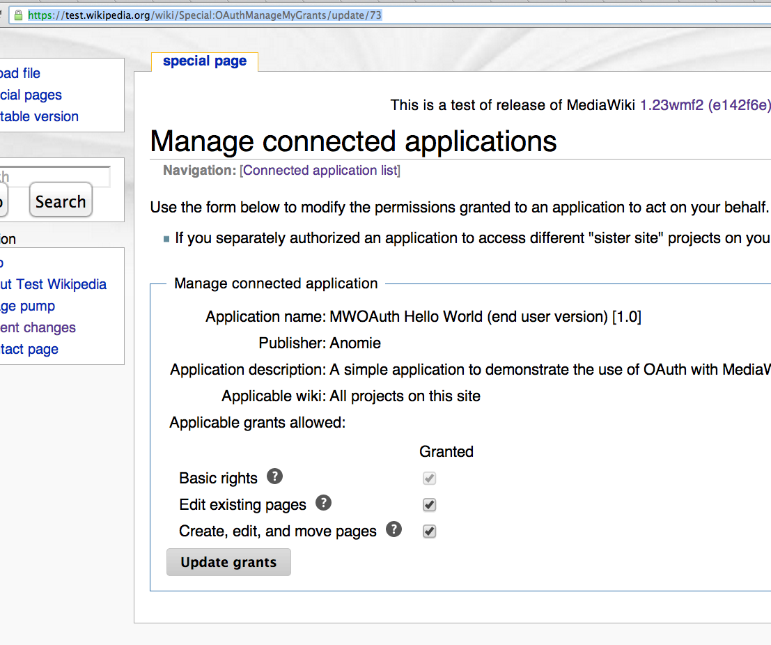
Currently, buttons with a coloured background, such as those in the new CreateAccount page, and the OAuth extension, are displayed as grey. Coloured buttons are important as part of a move we're doing towards making Wikimedia sites have a more fluid user experience, so it'd be great if MonoBook could be modified to incorporate those.


Version: 1.22.0
Severity: normal

Details

Reference
bz55554

Event Timeline

bzimport raised the priority of this task from to Medium.Nov 22 2014, 2:23 AM
bzimport set Reference to bz55554.

I'm pretty sure sticking to grayscale for Monobook (and all other non-Vector skins) was a conscious design decision, but I have no idea who decided on that or when. I don't like it too much either.

Created attachment 13471
Monobook and Vector login form comparison ([[Special:UserLogin]])

Attached:

2013-10-10_18_55_08-Log_in_-_Wikipedia_-_Opera.png (483×670 px, 33 KB)

Maybe not a dupe, but a blocker at least.

I believe this blocks OAuth's deployment to Wikimedia wikis. We can't have Monobook users getting grey buttons instead of blue. They look disabled.

The original approach should have been to either not style the buttons at all or style them appropriately.

Created attachment 13713
Screenshot from https://test.wikipedia.org/wiki/Special:OAuthManageMyGrants/update/73 using Monobook while logged in

Attached:

Screen_Shot_2013-11-05_at_7.42.57_PM.png (926×1 px, 167 KB)

(In reply to comment #5)

I believe this blocks OAuth's deployment to Wikimedia wikis. We can't have
Monobook users getting grey buttons instead of blue. They look disabled.

The original approach should have been to either not style the buttons at all
or style them appropriately.

I don't think this should block OAuth, but I'll let Dan make the final call on that.

Monobook users presumably are used to always seeing gray buttons, and disabled buttons (in monobook) are a much lighter shade of gray both on the background and text. So I don't think a monobook user would be confused about the button being disabled.

(In reply to comment #7)

Monobook users presumably are used to always seeing gray buttons, and
disabled buttons (in monobook) are a much lighter shade of gray both on the background and text. So I don't think a monobook user would be confused about the button being disabled.

That isn't entirely true. As an avid Monobook user, my only real exposure to buttons is on the login form which, as I am logged out when using that form and the default skin which logged out users are presented with is Vector, has lovely coloured buttons. In fact I found it so confusing that I filed this bug. :-)

That said, this isn't a blocker of the OAuth deployment. It's a flaw of Monobook, true, but given the context of the form and the fact that everything behind it is shaded a bit, it should be clear to users that the buttons aren't disabled.

The design team has decided that in order to ensure a good user experience and reduce the overhead for engineers in supporting older skins, we're moving away from officially supporting Monobook improvements. I'm changing the priority of this bug accordingly; if a volunteer dev wants to implement this improvement then they have my support, but the engineers in platform and the design teas can't afford to devote time to this.

(In reply to comment #8)

That said, this isn't a blocker of the OAuth deployment. It's a flaw of
Monobook, true, but given the context of the form and the fact that
everything behind it is shaded a bit, it should be clear to users that the
buttons aren't disabled.

How is it a flaw of Monobook that the default user interface controls have had custom styling applied to them that forces them to be grey (or gray)? This doesn't make any sense.

(In reply to comment #9)

The design team has decided that in order to ensure a good user experience
and reduce the overhead for engineers in supporting older skins, we're moving
away from officially supporting Monobook improvements.

Most power-users use Monobook. Who is "the design team"?

Please leave this as low priority if you don't plan to provide a patch. Information about the design team can be found on https://www.mediawiki.org/wiki/Design

(In reply to comment #11)

Please leave this as low priority if you don't plan to provide a patch.

These two points are unrelated. It isn't an enhancement request to not have the buttons look disabled. Either the styling should be removed completely or it should be implemented properly. The current implementation simply looks broken.

(In reply to comment #12)

Either the styling should be removed completely or it
should be implemented properly. The current implementation simply looks
broken.

Correct, however MediaWiki maintainers and design team do not concentrate on non-default skins like Monobook. Not all skins have the same priority and receive the same attention, hence this is low priority. I ask you again to leave it like that.
If you are keen on getting this bug report fixed the way to go is to provide a patch or find somebody to provide a patch. Thanks for your understanding.

(In reply to comment #13)

Correct, however MediaWiki maintainers and design team do not concentrate on
non-default skins like Monobook. Not all skins have the same priority and
receive the same attention, hence this is low priority.

Are you a MediaWiki maintainer or a member of the design team? Who, exactly, are you speaking for? As noted in comment 10, most power-users use Monobook.

I don't plan to spend too much fighting over priorities here.

Krinkle and MatmaRex are already CC'ed and developers in this area.
Dan is the product manager of Core, so he has a say about priorities.
Dan set the priority to "low" in comment 9.

I am also severely overloaded.

I can submit a commit to use the same colorful styles for Monobook as for Vector in like 30 seconds, but I'm not sure if that would be "appropriate" either.

(In reply to comment #16)

I am also severely overloaded.

I can submit a commit to use the same colorful styles for Monobook as for
Vector in like 30 seconds, but I'm not sure if that would be "appropriate"
either.

I personally have no problem with this. I've CCed Pau and Steven to see what they think.

As I said at bug 47698, "we could consider using the same colors on Monobook if there is consensus to do so."

I haven't found anyone that really likes the grey buttons, nor has any one proposed a specifically Monobook-y look for the buttons (encouraging the latter was partly why I had it like that originally). In contrast, several people seem to prefer the colored ones here.

So I'm alright with just putting the colored buttons for all skins, or just Vector and Monobook (not sure which Bartosz has in mind).

That doesn't rule out a non-Vector skin switching to a custom button look in the future.

I think that we should try to have a UI vocabulary as common as possible across all different skins. Concepts such as "primary" button should be available on all skins, and I find it ok to propose a default implementation for those (e.g., blue button) that can be later overridden if it does not fit the skin, rather than making "primary" buttons not available on most skins (or indistinguishable from regular buttons) to anticipate problems.

swalling wrote:

(In reply to comment #17)

(In reply to comment #16)

I am also severely overloaded.

I can submit a commit to use the same colorful styles for Monobook as for
Vector in like 30 seconds, but I'm not sure if that would be "appropriate"
either.

I personally have no problem with this. I've CCed Pau and Steven to see what
they think.

As I said at bug 47698, "we could consider using the same colors on Monobook
if
there is consensus to do so."

I haven't found anyone that really likes the grey buttons, nor has any one
proposed a specifically Monobook-y look for the buttons (encouraging the
latter
was partly why I had it like that originally). In contrast, several people
seem to prefer the colored ones here.

So I'm alright with just putting the colored buttons for all skins, or just
Vector and Monobook (not sure which Bartosz has in mind).

That doesn't rule out a non-Vector skin switching to a custom button look in
the future.

I think Matt's summary here is spot on.

Bartosz: if you want to implement the patch you talked about, that will work just fine I think.

Well, then the patch is just:

diff --git a/resources/Resources.php b/resources/Resources.php
index a022c6d..c99b6d1 100644

  • a/resources/Resources.php

+++ b/resources/Resources.php
@@ -1179,10 +1179,7 @@ return array(

		'position' => 'top',
	),
	'mediawiki.ui' => array(
  • 'skinStyles' => array(
  • 'default' => 'resources/mediawiki.ui/default.less',
  • 'vector' => 'resources/mediawiki.ui/vector.less',
  • ),

+ 'styles' => 'resources/mediawiki.ui/vector.less',

		'position' => 'top',
	),

);

But now the "vector" hardcoded in the module name would be silly and renaming that would be boring grunt work.

We should probably rename "default" → "base" and "vector" → "default" in file names etc., or something like that.

It's not quite that simple, since there is another difference between default and vector. This is vector-type, which is currently font-size and line-height. This bug is not requesting to roll out the typography to all skins.

As far as the renaming, 'default' should mean 'unless a skin specifies an explicit alternative', and 'vector' is self-explanatory.

I'd like to see a preview of what this would the buttons would look like after these changes.

Created attachment 13989
Hypothetical mockup of Monobook login screen with colored buttons

Very similar. It may be identical/indistinguishable for some people/browsers.

I made the screenshot in Firefox 23, by commenting out vector-type, and loading the same LESS as vector for Monobook.

Attached:

Monobook_colored_buttons.png (513×1 px, 31 KB)

Change 103498 had a related patch set uploaded by Mattflaschen:
Apply mediawiki.ui.button colors to all skins

https://gerrit.wikimedia.org/r/103498

Given Terry's rule of three, I've asked the design team to give some input on this patch before we consider merging.

swalling wrote:

(In reply to comment #25)

Given Terry's rule of three, I've asked the design team to give some input on
this patch before we consider merging.

Hey Dan,

Matt already took care of that. :)

You can see Pau's comment 18 here. I think it sounds like he supports similar button styles across skins, as much as we can.

Change 103498 merged by jenkins-bot:
Apply mediawiki.ui.button colors to all skins

https://gerrit.wikimedia.org/r/103498

Christmas presents arrived early this year!

swalling wrote:

(In reply to comment #28)

Christmas presents arrived early this year!

heh. :)

Checking this out on Beta Labs, I see an orange background when using Monobook (example: http://en.wikipedia.beta.wmflabs.org/w/index.php?title=Special:UserLogin&useskin=monobook).

Is that a bug with Beta Labs? I see it not just on pages using mediawiki.ui, but with any, like http://en.wikipedia.beta.wmflabs.org/wiki/Dido_Sotiriou?useskin=monobook

(In reply to comment #30)

'body' has a 'background-color' set to 'orange' for some reason in
http://en.wikipedia.beta.wmflabs.org/wiki/MediaWiki:Monobook.css .

Hashar added it. He's not on IRC now, so I'm CCing it. Presumably he was testing something, but it would be good to resync with English Wikipedia if that's done.

Sorry for the delay. I think I have added the orange background on beta to highlight the fact that one was browsing the beta version and not the production one. I guess you can get rid of that lame orange color :-]

(In reply to comment #32)

I guess you can get rid of that lame orange color :-]

Done