Page MenuHomePhabricator

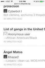
Anonymous icon on watchlist is weird looking
Closed, DeclinedPublic

Description

I'm not sure how to better describe this bug, but the icon just looks weird.

The eyes look like they're closed? Or something...

I can't think of a reason why anonymous users are represented differently,


Version: unspecified
Severity: enhancement
See Also:
https://bugzilla.wikimedia.org/show_bug.cgi?id=51927
Details

Reference
bz56815

Event Timeline

bzimport raised the priority of this task from to Low.Nov 22 2014, 2:22 AM
bzimport set Reference to bz56815.
bzimport added a subscriber: Unknown Object (MLST).

bingle-admin wrote:

Prioritization and scheduling of this bug is tracked on Mingle card https://wikimedia.mingle.thoughtworks.com/projects/mobile/cards/1379

Created attachment 13748
screenshot

Hit submit a bit early.

Attached:

2013-11-08_14.51.28.png (960×640 px, 75 KB)

Designers can explain why this is the case but this is not a bug as such as it is not clear how someone could pick up this bug and resolve it.

It would be better to discuss this here: https://www.mediawiki.org/wiki/MobileFrontend/Feedback on the design mailing list and raise a bug/enhancement request on some outcome of that conversation.

(In reply to comment #3)

Designers can explain why this is the case but this is not a bug as such as
it
is not clear how someone could pick up this bug and resolve it.

Ok, it would be helpful if they could comment here. This bug can be fixed by either:

a) Using a different icon

b) Using the icon for logged in users for anonymous ones (easier!)

It would be better to discuss this here:
https://www.mediawiki.org/wiki/MobileFrontend/Feedback on the design mailing
list and raise a bug/enhancement request on some outcome of that
conversation.

That page says "If you have discovered a bug please instead raise it on Bugzilla.".

or
c) change nothing

It doesn't seem like a bug to me and is not actionable by any means since the different icon was intentional and thus not an error.

If a designer thinks this icon needs to change and provides an asset to do so by all means reopen it. Jared is cc'ed on the bug so it would be interesting to hear his opinion.

(In reply to comment #2)

Created attachment 13748 [details]
screenshot

This icon looks high.

Attached:

2013-11-08_14.51.28.png (960×640 px, 75 KB)

This isn't resolved. Nobody is saying there's a particularly clear path forward (yet!), but we know that this issue is unresolved.

(In reply to comment #2)

Created attachment 13748 [details]
screenshot

As I noted at bug 41484 comment 45, these icons conjure up thoughts of [[blackface]]. The newest variant looks stoned or asleep. I really hope these icons are not currently deployed anywhere.

Attached:

2013-11-08_14.51.28.png (960×640 px, 75 KB)

(In reply to comment #8)

(In reply to comment #2)

Created attachment 13748 [details]
screenshot

As I noted at bug 41484 comment 45, these icons conjure up thoughts of
[[blackface]]. The newest variant looks stoned or asleep. I really hope these
icons are not currently deployed anywhere.

haha, thanks for sharing the blackface link. I hope when I smile I don't remind you or anyone else of blackface. I don't have one but I smile pretty similarly to blackface look-alike icon.

I got to be honest, I put a lot of thought into creating the icon, I couldn't decide which one would score a 100% user satisfaction. But then again, from experience that hardly ever happens, or ever. Since the heart icon was previously
offensive to some cultures, the most important goal was to not make it offensive while still being able to represent "thank you."

I can empathize that you are looking out for the rest because I do too. It may look like blackface sometimes but at least you got the point of the icon. Or am I wrong?

We haven't got confused users yet, or rather, we haven't got user complaints about different expectations when they click on the thank icon. So far the icon's been doing very well, and I'm glad it hasn't offended anyone, which means, so far, goal achieved. I'd hate if the icon must end up being a camel (http://bit.ly/bO5T). :P Until my solution starts to fail my goals, I hope it's fair for me to say that I will put this in my non-urgent to-do list until I hear users complaining about it being offensive and that they had different expectations when interacting with the icon. Meanwhile, let me know if anyone has another alternative suggestion.

About the anonymous icon, it was first used quite recently, and we are still testing the water and gathering user feedback. Anonymous users tend to not want an identity attached to them, hence, eyes closed. We wanted something that was easy to scan with enough distinction between signed on and anonymous users. The same goes to anonymous icon, while it's still early to come to a conclusion, I still hope it's fair that I put this under our non-urgent to-do list until we get more feedback. :D

Attached:

2013-11-08_14.51.28.png (960×640 px, 75 KB)

Legoktm, I wanted to address your question about why an anonymous user should look different.

Anonymous users will appear in lists such as watchlist, recent changes,
article history. People who are monitoring these queues need to look for certain things such as anons, large amounts of data removal, edits done on mobile etc.

Hence Anonymous users need to have a different icon. That said, the icon should have no negative connotation. Anon's certainly do a lot of useful work on Wikipedia.

This seems to be by design so I'm closing this. If you want to reopen please provide further actionable detail.