Page MenuHomePhabricator

Colors used to mark added/deleted spaces in diffs should have higher contrast
Open, MediumPublic

Description

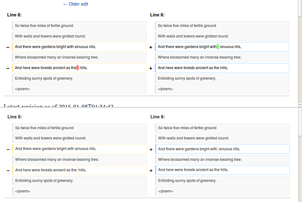
The colors used to mark diffs are unnecessarily light. They work well when whole words or sentences are changed, but for single characters or spaces i almost need to stick my nose to the screen to find what is changing.

See for instance: https://ca.wikipedia.org/w/index.php?title=Anarquisme_a_Espanya&curid=1010721&diff=12614384&oldid=12591573

Please use colors with higher contrast with the white background.


Version: 1.23.0
Severity: normal

Details

Reference
bz59093

Event Timeline

bzimport raised the priority of this task from to Medium.Nov 22 2014, 2:34 AM
bzimport set Reference to bz59093.
bzimport added a subscriber: Unknown Object (MLST).

See for instance the darker red/green colors used to mark specific changes at https://gerrit.wikimedia.org/r/#/c/100000/1/ProofreadPage.i18n.php

For what is worth, mobile is also using darker red/green (in a confusing way, but that is out of scope here):

https://ca.m.wikipedia.org/w/index.php?title=Anarquisme_a_Espanya&curid=1010721&diff=12614384&oldid=12591573

Light colours are used for accessibility reasons, in order to maintain a good contrast with the foreground (text). See bug 11374.

Translatewiki puts a dotted border around the text being changed, e.g. https://translatewiki.net/w/i.php?diff=5191317&oldid=5191063 which might be good for visibility, even if not especially attractive.

Ok, point taken. Still, If I don't see the changes, someone with visual impairment will have even a harder time.

Maybe the current rule works (although I would still welcome consistency of colors between mobile and desktop). However, maybe a different behavior could be designed for one character changes, where the light colors is easy to be camouflaged? The dotted border isn't attractive indeed, but at least does the job you want to do when looking at a diff.

The last time we discussed diff colors it was a 5 month ordeal.... :D

Can we just close this and move on?

Let me try again:

Looking at a diff, it is very difficult to find changes in added/removed spaces because the colors used by default don't have much contrast with the white background. It is difficult for an average person with an average screen, and I guess it is even harder with users with visual impairment.

See for instance

https://ca.wikipedia.org/w/index.php?title=Anarquisme_a_Espanya&curid=1010721&diff=12614384&oldid=12591573

The current colors are fine to mark changes in text since the text itself is marked in bold. However, in the case of spaces there are no characters involved.

One solution could be to use only in this situation the darker version of the same colors that is being used for the border of the box of the paragraphs changed. Without changing any color scheme, this would provide enough contrast to find easily those single spaces in diffs.

Using background colours may be the wrong approach for exactly this reason - to get the contrast high enough for spaces to stand out (or even show up, depending on your screen and/or eyesight), you wind up with contrast too high to easily read the text itself. Using bolding and colour worked well before for the text, but that didn't show space changes.

The dotted border is probably more along the lines of what we would want - either a border, or a colourful underline (like what spellcheckers do), or some other kind of formatting change that doesn't interfere with the text itself.

Regardless of what you do, though, some people will find it ugly. That's just a given.

Change 106763 had a related patch set uploaded by Jackmcbarn:
Increase changed text background contrast

https://gerrit.wikimedia.org/r/106763

FYI: I use a small script to highlight white-space changes:
https://github.com/he7d3r/mw-gadget-HighlightSmallDiffs

Meh. Changed abandoned. Did we fall in one of those situations where the better solution was dismissed in pursue of the perfect solution?

Meanwhile, diffs in spaces are easy to spot in most if not all code review applications, when they continue to be difficult to find in MediaWiki.

FYI: I use a small script to highlight white-space changes:
https://github.com/he7d3r/mw-gadget-HighlightSmallDiffs

That's great! After/Before screenshot (this diff):

WWbdhSD.png (652×974 px, 58 KB)

Is it something we could merge into core?

Please don't proceed with this with the current color scheme shown in the
image… we shouldn't be mixing these color schemes, we can add additional
contrast without having a mixture of red, green, blue, and yellow. Not
only are those colors not colorblind safe, they are adding extra layers of
meaning that could be very unclear to users.

*Jared Zimmerman * \\ Director of User Experience \\ Wikimedia Foundation

M +1 415 609 4043 \\ @Jaredzimmerman http://loo.ms/g0

I agree with Jared, and I also think the space highlights should not have any additional padding. This is confusing (it looks like a double space was added or removed, when it was only a single space).

currently the colors don't match the colors on the endcaps or borders, even just having them that same color adds more contrast, than we have now. Perhaps lets start with that subtle change of using a single color for the borders, endcaps, and space highlighting, and see if that is enough additional contrast.

That's great! After/Before screenshot
Is it something we could merge into core?

Most of the impact is achieved by making the coloured spot fatter, as far as I can see. That's certainly something easy enough to do? No quarrels about colours needed. :)

Unmerging, per Nemo_bis' comment at the other task

[...] this bug is about *identification* of whitespace changes, not about their display.

Sorry for the noise.

Let me suggest a possible algorithm:

Break each block of text up into domains, where the domain boundaries are where you change from one color to another in the current display scheme. For example, in this diff cited above, the first diff block on the left would have three domains:

  1. Aquests ... Espanyol
  2. The single space that was deleted
  3. }}citar ... </ref>

while the corresponding block on the right would be one single domain.

Have a palette of N colors (3 or 4, would be enough, I guess). Make the background color of each domain the ordinal domain number modulo N. Then, when comparing the two text blocks, it would be immediately obvious where the changes are. Basically, this is applying edge detection to the diffs, and the human visual system is really good at edge detection.

This is probably not the best way to display a diff most of the time, but having a button to quickly toggle back and forth between the current scheme and what I describe above would work. You look at a diff, don't see any changes, flip to edge detection mode, immediately spot the domain boundaries, then flip back to see the details. Probably just a matter of adding some div tags with the right classes around the domains and a little javascript to flip modes by hacking the CSS.