Page MenuHomePhabricator

Flow: 3 elements need darker font for accessibility
Closed, ResolvedPublic

Description

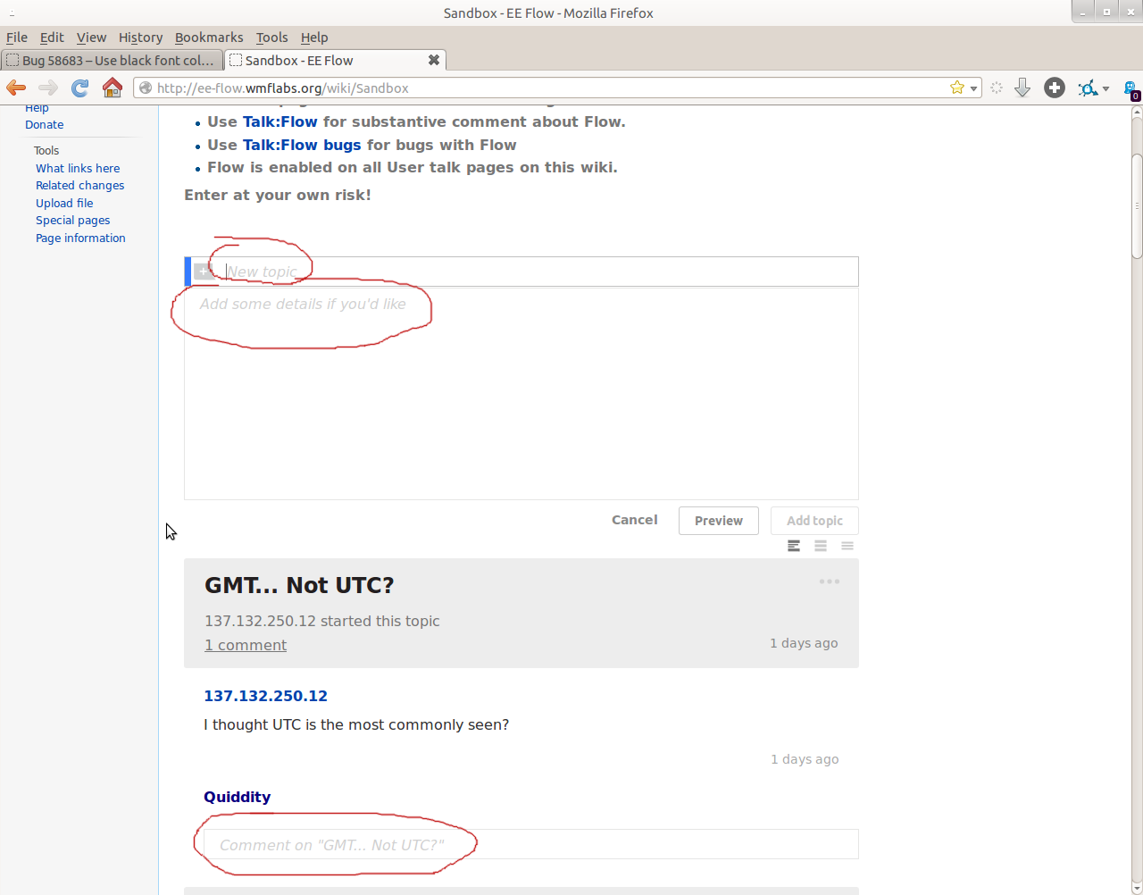
Screenshot with 3 areas circled in red

The 3 areas on the screenshot circled in red:

  • Placeholder text for "New Topic" Title
  • Placeholder text for "Add some details if you'd like"
  • Placeholder text for "Comment on ["title"]"

are all much too light (low contrast). People with poor eyesight can't read that.

Semi-related to bug 58683


Version: unspecified
Severity: major

Attached:

Screenshot_from_2014-01-10_18:26:21.png (1×1 px, 109 KB)

Details

Reference
bz59933

Event Timeline

bzimport raised the priority of this task from to Medium.Nov 22 2014, 2:37 AM
bzimport set Reference to bz59933.
bzimport added a subscriber: Unknown Object (MLST).

bingle-admin wrote:

The WMF core features team tracks this bug on Mingle card https://wikimedia.mingle.thoughtworks.com/projects/flow/cards/712, but people from the community are welcome to contribute here and in Gerrit.

Using black on placeholder text would confuse users that is placeholder text to begin with. I have never in my career seen placeholder form field text displayed in black for this reason, closing as INVALID as it would cause more problems than it would fix.

Nobody said the placeholders should be black. The bug says they're supposed to be *darker*.

The current color for placeholders (#D1D1D1) passes *none* of the often-quoted WCAG accessibility standards (you can check on http://snook.ca/technical/colour_contrast/colour.html for example)

Vector uses #999 for searchbox placeholders.

swalling wrote:

(In reply to Bartosz Dziewoński from comment #4)

Vector uses #999 for searchbox placeholders.

The same is true for login/signup/other forms like password reset, I believe?

Practically speaking, when I look at http://www.mediawiki.org/wiki/Talk:Flow which has both the Search box and Flow placeholders, I can't tell the difference between the Vector Search and Flow placeholders.

If anything, the Flow placeholders are easier for me to read, because they have larger input areas, more whitespace, and the font size is larger.

Raising severity, this actually results in people not realizing that they can post a comment, because they can't see the text.

https://en.wikipedia.org/wiki/Wikipedia:Village_pump_(technical)#A_beta_option_without_option_to_start_a_response

I would fix this for you, but based on the comments here I have no idea if my work won't go to waste. Will it?

Change 129491 had a related patch set uploaded by Wctaiwan:
Darken input box placeholder text colour

https://gerrit.wikimedia.org/r/129491

(In reply to Steven Walling from comment #5)

(In reply to Bartosz Dziewoński from comment #4)

Vector uses #999 for searchbox placeholders.

The same is true for login/signup/other forms like password reset, I believe?

I think they use the browser defaults, which vary across browsers of course. They seem to be very slightly lighter than Vector's search placeholder.

This has been a persistent complaint. I think we can document one "I can't find a button to post" comment for each user-facing Flow page that's been deployed. Especially since this is an unfamiliar product, this needs to be *more* legible than the well-understood search box.

Change 129491 merged by jenkins-bot:
Darken input box placeholder text colour

https://gerrit.wikimedia.org/r/129491

The colour change was very minor (from #AAA to #999, which seems to be the one used by the search box given /skins/vector/components/search.less), so it might not be particularly noticeable. Quiddity says on IRC that maybe it should be even darker, and I'm inclined to agree.

In addition, Quiddity and S said on IRC that for them the change was from #D1D1D1 to #C8C8C8 in Firefox, using results from a colour picker. Testing with #F00 (bright red), I got http://i.imgur.com/Byt13Pf.png, which would seem to indicate that Firefox makes the text lighter than the specified colour (Chrome, on the other hand, seems to use #F00 as desired). Not sure how to go about this.

AAA OR 999 specified via LESS variables are both acceptable. I don't think we should do a ton of work for a browser specific override unless it's lightweight and CSS only.

(In reply to wctaiwan from comment #11)

Firefox makes the text lighter than the specified
colour (Chrome, on the other hand, seems to use #F00 as desired). Not sure
how to go about this.

What the browser default is? These are usually quite sane, and probably pretty close to each other in this case. We might just want to drop the color override (maybe in Vector too?).

Yet another reason why placeholders are inferior to normal text labels when used as, well, labels.

(In reply to wctaiwan from comment #11)

In addition, Quiddity and S said on IRC that for them the change was from
#D1D1D1 to #C8C8C8 in Firefox, using results from a colour picker. Testing
with #F00 (bright red), I got http://i.imgur.com/Byt13Pf.png, which would
seem to indicate that Firefox makes the text lighter than the specified
colour

Firebug HTML > Style > Show User Agent CSSsays Firefox has an opacity rule making it lighter.
input::-moz-placeholder, textarea::-moz-placeholder {

display: inline-block !important;
opacity: 0.54;
overflow: hidden !important;
pointer-events: none !important;
resize: none !important;

}

setting opacity: 1; makes it less light.

Created attachment 16436
screenshot

The "Start a new topic" and new-topic-placeholder text is now #757575 (good!), but the "reply" to an existing post placeholder-text is #878787.

Please could we standardize on #777 or #757575 as the absolute minimum grey for text? (For Everything except "search" field placeholders, where there's generally a button labelled 'search' or a magnifying glass to tell the user what it's for.) I've added a section for "Text color" at [[mw:Wikimedia Foundation Design/Typography]], let's continue this discussion there.

This bug can be closed, once the remaining reply-placeholder text is #777 or darker. (It could potentially be this current color or lighter, if we had deeper threading/indenting - but currently the placeholder text is needed in order to clearly see who we're replying to, especially if we're composing 2 replies at the same time.)

Attached:

en.wikipedia.org_2014-09-10_12-28-19.png (705×765 px, 61 KB)

777 feels really dark for placeholder text, I'd be more comfortable with 999 Moiz and May are working on the accessibility section of the Mediawiki.ui Guidelines. So I'll defer to them and their research on the matter.

Created attachment 16439
screenshot of potential way to discern differences

(In reply to Jared Zimmerman (WMF) from comment #16)

777 feels really dark for placeholder text,

Definitely, it is really dark (too dark) for most of us, but until we have some kind of accessibility pane, the default ought to be something that works well for *everyone*.

However, I suppose the shape of the different responses, will actually give sufficient clue to the people who don't have sufficient contrast to actually read the words.

I'll close this bug [and request that we don't take my update as an opportunity to go even lighter than #878787 for now), and hope for both an accessibility/appearance control panel, and guidelines on text-color and accessibility, sometime in the future. :)

Attached:

www.mediawiki.org_2014-09-10_23-25-05.png (827×804 px, 79 KB)

(In reply to Jared Zimmerman (WMF) from comment #16)

777 feels really dark for placeholder text, I'd be more comfortable with 999
Moiz and May are working on the accessibility section of the Mediawiki.ui
Guidelines. So I'll defer to them and their research on the matter.

If you wouldn't have come up with the ingenious plan to make all fonts (even body text) grayish in the first place you wouldn't have to whine about #777 being "too dark" as a placeholder...

If I look at a FLow page nowadays it looks kinda colorful (in regards to different shades of gray) and I'm most certain that this can only confuse people in contrast to a clear color sheme with one black font for body text and one gray font for placeholders / meta information.

Just a though, but I'm sure the "designers" will make sure this won't happen.

Eduard: Please avoid comments here that could be interpreted as sarcasm. https://www.mediawiki.org/wiki/Bug_management/Bugzilla_etiquette has some hints. Thank you for considering.

It's not sarcasm, it's my opinion.

That gray text used for so many elements in Flow is a bad idea to start with, and it results in issues like this (where placeholders need to designed so light that they are not readable anymore because otherwise they could be mistaken for actual content...)

(In reply to Jared Zimmerman (WMF) from comment #16)

777 feels really dark for placeholder text, I'd be more comfortable with 999
Moiz and May are working on the accessibility section of the Mediawiki.ui
Guidelines. So I'll defer to them and their research on the matter.

That because it should be a label, not a placeholder text.