multi-line button alignment issues in Chromium
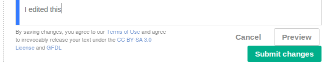
When editing a reply, the indent plus the 50% wide terms of use plus the longer [Submit changes] text lead to buttons wrapping onto a second line.
Even if we tweak the design (more wrapping, quiet "Cancel" button, etc.), the buttons are going to wrap in some languages, so Agora should handle this better. We should recheck when Flow uses the Agora in core, but for now I notice:
- Buttons butt up against each other vertically, there's no spacing.
- The middle Preview button isn't fully right-aligned (in Chromium but OK in Firefox). I think it has a gap to its right for whitespace to the next button even though the next button is on the next line. If I add a button myself in Chromium developer inspector it doesn't have a separate closing </input> and seems to align properly.
- When I pointed out a similar issue with the Login form, Jared wanted the main CTA to be on the first row, with other buttons below, which I think is doable if each button is float-right and we swap ordering, but will have strange tab behavior.
If it happens with local Agora-override styles removed then this bug should move to core Skins component.
Version: master
Severity: normal
Attached: