Page MenuHomePhabricator

OOjs UI: Alignment and padding of icons in used in iconed ButtonWidget are a bit ugly
Closed, ResolvedPublic

Description

Screenshot

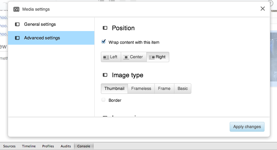
Right now the labels of the tabs Left, Center and Right are now aligned with the icons on them rather a bit misplaced upwards.Also, there should be a bit more spacing between the icon and the tab label.

See the screenshot attached.

Test Environment: http://en.wikipedia.beta.wmflabs.org/
Browser: Chrome Version 26.0.1410.65 & FF 25
OS: MAC OS X 10. 8. 5


Version: unspecified
Severity: minor

Attached:

Screen_Shot_2014-03-06_at_1.23.24_PM.png (507×931 px, 57 KB)

Details

Reference
bz62345

Event Timeline

bzimport raised the priority of this task from to Medium.Nov 22 2014, 3:06 AM
bzimport added a project: OOUI.
bzimport set Reference to bz62345.

Trevor's in-person comments:

  • More margin between the text and icon would be nice
  • The images are ~1px too low because they're weighted down-file rather than up-file, and this should be reversed

These might have been butchered by me, sorry.

It appears you don't have the browser set to 100% zoom in the screenshot (ctrl+0)

Change 117422 had a related patch set uploaded by Esanders:
Balance margins around icon on iconed ButtonWidget

https://gerrit.wikimedia.org/r/117422

Change 117422 merged by jenkins-bot:
Balance margins around icon on iconed ButtonWidget

https://gerrit.wikimedia.org/r/117422