Page MenuHomePhabricator

Have mediawiki.ui buttons show focus in a clear and accessible way
Closed, ResolvedPublic

Description

This is just BAD practice. We should by default NOT do this and only very specifically do it if we have real alternative styles.

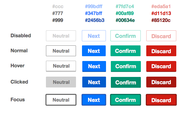
We currently apply the same style for focus as for hover, which in my opinion is simply not suited for the focus state. The only difference in this hover+focus style from the 'plain' style is a slightly darker green bottom line. I suggest taking a good look at github for instance, where they use a small dotted line, or they show the tooltip of the control for instance (the hover action).

As put eloquently here: "Stop messing with the default focus outline"
http://tjvantoll.com/2013/01/28/stop-messing-with-the-browsers-default-focus-outline/


Version: unspecified
Severity: normal

Details

Reference
bz62924

Event Timeline

bzimport raised the priority of this task from to Medium.Nov 22 2014, 2:51 AM
bzimport set Reference to bz62924.

+1, this has been annoying me too. The current indicator is too subtle.

Change 119998 had a related patch set uploaded by TheDJ:
Accessibility: Don't remove outlines from focusable elems

https://gerrit.wikimedia.org/r/119998

This is something we discussed a bit before. We decided to tentatively keep the focus the same as hover, but I agree we should revisit it.

However, as you note, it is possible to make a good focus style that is not the browser's default. The GitHub one (which I hadn't seen before) is a good example (Go to https://github.com/wikimedia/mediawiki-core then tab and shift-tab around until you get to the Watch/Star/Fork buttons).

Of course, our buttons look quite different from GitHub's, but it should still be possible to find a good distinctive styling. If not, we can use the browser defaults.

Lets revisit this once we have all the controls together in one place (living style guide) rather than while things are still in flux.

All the buttons are in the living style guide at http://tools.wmflabs.org/styleguide/desktop/section-2.html . I don't think that's a blocker.

Given that this is already used in production, I would suggest reverting to the default focus styling while, as Jared puts it, "things are still in flux". We can come up with proper focus styles later.

Change 119998 abandoned by TheDJ:
Accessibility: Don't remove outlines from focusable elems

https://gerrit.wikimedia.org/r/119998

All states of a button

Added new spec

Attached:

Screenshot_2014-09-23_16.18.13.png (376×616 px, 60 KB)

for the lighter and darker versions of the mw.ui colors cna you calculate the HSB differecnes so we can code these with LESS variables rather than hard coding hex values.

e.g. dark green is constructive(minus)HSB 0,0,30

This way if we need to add new colors, we can specify one value and have light and dark calculated automatically.

(In reply to Jared in comment #9)

We could use the same approach as with the bevel where instead of specifying a color we just set it to black with a particular opacity.

Change 162514 had a related patch set uploaded by Prtksxna:
buttons: Update focus state

https://gerrit.wikimedia.org/r/162514

Change 162515 had a related patch set uploaded by Prtksxna:
buttons: Update focus for quiet buttons

https://gerrit.wikimedia.org/r/162515

Depending on the browser/platform that could render differently than having it draw the correct color, but arrive at that color programmatically

Change 162514 merged by jenkins-bot:
buttons: Update focus state

https://gerrit.wikimedia.org/r/162514

Change 162515 merged by jenkins-bot:
buttons: Update focus for quiet buttons

https://gerrit.wikimedia.org/r/162515