Page MenuHomePhabricator

Hovercards: cards should inherit default Vector typography
Closed, ResolvedPublic

Description

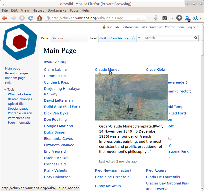
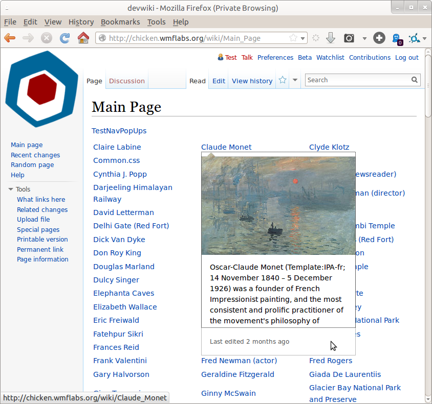
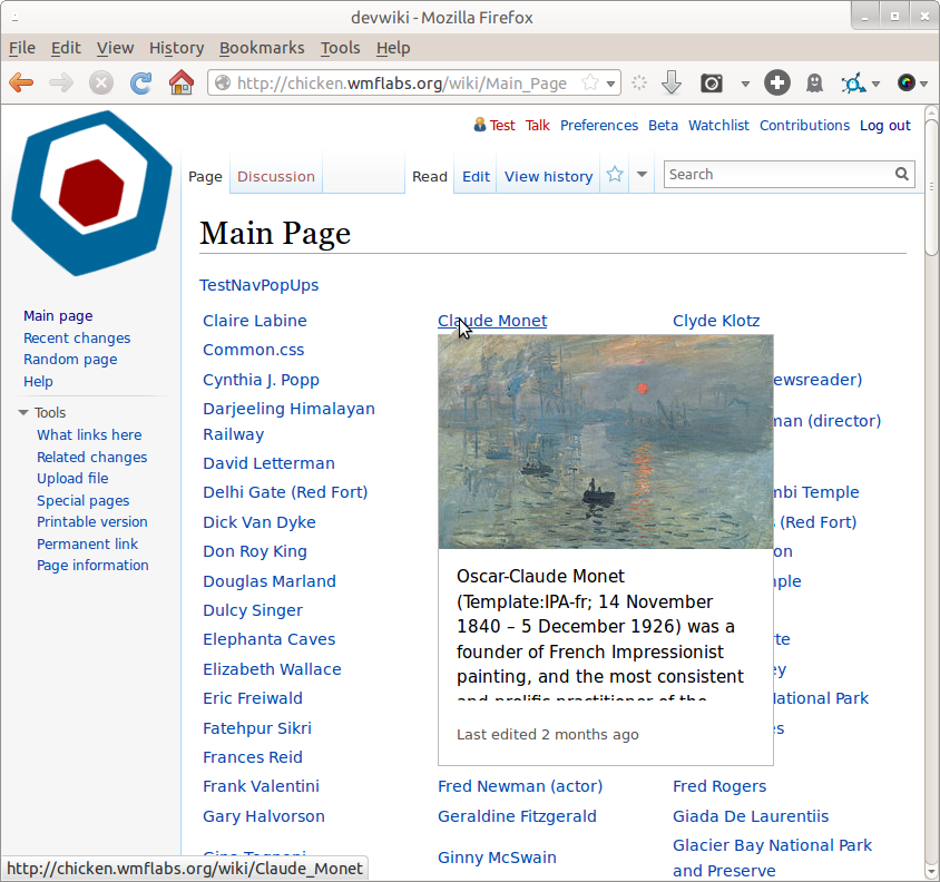
The typography refresh changed the font size on Wikimedia wikis, but Hovercards has not been affected by the typeface changes.

Hovercards should respect the typeface of the wiki it's running on.


Version: unspecified
Severity: enhancement
See Also:
https://bugzilla.wikimedia.org/show_bug.cgi?id=65045

Details

Reference
bz63508

Event Timeline

bzimport raised the priority of this task from to Medium.Nov 22 2014, 3:12 AM
bzimport added a project: Page-Previews.
bzimport set Reference to bz63508.

If I remember correctly Vibha and I took this decision consciously according to the size of the hovercard. It initially *was* picking up the typography of the wiki but that wasn't working out.

Prateek and I have discussed this. Respecting the typography will significantly increase the size of the layout. Will review with Jared before resolution.

(In reply to Vibha Bamba from comment #2)

Prateek and I have discussed this. Respecting the typography will
significantly increase the size of the layout. Will review with Jared before
resolution.

I actually filed this bug on the advice of Jared (an email he sent on 3rd April 2014 at 19:00).

Ultimately, I feel this is primarily a design decision so it's up to you how to proceed. I'll support your decision, whatever it is.

Prateek, I chatted with Jared with this. Here is an idea. What if we set up an instance on labs with a few articles and a switch. The Switch works as follows -

  1. Replicate a version of hovercards which respects the typography of the page.
  2. Create a second instance that uses a 125% increment in the type size.

I know this sounds strange, because we will see much less text if the size of the popup stays at what it is right now. The rationale is that users need to be able to read the popup quickly. So showing less text which can be more efficiently read is worth the tradeoff.

Change 126970 had a related patch set uploaded by Prtksxna:
DONT MERGE/REVIEW - Pref for testing on chicken

https://gerrit.wikimedia.org/r/126970

my recommendation is that the type be at minimum the same size as the body text, and ideally larger. This would mean less text, not bigger hovercards.

Agree, that is the idea. Size of popups is not going to increase.

Change 126970 abandoned by Prtksxna:
DONT MERGE/REVIEW - Pref for testing on chicken

Reason:
It was alright to do this with common.css

https://gerrit.wikimedia.org/r/126970

To see the current type size go to
http://chicken.wmflabs.org/wiki/Main_Page and login using the
following credentials-

User: normal
Password: normalnormal

To see the larger type go to the same page and login with the
following credentials-

User: test
Password: testtest

You are seeing the larger type if you see the logo on the top left spinning.

The larger type looks good to me. More welcoming to read while still providing enough text to provide context.

Created attachment 15144
screenshot - smaller text

Attached:

Screenshot_from_2014-04-21_09:32:43.png (791×844 px, 262 KB)

Created attachment 15145
screenshot - larger text

Attached:

Screenshot_from_2014-04-21_09:32:48.png (791×844 px, 266 KB)

Created attachment 15146
screenshot - last edited div-size

I agree the larger font for the extract is good.

However, could the "last edited [time]" be reduced in font-size, and drastically reduced in div-height? It's currently taking up ~55px out of ~400px.

Attached:

Screenshot_from_2014-04-21_09:47:11.png (791×844 px, 268 KB)

Can we try 0.5em larger? Right now the type size looks practically the same as the background article text. If its different, then its better for it to have a good size contrast.

Do we need any other tests before we make the decision?

Created attachment 15258
screenshot - even larger text

Here's the 0.5em larger font, screenshot attached.

The "last edited [time]" div really really needs to be reduced.

Attached:

Screenshot_from_2014-04-30_15:30:46.png (792×844 px, 265 KB)

Should I mark this as duplicate of 65045 and close this?

  • Bug 65045 has been marked as a duplicate of this bug. ***

(Quoting Vibha's comment from bug 65045)

Need to make the type size bigger so a reader can scan it quickly.
We have been testing a larger type size and it helps with quick reading. The caveat is that a user sees less text.

.mwe-popups{
font-size: 15px;
line-height:24px;
}

.mwe-popups-extract {
max-height: 103px !important;
}

.mwe-popups-is-tall .mwe-popups-extract {
max-height: 100px !important;
}

Change 132492 had a related patch set uploaded by Prtksxna:
Increase font size

https://gerrit.wikimedia.org/r/132492

Change 132492 merged by jenkins-bot:
Increase font size

https://gerrit.wikimedia.org/r/132492

Prtksxna raised the priority of this task from Medium to Needs Triage.Dec 3 2014, 5:29 AM
Prtksxna moved this task from Backlog to Archive on the Page-Previews board.