poor layout of SimpleCaptcha in Create account form
.mw-ui-vform wants to style its contents as chunky full-width blocks. It used to only apply this to elements that are immediate children of its divs. As I understand it, this was so arbitrary HTML dropped in the form wouldn't get unexpectedly styled, but sometimes you want it and sometimes not.
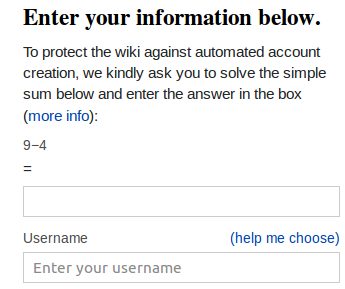
Gerrit 121842 fix for Bug 63233 removed the div parent from the selector so all labels and input field within .mw-ui-form get the styling. Now QuestyCaptcha looks great, but the layout of SimpleCaptcha is degraded. Its HTML includes
<p><label for="wpCaptchaWord">9−4</label> = <input name="wpCaptchaWord" id="wpCaptchaWord" size="5" autocomplete="off" tabindex="1" /></p>
which normally displays as plain
9−4 = [ ]
but now the mw-ui-vform CSS gives the label display:block and different alignment, and gives the input field display:block and width 100%. The result (see attachment) is
9−4
[width 100% text area ]
I'm not sure what the best fix is. SimpleCaptcha could move the = into the label to reduce it to two lines, and override the full-width input field with style="width:auto;".
The CAPTCHA's same chunk of HTML appears elsewhere. The create account form reformats and restyles the FancyCaptcha image CAPTCHA, but it would be a lot of work to restyle other captchas.
Version: unspecified
Severity: normal
Attached: