Page MenuHomePhabricator

Kerning of Nimbus Sans L could be improved
Closed, DeclinedPublic

Description

Author: swalling

Description:
Some people are reporting that kerning of Nimbus Sans L could be improved.

Originally reported by Brian Wolff at http://lists.wikimedia.org/pipermail/wikitech-l/2014-April/075909.html


Version: unspecified
Severity: normal
OS: Linux
Details

Reference
bz63807

Related Objects

Event Timeline

bzimport raised the priority of this task from to Medium.Nov 22 2014, 3:15 AM
bzimport set Reference to bz63807.
bzimport added a subscriber: Unknown Object (MLST).

swalling wrote:

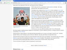
I did some testing myself in Firefox and Chrome, and I am not really seeing a major issue to be honest. (See attached screenshots).

swalling wrote:

Decided to upload screenshots to Commons instead. They're at...

[[commons:File:Screenshot of MediaWiki in Chrome with new typography.png]]
[[commons:File:Wikipedia Linux screenshot new typography in Firefox.png]]

Remember that, if you were getting DejaVu Sans before, this is going to look smaller in some respects. We talked about this in bug 63686 as well. DejaVu is a humanist san-serif with much wider appearance to the eye, but vertical x-height is more uniform in a Helvetica-like sans such as Nimbus. This gives us more consistent appearance and readability for large text blocks, which is why it was chosen.

swalling wrote:

Screenshot

Attached:

0002screenshot.png (768×1 px, 235 KB)

swalling wrote:

The additional screenshot I attached is from Chrome on Linux, looking at the same caption Brian reported on. I do not see the same kerning problem he did. Is this potentially browser-specific?

As I said in a follow up email, the issue is more pronounced in Firefox. Do you not see it in Firefox?

https://commons.wikimedia.org/wiki/File:Typo-refresh-kerning-wn.png

I measured both the fake kerning space and the real space. They were both exactly 3 pixels

Oddly enough, chrome on the exact same computer seems to select arial over nimbus (which looks significantly better)

swalling wrote:

(In reply to Bawolff (Brian Wolff) from comment #7)

Oddly enough, chrome on the exact same computer seems to select arial over
nimbus (which looks significantly better)

I assume you downloaded Arial as part of a Windows font package? (Not sure what distro of Linux you are on, but this is somewhat common among Ubuntu users it seems.)

I have it. Possibly from wine. Or some other package i installed over the years. Distro is debian

We won't be overwriting the kerning to the font, as that would likely cause more issues than it resolves.