Page MenuHomePhabricator

Update logo for wikimediafoundation.org
Closed, InvalidPublic

Description

Author: hwalls

Description:
The Wikimedia Foundation logo was revised by the WMF in 2012, but is not reflected in a number of places. One notable place is the wikimediafoundation.org logo.

Described in the visual identity guidelines here:
https://wikimediafoundation.org/wiki/Visual_identity_guidelines#toc-foundation

The current logo can be found here:
https://commons.wikimedia.org/wiki/File:Wmf_logo_vert_pms.svg


Version: wmf-deployment
Severity: enhancement
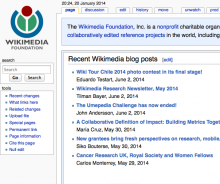
Details

Reference
bz66044

Event Timeline

bzimport raised the priority of this task from to Medium.Nov 22 2014, 3:25 AM
bzimport set Reference to bz66044.
bzimport added a subscriber: Unknown Object (MLST).

The logo uses incorrect colours.

hwalls wrote:

Can you be more specific?

The colors were professionally adjusted at the same time as the proportions.

The Wikimedia logo uses different colours; these are incorrect.

hwalls wrote:

Hi Nemo,

That is the major difference along with minor spacing differences around the text.

This can be solved without the use of Bugzilla; just get a Wikimedia Foundation wiki administrator to overwrite https://wikimediafoundation.org/wiki/File:Wikimediafoundation-logo.png.

The full list of that wiki's admins can be found at https://wikimediafoundation.org/wiki/Special:ListUsers/sysop.

CC-ing James Alexander, who's one of those people, so he can have a look at the issue at hand.

(In reply to Heather Walls from comment #5)

That is the major difference along with minor spacing differences around the
text.

(That is, after the traditional colours have been restored by Rich Farmbrough.)

Slightly off topic after comment 6: such a size is in direct contrast with the standard logo sizes of most Wikimedia wikis, which strive for a square, usually 135px in width and the same or something more in height; both are always in the range 128–159 px IIRC, with a handful negligible exceptions. Most notably, of course, the Wikipedia logo ([[commons:Wikipedia/2.0]]) is at 135x155.

I don't foresee such an atypical size pattern being widely adopted; be aware you'll have to either live with an increased logo inconsistency or invest huge efforts in pushing adoption.

hwalls wrote:

(Someone will have to explain to me why people who also would seem to prefer public domain, care so deeply about slight differences in color intended to make the logos work better visually.)

I see what you say about the logo proportions on other Wikimedia wikis. No adoption outside of Wikimedia Foundation wiki (as far as site logos) is requested or expected.

I am only trying to make the usage of logos by the WMF align with the visual identity guidelines.

(In reply to Heather Walls from comment #8)

(Someone will have to explain to me why people who also would seem to prefer
public domain, care so deeply about slight differences in color intended to
make the logos work better visually.)

I didn't judge colours, I just noted a difference. Three other persons used the adjective "correct", I was very NPOV and chose "traditional".

I see what you say about the logo proportions on other Wikimedia wikis. No
adoption outside of Wikimedia Foundation wiki (as far as site logos) is
requested or expected.

I am only trying to make the usage of logos by the WMF align with the visual
identity guidelines.

Ok, then if that part of the visual identity guidelines is only meant for the WMF, or for its wiki, it should note so. Otherwise it will be very hard to process shell requests and the like by others, with conflicting sources.

(In reply to Nemo from comment #9)

(In reply to Heather Walls from comment #8)

(Someone will have to explain to me why people who also would seem to prefer
public domain, care so deeply about slight differences in color intended to
make the logos work better visually.)

I didn't judge colours, I just noted a difference. Three other persons used
the adjective "correct", I was very NPOV and chose "traditional".

I appreciate that :) I have limited feelings about the specific colors (though I would mostly keep the traditional if it was all up to me) though I know I have strong strong attachment to the logo as a whole and have since long before I was staff. I can't fully explain why but it is there regardless ;)

(Mostly Note to show that I've seen this and will take a look about changing things tomorrow when I'm at the office, probably in the afternoon because packed solid for the morning)

hwalls wrote:

Thanks James, and everyone for your input.

(In reply to James Alexander from comment #10)

(Mostly Note to show that I've seen this and will take a look about changing
things tomorrow when I'm at the office, probably in the afternoon because
packed solid for the morning)

I already looked into this. The wiki logo for wikimediafoundation.org can be changed by any unblocked user, it looks like. I did a quick comparison (attachments forthcoming). I don't love the smaller icon size, but it's acceptable as long as the colors remain as they've been.

Created attachment 15556
Current logo in use at wikimediafoundation.org, 2014

Attached:

wmfwiki-current-logo-2014.png (507×604 px, 112 KB)

Created attachment 15557
Proposed logo for use at wikimediafoundation.org, 2014

Attached:

wmfwiki-proposed-logo-2014.png (482×633 px, 111 KB)

hwalls wrote:

Update: we're going to leave this as it is for now.