Page MenuHomePhabricator

OOjs UI: Auto-shortening of dialog titles when there's insufficient space isn't working
Closed, ResolvedPublic

Description

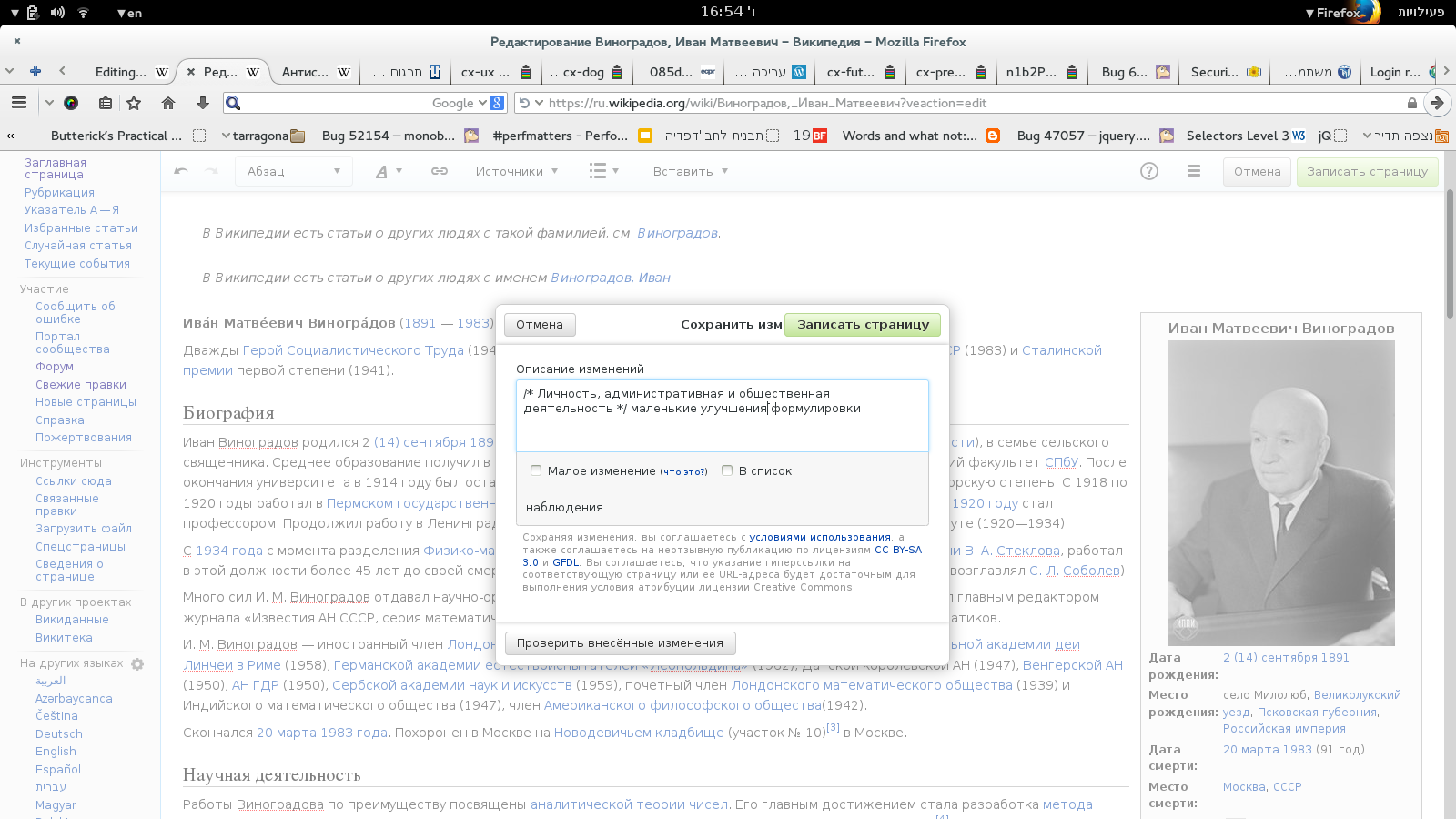
In languages where the messages "Save your changes" and "Save page" are longer than in English, the button can overlap the window title.

For an example of how it can look see the attached screenshot (in Russian).

A full list of translations of these messages can be found here:


Version: unspecified
Severity: normal

Details

Reference
bz68571

Event Timeline

bzimport raised the priority of this task from to High.Nov 22 2014, 3:33 AM
bzimport added projects: OOUI, Design, I18n.
bzimport set Reference to bz68571.

Created attachment 16036
a screenshot with the problem

Attached:

vinogradov.png (900×1 px, 297 KB)

This happens even in English in the "Insert references list" dialog.

It seems the intended behavior is to ellipse the text, but that doesn't happen because the label is inline-block. If I override that to inline, then it displays silly because it had margins which are no longer applied, which would have to be fixed with some more rules (line-height probably). That doesn't seem optimal and it feels like it could cause other problems later, so I'm not sure if we should do it.

I wonder if that behavior is a good idea at all. Perhaps we should center the label within the space between buttons if there isn't enough space to center it relative to the entire window? That could be done in ProcessDialog#fitLabel, or with some creative CSS, and would make this problem a lot rarer.

(In reply to Bartosz Dziewoński from comment #4)

It seems the intended behavior is to ellipse the text, but that doesn't
happen because the label is inline-block. If I override that to inline, then
it displays silly because it had margins which are no longer applied, which
would have to be fixed with some more rules (line-height probably). That
doesn't seem optimal and it feels like it could cause other problems later,
so I'm not sure if we should do it.

This has been fixed in 6ede2d8223df9e62f4693fd45570b55eb682d69d and adfcf92c6abfe15d782481c5d786c1f8136429ae, it seems.

I wonder if that behavior is a good idea at all. Perhaps we should center
the label within the space between buttons if there isn't enough space to
center it relative to the entire window? That could be done in
ProcessDialog#fitLabel, or with some creative CSS, and would make this
problem a lot rarer.

And I'm going to do this too.

Change 160812 had a related patch set uploaded by Bartosz Dziewoński:
ProcessDialog: Don't center the title label if there's not enough space

https://gerrit.wikimedia.org/r/160812

Change 160812 abandoned by Bartosz Dziewoński:
ProcessDialog: Don't center the title label if there's not enough space

Reason:
Okay, so it seems we don't actually want to do this. I'm not sure if I agree, but I can accept that this is by design.

https://gerrit.wikimedia.org/r/160812