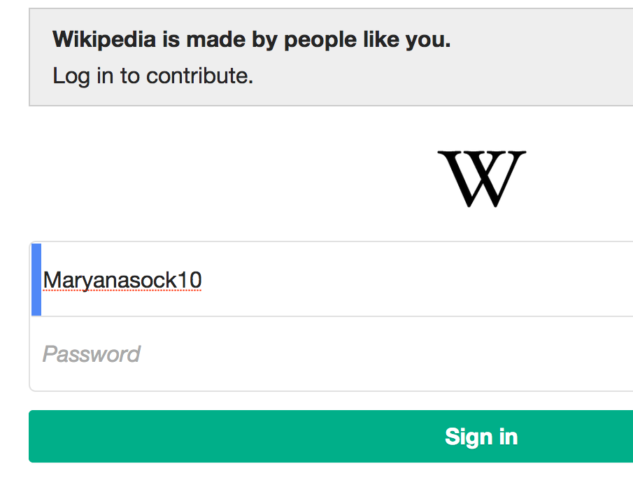
Login form on mobile site on beta labs (viewed in desktop Chrome)
On beta labs, the blue input indicator has begun to appear on the login & account creation form fields on the mobile site; however, since those fields have rounded corners on mobile and the input indicator evidently expects the square fields that are present on desktop, there's an awkward gap around the edges (see attached screenshot). There also appears to be some padding missing between the indicator and the input text, because it's quite close & crowded -- and imho the padding isn't entirely ideal on desktop, either :)
Version: unspecified
Severity: normal
Attached: