Page MenuHomePhabricator

Echo: Flyout's Alerts · Messages tab-links should have active tab as "black text, non-linked"
Closed, ResolvedPublic1 Estimated Story Points

Description

screenshot

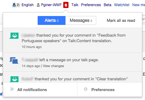
Currently the flyout's two tabs, have the link colors backwards.

The label for the active tab, should be colored black, and should not be an active link.
The label for the inactive tab, should be blue, and clickable.
(per standard mediawiki UX, and usability best-practices.)

When you have only Alerts (no Flow messages) the one word should likewise be black text non-linked (this was T76912).


Version: unspecified
Severity: normal

Attached:

www.mediawiki.org_2014-08-22_16-50-55.png (160×932 px, 29 KB)

Event Timeline

bzimport raised the priority of this task from to Needs Triage.Nov 22 2014, 3:37 AM
bzimport set Reference to bz69929.
bzimport added a subscriber: Unknown Object (MLST).

More generally the flyout should implement our developing standard for tabbed panes, which seems to be a blue bottom border to indicate current tab and no color. https://trello.com/c/F3SdIvRg/45-tabs

Spage added a subscriber: Jaredzimmerman-WMF.

Back in September we made the patch https://gerrit.wikimedia.org/r/#/c/159222/ fixing this, so I'm pretty sure this bug should have been closed then, and what we're seeing now is a regression.

To fix this properly we need a design spec for tabs, see the Trello card. @Jaredzimmerman-WMF suggests using button group, but mediawiki.ui doesn't have any support for highlighting the current "selected" button.

Spage set Security to None.

Wasn't the active one bold at one point? seems to have changed…

Danny says "we don't need design approval to fix the regression -- go ahead and fix it. :)"

Spage renamed this task from Echo: Flyout's tab-links, should have active tab as "black text, non-linked" to Echo: Flyout's Alerts · Messages tab-links should have active tab as "black text, non-linked".Dec 11 2014, 1:13 AM
Spage removed Pginer-WMF as the assignee of this task.
Spage updated the task description. (Show Details)

In the short term, making the current selection to be bold and black will avoid the current issue.

For the long term, tabs or button groups could work. Given that the "messages" tab requires additional actions ("Mark all as read"), a button group may be more space efficient. I created two quick mockups below (I added the "mark all as read" action to the "Alerts" for the sake of the example):

Based on button groups:

button-based.png (325×470 px, 49 KB)

Based on tabs:

tabs-based.png (341×470 px, 55 KB)

@Pginer-WMF just wanted to share this with you https://www.mediawiki.org/wiki/Compact_Personal_Bar#mediaviewer/File:CPB_flyout_icons_v2.png in case you wanted to use it for greater alignment (the eng. work has not been done) but it was a pattern I'd hoped to see for settings, and actions on flyout lists. Take a look and use at your discretion.

DannyH renamed this task from Echo: Flyout's Alerts · Messages tab-links should have active tab as "black text, non-linked" to [1] Echo: Flyout's Alerts · Messages tab-links should have active tab as "black text, non-linked".Jan 12 2015, 8:05 PM
Mattflaschen-WMF renamed this task from [1] Echo: Flyout's Alerts · Messages tab-links should have active tab as "black text, non-linked" to Echo: Flyout's Alerts · Messages tab-links should have active tab as "black text, non-linked".Feb 2 2015, 8:03 PM
Mattflaschen-WMF edited a custom field.
gerritbot subscribed.

Change 188214 had a related patch set uploaded (by BearND):
Make current Echo overlay tab dark gray and bold

https://gerrit.wikimedia.org/r/188214

Patch-For-Review

Change 188214 merged by jenkins-bot:
Make current Echo overlay tab dark gray and bold

https://gerrit.wikimedia.org/r/188214

Mattflaschen-WMF reopened this task as Open.

I'm going to move this to product review, but it should be closed shortly.

Works on Beta, closing.