Page MenuHomePhabricator

Vector: h3 should not appear as heavier weight than h2
Closed, DuplicatePublic

Assigned To
None
Authored By
Isarra
Aug 25 2014, 9:47 PM
Referenced Files
F14649: 69998.png
Nov 22 2014, 3:41 AM
F14646: Screenshot_2014-09-23_13.23.41.png
Nov 22 2014, 3:41 AM
F14645: vector_headers_windows.png
Nov 22 2014, 3:41 AM
F14643: vector_headers.png
Nov 22 2014, 3:41 AM
Tokens
"The World Burns" token, awarded by QEDK.

Description

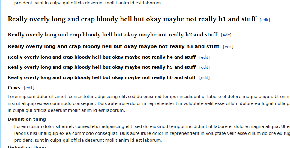
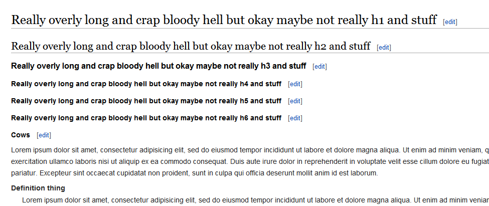
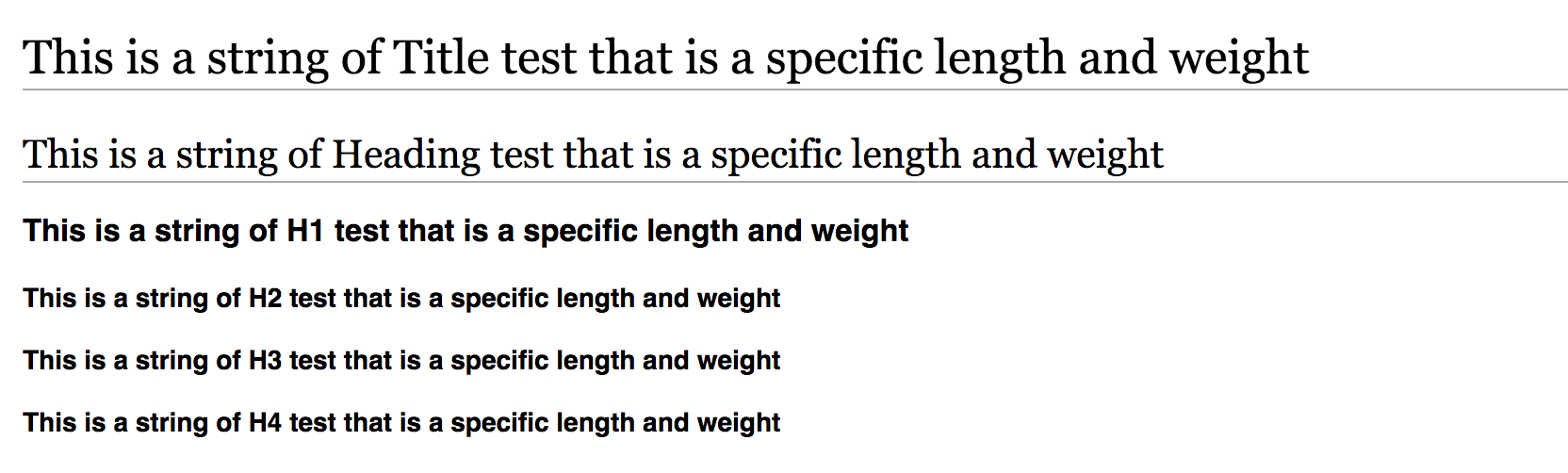
The h3s in vector are bolder than and subsequently can appear a bit bigger than h2s, despite being less important than h2s.

Headers should appear with decreasing apparent importance according to which header they are.


Version: unspecified
Severity: normal

Related tasks

T65844: h3 should not be more prominent than h2 headings
T71999: MonoBook: h3 should not appear as heavier weight than h2
T72004: h4, h5, and h6 headers should not have the same styling
T73240: Re-evaluate serif font stack for headers

Details

Reference
bz69998

Event Timeline

bzimport raised the priority of this task from to Needs Triage.Nov 22 2014, 3:41 AM
bzimport set Reference to bz69998.
bzimport added a subscriber: Unknown Object (MLST).

Change 162304 had a related patch set uploaded by Legoktm:
Make h1-6 sizes consistently different

https://gerrit.wikimedia.org/r/162304

I'm not able to reproduce this. I'm seeing H2 and H3 as visually identical, but properly affecting the information hierarchy in the TOC, which seems reasonable to me. I'm not sure I see the value in a proliferation of stylistic differences from H1-H5 beyond what is absolutely necessary.

Jared, your system must be horribly misconfigured then. Can you provide a screenshot? For a more visible effect, try looking at a page in Russian, Arabic, Hebrew or Chinese, as in all of these languages (and probably many more) the effect is a lot more profound than in languages using the Latin alphabet.

Bartosz, can you provide a link to a page where the effect is prominent.

Bartosz can you provide a screenshot? This could be platform specific.

Created attachment 16564
Headers on enwp

Screenshot of https://en.wikipedia.org/wiki/User:Isarra/header_test

The h3 text is much heavier than the h2. Due to the different fonts, you can also see how the h3 can appear longer on some linux systems.

I'm afraid I don't have a testpage for any of the other languages Bartosz mentioned, but even in english you get the point.

Attached:

vector_headers.png (495×967 px, 60 KB)

Created attachment 16565
Headers on enwp (windows)

Same thing, different fonts.

Attached:

vector_headers_windows.png (411×975 px, 29 KB)

Looks like a weird platform specific bug then?

(In reply to Jared Zimmerman (WMF) from comment #8)

Looks like a weird platform specific bug then?

If 'everything that isn't your personal computer' is 'platform specific', perhaps. The same thing holds on macs; I just don't have direct access to one or I'd have uploaded a screenshot of that, too.

Isarra I personally see nothing wrong in that screenshot.

There is nothing that says an h3 need to be a stronger font weight than h2.

I can tell the h2 is more important than the h3 as:

  • it has an underline
  • it has a bigger font size
  • it has larger line height/margins

Created attachment 16566
Headings test Mac/chrome

I've added the example as rendered on mac chrome (safari is indistinguishable)

Attached:

Screenshot_2014-09-23_13.23.41.png (502×1 px, 88 KB)

(In reply to Jon from comment #10)

Isarra I personally see nothing wrong in that screenshot.

There is nothing that says an h3 need to be a stronger font weight than h2.

I can tell the h2 is more important than the h3 as:

  • it has an underline
  • it has a bigger font size
  • it has larger line height/margins

Aye, by itself the weight difference is by no means a major issue. The underline and margins on the h2 do effectively indicate that it's supposed to be more important, but even so, the h3s are... strange. Due to the bolding and font differences effective weight of the h3s is significantly higher than the h2s, and why? It looks strange, and there's really no good reason for this.

So why not make it better? That's all this is about.

For a bit of history, this issue has actually been present in monobook since its release, with vector merely inheriting the header styles from that. The typography refresh may have made it stand out more (especially on some platforms) due to the different fonts, however: serif fonts tend to be a lot lighter in general than sans-serif, which is also part of why they've historically been regarded as so bad for screen use, and the different fonts in the serif stack also have quite a bit of variation in their own sizes, which can make the effect even more pronounced depending on which gets used.

But that just means the serif stack should be applied to all the headers so it doesn't matter, that's all. Beyond that the fix is still pretty much exactly the same here as it would be for monobook.

(In reply to Jared Zimmerman (WMF) from comment #4)

Bartosz, can you provide a link to a page where the effect is prominent.

Try these:

https://en.wikipedia.org/wiki/San_Francisco#Education
https://he.wikipedia.org/wiki/סן_פרנסיסקו#.D7.90.D7.AA.D7.A8.D7.99.D7.9D_.D7.91.D7.A2.D7.9C.D7.99_.D7.97.D7.A9.D7.99.D7.91.D7.95.D7.AA
https://zh.wikipedia.org/wiki/旧金山#.E6.97.85.E9.81.8A
https://ru.wikipedia.org/wiki/Сан-Франциско#.D0.9E.D0.B1.D1.80.D0.B0.D0.B7.D0.BE.D0.B2.D0.B0.D0.BD.D0.B8.D0.B5

This is the article about San Francisco. How bad the headings look depends on the language, with some it's mostly okay, with some it's awful.

There are no links above to a wiki in Arabic script, because it seems that they all overrode the "typography refresh" styles to restore sans-serif headings. I guess it looked *that* bad there.

Bartosz, I think from this we can surmise the problem primarily exists in windows, as I'm not seeing anything I would refer to as confusing, or awful on a mac in chrome or safari, so the question remains, "Why are these rendering an such a different way across platforms?"

If the bug report is read literally, that H3s should not be bold, OR H2s should be bold, OR that H2s should be bold and H3s should not I'm not sure I agree with that. As Jon pointed out, I have no issue clearly differentiating between H2s and H3s and aside from this bug, I've not heard this issue from any significant number of users.

Created attachment 16568
URLs in comment 13; Firefox 32 private session (logged out), 100% zoom, Fedora 20

Attached:

69998.png (354×512 px, 28 KB)

Related: Bug 71240 - Re-evaluate serif font stack for headers

(I know bugzilla has a thing for related bugs somewhere, but the interface doesn't really give any hints as to which field that actually is.)

(In reply to Isarra from comment #16)

Related: Bug 71240 - Re-evaluate serif font stack for headers

(I know bugzilla has a thing for related bugs somewhere, but the interface
doesn't really give any hints as to which field that actually is.)

"See also" field :)

Change 162304 had a related patch set uploaded by Bartosz Dziewoński:
Make h1-6 sizes consistently different

https://gerrit.wikimedia.org/r/162304

Change 164712 had a related patch set uploaded by Isarra:
Adjust header sizes to scale apparent size according to header weight

https://gerrit.wikimedia.org/r/164712

Running Firefox 37.
h2 and h3 are different. But, h4, h5 and h6 look almost the same.
Shouldn't that be a more pressing issue?
But hierarchy runs fine, so...

Isarra set Security to None.
In T71998#1255301, @Ankit-Maity wrote:

h2 and h3 are different. But, h4, h5 and h6 look almost the same.
Shouldn't that be a more pressing issue?

h4-6 are the same. See T72004.

But I agree that using the same font for all headers will solve any discrepancy issues. But it is also a design change, so it warrant more discussion (on phab).

I'm not a fan of the "it's by design" (anti)pattern. If it's broken, it's broken. There can be multiple solutions and each patch should make a single self-contained change, but as long as we have only one solution on the table then that solution should be adopted until a better one comes.

Nemo_bis triaged this task as Medium priority.May 31 2015, 2:52 PM
Nemo_bis added a project: I18n.

I say we start by just putting the fonts back to all the same. Probably sans-serif, unless we can actually find a grouping of serifs everyone actually has that respond proportionately to their sans serifs. Objections?

And I suppose this would depend on how well the related i18n things have been sorted out?

I once already suggested throwing out Georgia as being diproportionate to the other fonts. See https://www.mediawiki.org/wiki/Talk:Typography_refresh#Header_fontstack. I also suggested ohter fontstacks that are very similair in design and metrics. But ditching Georgia is the main argument in all of them.

And I suppose this would depend on how well the related i18n things have been sorted out?

They have not been sorted out.

Change 216028 had a related patch set uploaded (by Isarra):
Make headers use the same fonts as the rest of the content

https://gerrit.wikimedia.org/r/216028

Change 573052 had a related patch set uploaded (by Aron Manning; owner: Aron Manning):
[mediawiki/skins/Vector@master] [Typography] Fix sizes and consistent font usage of headings h1-h6.

https://gerrit.wikimedia.org/r/573052

Change 573052 abandoned by Jdlrobson:
[Typography] Fix sizes and consistent font usage of headings h1-h6.

https://gerrit.wikimedia.org/r/573052

Change 573052 restored by Aron Manning:
[Typography] Fix sizes and consistent font usage of headings h1-h6.

https://gerrit.wikimedia.org/r/573052

Change 576109 had a related patch set uploaded (by Aron Manning; owner: Aron Manning):
[mediawiki/skins/Vector@master] [POC] [Typography] Fix sizes and consistent font usage of headings h1-h6.

https://gerrit.wikimedia.org/r/576109

Change 576109 abandoned by Jdlrobson:
[POC] [Typography] Fix sizes and consistent font usage of headings h1-h6.

Reason:
No changes to typography are planned in the near future and associated tasks have been declined. Removing this from the review queue. The link to this will continue to be preserved if we decide to pick this up in future.

https://gerrit.wikimedia.org/r/576109

Change 576109 restored by Aron Manning:
[mediawiki/skins/Vector@master] [POC] [Typography] Fix sizes and consistent font usage of headings h1-h6.

https://gerrit.wikimedia.org/r/576109