Page MenuHomePhabricator

Undocumented delete confirmation interface change
Closed, DeclinedPublic

Description

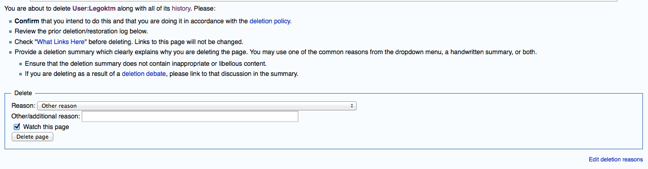
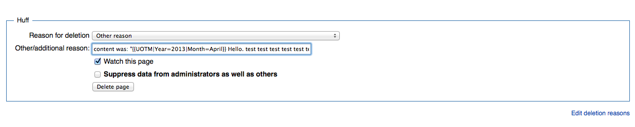
Current MonoBook with regression

Didn't test any other skins...

See attachments. Originally reported at https://en.wikipedia.org/w/index.php?title=Wikipedia:Administrators%27_noticeboard&oldid=629586567#Delete_button

Likely cause: https://gerrit.wikimedia.org/r/#/c/154121


Version: unspecified
Severity: normal

Attached:

Screen_Shot_2014-10-14_at_9.14.48_AM.PNG (334×1 px, 70 KB)

Details

Reference
bz72041

Event Timeline

bzimport raised the priority of this task from to Needs Triage.Nov 22 2014, 3:53 AM
bzimport set Reference to bz72041.

Created attachment 16763
Older core/MonoBook without regression

Attached:

Screen_Shot_2014-10-14_at_9.14.58_AM.PNG (249×1 px, 35 KB)

Hmm, appears to be present in the other skins as well.

Alright, so this appearance change is indeed caused by that commit. I believe it is caused by the part that switches from tables to divs ("Stop using tables use divs instead. It's the future!")

I see three main options:

  1. Keep this appearance and better communicate it. I agree the communication here was lax, but it's really not that different. I'm not sure, but I think this layout is also more consistent with the general UI direction.
  1. Keep it as divs and use display: table-cell or display: table (I think this still might require markup change, and it needs to be checked on mobile, but it's otherwise pretty straightforward). The downside is that it's still tabular layout, and it's not clear to me we actually want tabular layout here.
  1. Go back to table elements, but keep the MW UI styling changes.

I recommend #1.

I think #2 would be preferred, but #1 is also reasonable if #2 is not worth the effort.

matmarex claimed this task.

I don't think it's worth the effort, the interface indeed does look almost the same. I also don't remember anyone else complaining (certainly not recently).