Page MenuHomePhabricator

OAuth permission screen needs redesign for better usability and comprehension
Open, MediumPublic

Assigned To
None
Authored By
Jaredzimmerman-WMF
Nov 5 2014, 11:59 PM
Referenced Files
F12274: Specs_Aug29.png
Jul 18 2017, 3:24 PM
F115139: oauth-version2.png
Apr 16 2015, 5:55 PM
F115140: oauth-mobile-2.png
Apr 16 2015, 5:55 PM
F107151: auth-github.png
Mar 30 2015, 8:19 PM
F107153: auth-github-expanded.png
Mar 30 2015, 8:19 PM
F44470: oauth-mobile.png
Feb 20 2015, 9:54 PM
F44469: oauth.png
Feb 20 2015, 9:54 PM
F15091: IMG_0448.PNG
Feb 6 2015, 11:31 PM

Description

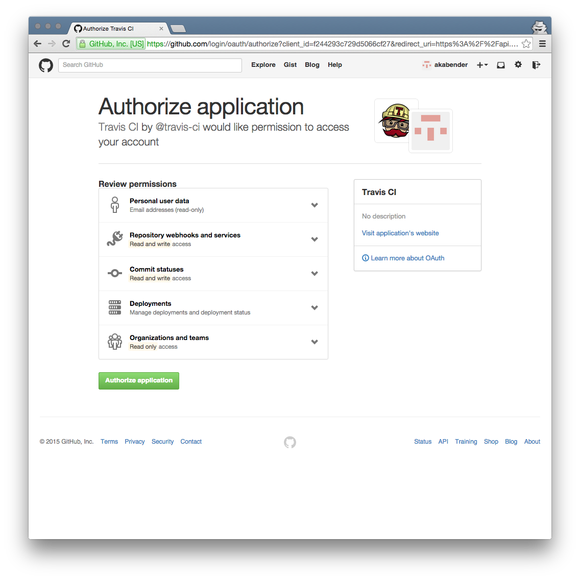
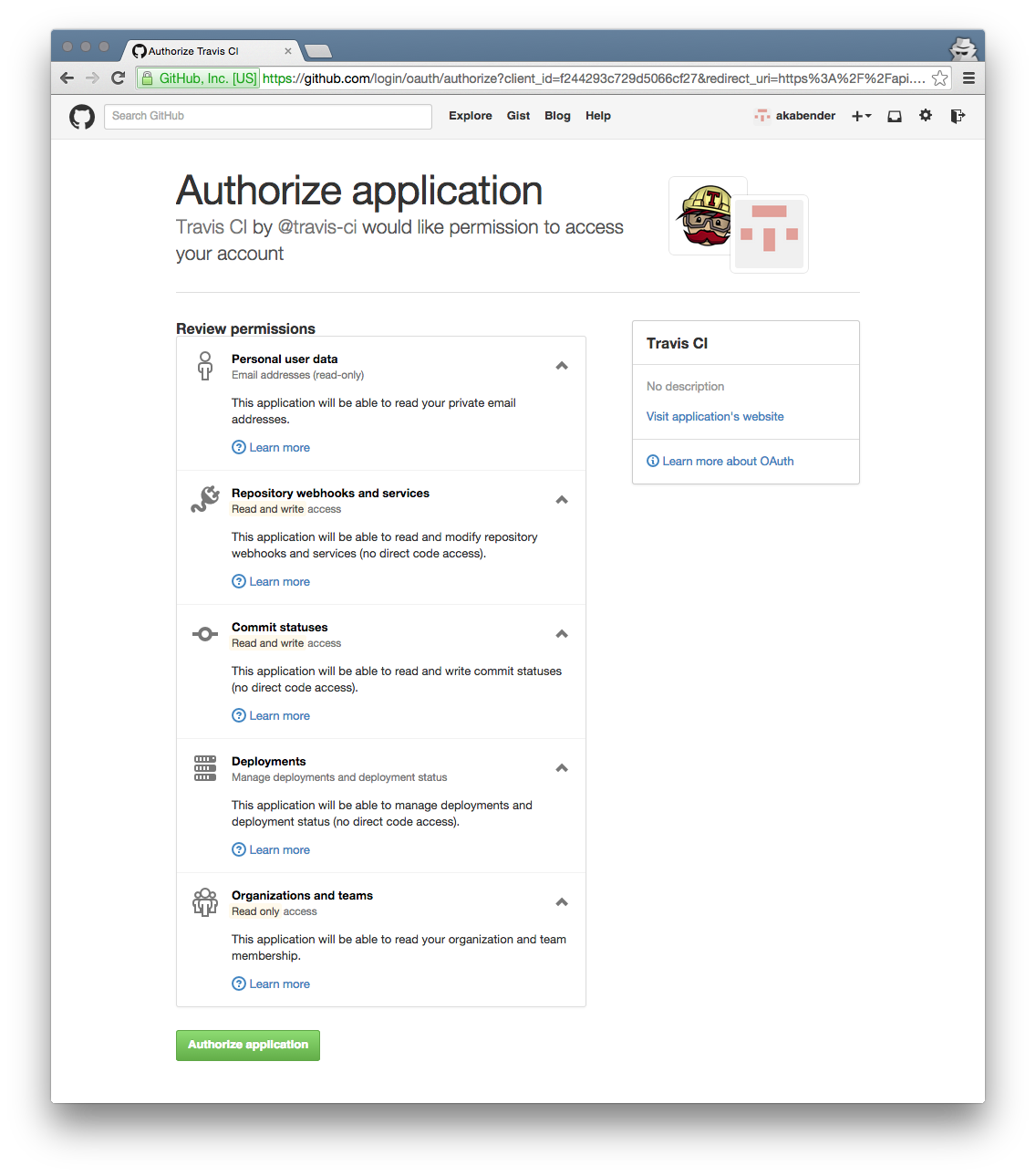
Various problems have been documented related to the visual appearance and wording of the authorization screen:

  • MediaWiki OAuth dialog text is unclear and sounds more scary than it is (T598)
  • Message describing OAuth activities are confusing to end users (T69082)
  • Remove link to WMF privacy policy on OAuth Authorize (T64686)
  • Add warning for user on /authorize about privacy policy (T64687)
  • Grant "High-volume editing" is confusing (does not provide "edit" right) (T70312)
  • Dialog for granting an app permission should clarify or link to what "basic rights" are (T68978)
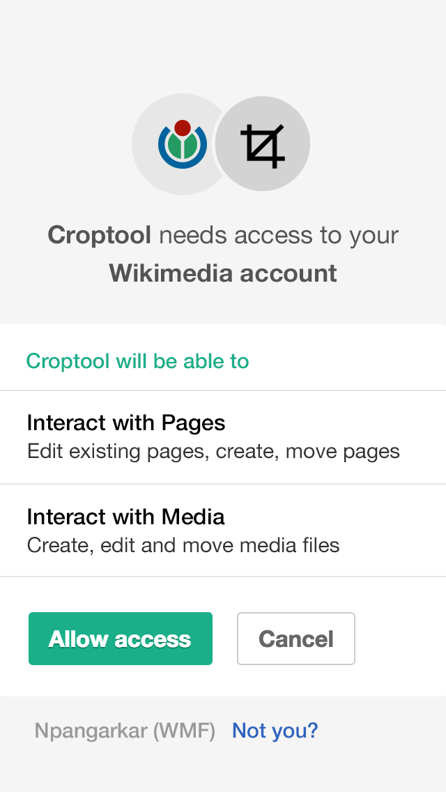
  • When OAuth is triggered on mobile browsers, it still overlays the desktop site, and the dialog is not formatted for mobile screens. (cf. T121898) (for completeness: ...or sometimes it just fails: T112730, T121898)
    IMG_0448.PNG (1×750 px, 92 KB)
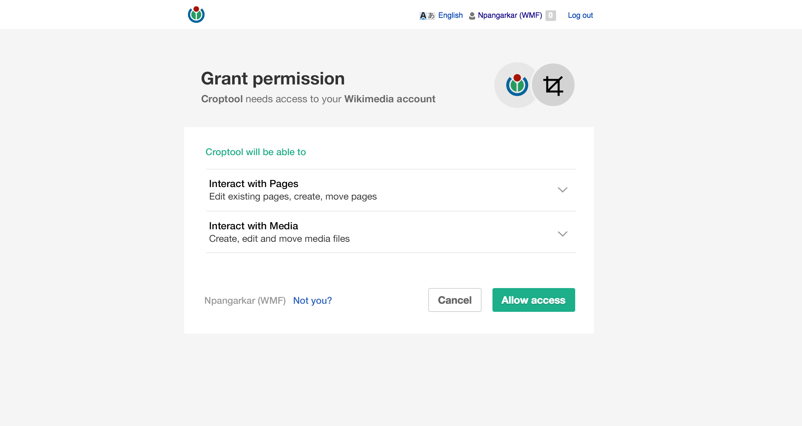
Proposed layout changes

Desktop (but making it not a dialog is out of scope for this task - see T98879):

oauth-version2.png (1×2 px, 87 KB)

Mobile:
oauth-mobile.png (1×640 px, 65 KB)

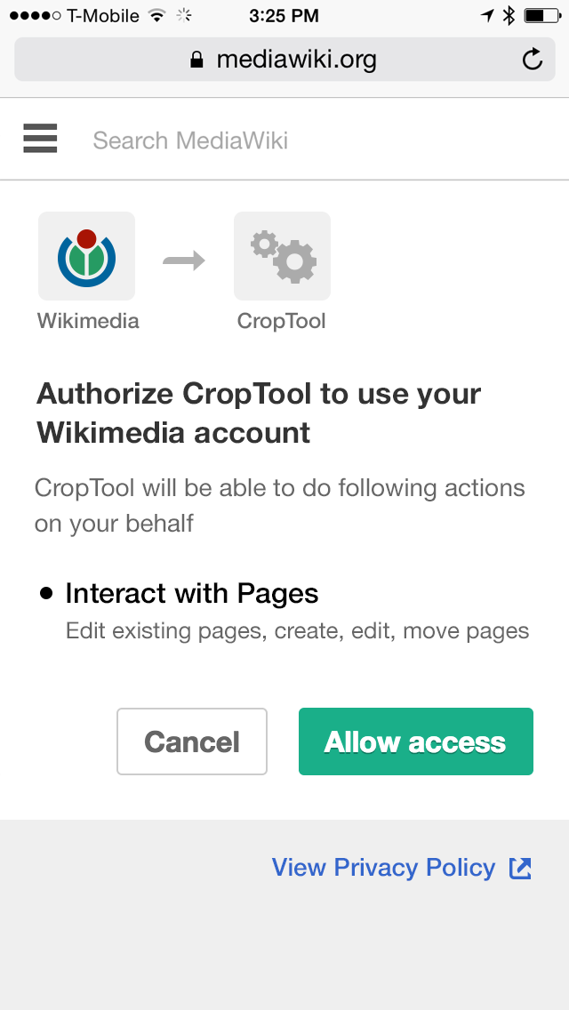
(see T75062#1055431 and T75062#1213120 for additional information)

Details

Reference
bz73062

Related Objects

StatusSubtypeAssignedTask
OpenNone
OpenNone
OpenNone
ResolvedEsanders
OpenNone
OpenNone
OpenNone
DeclinedNone
Resolvedbd808
DuplicateNone
DuplicateQgil
OpenNone
ResolvedNone
OpenNone
OpenNone
ResolvedEsanders
ResolvedNone
OpenFeatureNone
OpenNone
OpenNone
OpenNone
OpenNone
ResolvedFrostly
ResolvedFrostly
OpenNone
OpenNone

Event Timeline

There are a very large number of changes, so older changes are hidden. Show Older Changes

Mocks for oAuth on desktop and mobile.

They look visually nice, but I feel "Interact with pages" is an Android-like oversimplification in regards to what the MediaWiki API can do.

@Ricordisamoa, This is the current text, these designs aren't actually changing the copy, just the design and layout.

@Ricordisamoa, This is the current text, these designs aren't actually changing the copy, just the design and layout.

Yes, but now the titles and descriptions are of the same color, while the grey descriptions make users feel they're not important.

@Nirzar I think this is a good iterative step, but I'd recommend that we start thinking about a (very) special page for the OAuth permissions that is minimal, has our branding, does not have the normal site chrome and doesn't use a lightbox at all. I think what you have here is a great next step.

+1 for thinking about removing the lightbox feature of the existing display. The current implementation uses jQueryUI's dialog() with window proportional width and height which is at least part of the display problem for smaller mobile viewports. I like GitHub's authorization screen which is just a plain page with a tiny bit of javascript to show/hide detailed permissions information.

-1 for removing the normal site chrome (i.e. skin) however. This sounds like it would block using OutputPage in the implementation and instead require some kind of special new rendering system to be developed. If there is already such a thing that I just don't know about then please educate me, but lets not expand the scope of a "clean up the display" ticket to "invent a new system that allows suppressing the skin but still allows all other backend features".

As a random comparison, here's what github's authorization screen looks like when travis-ci asks to access your account:

auth-github.png (1×1 px, 202 KB)

auth-github-expanded.png (1×1 px, 245 KB)

The "Learn more" links point to https://help.github.com/articles/connecting-with-third-party-applications/#user-data

A few more random comparisons: Facebook, Google, Twitter (random googled screenshots, might not be up-to-date). A common pattern (besides the application having an icon) is that users are able to see who they are (which account they are using). The mobile mockup is missing that feature.

Change 201230 had a related patch set uploaded (by MarkTraceur):
Change dialog for Special:MWOAuth to use OOUI

https://gerrit.wikimedia.org/r/201230

MarkTraceur subscribed.

That patch is 1) so it's easier to work with and 2) so it's more consistent across desktop and mobile.

More tweaks to come.

Based on the feedback on the first iteration here are improved screens for oAuth

  • Not inside a modal window. oAuth has own page of it's own.
  • Much clear and short communication - "Grant permission, X needs access to your Y account"
  • The text for permission details is now prominent than before.
  • Clicking on the permission detail can reveal more details about it. (I haven't finished that screen since I want to get feedback on this idea of having click-to-reveal approach)
  • shows your username in contextual place (on mobile screen too), also a link to change the accounts if needed. (not you link)
  • The user menu on top is a shorter version of regular user menu

oauth-version2.png (1×2 px, 87 KB)

oauth-mobile-2.png (1×640 px, 50 KB)

oauth-version2.png (1×2 px, 87 KB)

This design seems to go against the requirements stated in T75062#1121750.

perhaps we could look into how translatewiki does their main page (e.g. en extension that restyles a single page)

@Anomie can it be done only using CSS? where you make the lightbox background color to be the solid light grey and change the dimensions of the jQuery UI dialog box?

In general, we want people to instantly recognize that they are on whichever wiki they are being sent to, and giving out rights for this site.

The design is really nice, but I'm concerned a person who has only ever used enwiki wouldn't recognize the WMF logos, or realize they're giving away rights on enwiki. Power users who have changed their skin are also going to be confused until they look at the address bar and realize they really are on a wmf site.

Can we put that desktop form into the user's standard chrome as a first step, until these types pages are common on the wikis? For login / authorization forms we want to be fairly conservative both in the look & feel and in the technology we use, so we don't freak people out that they are being phished or open up subtle security issues on the technology side.

The design is really nice, but I'm concerned a person who has only ever used enwiki wouldn't recognize the WMF logos, or realize they're giving away rights on enwiki. Power users who have changed their skin are also going to be confused until they look at the address bar and realize they really are on a wmf site.

Presumably it would say "to your English Wikipedia account" and show the WP logo in that case?

For apps which only care about access to the global account for authorization (and so presumably use mw.org or meta) it will still be problematic, though.

+1 for thinking about removing the lightbox feature of the existing display. The current implementation uses jQueryUI's dialog() with window proportional width and height which is at least part of the display problem for smaller mobile viewports. I like GitHub's authorization screen which is just a plain page with a tiny bit of javascript to show/hide detailed permissions information.

Github pages are extremely lean, just a thin header and footer. MediaWiki pages are full of shiny crap that distracts you from the actual task. IMO the lightbox at least compensates for that a little. On mobile there is just no reasonable way to fit all the chrome around a dialog (our own mobile skin does not have it either).

-1 for removing the normal site chrome (i.e. skin) however. This sounds like it would block using OutputPage in the implementation and instead require some kind of special new rendering system to be developed. If there is already such a thing that I just don't know about then please educate me, but lets not expand the scope of a "clean up the display" ticket to "invent a new system that allows suppressing the skin but still allows all other backend features".

Chromeless dialogs would be great as they could be popped up in a new window and be less distracting. That's how e.g. Facebook authentication works. I agree it's too difficult to include directly into this task, I'll open a new one.

In T75062#1279703, @Tgr wrote:

-1 for removing the normal site chrome (i.e. skin) however. This sounds like it would block using OutputPage in the implementation and instead require some kind of special new rendering system to be developed. If there is already such a thing that I just don't know about then please educate me, but lets not expand the scope of a "clean up the display" ticket to "invent a new system that allows suppressing the skin but still allows all other backend features".

Chromeless dialogs would be great as they could be popped up in a new window and be less distracting. That's how e.g. Facebook authentication works. I agree it's too difficult to include directly into this task, I'll open a new one.

T71246 has a hacky but simple solution for this.

Is this dialog created by ext.MWOAuth.AuthorizeDialog module javascript, appears only ever used on the Special:OAuth/authorize end-point. This makes me wonder why it is a JavaScript module at all.

It's pretty bad for UX as it means the dialog represents only a tiny portion of the page, and shows up 2-10 seconds after the page initially starts loading (initial page is confusing and not useful). And with various bugs and short-comings (T128168, T95216, T98879, T71246) as a result.

However, looking at T98879 and T71246 in particular, it sounds as if there is a usecase for it being a dialog and that we want a full-screen dedicated view as separate thing. Why is that? In what scenario do we want this to be a dialog over an existing page? Is there a case where the underlying page isn't a blank page?

It seems to me like a good poor-mans first step would be to simply rid the JavaScript for creating the dialog and instead output it server-side on the special page (even just hardcoding the response from jquery-ui-dialog). The same styles can still be loaded for now. And any additional bindings can still be done by targetting the page directly. It'll be a weird hybrid, but should work fine.

In addition, special pages already have the capability to override the output stream, so it should be fairly straight-forward to, as a second step, to override the skin and output just the dialog. The same skin, jquery-ui, and extension stylesheets can still be loaded (and potentially optimised away, later). Using one of the existing blank skins would be nice if possible, but even if not, a raw OutputPage could be used like TimedMediaHandler does (code). Not pretty and does incur some technical debt, but in exchange for resolving an arguably larger amount of debt that currently exists, and solving quite a few accessibility, UX, and performance issues in the process.

Also, once server-side, the logical third step would be to use HTMLForm which has OOUI built-in.

Thoughts?

/cc @Tgr

However, looking at T98879 and T71246 in particular, it sounds as if there is a usecase for it being a dialog and that we want a full-screen dedicated view as separate thing. Why is that? In what scenario do we want this to be a dialog over an existing page? Is there a case where the underlying page isn't a blank page?

I have no idea why. I think the oAuth dialogs were modal windows in early stages of the concept of oAuth. I think the reason they were popover/modals because at the time there was no nuance to permissions apart from "yes accept" "no decline"

now everyone's oAuths are full page views because we explain what different permissions the application is granted for better privacy.

but that's just my intuition.

I can put together my version ( T98879 ) into a special page. a hybrid poor mans first step maybe?

However, looking at T98879 and T71246 in particular, it sounds as if there is a usecase for it being a dialog and that we want a full-screen dedicated view as separate thing. Why is that? In what scenario do we want this to be a dialog over an existing page? Is there a case where the underlying page isn't a blank page?

I have no idea why.

@Anomie probably remembers more clearly, but my hazy memory of this 4 year old decision was that the designer(s) who were working on the original feature wanted an "uncluttered" page for the grant accept/deny screen. I think there are pros and cons to this approach, but I agree that the current bottom loaded js overlay is pretty broken. +1 from me for a plain old special page with responsive internal layout that can make smart use of the available viewport and show better information to the end user.

The topic of hiding/obsuring site nav and normal skin after that is debatable. Pros are less cluttered view and more clear call to action for the end user. Cons include lack of recognition that this is actually a Wikimedia wiki that access is being granted to. That might be fixable with some strong branding, but honestly it would be better fixed with less cluttered default skins which is a completely different problem to solve.

Time constraints I imagine? jQuery UI was what was available at the time unless one wanted to build the UI from scratch, or use a plain HTML form (which looked kinda horrible pre-MediaWiki-UI), and the project was underresourced and had more pressing problems to solve.

I agree HTML-based OOUI is the path forward. In another project I used SkinApi as a null skin; that feels like a bit of a hack but works well.

@Anomie probably remembers more clearly, but my hazy memory of this 4 year old decision was that the designer(s) who were working on the original feature wanted an "uncluttered" page for the grant accept/deny screen.

Yes, that's correct. Personally I'd rather have had it be a normal special page, not terribly different from something like Special:Login (or like what you get if JS is disabled but perhaps styled nicer), but Design insisted on the popup. The whole thing came from the era when it seemed like Design was very disconnected from the realities of the sites. F12274 is one of the original mockups.

At least we managed to ignore their request that we try to use Helvetica as the font in there.

The topic of hiding/obsuring site nav and normal skin after that is debatable. Pros are less cluttered view and more clear call to action for the end user. Cons include lack of recognition that this is actually a Wikimedia wiki that access is being granted to. That might be fixable with some strong branding, but honestly it would be better fixed with less cluttered default skins which is a completely different problem to solve.

Indeed.

I think the oAuth dialogs were modal windows in early stages of the concept of oAuth. I think the reason they were popover/modals because at the time there was no nuance to permissions apart from "yes accept" "no decline"

now everyone's oAuths are full page views because we explain what different permissions the application is granted for better privacy.

That is incorrect, the authorization dialog always (as far as I remember) included explanations of what permissions were being granted.

It seems to me like a good poor-mans first step would be to simply rid the JavaScript for creating the dialog and instead output it server-side on the special page (even just hardcoding the response from jquery-ui-dialog). The same styles can still be loaded for now. And any additional bindings can still be done by targetting the page directly. It'll be a weird hybrid, but should work fine.

Just make sure whatever you do still makes some kind of sense if JS is disabled, and if CSS is disabled too. Note the jquery-ui-dialog output currently depends on the screen width and height, which aren't available server-side, but that's probably responsible for T128168 and could hopefully be done better with more responsive CSS instead.

but even if not, a raw OutputPage could be used like TimedMediaHandler does (code). Not pretty and does incur some technical debt, but in exchange for resolving an arguably larger amount of debt that currently exists, and solving quite a few accessibility, UX, and performance issues in the process.

IMO that's some pretty bad tech debt there. I'd rather not exchange jquery-ui tech debt for "copy a bunch of the guts of OutputPage" tech debt.

That is incorrect, the authorization dialog always (as far as I remember) included explanations of what permissions were being granted.

It always had blobs of explanation and not breakdown of different types with individual details (as modern oAuth and appAuth messages do) ... example in the description of this task.

Just make sure whatever you do still makes some kind of sense if JS is disabled, and if CSS is disabled too. Note the jquery-ui-dialog output currently depends on the screen width and height, which aren't available server-side, but that's probably responsible for T128168 and could hopefully be done better with more responsive CSS instead.

As you can see the proposed design changes can be achieved without JS

@Qgil this is going to be an issue for Space login/signup, especially on mobile.

@Tgr: Hi! This task has been assigned to you a while ago. Could you maybe share an update? Do you still plan to work on this task? Thanks! :)

Aklapper removed Tgr as the assignee of this task.Jun 19 2020, 4:26 PM
Aklapper removed a subscriber: Nirzar.

This task has been assigned to the same task owner for more than two years. Resetting task assignee due to inactivity, to decrease task cookie-licking and to get a slightly more realistic overview of plans. Please feel free to assign this task to yourself again if you still realistically work or plan to work on this task - it would be welcome!

For tips how to manage individual work in Phabricator (noisy notifications, lists of task, etc.), see https://phabricator.wikimedia.org/T228575#6237124 for available options.
(For the records, two emails were sent to assignee addresses before resetting assignees. See T228575 for more info and for potential feedback. Thanks!)