Page MenuHomePhabricator

Indicators (protected icon, featured icon) are not shown in Minerva
Open, MediumPublic

Assigned To
None
Authored By
RolandUnger
Nov 12 2014, 8:40 AM
Referenced Files
F34174966: Screenshot Guccini gold badge 2021-03-20.jpg
Mar 20 2021, 1:04 PM
F34174967: Screenshot Guccini exzellent 2021-03-20.jpg
Mar 20 2021, 1:04 PM
F34155667: image.png
Mar 12 2021, 2:24 PM
F32198069: Non-advanced tools.png
Aug 28 2020, 1:12 AM
F32197840: toolbar.png
Aug 27 2020, 5:54 PM
F32197831: short_title.jpg
Aug 27 2020, 5:43 PM
F32197832: long_title.jpg
Aug 27 2020, 5:43 PM
F28685383: Screenshot-2019-4-17 Sind sparrow - Wikipedia.png
Apr 17 2019, 8:53 AM
Tokens
"100" token, awarded by Proc."Like" token, awarded by taavi."Like" token, awarded by Pcoombe."Like" token, awarded by Naseweis520."Like" token, awarded by Ricordisamoa.

Description

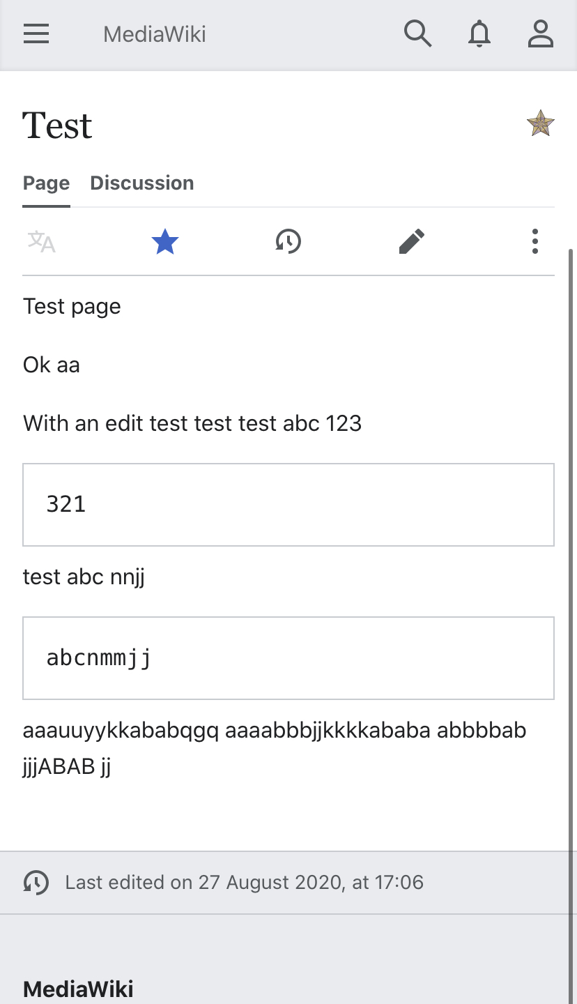
Indicator elements <indicator> are not shown in mobile view. They are not part of the html source code.

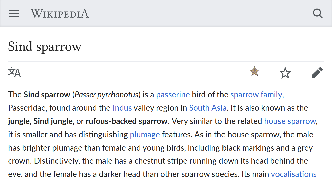
In desktop for instance, protected pages are shown like so:

Screen Shot 2018-08-28 at 10.44.11 AM.png (81×762 px, 16 KB)

In Minerva we are free to display the protection logo how and where we choose.

This also impacts the featured article of the day (via the Main page)
On desktop a star is shown, but not on mobile

Screen Shot 2018-08-28 at 10.49.36 AM.png (93×401 px, 15 KB)

Developer notes

These indicators are defined in templates like so:
https://en.wikipedia.org/wiki/Template:Pp-vandalism

Details

Reference
bz73299

Event Timeline

There are a very large number of changes, so older changes are hidden. Show Older Changes
Jdlrobson raised the priority of this task from Low to Medium.Aug 28 2018, 5:44 PM
Jdlrobson edited projects, added MinervaNeue; removed MobileFrontend.
Jdlrobson updated the task description. (Show Details)
Jdlrobson renamed this task from Indicators are not shown in Minerva to Indicators (protected icon, featured icon) are not shown in Minerva.Aug 28 2018, 5:48 PM
Jdlrobson updated the task description. (Show Details)

We can also make the MobileDetect extension works with indicator, if this feature is implamented, an editor would be allowed to determin whether an indicator is visible on mobile screen. If he doesn't want to do, he can use the <nomobile> tag surrounding the indicator, then it would be ignored in Minerva skin.

Have been using status indicator for https://commons.wikimedia.org/wiki/Template:Upload_picture_from_category_icon ; unfortunate that it does not show on mobile… :-(

(off topic, but are there workaround for this? CSS classes I could add to display it on Minerva somehow?)

As far as I understand, the only major issue preventing us from implementing this feature is that we don’t know where to put the indicators. What about placing them just before the watch star?

Screenshot-2019-4-17 Sind sparrow - Wikipedia.png (704×1 px, 85 KB)

Although I would like to hear a UX designer about how confusing the two stars (featured article icon and watch button) next to each other are. (And the size of the icon also doesn’t match, maybe it can be resized by Minerva. Also there can be put some rule to prevent long indicators from showing up on small screens.)

Use-case: As a user, I want to access the help documentation for [feature].

In desktop skins, many feature pages will show a .mw-helplink button for "Help" in the top corner of the content-area - E.g.

In minerva those links are not currently shown.

Implementation - I believe this section might indicate how it is done? https://www.mediawiki.org/wiki/Help:Page_status_indicators#Using_indicators_from_PHP_code

(I was about to file a task, but then found this one. Pasting my draft above.)

The featured article stars are a valuable recognition of article quality, and it's a shame they aren't visible on mobile. At the moment https://en.wikipedia.org/wiki/Wikipedia:Featured_articles has resorted to telling readers to use the desktop site on mobile instead.

For sure I'm simplify too much the issue, but maybe could be enough to add the block <div class="mw-indicators mw-body-content">...</div> (or maybe the renamed mw-mf classes) to allow the whole indicator mechanism.

Can this be tried one single minor wiki to test it?

Is it possible to have an update on the status of this apparently easy to solve ticket? Indicators in Wikivoyage & Wikipedia are used for many purpose and it's fundamental to show them on mobile view as well.

Is it possible to have an update on the status of this apparently easy to solve ticket?

This requires design so I'm not sure it's fair to say it's easy to solve. Space on mobile is pretty limited and some articles can have lots of indicators, some articles have long titles. With my engineering hat if the goal is simply to show them a trivial first step could be placing indicators at the bottom of an article so at least they are present on the page, however the lack of prominence is likely to be a problem.

Maybe @ovasileva can provide some idea around priority.

[…] and some articles can have lots of indicators, some articles have long titles.

I think long titles are not really a problem, as titles can (and do) break into several lines if they can’t fit on one line. As long is a moderate number of indicators, it’s OK.
Do you have an example of an article that has many indicators? I can’t imagine more than two or three really essential indicators. If there are more, most probably some of them should not be there in the first place. If they are really important on desktop but not needed on mobile, they can be hidden using CSS (and this should be done based on screen size, not skin), e.g.

@media (max-width: 719px) {
	/* hide everything but <indicator name="featured-star"> and <indicator name="pp-default"> */
	.mw-indicator:not(#mw-indicator-featured-star):not(#mw-indicator-pp-default) {
		display: none;
	}
}

or

@media (max-width: 719px) {
	/* hide <indicator name="my-useless-indicator"> */
	#mw-indicator-my-useless-indicator {
		display: none;
	}
}

(These IDs and classes are based on the ones present on Vector. I don’t know to what extent are these controlled by the skin, but using consistent names across skins is a good idea anyway.)

a trivial first step could be placing indicators at the bottom of an article

I think this doesn’t make sense. The bottom of the article is so unintuitive that nobody will notice them; it’s not worth the effort. Furthermore, the icons were put there using wikitext in the pre-<indicator> world, and they were moved to the top using a mix of CSS and JavaScript hacks, so I can imagine this is what will happen if indicators appear at the bottom—likely without proper UI/UX design.

a trivial first step could be placing indicators at the bottom of an article so at least they are present on the page, however the lack of prominence is likely to be a problem.

Indicators are important so they are not supposed to stay at the bottom but inside "div.pre-content", if you think that there are cases with many indicators, maybe the could stay in their own new line.

By the way I agree with:

If they are really important on desktop but not needed on mobile, they can be hidden using CSS (and this should be done based on screen size, not skin), e.g.

with templatestyle is quite easy to do.

A conservative approach can be: add the indicator div that will enable the whole mechanism, but set it not visible by default (in the short term) to allow some wiki to test it in advance and evaluate if their indicators are ok, or too many or in a position that is not the best one.
Notwithstanding this, if https://it.m.wikipedia.org/wiki/Llanfairpwllgwyngyllgogerychwyrndrobwllllantysiliogogogoch has a title spread in three lines, I don't think that adding in the same line the indicators would make such big difference.

I do think that stuff like pp-protected should be hidden on mobiles. We only want to show indicators like good-article / featured-article. The rest is kinda bloat.

I think the position to the right of the title is still a nice place to have them, but it does look messy if the title spans a few lines. Pictures (short and long title, first looks neat imo, second clearly needs work):

short_title.jpg (1×828 px, 138 KB)
long_title.jpg (1×828 px, 93 KB)

There's also the idea of having them to the right of the toolbar, and it'd get around that issue, but not sure how that looks?

toolbar.png (1×1 px, 630 KB)

I do think that stuff like pp-protected should be hidden on mobiles. We only want to show indicators like good-article / featured-article. The rest is kinda bloat.

I think hiding of an indicator should be opt-in rather than opt-out (i.e. all indicators should be shown unless explicitly hidden), as indicators usually indicate something important (padlocks are already part of the edit button’s pencil icon, so they’re not needed, but everything else is), and should certainly be configurable on-wiki, as there’s no uniform way to categorize indicators as padlock/quality assessment/other. I’m not sure how to maintain the categorization; probably a MediaWiki message with one indicator name per line? Adding a new attribute to <indicator> would be a bad idea IMO, as that would mean that MW core kind of depends on Minerva.

There's also the idea of having them to the right of the toolbar, and it'd get around that issue, but not sure how that looks?

The issue with this solution is that the namespace tabs are not always available, only if advanced features are on:

Non-advanced tools.png (1×750 px, 494 KB)

@Tacsipacsi to be completely frank, and just my opinion, but wikis don't exactly have the best idea of "what's important" from a UI perspective. Move protection indicators, for example, are utterly useless. Even 99% of editors don't wish to move the page, never mind readers. They're in place to stop the odd users moving articles, yet an icon is shown to everyone. On a smaller scale, especially for mobile, this applies for page protection too -- most people just read not write on mobile, and showing colourful locks is not particularly helpful, especially on a mobile view where they'd stand out a lot more. When you start looking at talk notices and editnotices the point becomes more obvious imo. One 'unintended' advantage of the software limitations of the mobile style is that it saves the mobile UI from becoming a cluttered mess. Quality assessment indicators are neat, and give a useful indication for readers also, though.

We can categorise indicators by the IDs they already have–good article indicators actually have hardcoded styling in Vector.

But I think the biggest blocker here is no clear place to put the icon. Even if aligned to the bottom for multi-line titles, which does look somewhat better, it still looks iffy imo. One idea might be to have it on the toolbar if advanced mode, and have it to the right of the pencil if not? I wonder if we can ask someone from design to give some quick thoughts?

@Tacsipacsi to be completely frank, and just my opinion, but wikis don't exactly have the best idea of "what's important" from a UI perspective.

Even if communities don’t have a good judgement on UI/UX, I don’t think forcing design decisions on them is a good thing. There has been too much controversy in the past about WMF/devs forcing decisions on communities.

most people just read not write on mobile

Many people edit from mobile, especially in the developing world. Even if editors are a minority among all mobile users—which is true on desktop as well, by the way—, they need to be considered. (However, the edit icon itself indicates protection on mobile, so I agree the colorful padlocks are not needed. But I disagree with your starting point that mobile is only for reading.)

We can categorise indicators by the IDs they already have–good article indicators actually have hardcoded styling in Vector.

What hardcoded styling? The grey stars next to the interwiki links have hardcoded styling, but page status indicators don’t (apart from the basic page status indicator styling that applies equally to padlocks, quality assessment and everything else). On enwiki the GA icon’s indicator is called good-star, on dewiki it’s topicon-Vorlage_Lesenswert, on eswiki articulo-bueno, on huwiki featured

But I think the biggest blocker here is no clear place to put the icon. Even if aligned to the bottom for multi-line titles, which does look somewhat better, it still looks iffy imo. One idea might be to have it on the toolbar if advanced mode, and have it to the right of the pencil if not?

Probably, although the tab bar (advanced mode) looks strange for me on your sketch. But a next iteration on the design might look better.

I wonder if we can ask someone from design to give some quick thoughts?

If it was as easy as asking someone, this task was resolved for years. :( But someone can give it a try, hope springs eternal…

@Jdlrobson, @Tacsipacsi referring to one of the previous discussed point about title area space, I would highlight how in en:wp has been managed:
https://en.m.wikipedia.org/wiki/Taumatawhakatangi­hangakoauauotamatea­turipukakapikimaunga­horonukupokaiwhen­uakitanatahu
(it dinamically adjust the horizontal leght of the title according to the actual size of the screen)

That said, I think that adding in remaining space on the right side of the title (or adding a newline) is the best solution and it can be managed in the same way.

That said, I think that adding in remaining space on the right side of the title (or adding a newline) is the best solution and it can be managed in the same way.

Which line would it go on then? The GA icon, for example, line 1, 2, 3 or 4? I think the only decent-looking option is on the bottom-right (i.e. 'line 4'), but (to my eye) it looks a bit stranger for 2 or 3 line title spans. Maybe I'm just being picky.

Saw this posted today and it makes me think, it could just be at the end of the text without alignment without much trouble?

Technically this is not difficult to achieve I think, I'm happy to submit a patch myself, it's just a design issue more than anything.

@Jdlrobson thoughts on the above recent comments? Or anyone in design we may be able to tag to get something moving here? I think the key questions are one of (a) where to place; and (b) which indicators to show: should they all be shown, or should limitation be expressed using a class or something?

As to limitations via class: there is always nomobile that can be used imo.

Adding on from the perspective of an en-WP editor, I agree that GA/FA icons are very important indicators that ought to be visible to mobile readers; the prevailing sentiment of the discussion Proc linked above affirms that that's the community's view.

Regarding the design, it looks like we're still waiting on input from a design expert. For multi-line titles, to lay out our options, it looks like we have:

  • Right and top aligned, with title continuing on lines below
  • Right and bottom aligned, with title continuing on lines below
  • Right and top aligned, with white space below
  • Right and bottom aligned, with white space above
  • At end of the title directly next to it
  • Somewhere on the same line as the edit pencil

Quick update from the web team: we discussed this a bit yesterday and think that a good first step would be to add the indicators to the Advanced mode on mobile and try to measure usage among editors there prior to conversations about wider release. I'd like to note that we're in the middle of the desktop improvements project and thus follow-up on this might be a little bit slow as it's not a high priority for us at the moment. That said, our designer @alexhollender will be thinking about placement and styling and will update the task with some mocks and guidelines within the next couple of weeks so we can start moving this forward.

additionally noting that we're currently auditing indicators on desktop (T263511) in preparation for moving the language switcher. Once we've gotten a bit further along we'll have a better sense of which indicators are present on various wikis, and will probably be more opinionated about if/how to show them on mobile.

Hi @alexhollender, just wanted to quickly follow up to check in about this. Were the mocks/guidelines that Olga mentioned above ever produced? Is there any other input you'd like from the community at this time?

@Sdkb I have not yet worked on this. Two questions:

  1. it seems as if "protected" status is currently shown on mobile via the edit icon — would it therefore make sense to reword this task to focus on the other indicators?
    image.png (1×752 px, 471 KB)
  2. would it be possible for you to try and rank the various indicators in terms of the amount of value they add to the reading experience of an article? I'm wondering if this might help us figure out where to start (since showing all indicators might be too difficult). Ranking might also suggest some sort of grouping — for example if there are several different indicators that all communicate "this is a high quality article" perhaps there might be a way for us to great a generalized mobile-friendly indicator that represents "high quality article" and use that in place of the various different ones on desktop. This would potentially simplify the reading experience since it wouldn't require people to learn what the various different indicators mean.
In T75299#6908495, @alexhollender wrote:

it seems as if "protected" status is currently shown on mobile via the edit icon

The indicators communicate more details: the padlock colors indicate the protection level (although this is probably not obvious for readers), including levels that don’t block the user from editing (e.g. an admin technically can edit a fully protected article, but often the protection policy forbids this except for some special conditions), and, more importantly, these padlocks link to pages explaining the protection policy—the edit buttons’ padlocks simply describe the situation (the what), the indicator padlocks explain the why. (Also, the what is described by the View source tab on desktop, so the situation is no different there, yet communities decided to place additional padlocks on pages.)

This would potentially simplify the reading experience since it wouldn't require people to learn what the various different indicators mean.

I think it would potentially make it more difficult for readers using multiple platforms. If you want to get rid of the different icons, you should encourage communities not to use them or group them (and potentially provide technical solutions to do so), across platforms. However, I don’t think a general “high quality article” indicator is a good solution—there’s a distinction between good and featured articles, and readers should be able to learn that they can expect even more from a featured article than in a good one.

I would also add that the icons for protected status are not that widely used across projects, there is no such thing on dewiki, for example.

But in general, an indefinite number of icons could in theory be used per article, so imo in the presence of an indicator the mobile version should only show an additional dropdown menu where the icons can be seen (maybe with a description on tap?). I feel like displaying more than one new icon in the menu or somewhere near the title (thinking about advanced mobile contributions here) is not an option. Also, the indicator area can be used for more things than just icons; there have been experiments with coordinates and similar text-based content. Directly displaying them could look very ugly (but even in a dropdown they would have to be handled with much care).

In T75299#6908495, @alexhollender wrote:

it seems as if "protected" status is currently shown on mobile via the edit icon

The indicators communicate more details: the padlock colors indicate the protection level (although this is probably not obvious for readers), including levels that don’t block the user from editing (e.g. an admin technically can edit a fully protected article, but often the protection policy forbids this except for some special conditions), and, more importantly, these padlocks link to pages explaining the protection policy—the edit buttons’ padlocks simply describe the situation (the what), the indicator padlocks explain the why. (Also, the what is described by the View source tab on desktop, so the situation is no different there, yet communities decided to place additional padlocks on pages.)

This would potentially simplify the reading experience since it wouldn't require people to learn what the various different indicators mean.

I think it would potentially make it more difficult for readers using multiple platforms. If you want to get rid of the different icons, you should encourage communities not to use them or group them (and potentially provide technical solutions to do so), across platforms. However, I don’t think a general “high quality article” indicator is a good solution—there’s a distinction between good and featured articles, and readers should be able to learn that they can expect even more from a featured article than in a good one.

Thanks for the additional information, and your viewpoints here. I agree that simplifying things can often lead to less understanding. At the same time the mobile website is, and might always be, more limited and simple than the desktop website. Our team worked on displaying page issues on the mobile site (link) and a compromise we ended up making was to simplify the system of icons used for the various issues. I think it might be okay, in some cases, to have a simplified approach for mobile, and still keep the more detailed approach on desktop. Maybe in a perfect world the website would be the same in both places, but I'm not sure that's a realistic goal.

Also, when thinking about bringing things from desktop to mobile we get the opportunity to ask: what is the value of this thing to the people reading and editing Wikipedia? I think we should start with this question, rather than assuming the indicators are valuable just because they are on desktop. By asking the question we also make space for new ideas/approaches to emerge. Maybe readers knowing an article is high quality is important, but knowing the difference between featured and good doesn't add value to their reading experience. Maybe there is a different approach we can take on mobile, while leaving the current approach on desktop as it is.

Some indicators have more value than others. The protected indicators are semi-valuable (but less-so on mobile, I suppose - either you can edit it or you can't, and that's indicated by the lock on the pencil icon). The move indicators are totally useless. The featured content indicators are useful, imo. Generally, there's a higher degree of quality to GAs/FAs (yes yes, I know, the disclaimers and all, but it's generally true as a rule). Good articles are pretty much a basic peer review, and quite different to featured articles which go a lot deeper. For example, on enwiki GAs require the coverage in the article to be broad, and FAs comprehensive. How many readers actually know this I don't know, but once you know this I think it helps to know that when reading the article.

I think the mobile interface should show the icons and differentiate between GA/FA. I don't really care for the other types of indicators, though.

Honestly, in order to do that, we don’t even need to resolve this task at all. The information on good/featured is already in Wikidata and could be quite easily displayed directly from there, like the short description (maybe even using the same small badges used on WD). Tooltips on tap would have to be added, but it seems fairly easy to me. Any comments on that approach? Could be filed in another task.

However, that is not a solution to this task. If it is decided that indicators will simply not be shown on mobile, that should be clearly communicated and the projects will then have to work on moving “essential” information from indicators to other, more mobile-friendly places. But this decision needs to be taken at some point, the task is now open for seven years and I still cannot see a way forward.

would it be possible for you to try and rank the various indicators in terms of the amount of value they add to the reading experience of an article?

@alexhollender Looking at this template, there are a few groups of topicons. First, there's the quality indicators for good and featured content. I strongly agree with Tacsipacsi and Proc that it would be a bad idea to merge them, as the difference in level of review is significant. They are both extremely useful to readers, for reasons I'll expand on below. Second, there's protection icons. I think mobile already handles these fine. The gradations aren't very useful, as the main salient question for the vast majority of mobile users is "am I, with my current rights, able to edit this page?" Move protection is in this category (and is indeed totally useless, even on desktop; it will be disappearing once the TfD discussion is processed). Third, there's the spoken version icon, which indicates that a spoken version of an article is available. This would be nice to have for accessibility, but it's not essential, as it is always accompanied by the "listen to this article" box at the bottom of a page. The humor icon appears mainly in projectspace, and is likewise typically accompanied by another template that would be visible on mobile. Lastly, there is a giant collection of topicons for userspace, indicating user rights, interests, accomplishments, etc. Sometimes users (including myself) will invoke {{top icon}} directly with a custom image, tooltip, and link. These provide useful information, and should be presented in some form, but could be hidden in a dropdown menu or something.

The GA/FA topicons are the primary reason I'm interested in this ticket, and they're pretty vital to readers (and should not be hidden in a dropdown). A basic question that every media-literate reader will ask when they encounter a page is "to what extent can I trust this information"? Sometimes issues are clear, such as with many style or prose deficiences, but often they're not, as with many neutrality concerns or incomplete coverage. On the low end, maintenance tags are the main cue we offer to help make issues clear; that's why we display them to readers, even on mobile. On the high end, our markers are the GA and FA topicons; we should be displaying them too for the same reason.

To speak briefly to your point about readers having trouble learning what the different indicators for GA and FA mean, I see that as a problem arising from the visuals and terminology we use. I launched an effort to redesign the topicons a few months ago which succeeded in acquiring a mandate, but it's been stalled since then due to lack of specific proposals and since no one has taken up my invitation to coordinate a competition phase. This is something where reform is needed everywhere, not a reason to fork mobile from desktop.

I would go along with giving good/featured a special treatment (as I said, I would then just directly take that information from WD and ideally display the small badges to the right of the short description), which should be prioritised, and offering a dropdown for anything else users might have added to the indicator area (unless specifically marked as nomobile).

EDIT: Experimented with the quality indicators. My idea would be to add the badges (either the WD gold/silver ones or the local ones) to the tagline, floating on the right. See screenshots (based on this featured article on dewiki):

Screenshot Guccini exzellent 2021-03-20.jpg (599×573 px, 80 KB)

Screenshot Guccini gold badge 2021-03-20.jpg (583×573 px, 80 KB)

@XanonymusX I don't think the tagline is shown on most mobile displays for most wikis.

@XanonymusX I don't think the tagline is shown on most mobile displays for most wikis.

Do you have examples? I checked some other projects where the tagline has no content, but it is still there in the source and could potentially be used for what I proposed. But I was just using the first thing on my mind, it could also just be floating within the page-heading in general.

Looking into it, the Android app does seem to have taglines but m.wikipedia.org does not.

No idea about the apps, but what do you mean by m.wikipedia.org? That is not a project. My screenshots above are from de.m.wikipedia.org, in case that wasn’t clear. However, I have come to realise that this task is actually about the Minerva skin, not specifically about mobile web, there we indeed do not have a default tagline. But as already said, it can just float within the page-heading, a tagline is not a necessity.

Sorry, I was referring to en.m.wikipedia.org.

But mobile web of enwiki does have a tagline, it is just empty. And I stand corrected, the same holds true for Minerva on desktop generally, so the tagline should indeed be the preferred position for the indicators. My proposal:

  1. Directly show the quality indicator based on Wikidata information in the tagline (an explanatory tooltip on tap would be helpful).
  2. In the presence of other indicators on a page, show an additional icon/button (maybe another three dots or a little arrow) at that position or next to the quality badge, which opens a dropdown with all the indicators.

IMO, step 1 could be implemented quickly, while step 2 might require some more work (but it is also less essential, as pointed out by others above).

I don’t think relying on Wikidata is a great idea. The local templates and the Wikidata information should say the same, but nothing enforces it, inevitably leading to differences every now and then. So if Vector uses the local templates and Minerva uses Wikidata, they will have the same result only in 99% of the articles. I think adding some metadata to the indicator (e.g. <indicator name="topicon-Vorlage_Exzellent" category="assessment">) is a better solution—it requires some work to add it to templates around wikis, but then it guarantees 100% correct output, and it can even handle if wikis choose a different assessment system, which isn’t (yet) properly mapped in Wikidata (like Wikisources’ {{TextQuality}} template).

If there was a workable proposal for generally showing indicators in Minerva, sure; but since 2014 there hasn’t been any, as far as I can see. My WD-based proposal is relatively easy to configure, as the same is done for generating the short description on most projects, so I have more hope that it could be done quickly. And people seem to agree that those quality badges are the most important/relevant types of indicators, so giving them a special treatment seems to be in line with what has been discussed about the general problem. Oh, and just like with the short description, a way to locally overwrite it (with a categorised indicator as proposed?) could be implemented as well. The rare discrepancy between WD and local indicator (which at least on dewiki is tracked and quickly fixed) is still an improvement over not having any indicators shown.

As far as I see, the main issue causing this not to be fixed for more than six years now is UI design, not the underlying technology. UI design should be independent of what the underlying technology is; if your proposal about using the tagline works for badges from Wikidata, it will work for badges from indicators as well. If it doesn’t work out for indicators, it won’t work out for WD badges either.

My proposal about the indicator attribute is also an approach to treat assessment badges specially; although a bit less specially, but more extendably—for example, if it’s decided that protection padlocks should not appear on mobile, not even among other, less important indicators, it’s easy to add a category="protection" that’s completely hidden by Minerva.

The huge difference between assessment indicators and short descriptions is that short descriptions don’t exist at all on desktop, so there’s no other source which could create discrepancy. (They have their own issue, namely being invisible to power users, who mostly edit on desktop, and thus being prone to vandalism, but that’s another story.)

By the way, there’s no tracking on huwiki (and probably on many other wikis either), and as a result Wikidata has only 1445 huwiki badges, whereas on-wiki there are 1036+425=1461 quality (featured+good) articles. This means that at least one in a hundred articles is missing its badge on Wikidata, so my above wild guess about 99% correctness is surprisingly correct. 🙂

Well, high time to track these discrepancies then! ;)

Yes, I would like to hear from the Design department (is there such a thing? I’m clueless, sorry) about the tagline proposal. Why I thought an extra treatment for these particular indicators would be good: we can be sure that they are icons. As already mentioned, almost anything could be added to the indicator area, which could gravely affect design on a smaller screen. And let’s not forget: the Interwiki links on mobile also need to show the badges (that’s why the information is added to WD in the first place), which they currently don’t, so there needs to be a WD connection anyway.

If the design question can be settled, the opt-in approach with an extra class would be a good one though, I guess. However, in the presence of several indicators, mobile needs to put them into a dropdown, and that seems like quite an effort to me, design-wise.

DeltaBot is ought to fix the discrepancies, but it seems not to work. 🙁

We agree that special treatment is probably needed, the only question is how to implement that; I say let (and require) the communities decide and configure this special treatment. This attribute-based configuration can work even if the approach for non-assessment indicators is not yet decided upon; simply everything that doesn’t have this attribute is completely omitted.

One more argument that just came into my mind: if there’s no attribute that designates assessment indicators, then when we come to the point where all indicators are displayed (likely in a dropdown), then assessment indicators from Wikidata will appear outside of the dropdown, while on-wiki indicators with the same meaning will appear in the dropdown, so we’ll have two (potentially differently-looking) icons describing the same thing. Thus we’ll then be forced anyway to mark assessment indicators somehow, but for sure some communities will be late to add this markup, leading the double icons to appear regardless. It’s much easier to just not introduce this double system in the first place.

Yeah, the latter point I thought about as well. So, I would summarise our “common” ideas:

• Add a class or type attribute to the indicator tag and predefine some values (global and preferably localisable ones).
• Add indicators to the page-heading in Minerva, floating to the right; ideally in the tagline, so as to avoid affecting the page title.
• Show only a limited number and/or category of indicators (not more than one per page seems advisable for small screens); provide an optional dropdown at the same position which can contain other indicators.
• Indicators not using a supported type/class value will not be displayed at all.

Since the dropdown is a more complex change (I guess), for the beginning the mobile indicator area might only support one type (the quality badges), and then gradually support others, when a solution for the dropdown is found.

• Indicators not using a supported type/class value will not be displayed at all.

I think that, while the one displayed initially (the assessment one) should be opt-in, the ones appearing in the dropdown should be opt-out—if there’s a dropdown anyway, real estate doesn’t seem to be a huge concern within that. Most indicators will probably work just fine within the dropdown, and even the ones that don’t, won’t break the page to the extent that would warrant making them opt-in (worst case: they overflow, forcing the user to scroll horizontally—but only if they open the dropdown).

Otherwise I agree with the points you listed above.

Another example for indicators: just saw that Dutch Wikipedia (nlwiki) puts the player for spoken articles in the indicator area (eg here), quite a stretch. At least it is also added to the end of the article (similar to dewiki, where the indicator icon only links to the footer with the player).

Russian Wikipedia examples:

  1. Geographical coordinates are moved to indicators that are shown first, before any icons, example: https://ru.wikipedia.org/wiki/Санкт-Петербург
  2. Some pages with Template:Box can define page shortcuts (WP:5P etc.) in indicators, example: https://ru.wikipedia.org/wiki/Википедия:Технические_запросы

Coordinates can be hidden on mobile if needed since they are present in text, too.

@Jdlrobson I see this is now in "triaged but future". Does that mean you've given up and thrown this onto the backlog?

@Jdlrobson I see this is now in "triaged but future". Does that mean you've given up and thrown this onto the backlog?

I'm not sure where this interpretation is coming from but our use of Phabricator is documented in https://www.mediawiki.org/wiki/Reading/Web/Phabricator#Backlog_columns and this is not how you should interpret it.