Page MenuHomePhabricator

Use consistent icon to represent registered users
Closed, ResolvedPublic

Description

Author: swalling

Description:
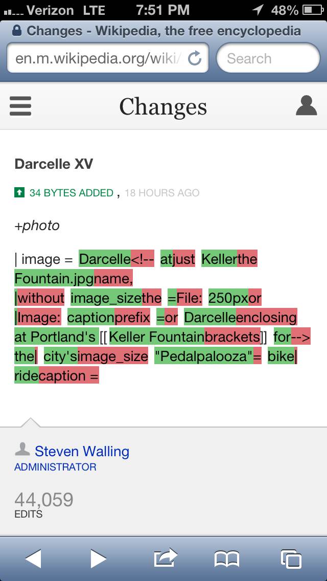
Mobile diff view, which shows both icons

Using mobile while logged in, I noticed that there is a very similar user icon for representing Notifications and for representing users on the mobile watchlist. Rather than use two very slightly different icons, can we just use the "registered user" icon from the mobile watchlist, but scaled up?


Version: unspecified
Severity: normal
See Also:
https://bugzilla.wikimedia.org/show_bug.cgi?id=41484

Attached:

photo.jpg (1×640 px, 74 KB)

Details

Reference
bz53732

Event Timeline

bzimport raised the priority of this task from to Medium.Nov 22 2014, 1:48 AM
bzimport set Reference to bz53732.
bzimport added a subscriber: Unknown Object (MLST).

The current notifications icon you're seeing is just a placeholder that Juliusz initially added to beta, not something design came up with :) We do have a real notifications icon that should definitely go in its place sooner than later.

If a design is provided this should be an easy fix. Can someone upload an asset to this bug?

(In reply to comment #2)

If a design is provided this should be an easy fix. Can someone upload an
asset
to this bug?

Like attachment 13009 and attachment 11793?

swalling wrote:

(In reply to comment #2)

If a design is provided this should be an easy fix. Can someone upload an
asset
to this bug?

I was just thinking we could pick one of the two icons already in use on the mobile site? (See the attached screenshot.)

We should use only one, let's use the one shown at the top right corner. I believe Juliusz already has the asset since he made it?

We would need to resize the image used for Echo but happy to use this if this is the one to go with.

This is a list of places where profile icon will appear:
Left Navigation
Watchlist Diff View

The issue with making it consistent is that we also have to think of it as a system:

Anonymous user
Logged out user
Logged in user
Logged in with Notifications

We have some assets but we don't have consensus on it for all areas.
Lets not rush into updating the watchlist view etc for now.

Im setting up a review to resolve this and will update this bug.

Thanks

Note the existing icon is black and in the left menu it won't need to be white.

You mean it will need to be white ? ( Considering the background is black )

Yup sorry.. autocorrected (typed from my phone)

Change 86052 had a related patch set uploaded by Jdlrobson:
Make watchlist user icons consistent with rest of UI

https://gerrit.wikimedia.org/r/86052

Change 86052 merged by jenkins-bot:
Make watchlist user icons consistent with rest of UI

https://gerrit.wikimedia.org/r/86052

swalling wrote:

Reopening since the bug for mobile is fixed, but there's still an inconsistent user icon on desktop. I'll attach a screengrab.

swalling wrote:

The little man on desktop

Attached:

Screen_Shot_2013-10-18_at_1.57.15_PM.png (31×495 px, 11 KB)

Moving to Vector where that code exists..

This report is about the MobileFrontend extension, and the design there has been apparently adjusted. The report about core is bug 41484. Please keep the two separate and this one closed.